

clockw3rk
-
Posts
33 -
Joined
-
Last visited
Content Type
Profiles
Forums
Articles
Downloads
Gallery
Blogs
Posts posted by clockw3rk
-
-
@viking Platform wheels #9 and #2 are absolutely gorgeous. The more minimal, and the less clutter, the easer it is for a non-technical user to walk up and make sense of it. It may be completely irrelevant for this group, but I do find Bigbox performance to be a major concern, since most users still cannot keep their Bigbox instance running longer than a day without it stuttering, or being unresponsive. I haven't tested if that issue is related to themes themselves, but I think it's a huge barrier to adoption.
-
 1
1
-
-
7 hours ago, viking said:
!! THEME UPDATE !!
Massive thx to @faeran !

Already available on the download page + on the BigBox theme manager (pending validation)
(Prefer to use the BigBox theme manager)
Changes v.2.02:- TextGamesView: Adjusted Box - Front, Max Height to 1150
- TextGamesView: Changed Favorite icon's default Visibility state to Collapsed
- TextGamesView: Icon DockPanel's Height changed to Autosize
- Updated Colors
- Updated hardware PNGThank you both for all of your work on this amazing theme!
I just downloaded it from the Theme Updater, and did a quick once-over on all the platforms to check for color mismatches. Here’s what I found.
Platform video color mismatch:-
NEO GEO CD
-
Taito Type X
-
Amstrad CPC
-
Commodore Amiga CD32
-
Mattel Intellivision
-
MSX / MSX2
-
Nintendo Pokémon Mini
-
Sammy Atomiswave
-
Sega Genesis
-
Sega Naomi
I downloaded all of the correct platform videos for this manually from the download page for this theme. -
-
2 hours ago, viking said:
Hi all !
With delay, here is the official theme v2 presentation!
Again, HUGE THX to @faeran For his incredible work on this theme
So, COLORFUL v2 is here !
# PlatformWheel1FiltersView

- New wheel with hardware image.
- General update of fonts and details polish.
- 100% new code from scratch.
# PlatformWheel2FiltersView
- New wheel with hardware image.
- New button design.
- General update of fonts and details polish.
- 100% new code from scratch.
# WheelGamesView
- 100% new code from scratch.
# Wheel2GamesView
- 100% new code from scratch.
# TextGamesView
- Complete new design.
- 100% new code from scratch.
The big new feature of this v2 is mainly the all new foundations.
The idea is to have a solid base to develop new views later.
In this regard, I had the opportunity to test this theme with my family recently. And neither my wife nor my children had the patience to wait for the long animation of PlatformView. My conclusion is that my design is too flashy and not functional enough. So I'm going back to working on my designs for Faeran, with more functional, with less animation ones.Hope you like !
@faeran @viking Thank you both for all of your work. This is still the best theme for Bigbox, and I'm looking forward to all of the tweaks you make from here forward.
On the transition timing that your family was too impatient for: How about halving the transition time? I personally think you're spot-on with the design, and even most of the transition details, but you could certainly add speed.
-
I may have stumbled onto something regarding the platform wheel transition stuttering that others have mentioned. I don't really have the required technical expertise to be ultra clear, so please bear with me.
While switching between platforms using "colorful platform wheel 2" (on 3 different computers, all with different specs), I experience a hanging-up in the background color image while it stretches across rightward to cover the screen. Essentially it stops moving for a moment, then continues on.
I noticed that if I change from VLC to Windows Media Player, it clears up the stutter, but replaces it with a quick black-out, followed by a quick image pop-in, seemingly at the exact same point in the transition where it would normally get hung-up using VLC.
I'm wondering if someone could test this to determine if the transition stutter is related to the video player, and if so, could we use that to find a way to eliminate the stutter?
-
10 minutes ago, OdinsPlayground said:
<SolidColorBrush x:Key="Sega Lindbergh" Color="#e8bb42"/>
That worked perfectly. Thank you very much!
")
-
10 hours ago, OdinsPlayground said:
Sega Lindbergh. #e8bb42
It's strange, but I can't seem to get the color code to apply for the newly added platform after modifying both the themer.dll and the colors.dll as usual. All of the syntax seems to line up with everything else.
1. Created the new platform in Launchbox
2. Added the theme video to my theme videos folder (Colorful Light) with the platform name
3. Updated the themer.dll, and the colors.dll
4. Copy/paste .dll files to all 3 versions of Colorful theme just in case
Anyone else test this out yet?
-
@OdinsPlayground These look fantastic! Thank you! Do you happen to have the color codes handy for Atomiswave and Naomi?
-
3 hours ago, faeran said:
The new way of adding colors is by editing the COLORFUL_Styles.xaml file within: LaunchBox\Themes\Colorful - Light\Views\Styles
Should be as straight forward as adding a new SolidColorBrush line and editing the key to match (or partially match) your platform/playlist name and adding your color.
Working perfectly. Thanks again.
-
 1
1
-
-
26 minutes ago, Jason Carr said:
Thank you @viking! Both Colorful themes available in the Themes Manager in Big Box have been updated, so if you have downloaded them from the themes manager, you can update them from there.
Otherwise, if you've downloaded your theme from the forums, the forums themes have been updated as well.
Thanks again! Most of the platform wheel 2 images appear to be working again.
Several of the more recently added platforms are showing a green box now, and it doesn’t appear that changing the color codes using the dll still works. Any suggestions?

-
7 minutes ago, viking said:
UPDATE !! v.1.1
-
Updating the color system by @faeran
Now the colors should work with the latest version of BigBox.
I didn't do anything here. ALL the credit goes to @faeran and @Jason Carr !!!!This is fantastic! Thank you @faeran and @Jason Carr!
Do we need to take any steps to apply the fix?
-
1
-
Updating the color system by @faeran
-
Uh oh! Looks like launchbox 11.14 does still have an issue with the Colorful theme. As before on the 13.x betas, all of the platform wheel 2 themes now have gray boxes next to them when they load.
Are we out of luck?
-
On 12/11/2016 at 9:38 AM, neil9000 said:
If you look in your lunchbox folder there should be a folder called updates, they should be in there. You may have to sort by date as they are not named with version numbers.
Reverted to 11.2 and it’s working fine! Thank you!
-
Just a heads up Viking, the Colorful theme platform wheel 2 looks like it broke in the last several days. All of the areas to the left of the main image are gray when they transition in.
-
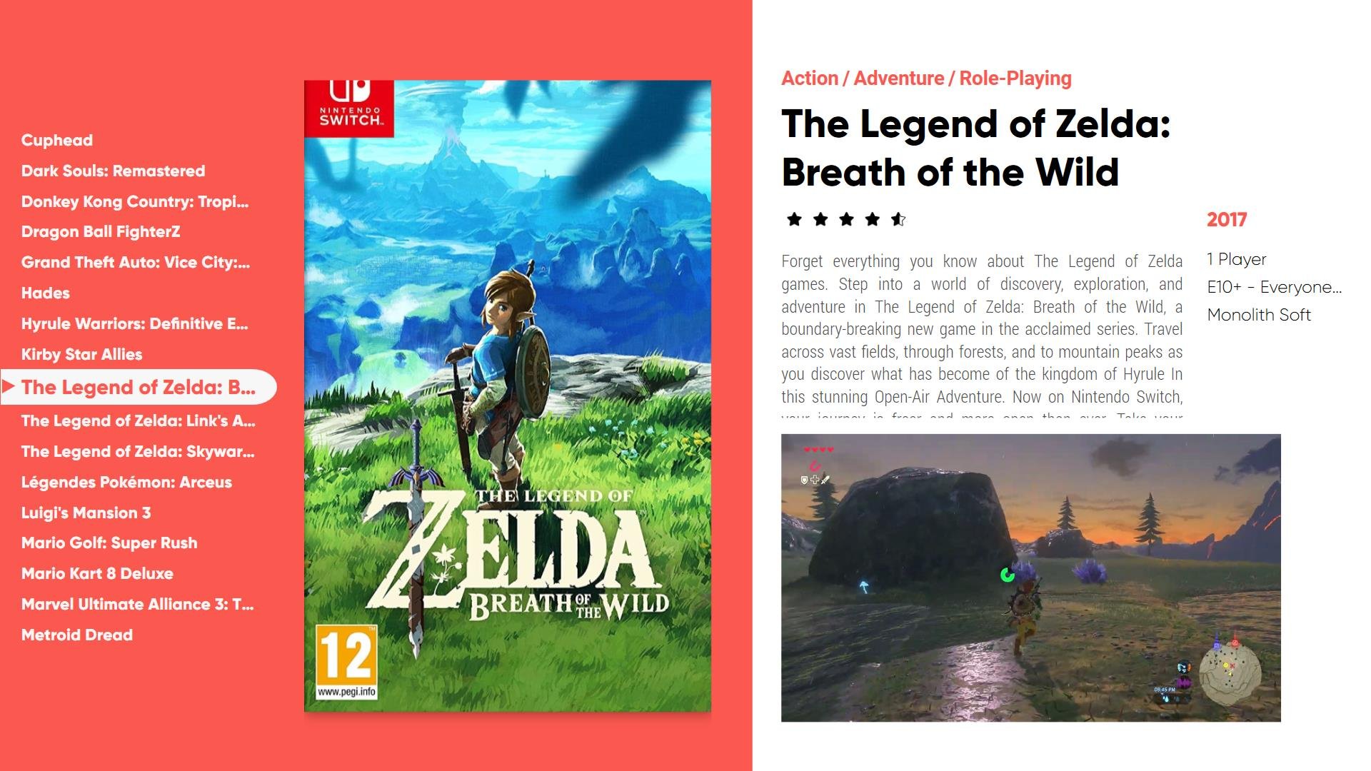
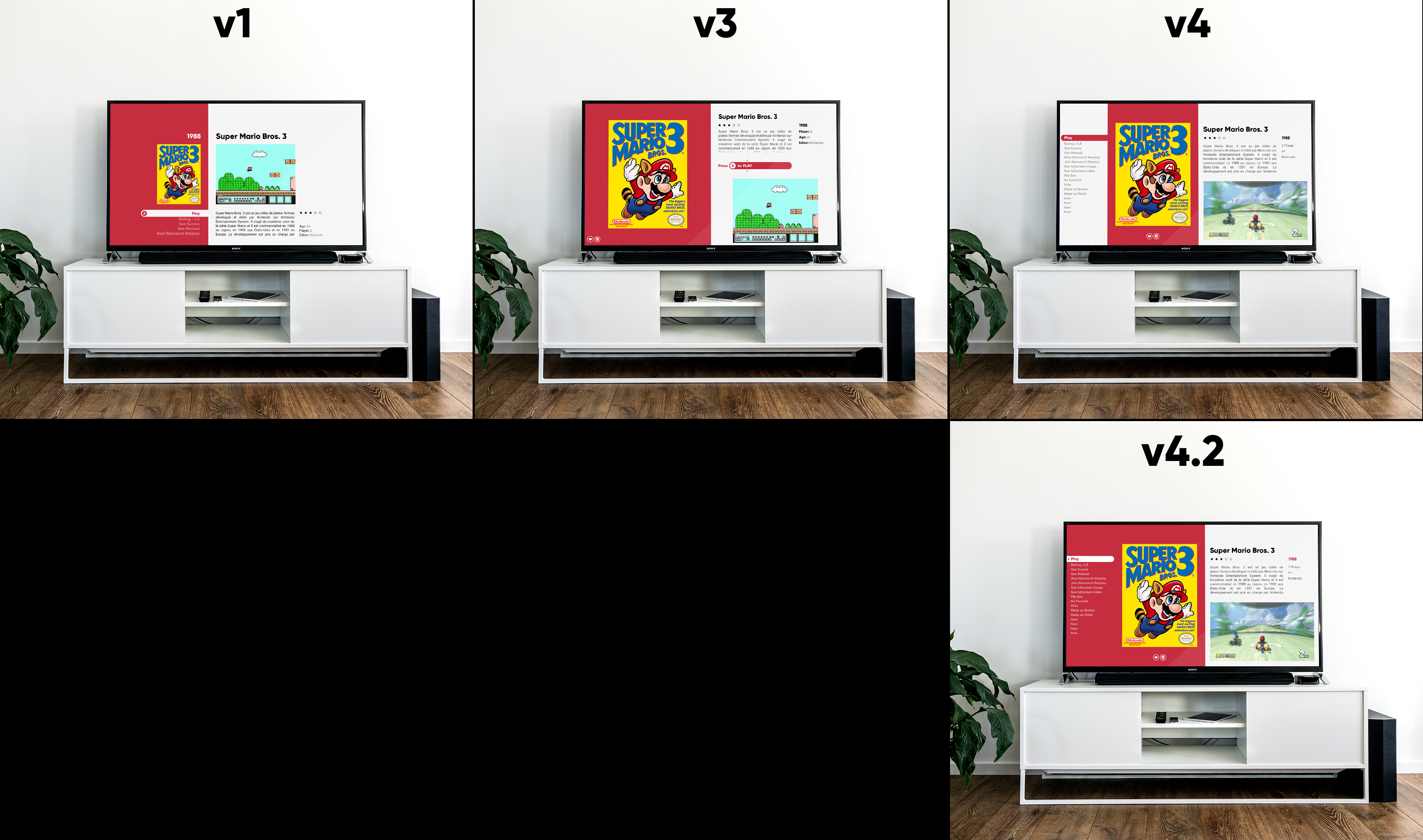
I'm honestly still stuck between v1 and v4.2. V1 is great, but I feel like the elements aren't large enough. If it filled more page space, it might be the best. The concept of the white selection highlight extending from the white area on the right is a great design, and it seems even cleaner/simpler than v4.2
-
2
-
-
55 minutes ago, viking said:
OK.
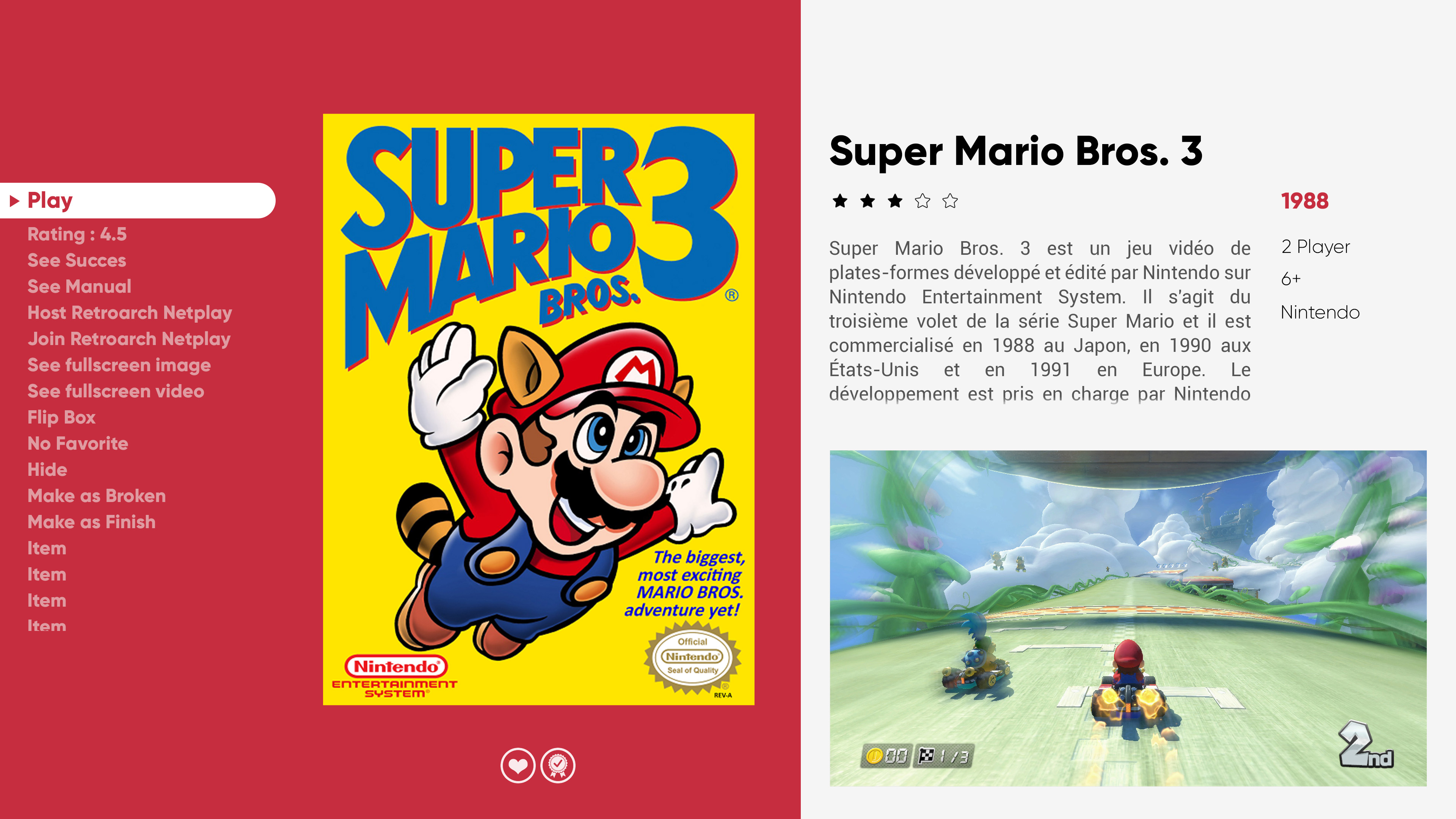
I hear that v4 is the most "classic" of the 3. But what if I add more "Colorful Background"? It remains classic in its design, but it seems consistent to me!
I like 4.2 better than 4. It would probably handle weird box shapes better. Red year is a nice touch.
-
1
-
-
12 hours ago, nicolasonline said:
Salut viking ca va?
Love all the work you've been doing. Just wanted to chime in with my opinion on the TextGamesView
My vote definitely goes to TextGamesView1 or TextGamesView3.
I think the decision is difficult because both are really nice obviously but I think for TGV1 (oh le train) it's probably better when one is sitting close to a smaller screen like on your PC monitor, but with TGV3 it looks much better on a TV and those Context Mockups you made on the TV really helps to visualize that. Since I'm gonna be using it mainly on my TV (I don't know if there are numbers on what percentage of BigBox users are TV vs Monitor) but that could help in the decision also. But yeah I'm probably leaning more towards TextGamesView3 because of that reason.
I think the only thing that could be cool to try out with TGV3 would be to find a solution to not having the blurry video to fill that space under the video if it's in 4:3. I know it's difficult because to fill that space with 4:3 is hard. So I tried different solutions, but I think what could potentially be a good candidate would be to actually take a cue from TGV1 and give it some more breathing room and reduce the size of the 16:9 space so that the video actually aligns with the text above on the vertically. Like this the "blurry" 4:3 behind the video would actually not feel so cramped. It could also work great for regular 16:9 videos as I did a quick mockup below. Maybe if all videos were 16:9 then keep it stretched out as it is is good, but yeah this might be a good solution for both, what do you think? My vote in any case goes to TGV3, but if either TGV3 or TGV1 make it, would be amazing!
Finally about PlatformWheels3 , it seems like it has been voted out/discarded. I may be too late, but just wanted to say I absolutely love it! I know what you mean with it seeming a bit off, and I agree, so I tried to play around with something. I think a huge difference helped when I removed the shadow, as most of all your other stuff don't have shadows. And I reduce the opacity of non-selected platform clear logos as well as their saturation and it could be an idea? If at some point in the future you decide to bring it back.
Cannot wait to check out the new features and views once they're out. Thanks again for your amazing work!
There you go! Dump that color behind the logos in platform 3!
-
2
-
-
Prefer textgamesview1. Platform4 looking very good.
-
1
-
-
Still not sure about platform3. Too much going on. Might try removing the background colors from the scroll wheel, and just keeping the grey + clear logo? That would reduce clashing.
I like where you were heading with this:
If you change the green button to red like in the recent platform4, then maybe remove the duplicate image of the selected console on the right, then replace it with arrows maybe that could work?
You could also play with the size of the images in the scroll wheel, make them larger and show less of them in both directions.
Just thinking out loud.
-
1
-
-
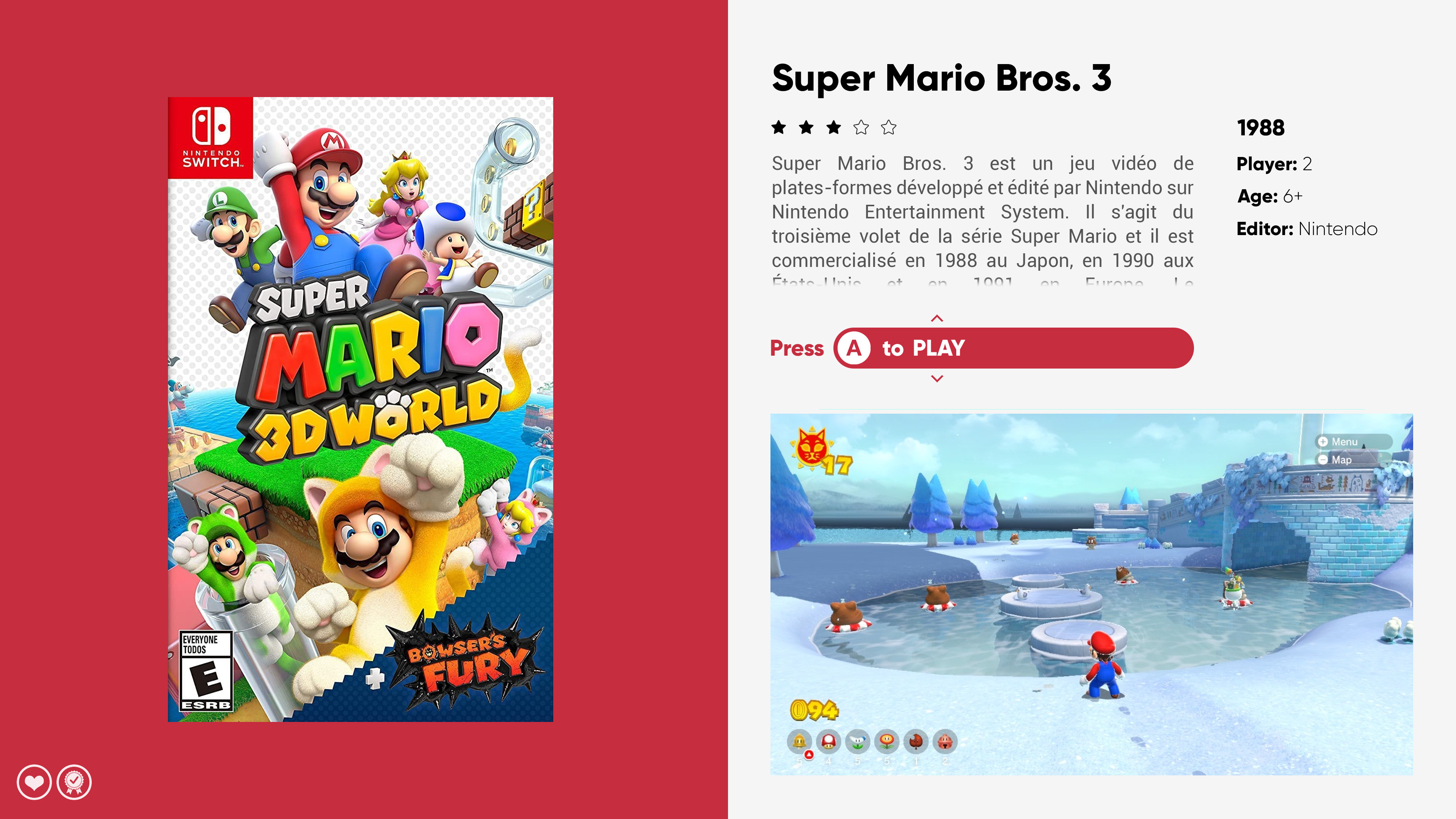
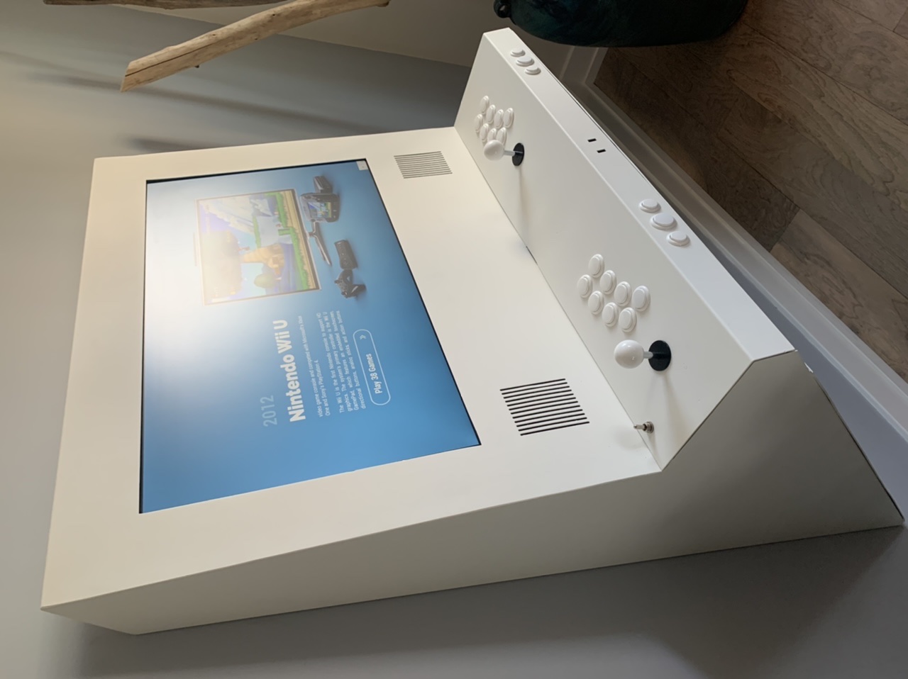
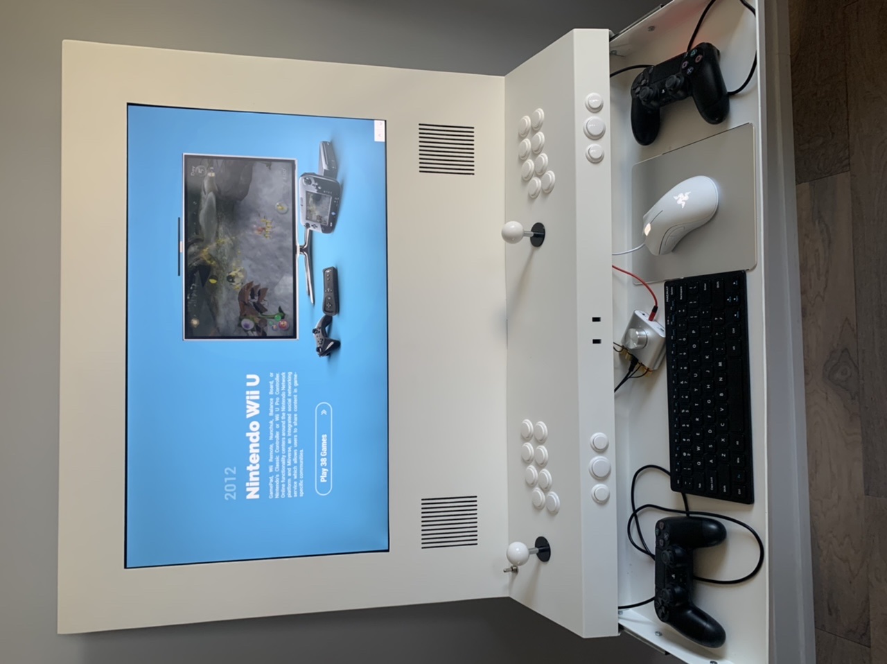
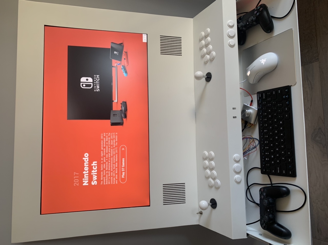
This is semi irrelevant, but here’s my current custom build. Feel free to remove this since it isn’t directly to the point of the thread. Only posting because it shows how insanely good this theme looks with a modern, mono-color cabinet around it.
One thing I’ve noticed as a possible design rule is: the fewer borders, the higher contrast with the cabinet around it.
-
1
-
-
I like the proportions of the main image on platform3, but the colors of the side wheel clash with one another.
Platform4 fixes the above problem with the white area, so I think it looks good, and better than 3 overall.
I have the same criticism of the up/down arrows as zetec, even in the current version of the theme. Those arrows seem to stand out from the theme more than they need to.
Very nice work overall. I need to look more closely at the game wheels before commenting.
Thank you for all of your work! By far the best theme out there..
-
1
-
-
These are awesome! Perhaps some color codes as well?
Thank you!
-
On 3/2/2021 at 11:46 AM, viking said:
@clockw3rk I upload un little .zip file on main theme download page, with color code up to date with last video upload.
Tell me if it's help !
Yes, it's easy, but not for inside BigBox theme download ... =/
Thanks so much for this. Working as intended.
-
1
-
-
On 4/27/2019 at 2:28 PM, sucramjd said:
New video guide on how to get this working without rocketlauncher and me talking you guys through it enjoy
Very much appreciated! I've been able to get this working for most games. How about Let's Go Island? The non-3D version seems to need the Borderless Gaming app to boot. Any way to just directly launch this via Launchbox like the others?
-
FYI my votes for additional videos would be Sammy Atomiswave, NAOMI, Nesica X, Fighting Games and Gaming Magazines (or individual top magazines like GamePro and EGM)
-
1
-


COLORFUL bigbox theme
in Big Box Custom Themes
Posted