
3.jpg.742da72ac43a94705002c210c5b6f7fd.jpg)
Zombeaver
-
Posts
4,003 -
Joined
-
Last visited
-
Days Won
54
Content Type
Profiles
Forums
Articles
Downloads
Gallery
Blogs
File Comments posted by Zombeaver
-
-
Would it be possible to get a view like the one you have a screenshot of with Viewpoint above - Coverflow with description and background video, but with the video in like the top right or left of the screen? Coverflow on the bottom half of the screen, description on the top left or right, and video on the opposite side of the screen from that?
While I think the idea of a full size background video is cool, frankly most of the video snaps you'll get from Emumovies, even at the highest available quality, don't look great when blown up that large. I like that view the most out of the available options, but the less-than-phenomenal video quality of the snaps kinda ruins it for me.
-
That got it! Thank ya much sir! ?
-
 1
1
-
-
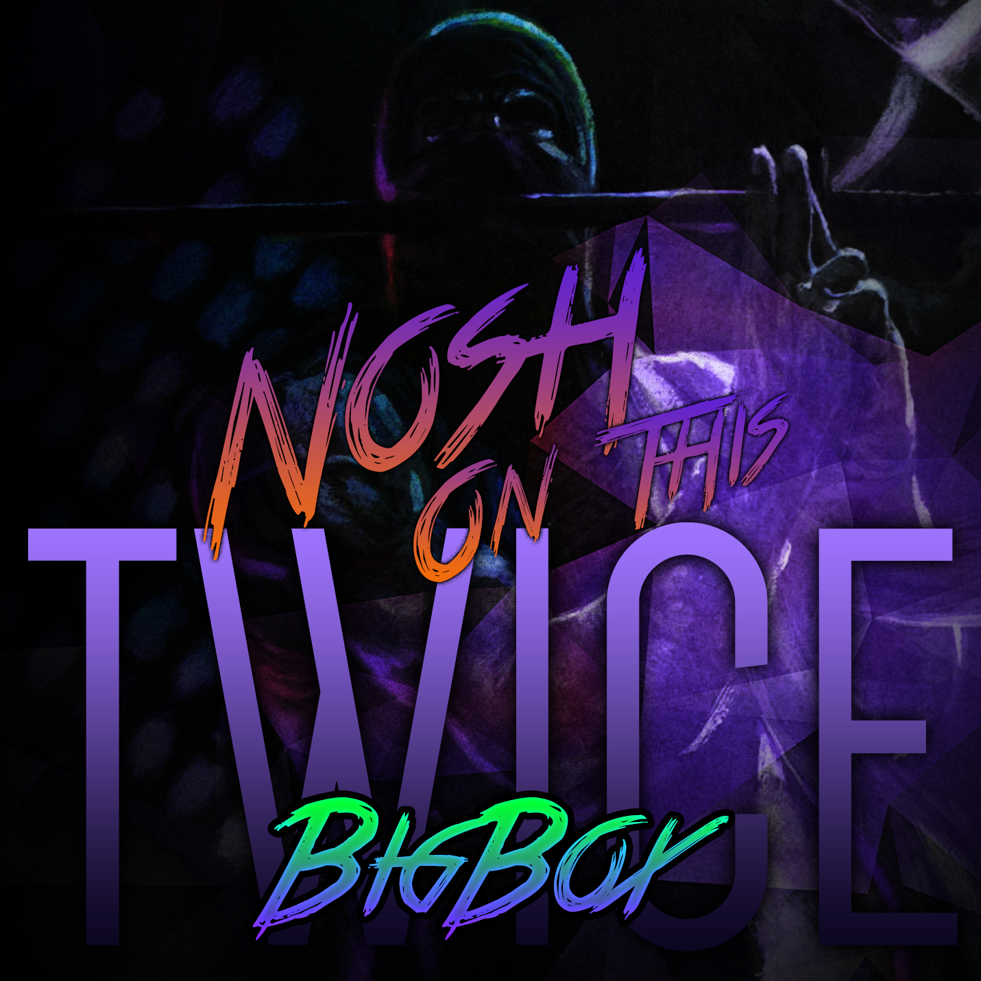
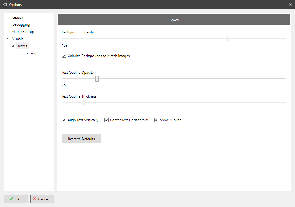
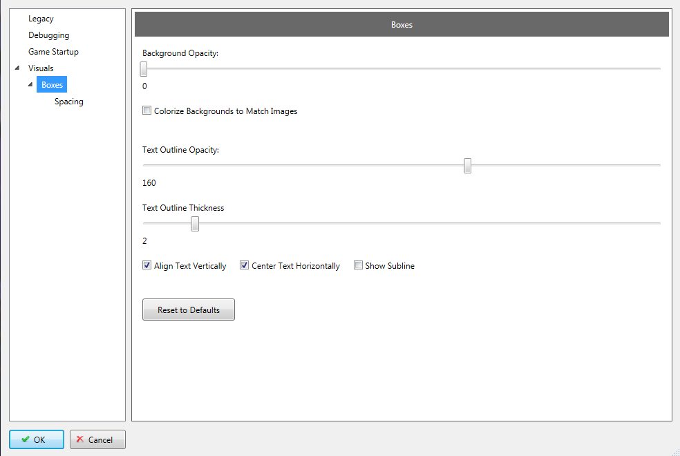
1 minute ago, nosh said:
I am guessing your settings look like this?
 Part of it is because you have "Center Text Horizontally" turned on. If you turn that off it should look better. I think the drop shadow is using a different font, ill look into it.
Similar, yeah. "Center Text Horizontally" is on.
It's actually even more noticeable with that turned off though:
-
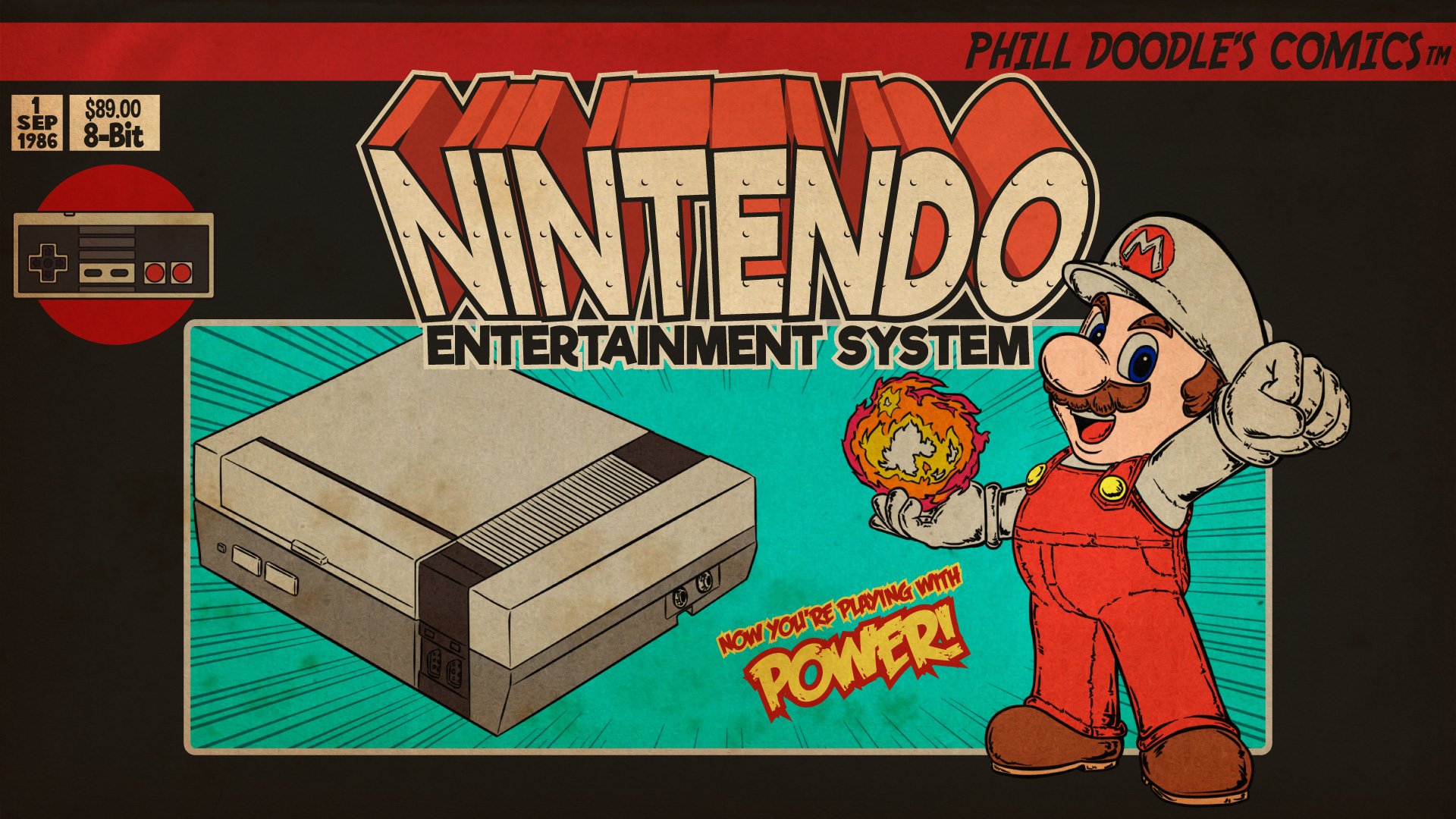
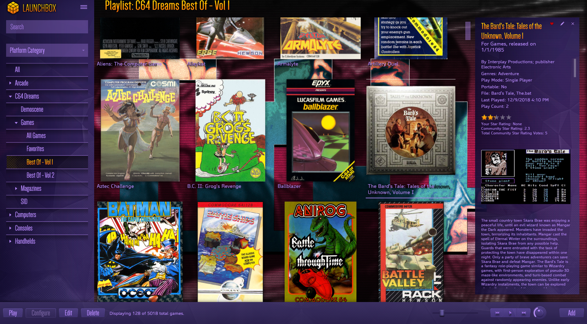
I'm loving this theme!
I am having one weird issue with the outlines on the box text though:
On smaller titles it's not too noticeable, but on longer ones like Bard's Tale here, you can see that the outline isn't lining up properly with the text. It's like it's using a different font size. You can see "wn" to the right of the first line, presumably from "Unknown", which is on the second line. I've messed around in Boxes/Spacing and can't seem to figure out how to fix this.
-
This looks sexy as hell dude! Can't wait to try this out. Awesome job!
-
I just picked up a Pi 3 pretty recently and messed around with quite a few themes in Retropie and this is one of my favorites for it. Thrilled to see it here on Launchbox! Thank you and keep up the great work!
-
1
-
-
@kmoney I haven't done a set with scanlines, no.
-
I like the look of this one quite a bit, but you need to up your bitrate - you've got a ton of compression artifacts going on here that really mar an otherwise great video.
-
Not in the same way I suppose, but that's something I would probably just do via transparency. If you wanted a layer of color adjustment, just add an additional layer under the foreground layer, fill it with the color you want, and then set the opacity to something like 30-40%. If you had a background layer underneath it, you'd want to set the blending mode to color and put the opacity at 100%, and set the background layer to an opacity of 30-40%.
Alternately, you could use something like the color-mangler.glsl shader to adjust the colors.
My normal SNES overlay:
Adding a 30% opacity red layer to it:Adding a 40% opacity red layer to it:
I'm not sure if this is exactly what you had in mind, but it's something you might want to try.
-
Nah it's okay, I think it's fine as-is. If you want to include the RA version in your download, you're welcome to do so. The path in the zip is where they need to be placed in RA. The rom needs to be named "destroyr.zip" for it to load automatically, otherwise destroyr.cfg needs to be renamed accordingly.
-
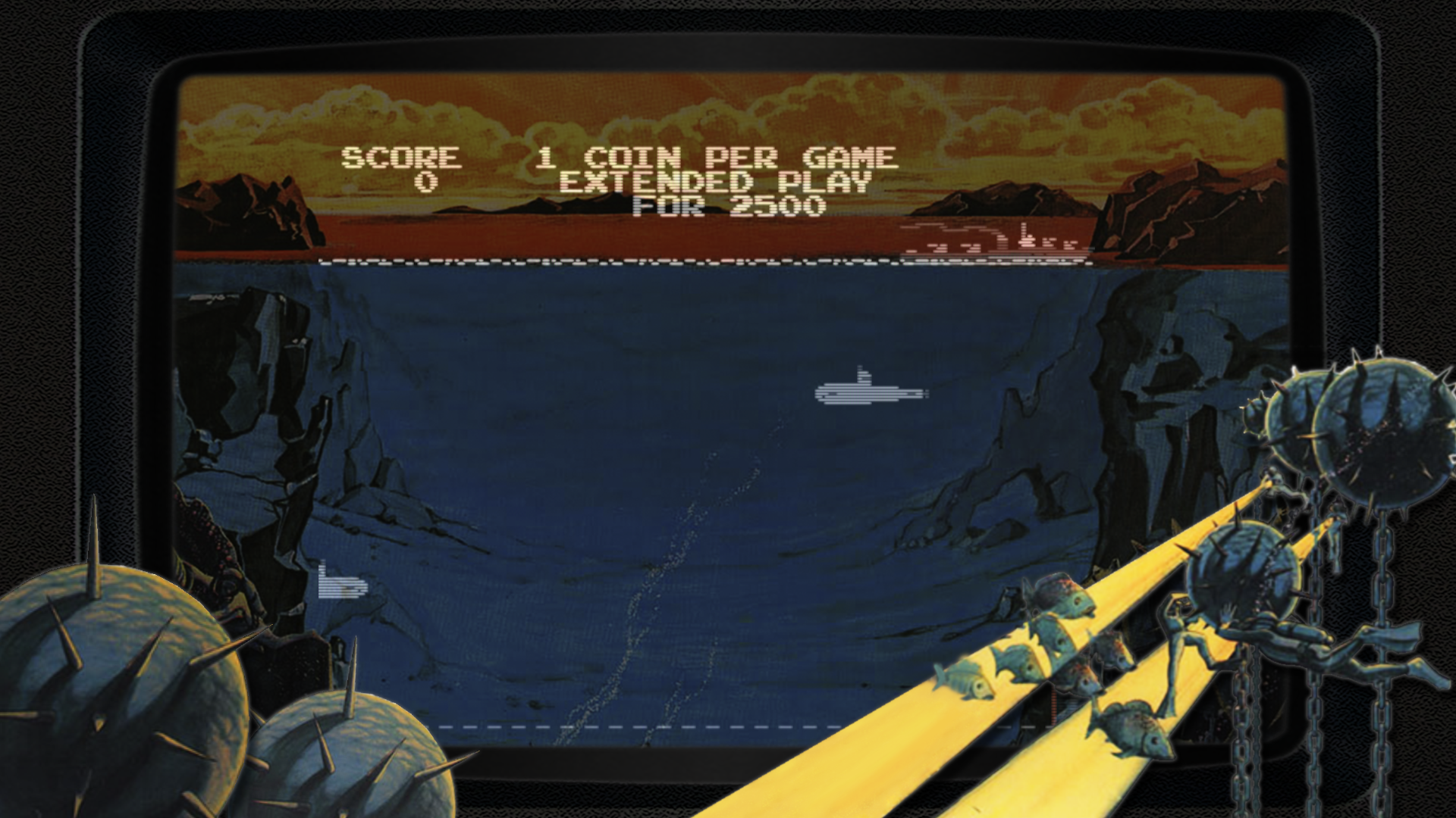
This is pretty neat! I was able to replicate this (the original arcade version) in Retroarch with the images you included - I combined them in Photoshop and put the background opacity at about 40% which looks pretty good, and made a config to use it and tweak the video settings to the appropriate size:
-
1 hour ago, rwprime said:
Nice - oh my gosh, I want that song in your number 3 video
It's The Midnight - Gloria
The Midnight are killer! They've got an EP (Days of Thunder) and an album (Endless Summer) both of which are fantastic.
-
 9 hours ago, Nicolition said:
Amazing work Zombeaver
I'm using this along the cityhunter theme to. Now because it look so nice I cannot even play a game I just stare at the theme with Attract mode on and listen to Dance With the Dead in the background :P.
When you have time I would love those one to the list if possible.
1- Wii U
2- 3DS
3- Wonderswan Color
And maybe if I don't ask to much can you make for those same platform the Clear Logo and Video style that you made in the CityHunter forum section ?
Thanks again for all the hard work and being nice enough to share with all of us.
Sure, I'll add those to my to-do list!
-
1
-
-
No problem!
-
@adu I usually wait until I have 2-3 new logos before updating the download section but if you want to grab it now, I just posted CPS-3 in the forums. Just click on the image, click "full size" at the bottom left, and then save it to your computer.
-
1
-
-
On 1/16/2017 at 5:40 PM, damageinc86 said:
How about an overall theme to go with these awesome banners?
If I knew a single thing about theme creation I might do that
I use CityHunter currently.
On 1/24/2017 at 0:22 AM, JamzVenture said:Nintendo Wii U would be great
I've added it to the to-do list!
-
1
-
-
3 minutes ago, adu said:
Waow ! Amazing !
Can you make a CPS-3 one please ?
Sure! I've got a to-do list and CPS-3 is actually on it already.
-
1
-
-
On 1/8/2017 at 10:38 AM, keltoigael said:
Stand alone versions of PC Engine, PC Engine CD vs the TC16 and CD counter parts. Danke.
They're available now. Bitte.
-
1
-
-
Just now, DOS76 said:
Oh its a gif that is brilliant though
Yep, just a gif haha. I used http://ezgif.com/maker specifically. Just upload the images, specify the delay etc. and save it.
-

Really awesome theme viking! Thank you!
Would it be possible to get a variation on Platform View 3 that, instead of the platform description, had the recent and favorites lists? I've got a few platforms like Arcade and Classic PC where use of the platform description just doesn't make much sense, and I'd prefer to have the favorites and recent lists instead. Also, would it be possible to use background videos rather than fanart in that view? It might actually look neat even with the blur filter, I'm not sure.
Thanks again! -
 8 minutes ago, Hexxxer said:
I am will try and re-encode the video on my next update and see how that works. In testing I came across a similar issue on a different encoding then I went with, I changed it to the current thinking I had fixed it. Guess not.
If you'd like, I'm happy to send you the render that I did. It's a larger file size than the original (I think it's about 40MB) as I wanted to avoid quality loss as much as possible. I could do a different one with a lower bitrate if you want.
11 minutes ago, Hexxxer said:As far as changing the colour of the selection bar, you are correct, my intention is to replace that in my next update as well.
It actually isn't the selection bar that I had an issue with (the Platform Wheel 3 view doesn't even use it). It's the highlight color when you're hovered over a game box - it's dark grey (it's blue in the default theme). It's very hard to distinguish a highlighted/selected box from one that isn't. White would be much easier to see. I can take a screenshot of it tonight if I need to.
15 minutes ago, Hexxxer said:That being said, my hands are tied until probably next week at this point so those changes won't be made until them.
No worries and no rush!
-
I love this theme! I was able to throw in my platform clear logos and banners (took me a few minutes to figure out they're implemented as "devices" not "banners" but that's okay) and it looks great! If I had one request it would be that the highlight color be changed to white. The current dark gray color is honestly quite hard to distinguish from a non-highlighted box. Other than that, I'm loving it. Thank you!
One issue I encountered though was with the background video in Platform Wheel 3 (which is a really neat idea by the way!). For some reason it wouldn't loop properly for me. It would get to the end (zoom in and then back out) and then just hang there for about 10-15 seconds before starting again (and not quite at the beginning either). I tried a number of different videos of a similar nature (stuff like this) from around the web in its place just to see what would happen - some looped properly, some didn't. So I loaded up your video in Vegas Pro 14 and re-rendered it to Sony AVC MP4 and that actually fixed it. I tried this on a few of the other videos I had tried, and it fixed it for some, but not for others. Very strange. In the cases where it wouldn't loop, the issue persisted whether using WMP or VLC engines.


Playtime Tracker
in Third-party Apps and Plugins
Posted
I'm glad you joined the forums just to complain about not having playtime tracking on a plugin that adds playtime tracking. Thanks for your contribution, hope you have a wonderful day.
Thank you for the plugin Grila. Nice little addition.