

viking
-
Posts
953 -
Joined
-
Last visited
-
Days Won
30
Content Type
Profiles
Forums
Articles
Downloads
Gallery
Blogs
Posts posted by viking
-
-
Yes I try, of course.
By the way, the camera Z position must be higher that the selected item.
I must missing something =/ -
A BIG thank you to everyone for your feedback.
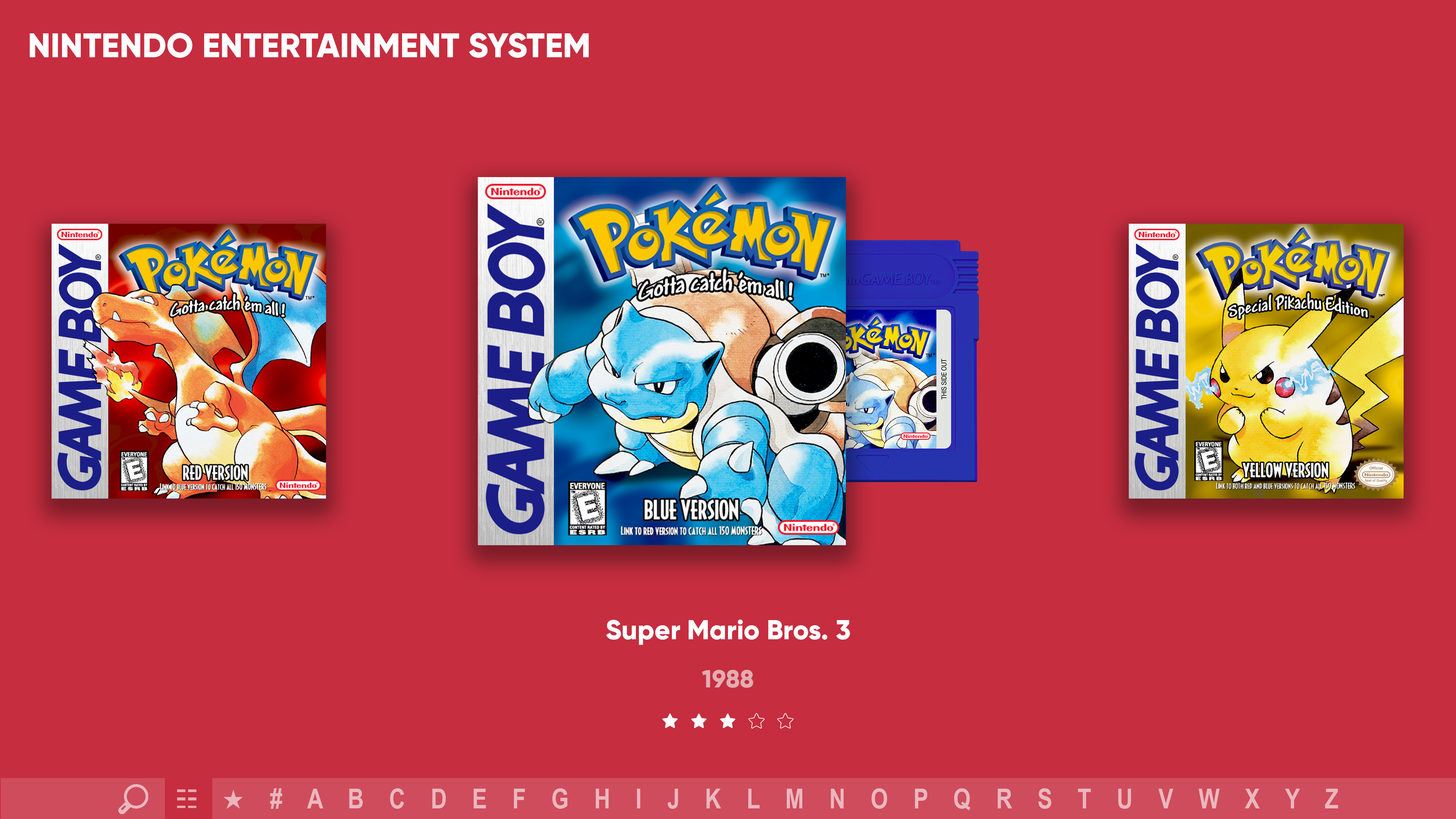
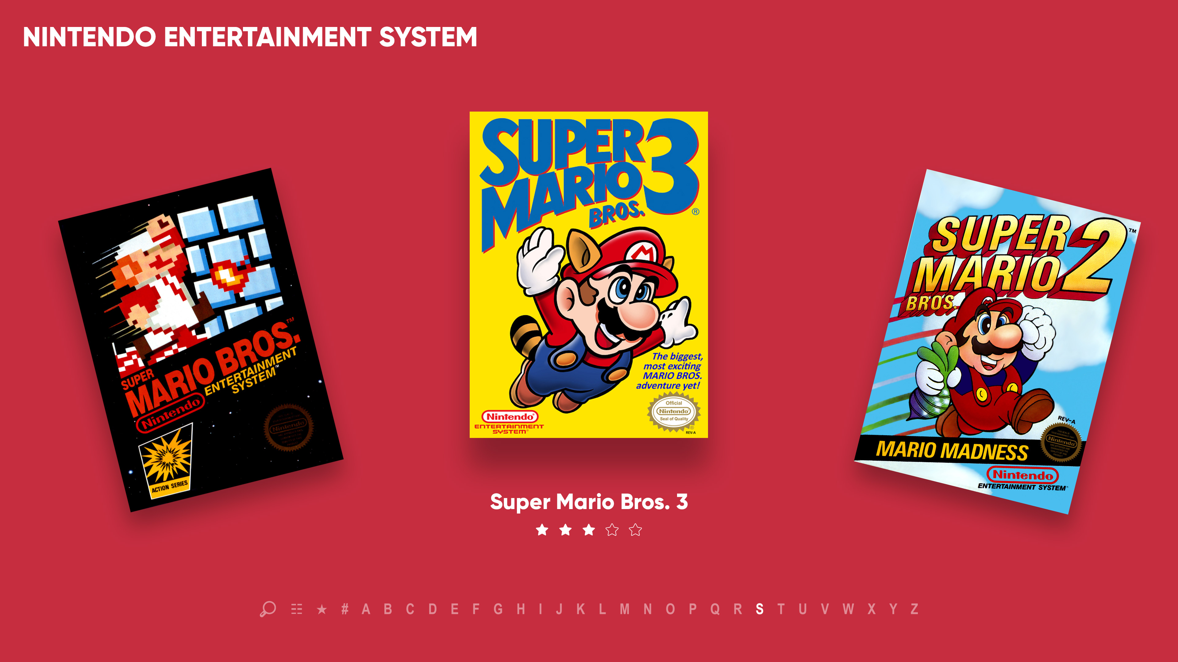
I will therefore go on v4.2 for the moment. We will see what I can do on code side.9 hours ago, ABeezy13 said:@viking Your updates from the last few pages are the fricking amazing. You are knocking this out of the park and improving your theme by a country mile! I love it all!!!!! But dude, you HAVE to include a view like what I attached. I just did a quick dirty mock up with my game boy box art and cart art to show you how good it looks! I hope you consider making this a view!!! (Since you said you may not make this view)

Yes, this view is well planned. BUT I have a big doubt about its feasibility on the code side.
I will try, with no guarantee of succeeding.The difficulty will be to set up an animation structure that works regardless of the height/width ratio of the images. And it's not nothing. There is so much variety that it gets complicated!
I have already started working the HorizontalWheel1GamesView view.
But stupid thing ... I can not have the selected item larger than the others... it begins well !
-
 4
4
-
 1
1
-
-
Hi guys !
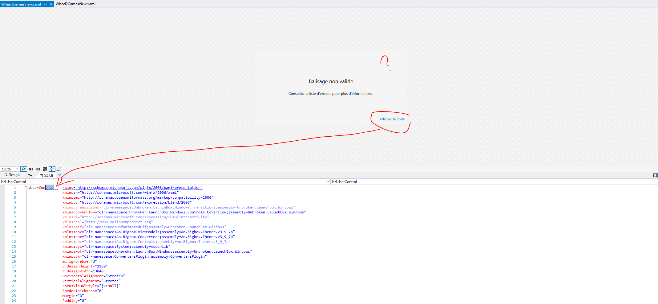
I'm slowly starting to work on updating my theme and I already have a problem with Visual Studio.
No preview and it tells me "invalid markup". If I do "Show the code" it highlights the point of the arrow for me. (see picture)
I had this problem before, but always with a real error.
Here, no XAML error, even with default theme views, and it's work fine in BigBox.Any ideas how to fix this?
I dont have the level to work only with notePad ++
-
OK.
I hear that v4 is the most "classic" of the 3. But what if I add more "Colorful Background"? It remains classic in its design, but it seems consistent to me!
-
5
-
1
-
-
On this subject: a little reminder.
TextGamesView is a bit special in BigBox. This is not theme dependent, but the way of BigBox structure itself was buid.
A single "TextGamesView.xaml" file, a single design, for 2 uses ====> SelectGames by text list /AND/ Game Detail ViewThat's why I'm so bothered by this sight.
- With version 1 and 3: nobody will be able to use it as a Game Selection by text list. Only for Game Detail.
- With version 4 : it's not perfect, but functional for a Game Selection by text list.Last layer of thought: I'd like to use the design structure of this view as the basis for the Pause and Start theme.
For graphic consistency.Hard ! I'm not a UI designer and I have to deal with BigBox UX ^^'
-
2
-
-
Yep, opacity isn't a problem and I thinks it's buidin in new wheel. It's about the saturation ...
-
1
-
-
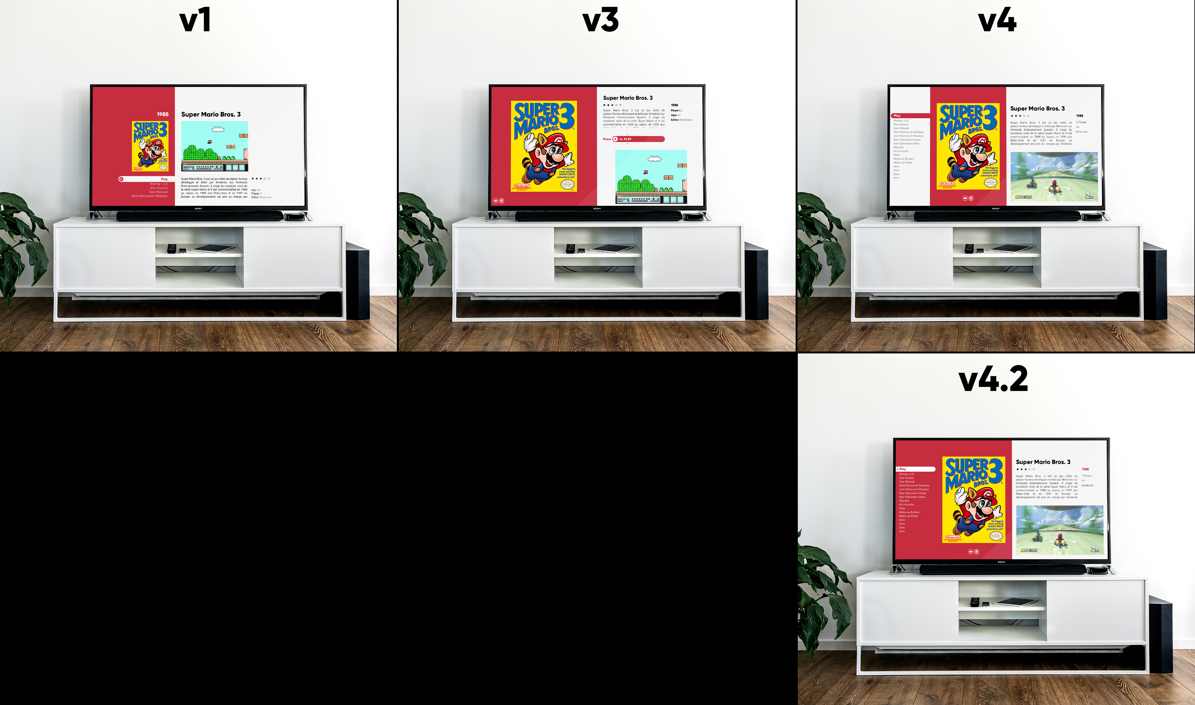
OK, last makup pass before testing all this in code! (in the next few weeks, I have to get back to work!)
All about TextGamesView.Exit the v2. Here come a new challenger : v4 !
Just kidding. It's a big modification of v3, integrating your feedback.
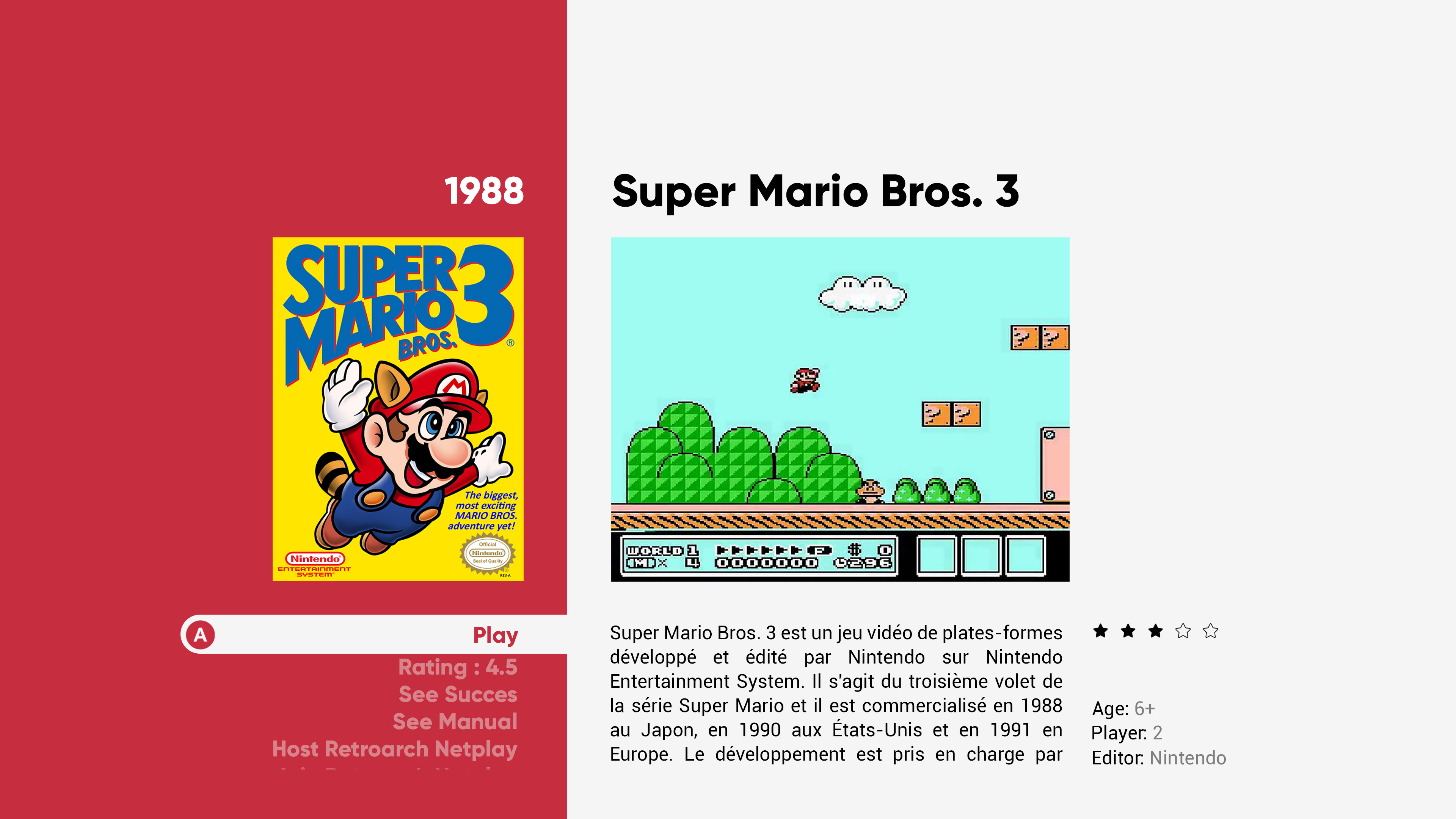
TextGameView v1 :
The same as yesterday. Just micro adjustments on the list.
The BIG problem with this view is going to be getting the video left aligned ... I never got there until now! If anyone has an idea, I'm interested!
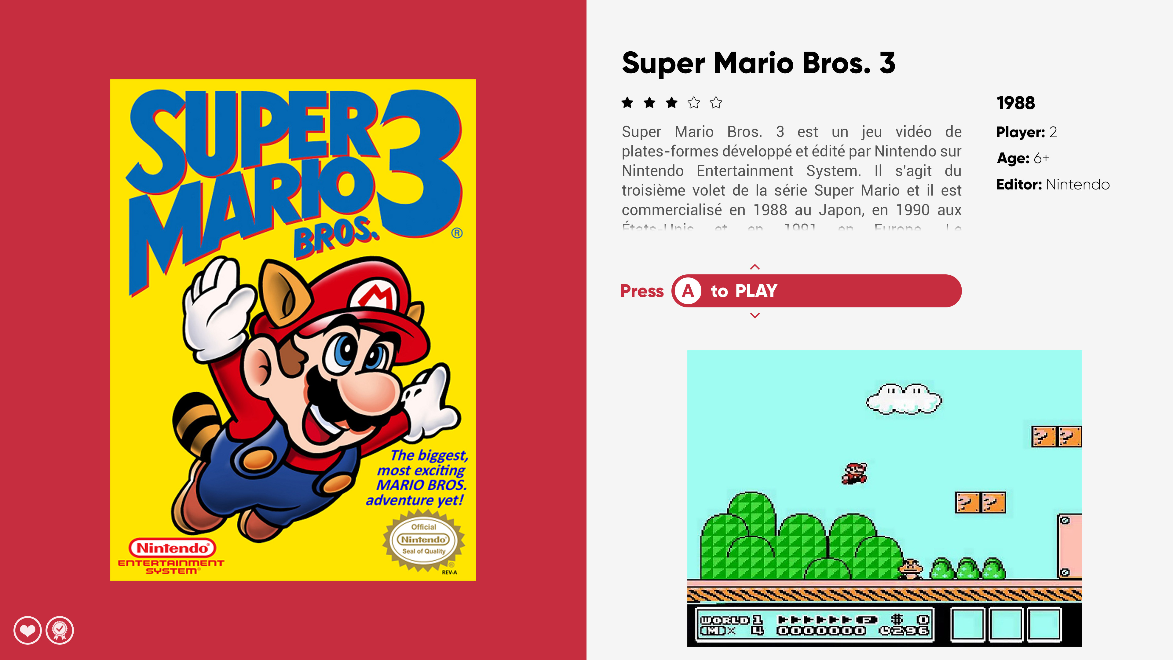
TextGameView v3 :
The same as yesterday, except the video breathe. Works best with 16: 9 but here is the result with 4: 3.
TextGameView v4 :
And a last version, based on v3, but trying to integrate the list option.
Please VOTE and give me your feedback !
-
2
-
-
15 hours ago, soqueroeu said:
My vote to avoid all problems is TextGamesView V1
Hey @viking, WheelGamesView and Wheel2GamesView are very similar. What do you think of unifying the few differences and maintaining only one of them?I think we will have problems with very big names in the "About" area (circled in red). This empty space that seems inevitable (circled in yellow) was also not very aesthetic:
You are right about v2. It does not work well and I prefer the previous one. In all cases, the choice will be made between v1 and v2.
10 hours ago, nicolasonline said:Salut viking ca va?
Love all the work you've been doing. Just wanted to chime in with my opinion on the TextGamesView
My vote definitely goes to TextGamesView1 or TextGamesView3.
I think the decision is difficult because both are really nice obviously but I think for TGV1 (oh le train) it's probably better when one is sitting close to a smaller screen like on your PC monitor, but with TGV3 it looks much better on a TV and those Context Mockups you made on the TV really helps to visualize that. Since I'm gonna be using it mainly on my TV (I don't know if there are numbers on what percentage of BigBox users are TV vs Monitor) but that could help in the decision also. But yeah I'm probably leaning more towards TextGamesView3 because of that reason.
I think the only thing that could be cool to try out with TGV3 would be to find a solution to not having the blurry video to fill that space under the video if it's in 4:3. I know it's difficult because to fill that space with 4:3 is hard. So I tried different solutions, but I think what could potentially be a good candidate would be to actually take a cue from TGV1 and give it some more breathing room and reduce the size of the 16:9 space so that the video actually aligns with the text above on the vertically. Like this the "blurry" 4:3 behind the video would actually not feel so cramped. It could also work great for regular 16:9 videos as I did a quick mockup below. Maybe if all videos were 16:9 then keep it stretched out as it is is good, but yeah this might be a good solution for both, what do you think? My vote in any case goes to TGV3, but if either TGV3 or TGV1 make it, would be amazing!
Finally about PlatformWheels3 , it seems like it has been voted out/discarded. I may be too late, but just wanted to say I absolutely love it! I know what you mean with it seeming a bit off, and I agree, so I tried to play around with something. I think a huge difference helped when I removed the shadow, as most of all your other stuff don't have shadows. And I reduce the opacity of non-selected platform clear logos as well as their saturation and it could be an idea? If at some point in the future you decide to bring it back.
Cannot wait to check out the new features and views once they're out. Thanks again for your amazing work!
What a feedback! Merci à toi !!
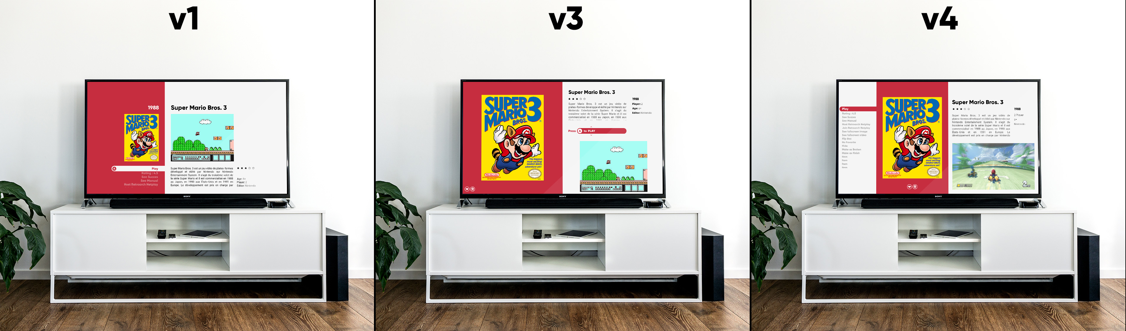
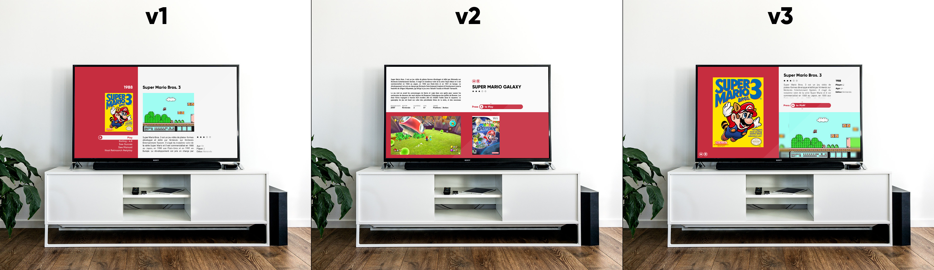
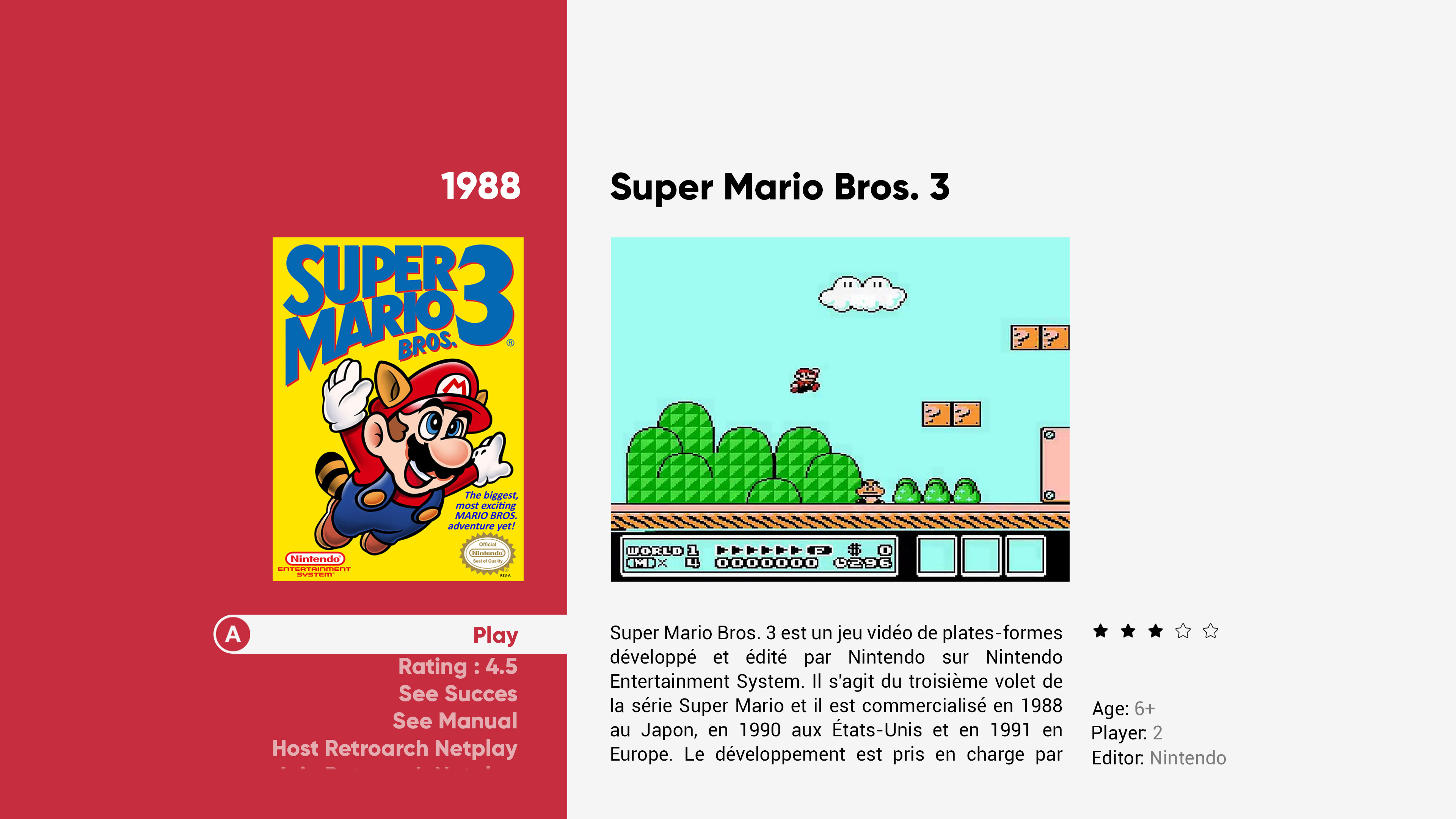
Yes, this theme is designed for large TV screens. A more modern interface, far from the 80's cab.
It remains the main design axis, blocked in 16:9. But if someone else uses it on a monitor, that's fine too!TGV1 is more ventilated, lighter, and allows to keep part of the option list.
TGV2 has a sharper and more spectacular design. I like it a lot too. But on a 4K TV, with an old crapy BoxArt jpg ... I don't know...Your idea of detaching the video to remove the blurry background is very good! I keep for a last mokup try =)
PlatformWheel3 : Once again, you are right. I spoke above. (ClearLogoSet full black or white) This is a problem, because I keep in mind the technical limits of the XAML format and the limits of my knowledge in code. I do not believe it is possible to desaturate logos on the fly in the code. In any case: I don't know how to do it. (any ideas on this?)
I'll do a code test on this. Without warranty ! (By the way, valid for all views)1 hour ago, thimolor said:TextGamesViews overall look nice, but what happens when the game title is really long? Do you trim the the title or scale down? I have always struggled to preserve space to the longer titles. It look bad with short title, but also I don't personally like when the text sizes vary or the title gets cut. There is also the text scroller, that might solve the problem.
You now have the button (Press A to Play). I'm not fan of this. I use DS4 and that does not have A button. Also you are hiding a lot of the menu items. If you can't remember the correct order then finding a particular menu item would be tedious. How about the gamers that use this view for finding games. In a perfect world there could be a sliding menu somewhere or we could have horizontal menu bar... just dreaming.
I think you are giving up too much space for the box art. It seems to be now 50/50.
HorizontalWheel2GamesView, I really like this one. Could you try to switch the alignment? Big boxart to the right? My eyes are drawn to the right, so it feels like I'm not looking what I'm supposed to. Maybe it's just me and my eyes
For very long names, I expected them to grow from the top, like the current views.
Again, these are mockups. Once chosen, they will have to be confronted with the reality of the code any games data! (the hard part)About the "A", it will be in PNG. I can create other PNGs that you can replace, depending on the gamepad used.
Yes, 50/50 for the BoxArt. This is the dramatic side of this view and why I love it!
Speaking of the wheel alignment, you're talking about the HorizontalWheel3GamesView right? Not the "2" ?
It's graphically more consistent on the left. Aligned with the rest of the text. Perhaps by lowering the unselected BoxArt opactie, the attention will be directed more to the left?Thank you all for your constructive feedback.
Today I would like to finish concept TGV1 and 3. And maybe do a quick code test for the HorizontalWheel1GamesView.
To try out @Jason Carr 's new wheel and to validate the "giant wheel" concept. See how the display handles this. -
Thanks !
For the others, there is an update on the previous page
Please check !
I add that the chosen TextGamesView will be the basis of the start and pause theme!
-
1
-
-
OK OK OK.
I think I will reach the goal. ^^ (Attention, big post)
But since it's a mess, I have prepared a summary image for you. A storyboard of colorful navigation. By the way, I updated the "old views". (font, style, fit ...)
The grids are side by side, because of similar design. Just the background color. Light/Dark or Colorful version. All will be develop.
For me there is enough view for this v2. That covers quite a bit of possibility.
There remains the GameDetailView to validate because there can only be ONE by theme!And so here is the complete selection of "final" design.
(except TextGamesView, I agree)PlatformWheel4FiltersView
Minor adjustment. Version with no video. The wheel will be the same as the existing one for the Platform View. (a white overlay with Clear Logo)
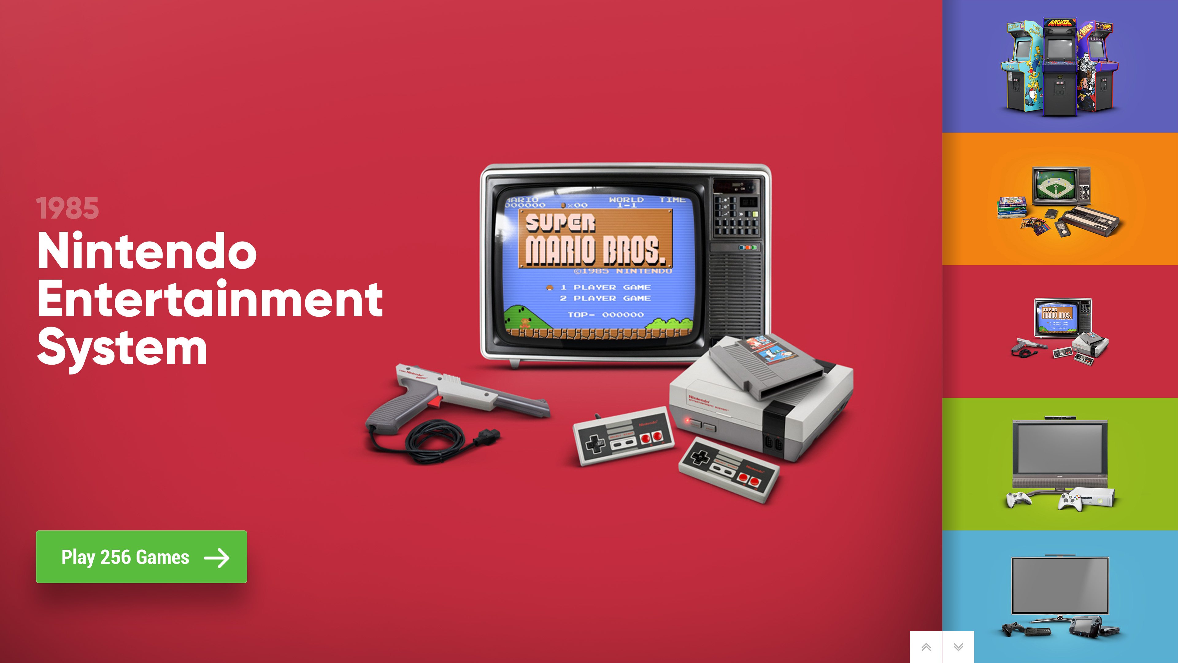
HorizontalWheel1GamesView
Modification of the alphabetical fast access band. More elegant on the big screen and always visible. I hope I can do that !!
I hope the wheel item quality will be good in this giant wheel in 4K. =/
HorizontalWheel2GamesView
Same as the previous one. But with a Cart/CD animation. I will try, but without guarantee.
HorizontalWheel3GamesView
I like this one too. Not too much technical difficulty, except the wheel. I haven't tried to setup the new version yet =)
WallGamesView & Wall2GamesView
I only put one picture for you. But there will be a light/dark background version. And a Colorful background version.
Wall3GamesView & Wall4GamesView
I only put one picture for you. But there will be a light/dark background version. And a Colorful background version.
And now the 3 version of the TextGamesView. We will have to choose only 1 concept !!! To your VOTE!
Me, I spent too much time on it: I can't see anything anymore ...
A little mockup to make it easier to read in context :
And in detail :
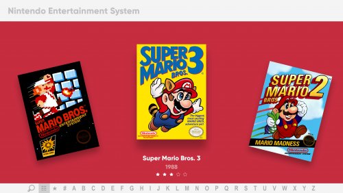
TextGamesView v1
Minor adjustment to the option list.
TextGamesView v2
Minor adjustment to the option list.
Redesign, taking into account your feedback. The video is centered whatever its ratio.
I preferred the one from yesterday personally ...
TextGamesView v3
No change.
I'll give you time to digest it all and give me your feedback! =)
-
2
-
-
Thx all !
I must have explained badly about the grids: The choice is not on the background color. Not even on the title.
Just on the grid itself. Its style, its density, its feeling.
-
4 hours ago, zetec-s-joe said:
If box to cart/dissc ratio size can be per system, then this would be so good
No chance. Sorry! I'm already having trouble finding the time to do whatever I want for Colorful. So develop 1 view for 1 platform ...
But you are right. This is the only way to control the effect. I would do some code testing, but if it doesn't work, I forget it.1 hour ago, soqueroeu said:Hi Bro!
I liked everything, except for TextGamesView v2. It only makes sense when the box game fills its entire space, which would be impossible with the various existing media measures. Have you ever thought about creating something with a smaller video window in the upper central part of the screen?HorizontalWheel2GamesView can be a success if theme can use its own templates and, if any game did not have an art, use a generic one.
Another detail can be considered for the whole theme is to try not to hide the entire scroll menu:
Another thing I always thought it should be: why can't any existing themes always start with a welcome screen, followed by a category? It would be possible ?
Man, I always found it strange, starts directly on some platform ...?This is the whole principle of this TextGameView v2. Cut it into 4 areas, with a diagonal loaded and a diagonal light.
Displayed small on a PC screen, it does not work well. But in full screen on a 50 "TV, I think so. I hope so!
About the button, that's what I'm looking for: hide the list and tinker with it to make it feel like a button. It is not perfect. I don't even know if I'll be able to code this. But it is a possible solution.
There is too much different data to display for me to get everything integrated in an elegant and airy way. I don't want anything too heavy.
The list is unnecessary. I'm trying to replace it. Ideally, by buttons. But I don't know if it's possible or how to do it. Ideas ?HorizontalWheel2GamesView.
Yes, ideally. But it's too long to create. The goal is to use the basic media that already exists. I try to do the minimum of custom asset. (except the video set, indeed!)40 minutes ago, clockw3rk said:Still not sure about platform3. Too much going on. Might try removing the background colors from the scroll wheel, and just keeping the grey + clear logo? That would reduce clashing.
I like where you were heading with this:
If you change the green button to red like in the recent platform4, then maybe remove the duplicate image of the selected console on the right, then replace it with arrows maybe that could work?
You could also play with the size of the images in the scroll wheel, make them larger and show less of them in both directions.
Just thinking out loud.
Um, I don't know. It seems to me too loaded with graphically different elements. The ideal would be to use a ClearLogoSet all white or black. To have a graphic unit. But I'll never have the time to create it. I'll see if anyone has already done this on the forum. If so, it may be possible to integrate it into the theme. (according to its weight)
Good idea about the arrow. I'll give a try !
About the wheel item size, the problem is the square ratio of the images. So to increase their size = increase the width of the wheel. So shift the rest of the view to the left. So less readable by compression.
37 minutes ago, bbweiners said:What if everything on the bottom of TextGamesView v2 gets centered.
um, no. It's not going to work here.
@Jason Carr Thx =) I will do my best !
Do you have an idea or a way to replace the option list of the TextGamesView, by graphic buttons? With 2 states: selected or not? Like new wheel model !
(Yes, I believe in Santa Claus ^^ If I interpreted correctly the way you built the navigation in BigBox, it will be complicated !!)EDIT : Oh, and about the last 2 GRID views, we're going to have to choose between the 2 versions! Tight or ventilated grid? Vote!
-
1
-
-
I still have a little time! Here are some updated mokup:
PlatformWheel3FiltersView
As requested, a test with a colored background. I'm still not convinced. Or with a custom ClearLogo set (like full white). But I want my designs to work as well as possible with basic media.
PlatformWheel4FiltersView
Still without video, the main image becomes the wheel. I like it but very (too?) simple.
HorizontalWheel1GamesView
This one, I like it a lot. I'll try to develop it like this! Validated for me =)
HorizontalWheel2GamesView
On the same idea, a variant with the CD / cartridge. I like the idea, but it remains to be tested depending on the media and the ratio of the boxes. Not sure at all that it works as I hope!
HorizontalWheel3GamesView
Minor buttons adjustment. I don't think I'm far from validation. What do you think ?
TextGamesView v1
Minor adjustment of buttons. I am no longer sure. The following 2 work better, don't they?
As a reminder, I can only have ONE by theme !!
TextGamesView v2
Total overhaul since yesterday's v2. I like. What do you think ?
The BoxArt always keeps this height and extends to the left according to its ratio.
I think she might be perfect for a big TV!
TextGamesView v3
Some button adjustments. But I'm starting to prefer v2 now!
And a quick test around the grid.
Based on POC theme density:
And with more room and title :
It's your turn !
-
3
-
 1
1
-
-
OK guys!
Mokup update for next view
It's slowly refined!HorizontalWheel1GamesView
I really like this one. Super simple, elegant, no video or parasitic info. Some micro adjustments for this version.
For feasibility, it remains to check how the "new wheel" handles with high resolution BoxArt!
HorizontalWheel2GamesView
Test by off-center the horizontal wheel. From my point of view, there is still too much info displayed on this view. But the graphics balance looks good.
Your opinion? Adjustments must to be made on the buttons I think.
No technical difficulty here... if I can do what I hope with the new wheel.
PlatformWheel3FiltersView
I still don't like it, but here a new version of the wheel. What do you think ? It's better, but not very elegant.
PlatformWheel4FiltersView
You are right. Hardware alone is not self-explanatory.
I did this test with ClearLogo with square ratio. It's really not great. It's too graphically inconsistent between each logo.
I'm not sure how to do this here ... Maybe just like the PlatformWhel3Filter (?)
(reminder: this is NOT a video on this view, but my next Banner set)
Or ... no visible wheel. I mean, the big picture IS the wheel ??
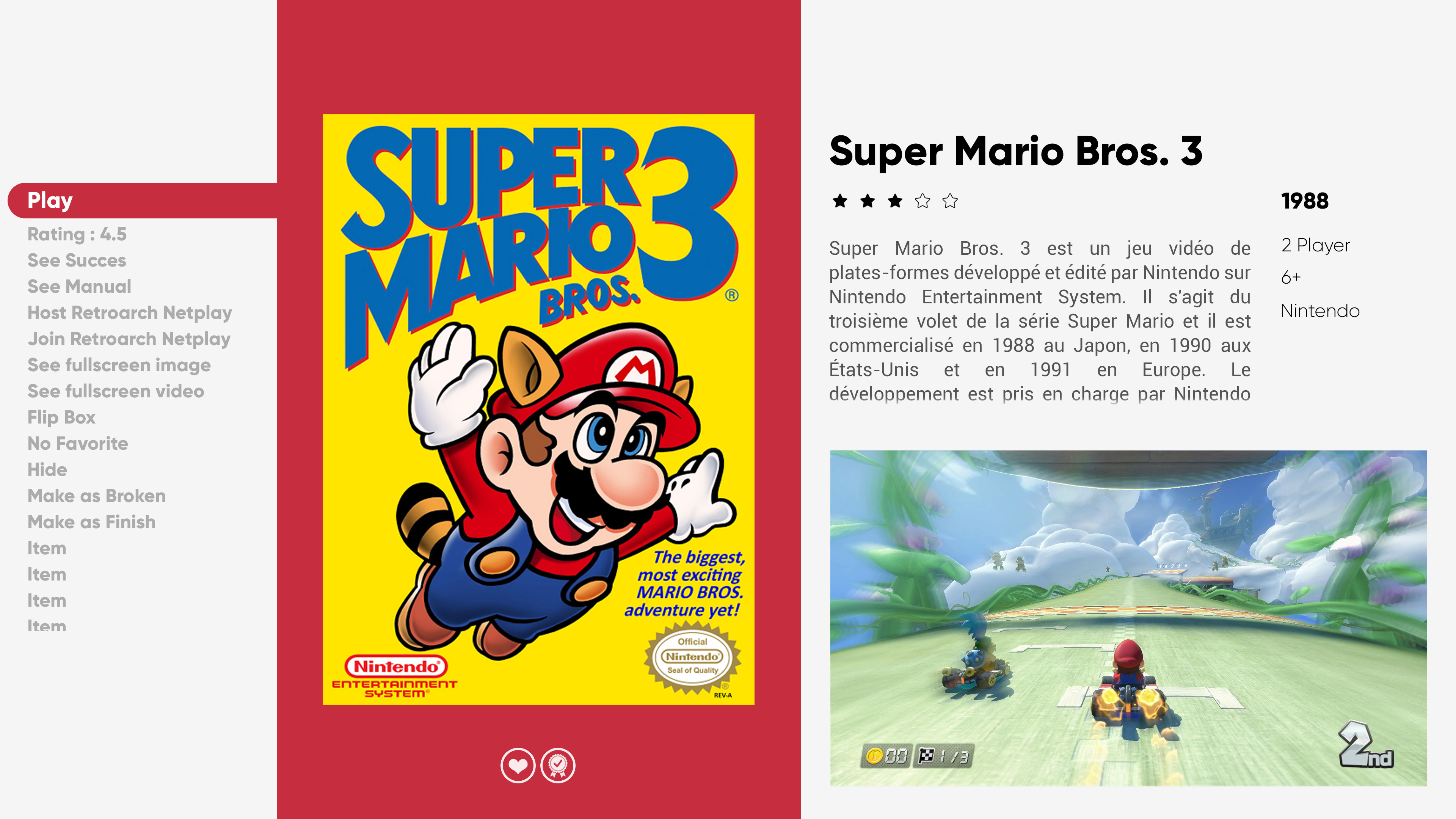
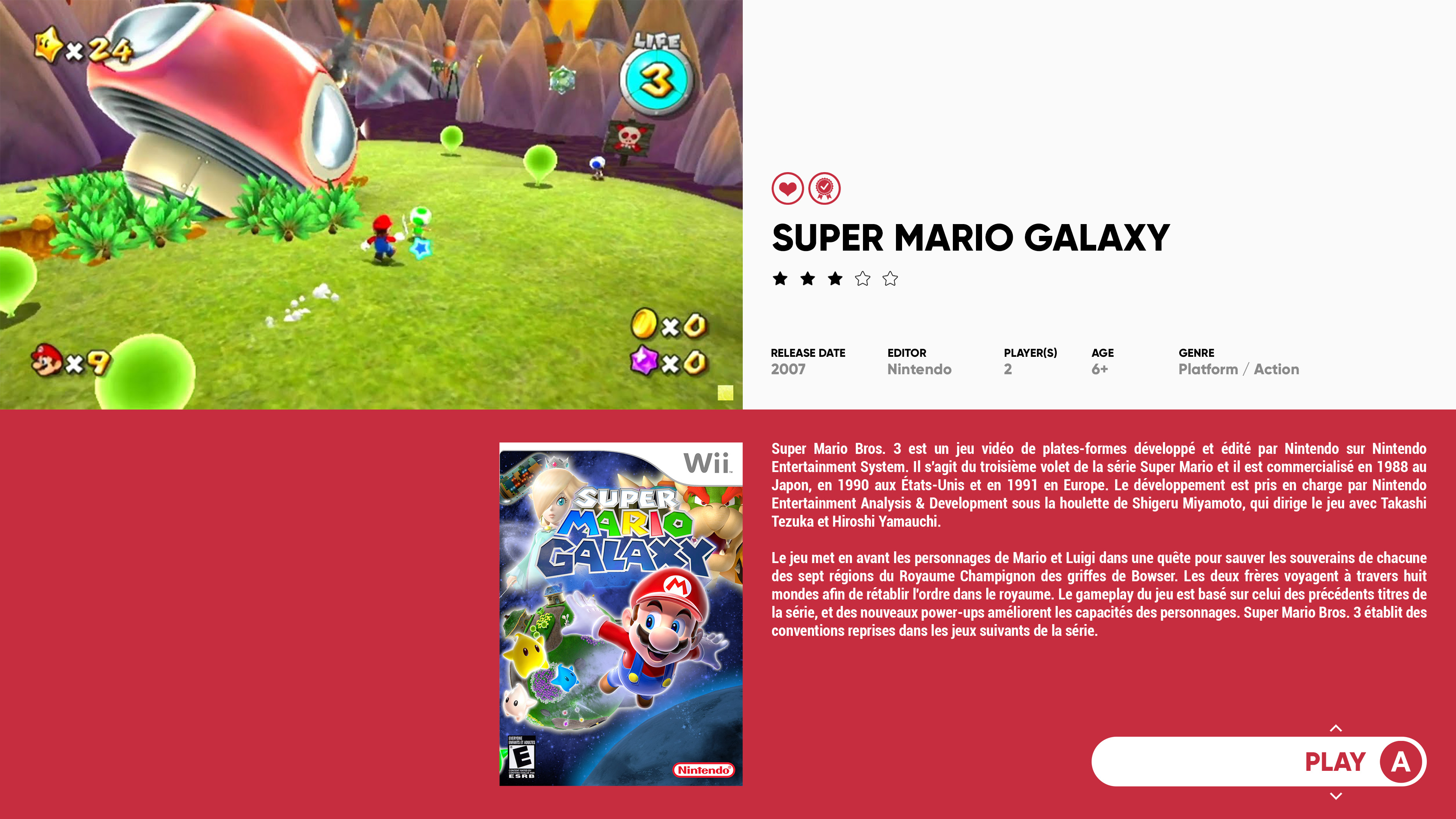
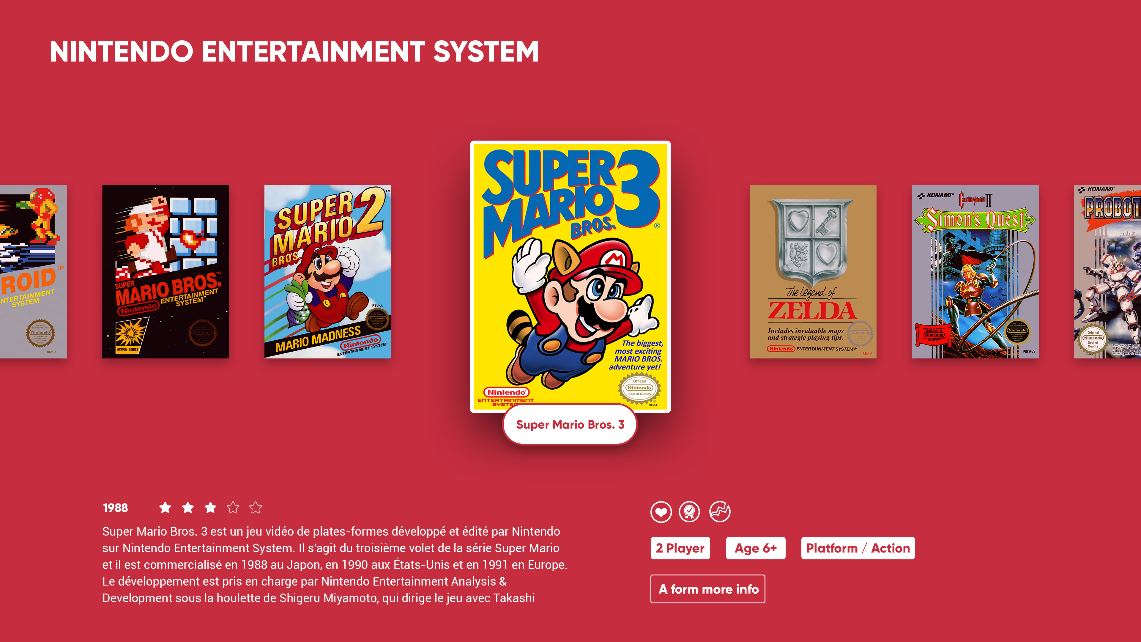
OK, now: Game Detail View.
As a reminder, I try to limit the information display on GamesSelectionViews. So in this case, GameDetailView is very important!
In BigBox, there can only be one. For me the most difficult view to design. Help me !
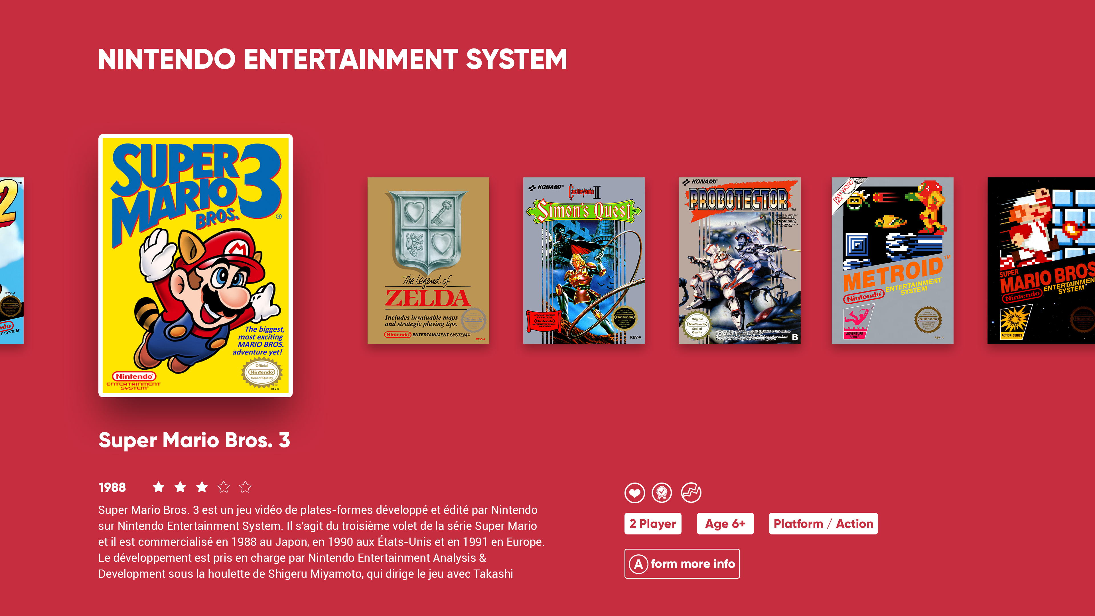
TextGamesView (v1)
Thank you for your advice! So I kept the concept and let it all breathe!
TextGamesView (v2)
OK, something different. I dont like at all ! Trach (?)
On the left, the big picture is the video. Below, the BoxArt and 2 Gameplay images.
In the background, a blurred FanArt or GamePlay.
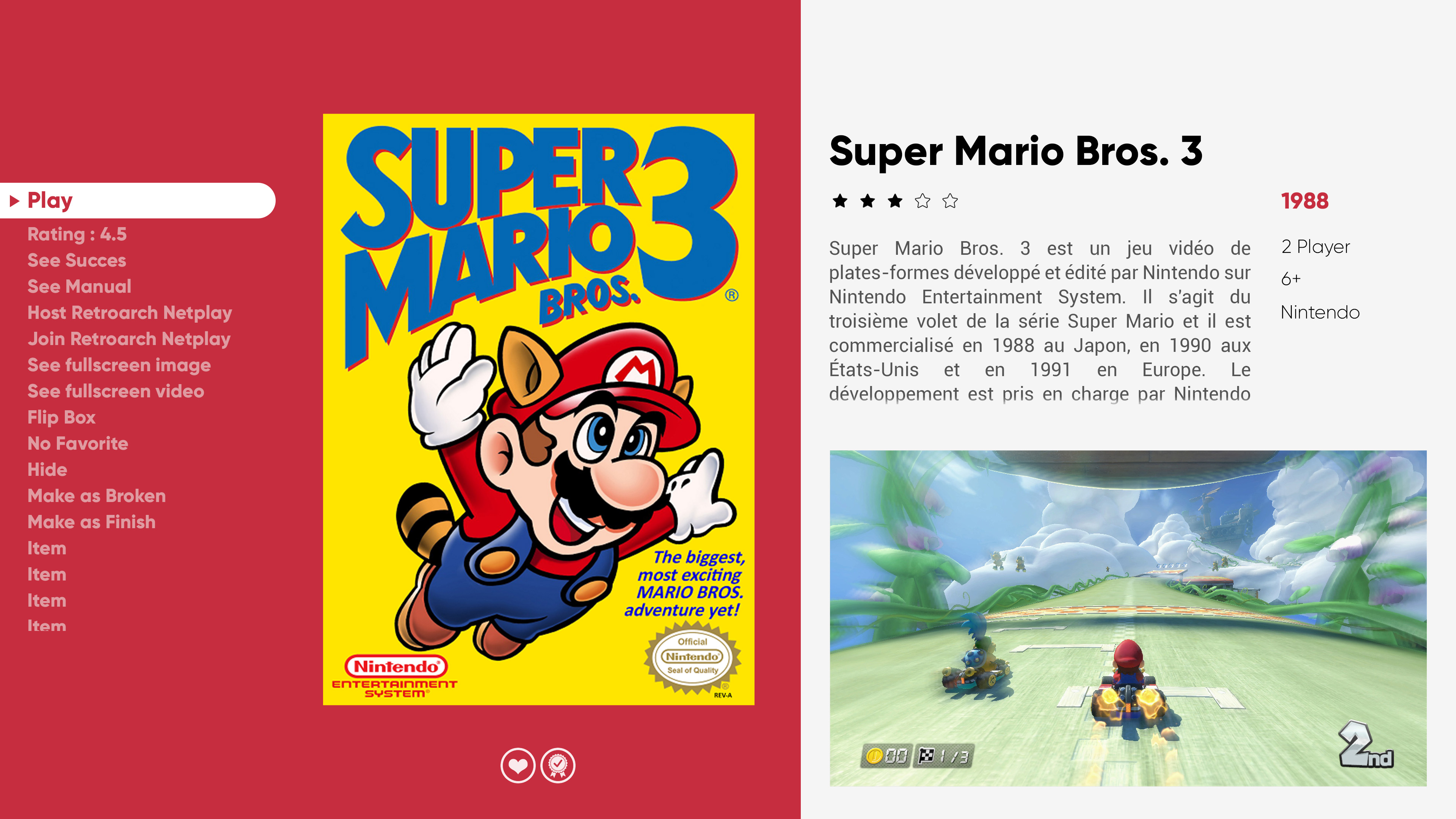
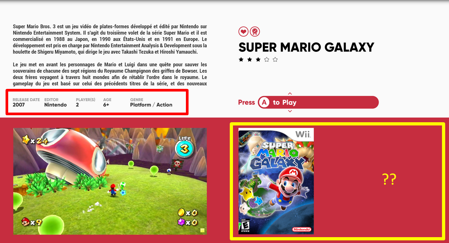
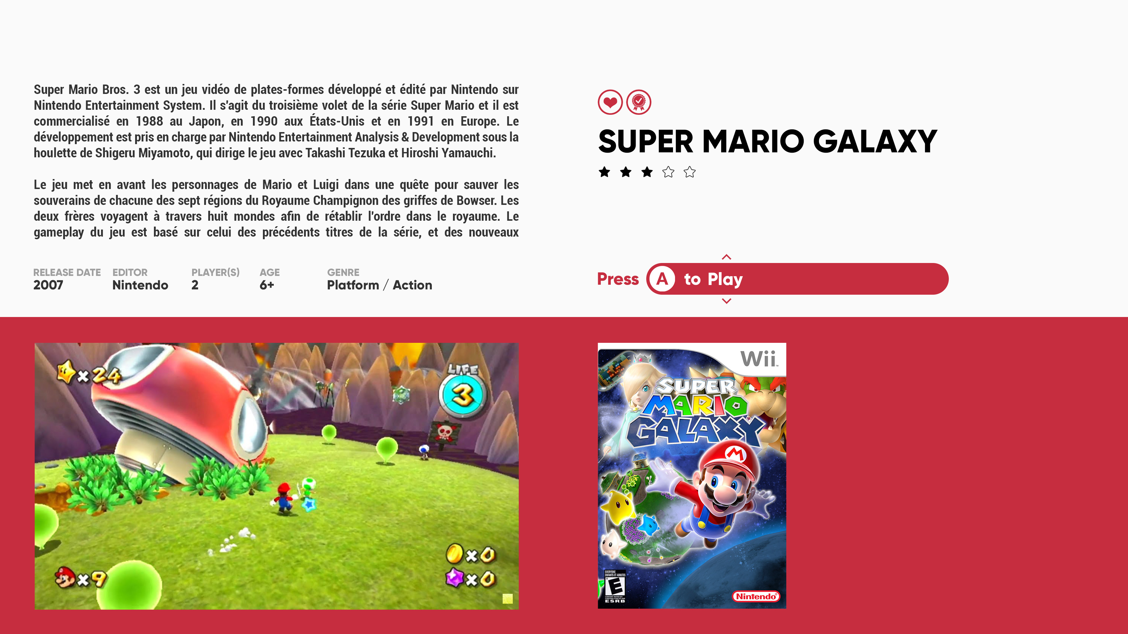
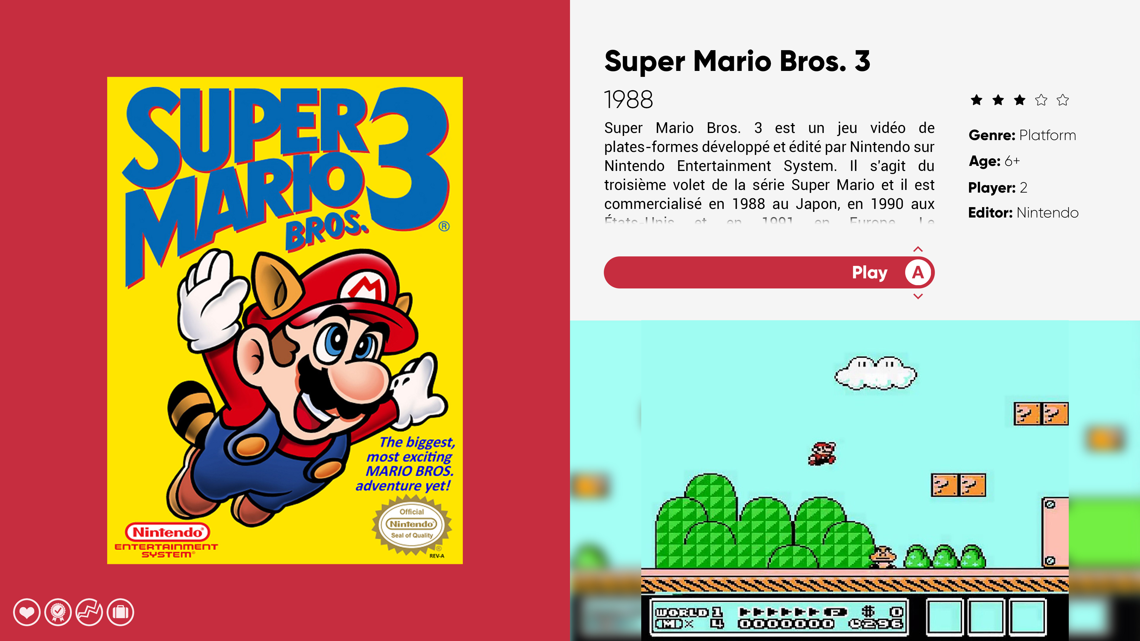
TextGamesView (v3)
I like this one !! The video area (bottom right) is in 16: 9 format. If the ratio is different, I use a blurred gameplay image for the background.
There is only this damn text list (Play, rating ...) that I don't know what to do with! Here, the idea would be to keep the button's graphic and scroll in front of the text. Technically, I'm not sure I can do it.
@Jason Carr @Grila do you know a trick to turn this list into a button?
And a test with large BoxArt and 16:9 gameplay video:
For the grids, I need to mature my designs. Next time !
Your turn !!!!! =)
-
2
-
 1
1
-
-
Wow! Thank you for your messages!
Many good comments!I prepare a new version as soon as possible
-
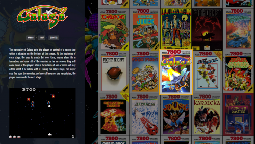
UPDATE !! +1 Platform video :
- Taito Type X2 -by- @OdinsPlayground Big THX to him !
Already available through all usual channels + updated ColorCode zip for the theme =)
-
2
-
Thx @Grila and @C-Beats for your help !! =)
OK, BIG design mockup update.
Give me your opinion ! It's precious to me =)PlatformWheel3FiltersView
The same as yesterday, but without the shadow on the right. I'm still not happy with this view ... Trash probably!
PlatformWheel4FiltersView
OK, something different here. The main image is NOT a video. But come from a BANNER set that I'm currently developing. We lose the gameplay video, but we gain the transparent background.
Bonus, this view should be lighter for older systems. What do you think ?
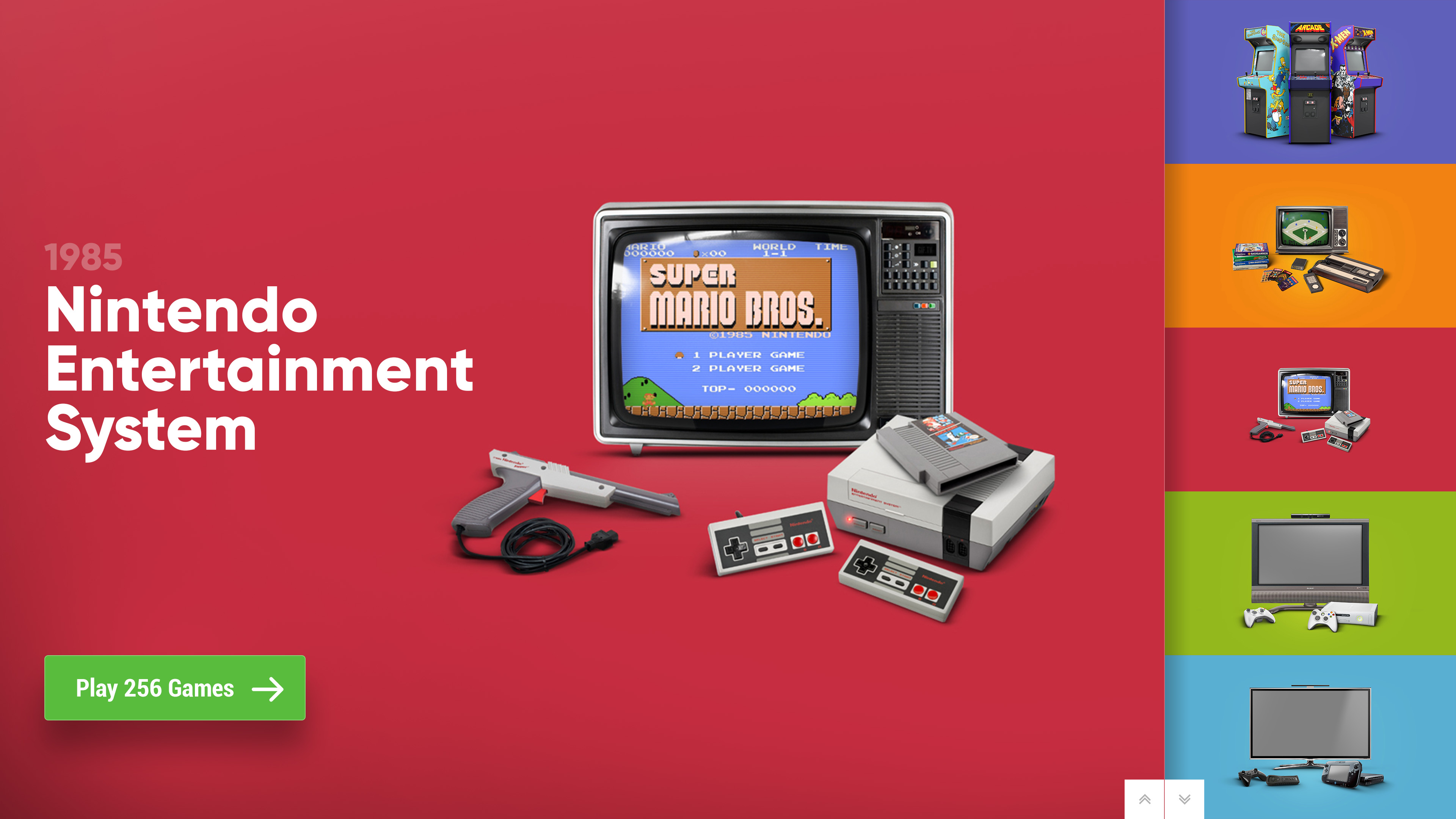
HorizontalWheel1GamesView
The same as yesterday, but softly corrected.
or with more wheel item. Less elegant for me. @zetec-s-joe
(I'm not sure it works well with wide formats - SNES style)
HorizontalWheel2GamesView
The same as yesterday, but with a white frame. To match the PlatfromView01. Not great right?
WallGamesView
And it's time for the grid! Hard to beat the POC theme by @faeran here. Without reinventing the wheel, here is my version.
(Here in light, to imagine in Dark)
Wall2GamesView
Same, but with a full Platform color un background.
Wall3GamesView
Still very inspired by the theme by @faeran, but Colorful way.
(Here in light, to imagine in Dark)
Wall4GamesView
Here too, the same, but with a color background depending on the platform. (my peronal favourite !)
TextGamesView
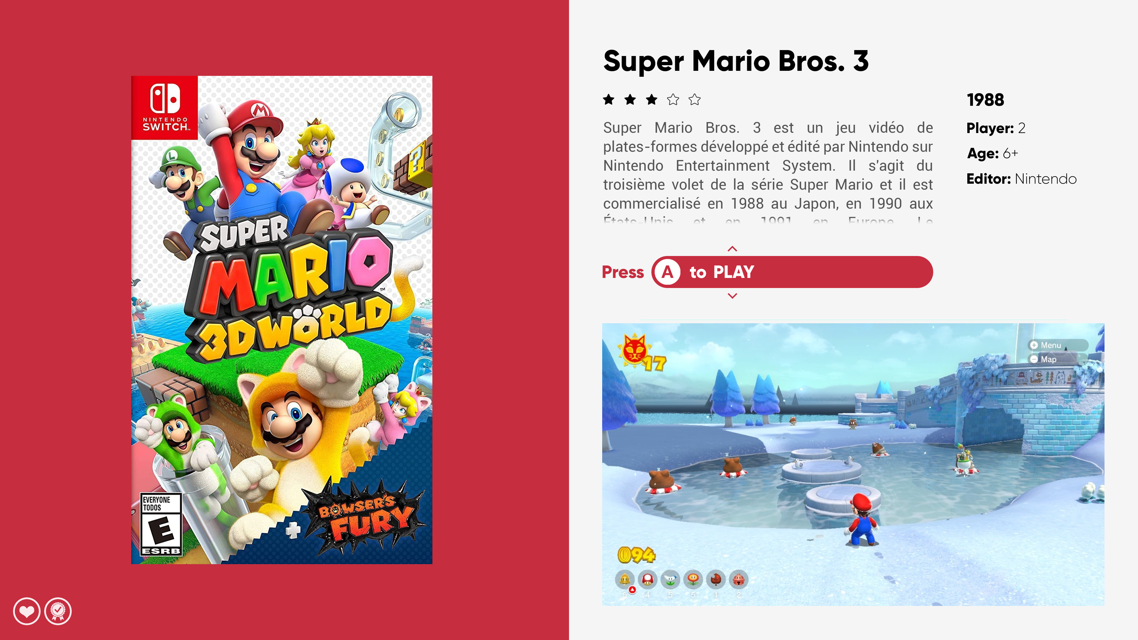
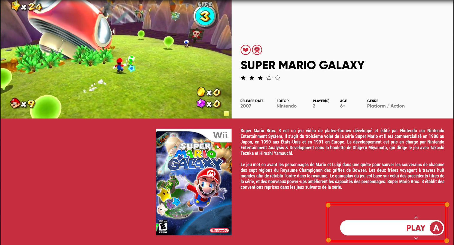
FINALLY I think I have something cool for the GameDetailView !! What do you think ?
And a test with a wide BoxArt + 16:9 video. To validate placement.
Technically, I will have to align the video to the left ... from memory, I never succeeded! =/ @Grila ??
Comments ? Ideas ? Suggestions? Preferences ?? =)
-
6
-
 1
1
-
-
16 hours ago, thimolor said:
I like how you use color. Looks fresh.
PlatformWheel3FiltersView Great concept. What if you removed the shadow from the right, that is over the platform wheel? Put a thin line there or nothing?
I like the HorizontalWheel2GamesView. Really clean, almost like game boxes on a table. The only thing that concerns me is the game title in a box. What happens when the game title is really long? Maybe put that title above the notes? Align the paltform title with the notes. I think this view could be a winner for those that like box art. For arcade games this won't work though.
TextGamesView This could be tweaked to be a good view. Full screen videos don't work nicely
Aspect ratios vary so much, There's going to be black borders almost always. You could use screenshot with uniform to fill. The box art is not always the same size, what happens when you put Snes box or Saturn in there, does it look balanced then?
For the title in a bubble, I was hoping to code a bubble that adapts to the length ... but no idea how to do it ^^
You're right about BoxArt for the Arcade. The best is to use the 3D Boxes for Arcade. But I don't know how to force them just for the arcade.
TextGamesView : You're right. This is the weakest view. I am lacking inspiration on this point. I will let it rest while waiting to find
14 hours ago, zetec-s-joe said:Maybe a wallview like the POC, maybe if you can have left panel clean and color matched like your system view? I can picture it but not describe it as well
Yes, I saw. I'm working on it
14 hours ago, zetec-s-joe said:
This is a nice view, is it possible to see a mock up like thiss but with instead of 3, use 5 or 7 cover, at the risk of it looking cluttered, it may look quite nice
I can give it a try, but I'm not convinced. We'll see that !
-
 1
1
-
-
Hi all !
A different post type today, because it's about concept here. @Jason Carr's last update gave me some ideas for new views.
I'm not happy with all of them, but here we go for discuss.The main idea is: what to do with that damn TextGamesList which is the same file as the AboutGameView.
In navigation, most of SelectGameView integrates ALL the information, then we go to the GameDetailView which gives us again same information.
It is unnecessary and it gives the impression of wasting time.
My bias would be to only use the SelectGameView for selection. And the TextGameView/Detail only for the details of the selected game.
The only negative point is that we lose the TextGamesList view ...Here are some loose concept mokup. (No guarantee that all will be developed)
PlatformWheel3FiltersView
Here with the (new)wheel always in place.
Not happy with this ... Not very inspired design! =/
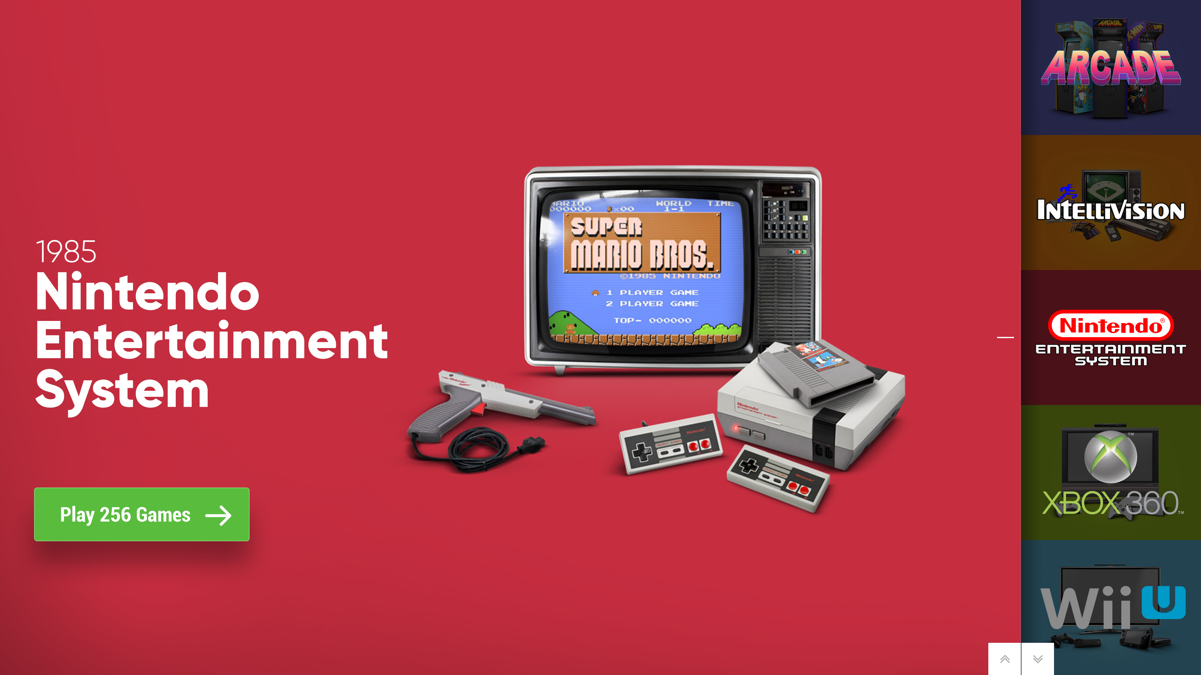
HorizontalWheel1GamesView
Not bad. Must test the rendering of the thumbnails in the wheel at this resolution!
HorizontalWheel2GamesView
I really like this one. What do you think ?
TextGamesView
And finally, after selecting the game, we come to a view like this. (video background)
Very frankly, I'm not happy with this version. Not easy to integrate the video in an aesthetic way!
Of course, a wall view will also come;)
Give me your feedback, it interests me !!!
-
5
-
1
-
-
For the image priority order (pause or gameplay) I believe it's setup in LaunchBox option.
-
Thx @sevenalive !
Startup and pause theme are planned, but not yet started. Sorry ...
Sound theme, it's going to be more difficult. I have no audio skills! At the moment I'm using XBOX ONE Sound Theme.About game details background image, I'm not sure I understand. Normally you have a gameplay video in the background. No ?
Can you take a screenshot ?The TextBox is small, because the platform/game name used a huge font and expands upward. So I need this space for the long name. (+ space for custom icons)
YES, there are plans for the coverflow and especially the grid views. The last @Jason Carr update excites me and I can't wait to develop these views !! =)
The POC by @faeran is awsommmmme ! This is (almost) exactly what I had in mind! ^^I also hesitate on one point and I ask you all the question:
I have a design "problem" with the GameListView which is also the GameDetailView. Same code file.
If no one is actually using the GameListView, I can designate it as a GameDetailView only. Not having to do both opens up possibilities!
Tell me =)-
3
-
-
UPDATE !!!
+ 3 platform video _by_ @OdinsPlayground !!
Already available on the usual network!
And the "color" file has been updated too. (Theme download page)- FM Town Marty
- Mattel Intellivision
- Sony PocketStation
-
1
-
NIIIIIIIIIICE !!!! All 3 videos ! =D Perfect !!!
You can send me all sources and video by private message.
I'll post, with credit, in right place for everyboby.THX !!!!
-
1
-
-
-
1
-


byOdinsPlayground.jpg.83d57cd3c473c7c22f7079791946392a.jpg)
byOdinsPlayground.jpg.19bfc0605d89eff885a607bd42b6c612.jpg)
byOdinsPlayground.jpg.7fec601bfff0b641846cc1acf4e11f5c.jpg)
byCMOSS.jpg.b3a66b023144b8e4300368b632223426.jpg.cb8e8d3ad4d25ce35d25745e513d282f.jpg)
XAML Tips and Tricks
in Big Box Custom Themes
Posted · Edited by viking
Hi guys !
Back again with my theme crafts!
Today I am blocking on HorizontalListBoxStyle. (in games view, the alphabetical fast access strip)
This is what I want to achieve :

I managed to do everything, but I get stuck on the opacity effect to highlight the selected item.
Basically:
It seems simple to me, but I can't do anything!
Ideas ? @Jason Carr @Grila @eatkinola
Here is my my piece of code :