-
Posts
34 -
Joined
-
Last visited
Duimon's Achievements

8-Bit Processor (3/7)
45
Reputation
-
Just wanted to answer this for anyone having issues with MAME and software lists. The Retroarch/config/mame/mame.opt file can be named the same as your rom folder. i.e. "advision" , "cdimono" , "electron" , "bbcb" etc. and you can manually edit it to enable or disable automatic software list support, cli boot, mouse support, read/write ini etc.
-
OCD can be a curse or a blessing. I was not happy with the settings screen. The image from the Kodi skin had all sorts of issues. (Specifically the perforated Metal.) It was off center, had horrible banding, the clear space in the middle was asymmetrical, and there were many image conversion artifacts. 😞 So I spent a large part of the day recreating the perforated metal from scratch in Illustrator. While I was at it I also recreated the Aeon MQ 8 logo. (The LB logo was already vector.) Any banding or artifacts in the screenshot are from JPG conversion for posting to the forum. Oh... and "Experience" was spelled wrong. (My Mistake. 😉)
-
I am indeed that same Duimon. Thank you for your enthusiasm!
-
BTW. The backgrounds are 4K and the other elements (Besides the metadata images and video.) are created in Adobe Illustrator and exported at a large scale, so they can be reused in other views.
-
Before I put this on the shelf I made some adjustments to improve text readability. I also customized the settings view logo and created a startup splash screen. (PNG renamed to MP4.) The splash screen stutters a bit near the end of the loading. (If someone has another way to customize I would love to know.) It works great with the Kodi launcher addon. (Since the launcher turns the background black before launching.)
-
Duimon changed their profile photo
-
I am starting an Aeon MQ 8 "Cold" theme using the Theme Creator. Here is what I have so far. Horizontal Platform Wheel View... Horizontal Games Wheel View... The top-right image box is a video. The 3DBox assets are my own templates. System Settings View... I have the blessing of the skin creator for my project so I am using as many of the skin assets as I can manage. Some of the features I need to do it right are forthcoming, so I am waiting until the 2.5 release to continue my work.
-
Just letting everybody know that I'm still here and will get back to these ASAP.
-
Here's a WIP.? I plan on having some default decorations, to make creating labels easier. They can be hidden in the source at the users discretion. They will also have a lightness adjustment layer to accommodate different colored backgrounds. (That pesky additive color thing again.?)
-
There is an awful lot going on over at Libretro right now, the new version of RA was released this weekend and because of this, the long awaited release of the new HSM shader happens on Sunday. I have a lot of shader preset work to do to be ready for the release. I will try to squeeze in those two requests in the middle somewhere.?
-
The Game Boy Color is in the repo.
-
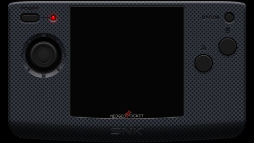
Always taking requests!? I'll move them to the top of the list. Really it just makes them happen sooner than later... since I plan on doing every cart ever made. I am dividing my time between this and my HSM shader graphics project, I am currently working on the Neo Geo handhelds. Here is a WIP of the Neo Geo Pocket. I am near finished and the Color will soon follow, since they are almost identical.
-
Thanks. I'm really pleased with the result, especially since I had no clue how I was going to pull this one off. ?Thanks again for the challenge, it's the best way to learn. I did some testing with the back layer HSV and fake transparency, I didn't behave exactly like I'd hoped, so I moved some things around and changed the back HSV layer blending mode to multiply. Here's an example with a green background. It takes a little playing around with the "Lightness" slider to turn the white background into something that shows when in multiply mode, along with the Hue and Saturation. I will include a readme with some details. Of course this will only work well with a plain color background. Most of the time I think the front layer adjustments will be enough. I'll leave that decision to the user.? I'll get this up in the repo tomorrow.
-
Here is a shot of the final graphic on a 50% gray background. I had to make a couple changes due to the weird way Illustrator exports multiply and screen blending modes over transparency.☹️
-
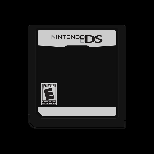
OK. I think this is as good as it's going to get. This was pretty crazy. I originally planned on the graphic actually being transparent. While possible in theory, in practice it won't work. The reason will be obvious to you artists out there... additive color. In the real world what we see is subtractive color, white is the absence of color and black is all colors combined. On a backlit screen it is the opposite, white is all colors combined. Having a transparent appearing graphic that was actually transparent makes the object appear to be backlit, which does not look real. Especially when compositing. The difference in color are always a consideration in my projects. For example, if you lay a black sheet of paper on a table and then a slightly more gray one on top of it, they appear pretty much the same. On the computer screen, when you place a 5% gray object on top of a 100% black background, the gray object looks almost white.☹️ Any way, aside from this creating a habit of my wanting, in general, to work above the 20% gray-scale level... here is the most recent WIP. It looks pretty good. I had to compare way too many shots of carts to come up with a clear picture of what this thing actually looks like. (It's hard to take a good photo of a transparent object.) To help everyone combat the side effects of additive color, and to give you more freedom, I have exported this as several layers and combined them in my template. We have front, PCB, and back layers. The front and back each have HSV adjustment layers, and the front has an additional Levels adjustment layer. They are all at defaults so initially have no effect. The front Levels adjustment will allow you to change the value offset of the cart so it looks more natural on various backgrounds, the HSV will let you change the color of the cart. The back HSV will let you fake transparency by adjusting the color to mimic various solid color backgrounds. Here is a sample of what this looks like used as source in my SGB PAL template... ...and here is a shot from the US SGB. Here I used the front Levels adjustment to lighten up the cart and an exaggerated HSV on the back to show some purple, just to illustrate the potential. As you can see, the default color of the cart looks pretty dark when used against a light background. It looks best on a 50% gray background, and acceptable on a black, I had to make a choice. The adjustment layers add a lot of freedom. I can already see at least one problem caused by Illustrator's weird multiply export bug. It should be easy to fix. This is easily one of the more difficult projects I have done. (Also one of the most fun.)
-
Thank you, and not to worry, the shell in this quick and dirty bears little resemblance to what the finished graphic will look like. I also have in mind to do some testing on exactly how Illustrator uses external PSDs as texture templates. I may be able to use some VERY custom textures depending on the results of my tests. I may even learn a thing or two along the way.


