

Jonny Severn
-
Posts
1,574 -
Joined
-
Last visited
-
Days Won
46
Content Type
Profiles
Forums
Articles
Downloads
Gallery
Blogs
Posts posted by Jonny Severn
-
-
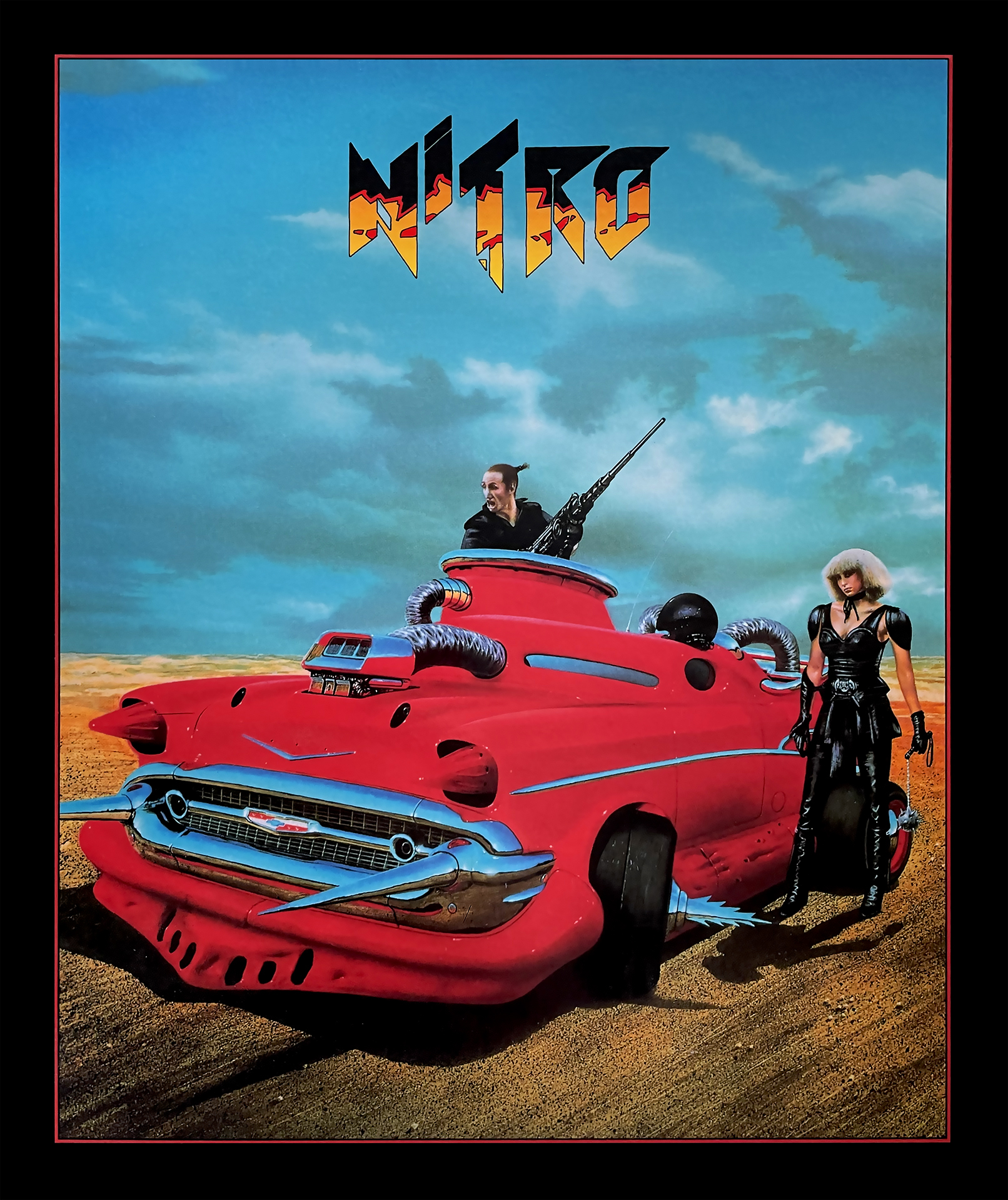
Just uploaded a new super high res scan for Nitro - Atari ST and Amiga.

-
 3
3
-
-
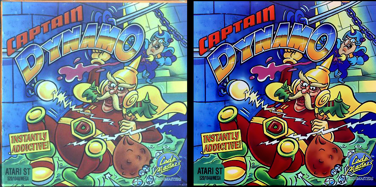
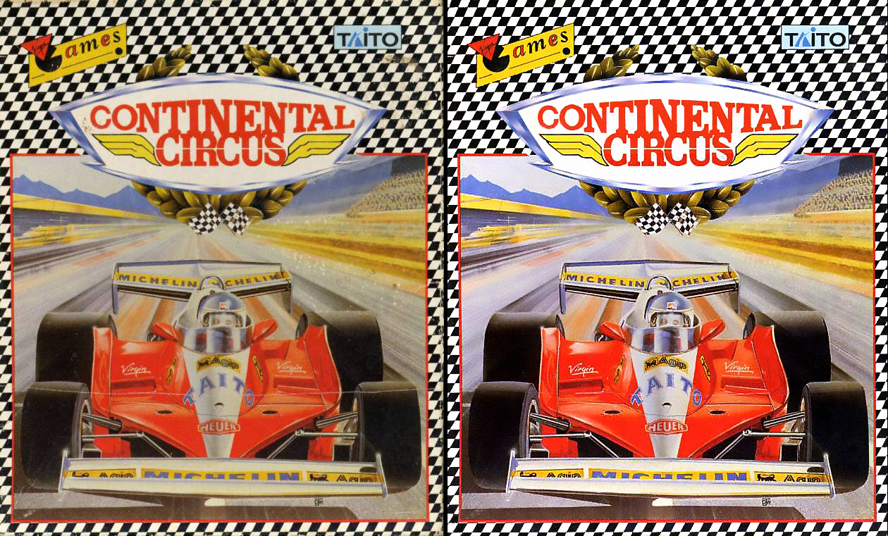
So this was an interesting one I worked on yesterday.
Typically old scanned media tends to have one or all of these traits.
The box has faded over time resulting in a loss of contrast.
The material has yellowed slightly, this is usually most noticeable in the light colours and white areas.
Too much blue in the dark areas black areas. I suspect this is a result of the printing and then scanning process. It's literally a case of the process colouring the content.
However, I'm not sure what had happened to this one ?
And failing that I managed to find a better scan!
-
4
-
 1
1
-
-
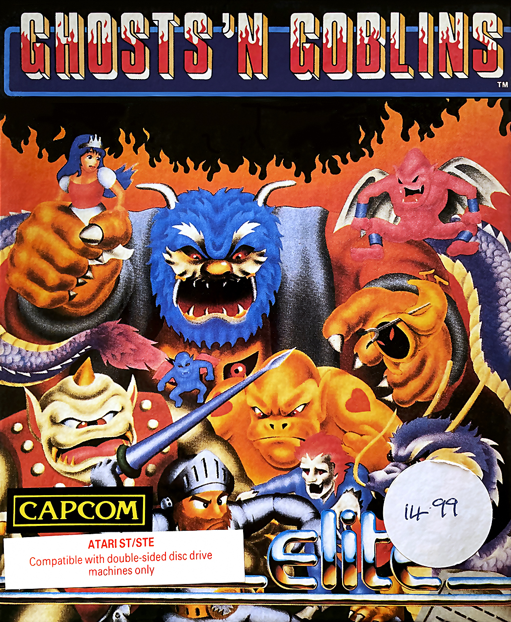
Atari ST
-
I’m currently looking at the Amiga and ST box art. The spectrum will come next ? that said, I’ve sorted most of the spectrum logos
-
Mercs box clean-up work from this morning. The original box looks like it has taken a beating
-
5
-
-
Everything gets uploaded as I do them. I've submitted about 3600 changes so far. I should be getting shares in Lunchbox for all this work
The truth is, this has been a good distraction throughout the 5-6 months lockdown here in the UK.
-
6
-
1
-
 1
1
-
-
Another Logo
-
3
-
-
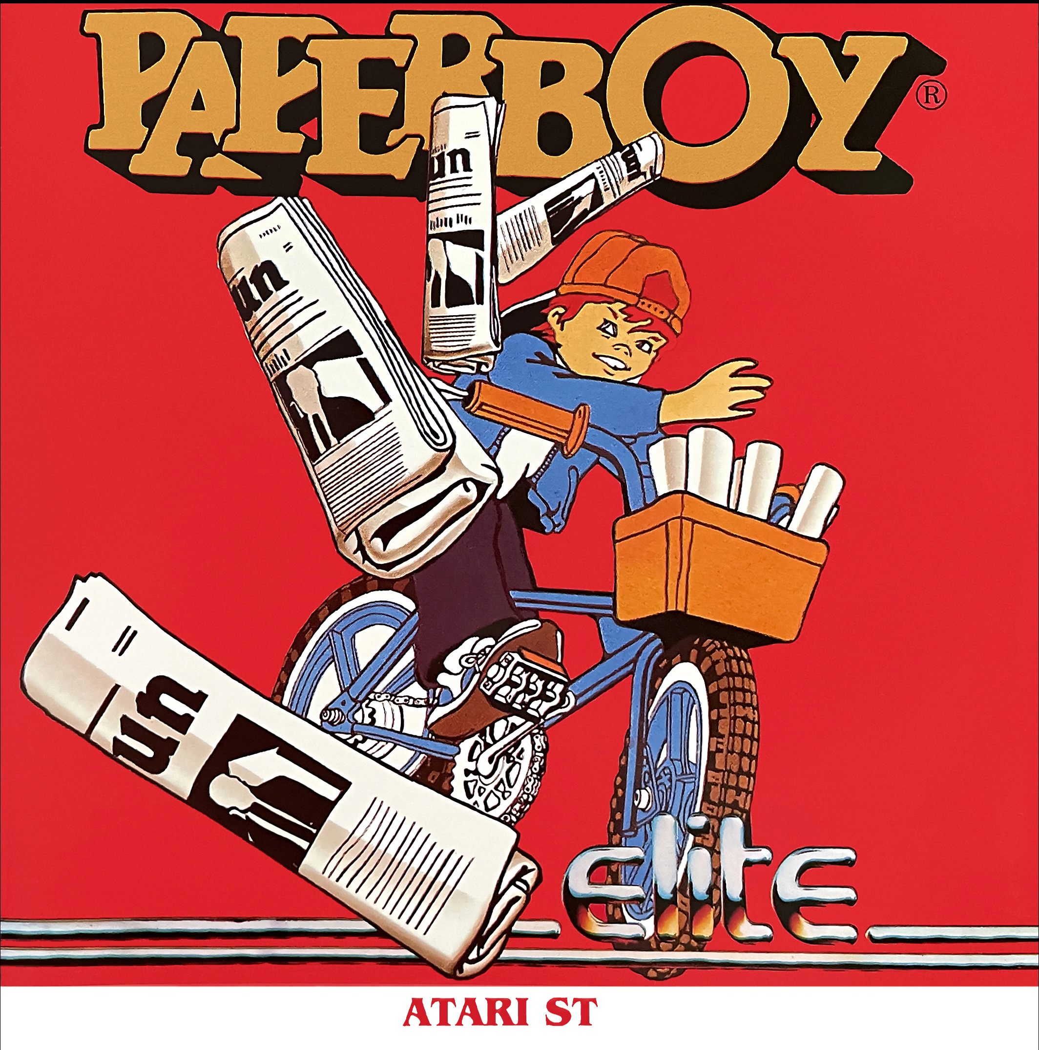
Another super high resolution front cover image for Elite’s Paperboy.
-
4
-
-
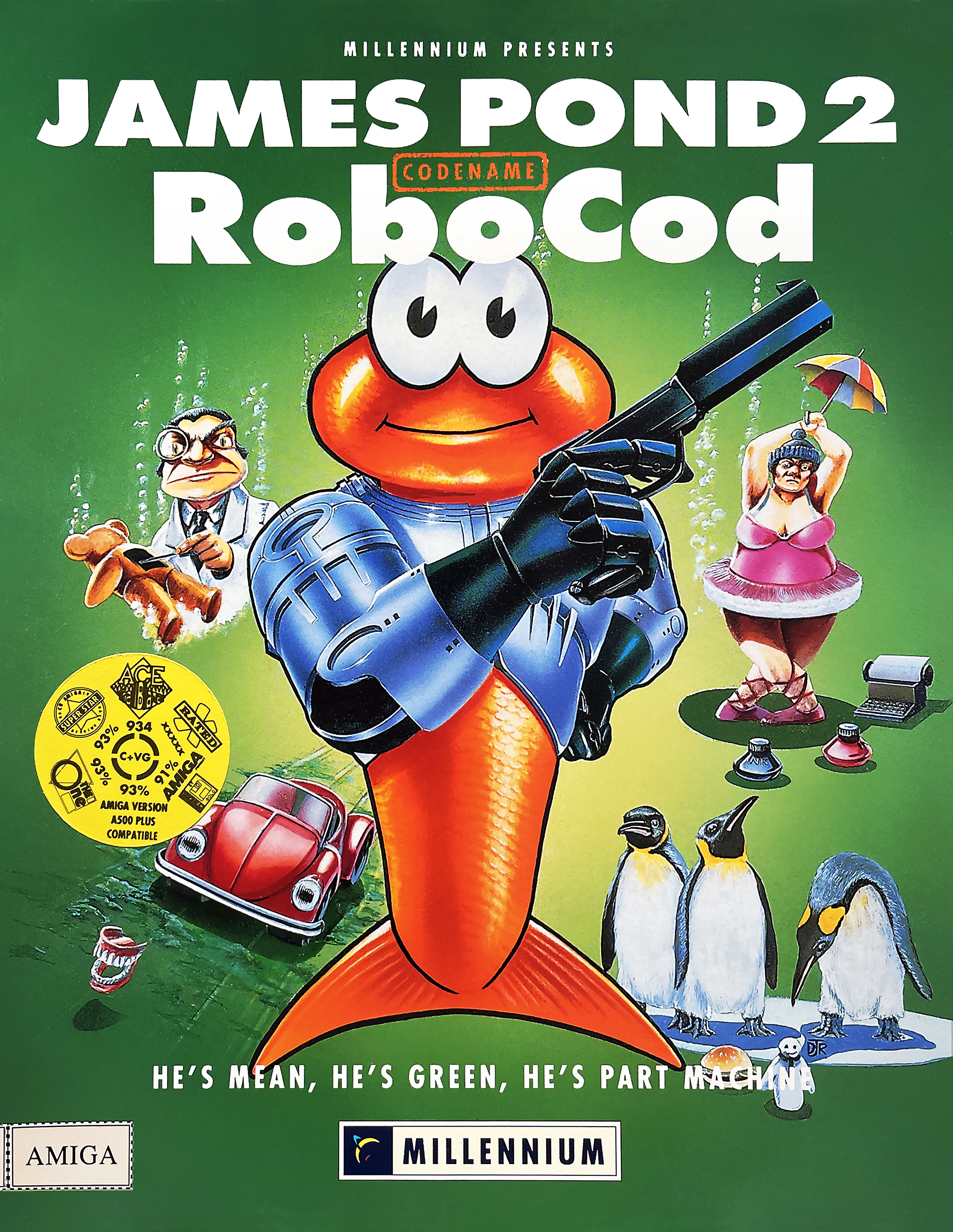
Some of today's clean up work
-
3
-
-
-
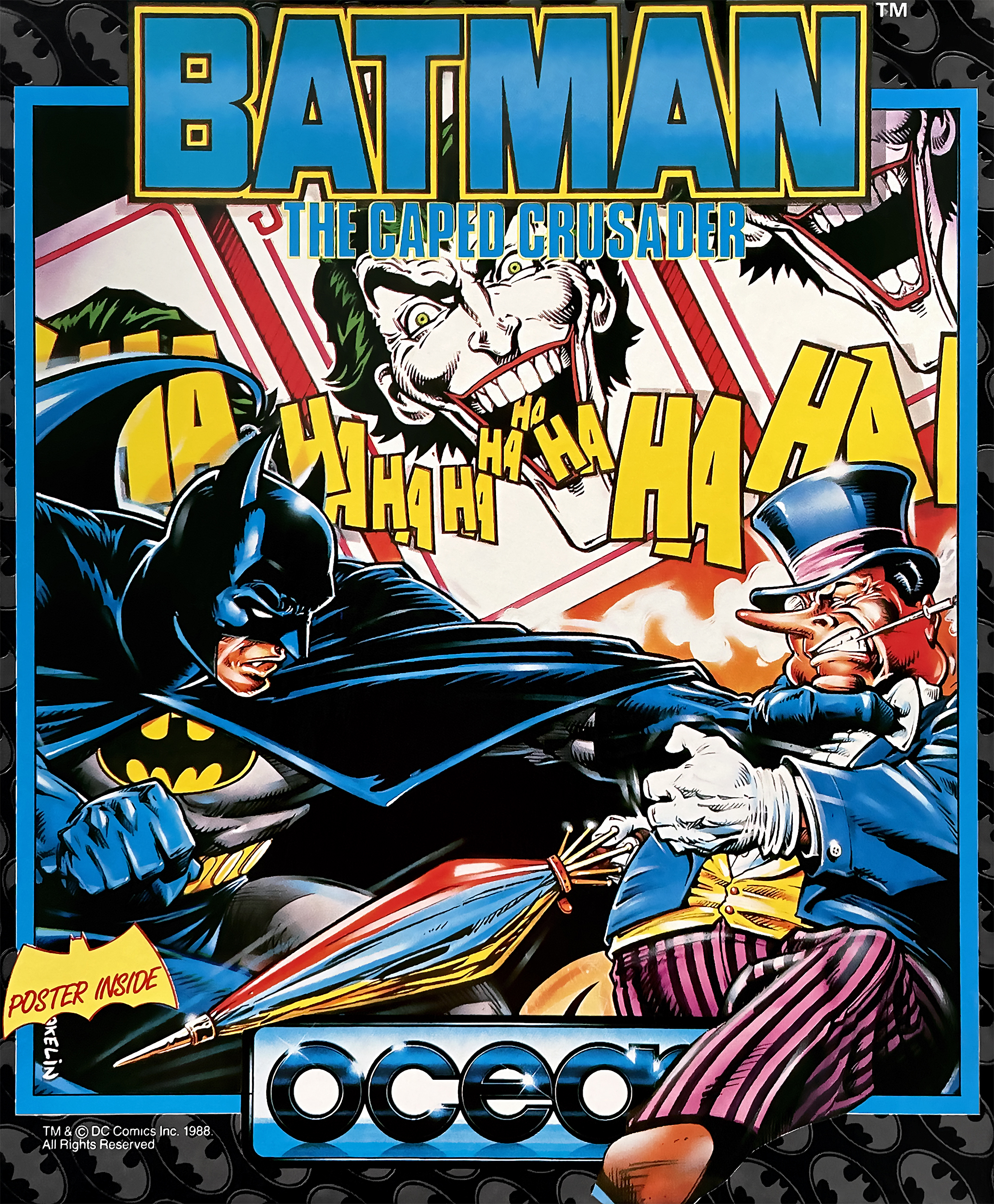
A new update: I do love Bob Wakelin's Ocean covers
-
5
-
-
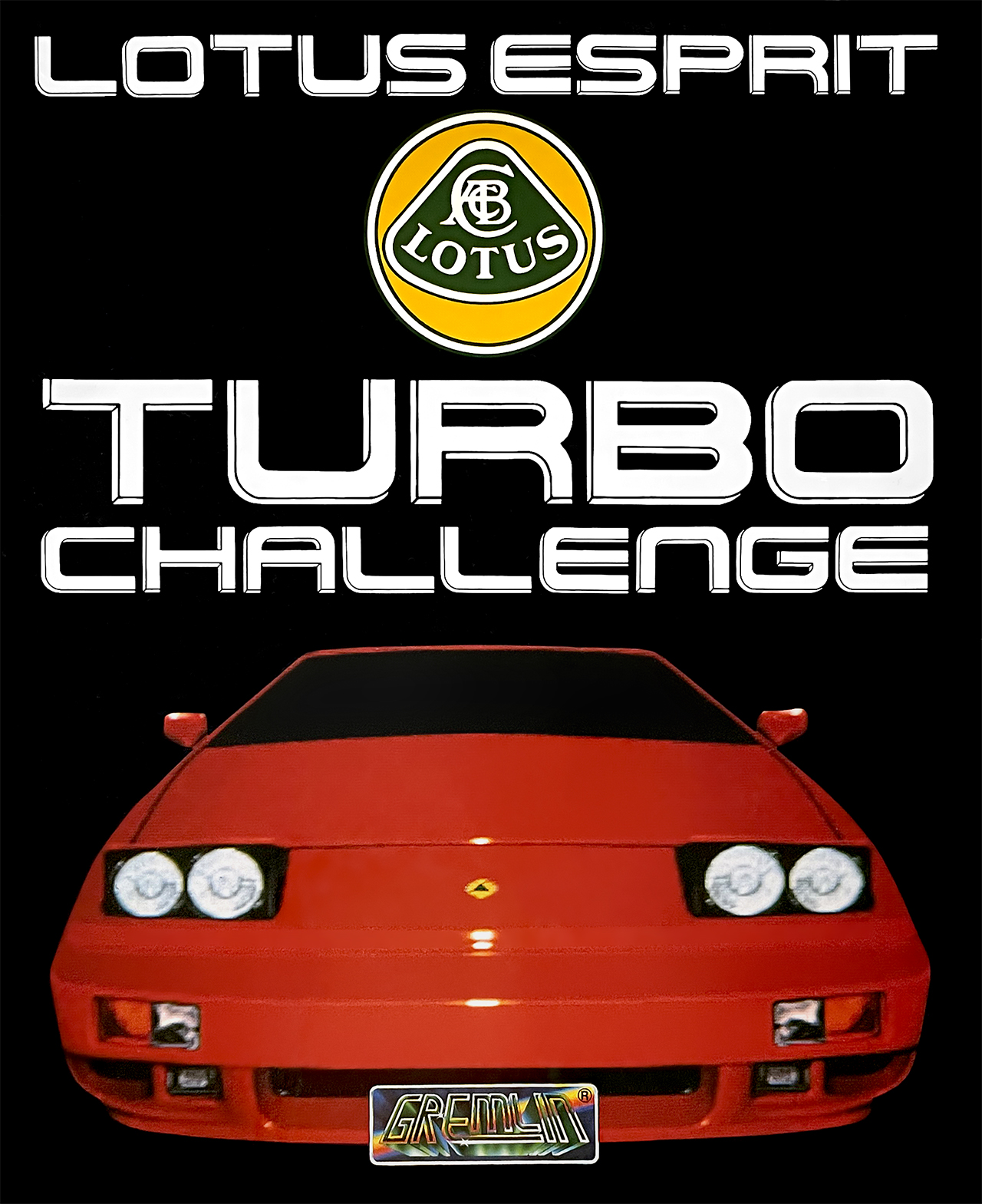
I've gone a bit mad / self-indulgence on this one. But it's a good game that deserves a decent box art image.
-
4
-
-
A few recent clean up /restoration jobs
-
2
-
1
-
 2
2
-
 1
1
-
-
Thanks dude
-
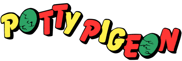
Here are some more examples of my logo clean up work:
-
6
-
1
-
1
-
-
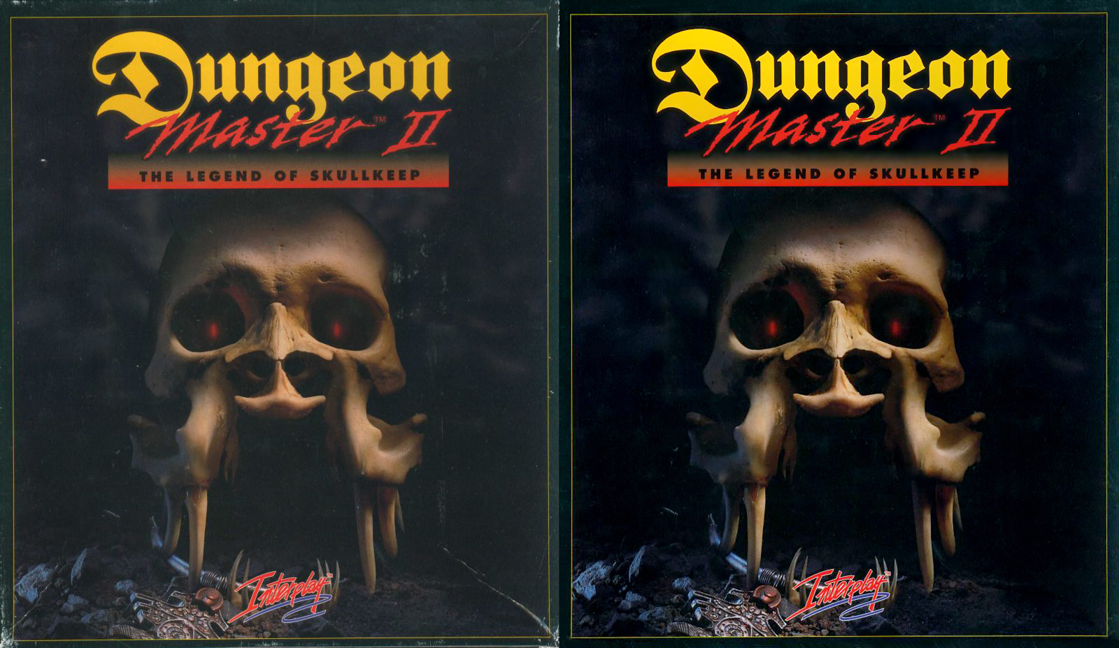
This one is a good example, I had to overlay multiple scans to get clarity across the whole box.
-
7
-
1
-
-
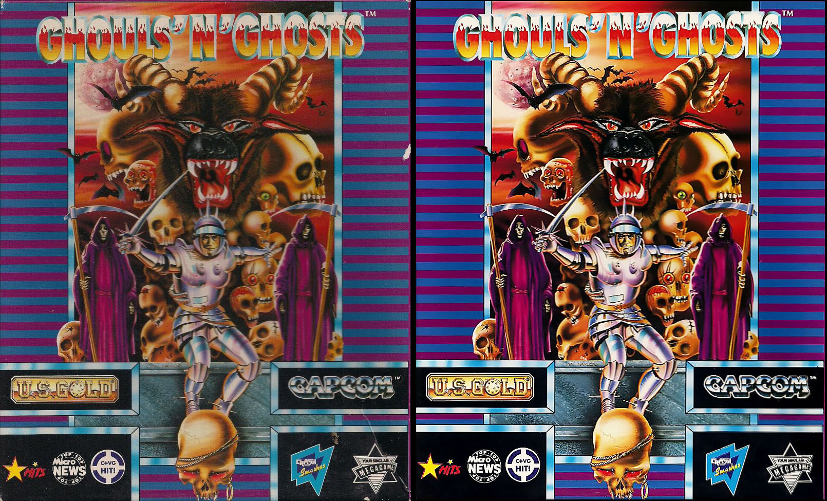
Here are a few examples of some before and after clean up work.
-
3
-
1
-
-
I'm currently working my way through the Amiga game covers, obsessively cleaning them up and scanning in new artwork (if required and if I have the original).
The plan is to then move onto the Atari ST covers then finally the ZX Spectrum covers.
I suspect the ZX Spectrum covers are going to be the biggest challenge. But it's keeping me quite until the pubs open here properly next month!
-
2
-
1
-
-
Prior to the second lockdown here in the UK, I finally got around to setting up my new MAME collection of games in Lunchbox. To my delight, boom! - the vast majority of the automatically downloaded logos were super clean and looked perfect! High-fives all around.
In the back of my mind, I had the idea of adding my favorite ZX Spectrum, Amiga, and Atari ST games to Launchbox. And when I was forcibly imprisoned in my home for the second time, I had no reason not to do it. I managed to get over the technical hurdle of getting these older emulators up and running and integrated into Launchbox. However, I noticed that some of the logos were missing or of low quality. This is hardly a surprise as many of these systems are pretty niche and old. Being an art director in tv, film, games for the last 20 odds years, these problems triggered my artistic OCD. Luckily, I have physical copies of many of the games, so I began scanning in logos and cleaning them up (Artworking them). And so began my unstoppable artistic OCD project, before I knew it, I had moved into the other consoles such as Playstation, PSP, and Gamecube. Disc’s not cutout properly, centered, and not spinning correctly on the entry into games I found particularly upsetting. So I had to fix those
")
Here is a rough breakdown of what I’ve done per platform. When I get time, I’ll share some of the disc templates if that’s useful to people.
ZX Spectrum. I did quite a fair bit of work on the logos here, scanning in original artwork and digitally cleaning them up, so they look decent. I also fixed some of the spacing issues around the logos, with the aim is to make them appear vaguely consistent. You basically want the volume / visual mass of each logo to be roughly consistent in the default view within Launchbox. This can be tricky because they come in all shapes in sizes. Good examples of my work: Robocop 1-3, R-Type, Overlander, JetSet Willy.
Atari ST and Amiga. These logos were in better shape, probably because the machines are newer and more popular with users. Common problems include low resolution, blurriness, and alpha problems in the cutout. Many logos have been cut out from a light or colourful background and many have these colors within the Anti-aliased edges.
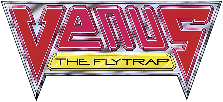
Initially, I would search online for a decent version of a logo but would often resort to scanning them in. Venus Flytrap, X-Out, Lotus games are good examples of my work. Many logos were originally creative to work over light backgrounds. In these cases, I have created and uploaded a version that works well over dark backgrounds.
SNES and MegaDrive (Genesis). Predictably these were in good shape But I did tweak a few things here and there.
PS1, PS2, Gamecube. I had to do a bit of logo work here, but I spent most of my time centered and cleaning up disc artwork. I do have a few of these original games, which I utilized to produce the disc artwork for titles such as Wipeout and the Destruction Derby. But if you search online, you usually find a high-resolution scan/photo of the official box art or disc. I couldn’t fix all the discs for each region. That would take a lifetime. But I tried to make sure at least one disc for each game would look decent and spin properly. My general preference has been towards the PAL/European regions as I’m based in the UK. I worked up about 75 Gamecube, 165 PS1, And 265 or so PS2 discs. Predicable the PS1 logos and disc artwork involved the most amount of work due to artwork availability and generally inconsistently in the way the original discs were printed.
Game Boy and Game Boy Advance. The Game Boy media seems to be in good shape, but the GBA has more inconsistency with its logos both in terms of quality and spacing. I worked through about 400 odd GBA logos.
I’m probably going to do another pass on the ZX Spectrum, Amiga, and Atari ST logos as I’m not sure I uploaded all of my changes.
Anyway, now the lockdown here in the UK is coming to an end I’ll calm things down for while But I thought I would share the obsessive work I have been doing
-
12
-
3
-
1
-


Game Box-art, Logos, Discs and Packs
in Game Media
Posted
A nice clean up job from this weekend