

Modo
-
Posts
1 -
Joined
-
Last visited
Content Type
Profiles
Forums
Articles
Downloads
Gallery
Blogs
Everything posted by Modo
-
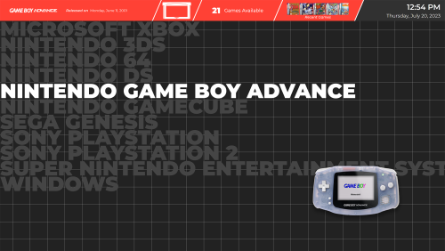 Loving this so far, but a couple of things that immediately caught my eye: The LaunchBox main menu font is tiny. The muted colors on unselected items is what I love the most about the theme, but I'd argue you could take it even further -- make them full grayscale. It would make the selected platform/game stand out a more. The small spaces between platform banners look weird with the grid pixels showing through. A solid color background would look better IMO.
