Jump to content
LaunchBox Community Forums

Sleipnir 1.5.5

   (0 reviews)

6 Screenshots

About This File

About:

This theme is inspired by Pegasus Frontend's default theme. I personally really love the look of Pegasus, but vastly prefer the functionality of Big Box, so this is me doing my best to combine both worlds. Excluding those credited below, all other custom assets were created by me. As a note: This theme was designed in 4K for use on a large television. Scaling issues present in previous versions have been fixed, to my knowledge.  This WIP upload is intended to get fresh eyes on the project and help to identify issues I may not be running into with my limited usage, as well as provide a better version of this theme than was currently available during a period of time where I don't have as much free time as I have previously.


Credits:

Genre Icons: Game Icons

Platform Clear Logos: v2 Platform Logos Professionally Redrawn + Official Versions, New BigBox Defaults 2.1.0

Platform Banners (Present only in legacy versions): BannerBox 2.1

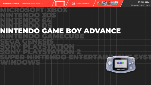
Platform Media: System Media - Stencil Platform Images 1.0.

Platform Images: COLORFUL Hardware PNG media (1x1) 1.1

Finally, many thanks to @y2guru for the Community Theme Creator. While this version no longer uses the CTC, I would have never started on this journey, nor gotten nearly as far, without it.

Edited by blattacker
New details


What's New in Version 1.5.5   See changelog

Released

Minor Updates to 1.5.5

  • Added additional wall view for Sony PlayStation 3 (Should work for all Blu-Ray sized systems)

Minor Updates to 1.5.4

  • Added additional platform-specific views (Theme now has the same Wall Views as Default Theme)

Minor Updates to 1.5.3

  • Fixed text scaling for "Available Games" section in Platform Filters View
  • Changed all file references to relative paths
     

New in version 1.5 (Progress update on version 2.0):

  • Converted from CTC theme to custom code for increased responsiveness
  • Converted text platforms view from image-based to proper text based view
  • Converted top bar sections into shapes to facilitate proper scaling
  • Updated Text Games View to match more thematically with the other views

To Do List:

  • Restore "endless scrolling" functionality to Text Filters View (In-Progress)
  • Recreate Platform Wheel View
  • Recreate System View
  • Retool Text Games View to match original theme
  • Add fallback images/icons where necessary
  • Create platform-specific Wall Games Views for remaining systems (Done to currently planned extent)
  • Like 8
  • Thanks 1

User Feedback

Recommended Comments

2 hours ago, Goga said:


my archiver gives an error maybe the archive with the theme is corrupted?


Unzipped just fine here with 7zip, maybe re-download?

Link to comment
Share on other sites

4 hours ago, Goga said:

my archiver gives an error maybe the archive with the theme is corrupted?

I can confirm that the file does not seem to unzip with Windows' built in archive utility. The archive was originally made with 7zip, which likely has something to do with this. I'm creating a new version compatible with other archive utilities now!

Link to comment
Share on other sites

The update will need to wait until I'm home from work, unfortunately. It seems as if something got corrupted in the upload when I uploaded a quick fix to one part, and now the archive doesn't seem to want to work even with 7zip. 

Link to comment
Share on other sites

Looks good apart from this bar looks odd, i'd shorten it to line up here.

16349.thumb.jpg.c21b3b6a2a2db8c0e5cf806979e4e2be.jpg

or get rid of the bar  completley and make the text grey with the highlighted white like your other text lists.

  • Like 1
Link to comment
Share on other sites

8 hours ago, Goga said:
thanks :)

The file should be fixed now, sorry for the delay! Please let me know if it works for you now!

Link to comment
Share on other sites

Loving this so far, but a couple of things that immediately caught my eye:

  • The LaunchBox main menu font is tiny.
  • The muted colors on unselected items is what I love the most about the theme, but I'd argue you could take it even further -- make them full grayscale. It would make the selected platform/game stand out a more.
  • The small spaces between platform banners look weird with the grid pixels showing through. A solid color background would look better IMO.
Link to comment
Share on other sites

On 4/17/2023 at 3:00 PM, Rlad said:

Looks good apart from this bar looks odd, i'd shorten it to line up here.

16349.thumb.jpg.c21b3b6a2a2db8c0e5cf806979e4e2be.jpg

or get rid of the bar  completley and make the text grey with the highlighted white like your other text lists.

I might do a version without the bar, though with the bar, my own preference/goal is to have it line up with the background grid. For that, I may adjust the platform title area to also end at a grid line so we can both be happy ahaha!


On 4/30/2023 at 9:50 AM, Modo said:

Loving this so far, but a couple of things that immediately caught my eye:

  • The LaunchBox main menu font is tiny.
  • The muted colors on unselected items is what I love the most about the theme, but I'd argue you could take it even further -- make them full grayscale. It would make the selected platform/game stand out a more.
  • The small spaces between platform banners look weird with the grid pixels showing through. A solid color background would look better IMO.

Going point by point: 

  • I agree the system font is small, though that was largely intentional, I was unable to make it larger without the menu needing to scroll, and I could not get that to look decent. I will try to fix that as I learn more about XAML and/or the CTC
  • I tried full greyscale but didn't like how it looked. In the next version, though, I will make an alternate wall view with full greyscale to give people the option.
  • Very good point, will definitely be implementing in the next update.
    • As a subpoint, the banner view is largely a placeholder as I design my own banners with dimensions that make more sense with this theme, but due to the sheer number of supported/identifiable platforms, this is an extremely long-term project for me.


Also as a general update, there will be future updates to version 1 of the theme using the theme creator, so please keep the suggestions (and/or bug reports) coming, but also I am working on version 2 which will be hand-coded to hopefully be a bit more responsive, as I've noticed the wall views are particularly sluggish

Link to comment
Share on other sites

Join the conversation

You can post now and register later. If you have an account, sign in now to post with your account.

Guest
Unfortunately, your content contains terms that we do not allow. Please edit your content to remove the highlighted words below.
Add a comment...

×   Pasted as rich text.   Paste as plain text instead

  Only 75 emoji are allowed.

×   Your link has been automatically embedded.   Display as a link instead

×   Your previous content has been restored.   Clear editor

×   You cannot paste images directly. Upload or insert images from URL.

×
×
  • Create New...