Jump to content
LaunchBox Community Forums

Mini Consoles Theme - RetroSai Nostalgia - Form over Function 2.2.5

   (24 reviews)

164 Screenshots

About This File

The inception of this project was catalyzed by observing the theme presented by exodus_cl. Inspired, I set out to architect a theme that would not only epitomize the unique ethos, ambience, and distinctiveness of each gaming platform I personally had the experience of using, but also pay reverence to their original design principles. Delving deep, I recreated and sometimes re-imagined themes of official mini consoles. Concurrently, I envisioned and formulated how other platforms, not originally themed by their respective manufacturers, might have been conceived.

A nuanced observation would reveal that each Atari platform, while retaining its distinct character, embodies a similar ambience. This pattern can be observed across platforms like Nintendo and SEGA. For contemporary consoles, my approach gravitated towards capturing the essence of their dashboards, trying to evoke a profound sense of nostalgia. Distinctive views have also been crafted for platforms like PS2 and Xbox, reminiscent of the Demo Disks prevalent during their era.

Theme Features:

  1. Aesthetic Integrity: Each console view crafted is a celebration of its unique vibe, endeavoring to pay the highest tribute to its original design.

  2. Dashboard Designs: Faithful recreations of existing Mini-Console dashboards are accompanied by imaginative conceptions of those that remain uncharted by official designers.

  3. Nostalgic Inclusions: Optional views are available replicating the classic Demo Disks for platforms like PS2 and Xbox.

  4. Auditory Experience: Background music encapsulates either iconic tunes from system games or melodies crafted using the genuine hardware.

  5. Re-imaginative Themes: Mini console themes, including those for the original Playstation and Sega Genesis, have been re-envisioned to seamlessly blend with the overarching theme.

  6. Regional Nuances: Alternate views tailored for specific regions encompass platforms like Famicom, Super Famicom, and the Sega Mega Drive series, to name a few.

  7. Universal View: A generic default games view is present, suitable for any console devoid of a custom design.

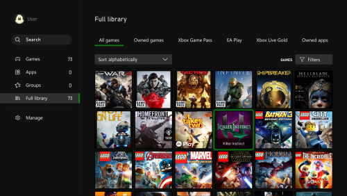
  8. UI Recreation: Emulating the ethos of newer consoles, UIs like the Xbox 360 Blades, PS3 XMB, and the WiiU Gamepad have been faithfully recreated.

Recommended Configuration:

  • Startup View: Platforms
  • Games List View: Horizontal Wheel 1
  • Platforms List View: Platform Wheel 1
  • View Consistency: Ensure separate views are maintained for each platform.

Please refrain from bypassing the game details screen, as bespoke game details screens have been designed in alignment with the native console/platform system menus where pertinent.

Critical Information: Within each custom platform, the Game Details View Menu is subtly concealed, simulating the initiation of a game. To reveal this concealed menu, one must navigate either up or down whilst in the Game Detail View.

Specific View Instructions:

The primary view for most platforms aligns with the Horizontal Wheel 1 view. However, specific cases are outlined as:

  • Systems devoid of a custom view should adopt the CoverflowGamesView.
  • For the Playstation 2 Demo Disk View, resort to the HorizontalWheel2GamesVIew.
  • Platforms like the Microsoft Xbox One, Nintendo Wii, WiiU, and Playstation Vita are best represented by the WallGamesView.
  • For the Microsoft Xbox Demo Disk, Playstation 3, and Playstation Portable, the WheelGamesView is recommended.
  • To ensure the Sega Master System/Sega Mark III/Sega SG-1000 Card Games are displayed appropriately, annotate "Card Media." at the conclusion of the Metadata Notes section for each game.

Navigational Caution: When interacting with the WiiU, restrict your navigation downwards to prevent the game title from overlapping with other games.

Supported Platforms with Distinct Themes: Duplicate listings are for accommodating particular naming conventions.

  • 3DO Interactive Multiplayer
  • Arcade
  • Atari 2600
  • Atari 5200
  • Atari 7800
  • Atari Jaguar CD
  • Atari Jaguar
  • Atari Lynx
  • Bandai WonderSwan Color
  • Bandai WonderSwan
  • ColecoVision
  • Commodore 64
  • Commodore Amiga CD32
  • Commodore Amiga
  • MAME
  • Mattel Intellivision
  • Microsoft Windows
  • Microsoft Xbox 360
  • Microsoft Xbox One
  • Microsoft Xbox
  • MS-DOS
  • NEC PC Engine CD
  • NEC PC Engine
  • NEC PC-FX
  • NEC TurboGrafx-16
  • NEC TurboGrafx-CD
  • Nintendo 3DS
  • Nintendo 64
  • Nintendo DS
  • Nintendo Entertainment System
  • Nintendo Famicom
  • Nintendo Famicom Disk System
  • Nintendo Game Boy Advance
  • Nintendo Game Boy Color
  • Nintendo Game Boy
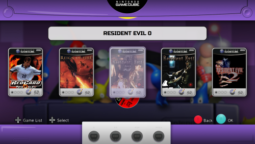
  • Nintendo GameCube
  • Nintendo Super Game Boy
  • Nintendo Switch (Longbox Alt View)
  • Nintendo Virtual Boy
  • Nintendo VirtualBoy
  • Nintendo Wii U
  • Nintendo Wii
  • Nokia N-Gage
  • Panasonic 3DO
  • Panasonic 3DO Interactive Multiplayer
  • Philips CD-i
  • PC Games
  • SNK Neo Geo AES
  • SNK Neo Geo CD
  • SNK Neo Geo Pocket Color
  • SNK Neo Geo Pocket
  • Sega 32X
  • Sega CD (Longbox Alt View)
  • Sega Dreamcast
  • Sega Game Gear
  • Sega Genesis
  • Sega Mark III
  • Sega Master System
  • Sega Mega CD JP
  • Sega Mega CD
  • Sega Mega Drive 32X
  • Sega Mega Drive JP
  • Sega Mega Drive
  • Sega Saturn JP
  • Sega Saturn (Longbox Alt View)
  • Sega SG-1000
  • Sega Super 32X
  • Sony PSP
  • Sony Playstation 2
  • Sony Playstation 3
  • Sony Playstation 4
  • Sony Playstation Portable
  • Sony Playstation Vita
  • Sony Playstation
  • Steam
  • Super Famicom/Nintendo Super Famicom
  • Super Game Boy
  • Super Game Boy 2
  • Super Nintendo/Super Nintendo EU
  • Super Nintendo Entertainment System
  • Windows
  • WonderSwan Color
  • WonderSwan
  • Xbox 360 (Metro Theme)

Regional Specificities: Ensure the naming convention for region-specific views aligns precisely with the following:

  • Sega Mark III
  • Sega Mega Drive
  • Sega Mega Drive JP
  • Sega Mega CD
  • Sega Mega CD JP
  • Sega Mega Drive 32X
  • Sega Super 32X
  • Sega Saturn JP
  • Nintendo Famicom
  • Super Famicom or Nintendo Super Famicom
  • Super Game Boy
  • Super Game Boy 2
  • Super Nintendo or Super Nintendo EU
  • NEC PC Engine
  • NEC PC Engine CD

Sony PlayStation Regional Specificities: Your PlayStation game cases will automatically adjust based on the region you've specified in LaunchBox

  • North America: Set region to North America
  • Japan: Set region to Japan (This is the default setting)
  • PAL: Set region to Europe

DreamCast Regional Specificities: Your Dreamcast game cases will automatically adjust based on the region you've specified in LaunchBox

  • North America White: Set region to North America (This is the default setting)
  • North America Black: Set region to North America Alt
  • European: Set region to Europe
  • Japan White: Set region to Japan
  • Japan Black: Set region to Japan Alt

Nintendo Switch Advisory: Every effort has been expended to ensure standard box art is visually appealing. Nonetheless, for an optimized aesthetic, please download the Square Switch Game Library Images and supersede your existing Front - Box Art.

Platform selection
NewPlatformTheme.thumb.png.fb7bb1f6e9b57054f53588021f5b37c9.png

Generic GameList View
GenericGamesView.thumb.png.426c78374295f378008c5ddab962c988.png

Supported Platforms Mini View (This one is Sega Saturn)
SegaSaturn.thumb.png.1b696265c181fef2368ebd8ec3df83ab.png

Region Alternate Platforms Mini View (This one is Sega Saturn JP)
SegaSaturnJP.thumb.png.3f51807c9953ae6f0905de8d42b68ad6.png

Alternate Demo Disk View (This one is Playstation 2)
PS2DemoDisk.thumb.png.acbd5df8f9f9ceeddbbfc87f11214593.png


-----------------------------------------------------

  • Added Nokia N-Gage Platform View

NokiaN-Gage.thumb.png.1a62256bbffe271c3cc7ad38a9b4e92f.pngNokiaN-GageGameDetails.thumb.png.08d89d887f40a204536f354eae04f7ca.pngNokiaN-GageGameDetailsList.thumb.png.9df967ecdd6fb6a8d84f564a0eeba97c.png

Video Demonstration

-----------------------------------------------------

  • Added Sega CD alternate view, Horizontal View 2, which features North American Longboxes.
    • Make sure to set your region for the game correctly for the box art you have.
    • North America region will show Long Boxes.
    • Mega CD does not have this alternate view.

SegaCDLongboxes.thumb.png.89964798f2a3164dedd9f6e932afade6.png


  • Added new Platform View for long requested Philips CD-i.
    • It's based on the Philips CD-i 1.0 Shell


PhilpsCD-i.thumb.png.3b0e460af2f86d5b98de05d75e83bdcf.pngPhilpsCD-iGameDetails.thumb.png.5b211d65a1742e5975fa89259a31f00b.png

As usual, pushing up or down while in the Game Details screen will show additional details and the Game Details menu.

PhilpsCD-iGameDetailsWindow.thumb.png.ee2d4af448c1e7a786b119962a1baa1e.png

If a game has a video, it will automatically fade in while in the Game Details screen.


PhilpsCD-iGameDetails2.thumb.png.ddad70789a8e6bc4778839819156faf7.png

Video Demonstration

-----------------------------------------------------

  • Added new Xbox 360 Metro Style Theme
    • Note: "Microsoft Xbox 360" is Blades, "Xbox 360" is Metro. Name your Platform accordingly.

MetroDashboard.thumb.png.357f13190ee4ea6695c19cd4af2eeb94.pngMetroGameDetail.thumb.png.a5a4d4f2a1097f6aeba63b48565da972.pngMetroGameDetailList.thumb.png.10bf5426fa1f3f840e728b19717ddaff.png
 

  • The Platform Logo Intro no longer replays when exiting from the Game Details Screen back to the Dashboard.
    • It will reset if you exit the Dashboard back to the Platforms View, so it will play again when entering the same platform again.
       
  • Added a generic Wall view that can be used for all platforms.
    • Note: Nintendo Wii is using Wall View 2 for the alternate Video view.
    • Additionally, the Game Details Screen will be the same themed one you'd usually see for each platform that has one.
       

WallView2.thumb.png.4a0f84611f771d22ed5b3aa7b5acf6d2.png


Video Demonstration

-----------------------------------------------------

  • Updated code base for latest version of LaunchBox (13.12)
  • Updated Nintendo Wii View to feature Screenshots by default.
  • Added Nintendo Wii alternate view, Wall 2, which features videos for the games.
    • WARNING! The alternate Wii View (Wall 2) requires a high-spec PC.
    • Performance WILL be diminished.

Video Demonstration


-----------------------------------------------------

Nintendo Famicom Disk System Demo Video

Screenshots

NintendoFamicomDiskSystem1.thumb.png.12624fd5fdd32f8fa4cd390d61951785.pngNintendoFamicomDiskSystem2.thumb.png.c854b8eee0ac9d451e8eaa86dd592227.png


-----------------------------------------------------

  • Added long requested alternate views (Horizontal Wheel 2) for Nintendo Switch and Sega Saturn with Long Box Art.

LongBoxSwitch.thumb.jpg.bda462b3e280b0ad55d602d4bbecfe07.jpg

-----------------------------------------------------

Sega Saturn is region based and intended for just the Box Art images and not Box Art that contains images including the case itself.

  • North America - Long Plastic Jewel Case
  • Europe - Black Edge Long Cardboard Box
  • Japan - Small Jewel Case

LongBoxSaturn2.thumb.jpg.01f4d6511ab0d21848d7ead088577115.jpgLongBoxSaturn1.thumb.jpg.d54926013e5286a6cd89796cb0780910.jpg


-----------------------------------------------------

 MS-DOS View:

MS-DOS.thumb.png.4c61c662d1fcfe1b3c72a861e8ffc22c.pngMS-DOSGameDetails.thumb.png.78dadc48348a92bd01cc59437c380777.png

-----------------------------------------------------

Platform View Demo:

The Platform View has undergone a complete overhaul inspired by the COLORFUL theme, incorporating the same vibrant colors found in COLORFUL Platform videos.

    The new Platform View has been adjusted to seamlessly accommodate any Platform video, resulting in a colored border surrounding the video for a cohesive and visually appealing theme experience.

-----------------------------------------------------

Audio Adjustment Script:

To assist with adjusting the volume of the Background Music for the theme, I've created a PowerShell script which will allow you to adjust the volume however you like! Feel free to check out the post here:

-----------------------------------------------------   

Nintendo Game Boy View:

NewNintendoGameBoyTheme.thumb.png.2591757becafe4dc338362a9db55e71a.png

  • A brand-new Nintendo Game Boy view has been introduced to replace the existing Nintendo Game Boy view.
  • This new view is designed to more accurately represent the Nintendo Game Boy platform, addressing the previous view's closer resemblance to the Nintendo Super Game Boy.

Nintendo Super Game Boy Views:

As a result of the Nintendo Game Boy view replacement, three distinct Nintendo Super Game Boy views have been introduced:

  • North America Super Game Boy View (Nintendo Super Game Boy): Tailored to North American users, this view captures the essence of the North American Super Game Boy experience.

NewSuperGameBoyUS.thumb.png.70f2f170a366d38166d43abe7c172bf8.png

  • PAL Regions Super Game Boy View (Super Game Boy): Designed specifically for PAL regions, this view provides a unique representation of the PAL Super Game Boy setup.

NewSuperGameBoyPAL.thumb.png.d3d455ab08c7f68126d0f2a0bf78ead3.pngSuperGameBoyDetailsScreen.thumb.png.9d9f9582726a8eb228a2581fa9b60900.pngSuperGameBoyDetails.thumb.png.035b43cf72a1f677a36b3842a91c42d5.png

  • Super Game Boy 2 View (JP Regions) (Super Game Boy 2): For users in Japanese regions, the Super Game Boy 2 view has been created to replicate the JP Super Game Boy experience.

NewSuperGameBoy2.thumb.png.e04e64c04795ad62dd1963834ad8d5ac.pngSuperGameBoy2DetailsScreen.thumb.png.4fc8b4cf7fd311d5a58cf76b960dca23.pngSuperGameBoy2Details.thumb.png.32066109f04f97ff689720469f9680cc.png


-----------------------------------------------------

Default Coverflow View and Default Game Details View Revamp:

    In addition to the Platform View overhaul, both the Default Coverflow View and Default Game Details View have undergone a complete redesign.

    These views have been transformed to align seamlessly with the COLORFUL style, while still preserving the distinctive backgrounds and colors associated with each platform.
-----------------------------------------------------

Arcade/Steam/Intellivision/Dreamcast Case Video Demo

Arcade/MAME View:

Imagine walking into a dimly lit room, only to be greeted by the vibrant glow of neon lights, screens reflecting off sleek surfaces and rows of brightly colored cabinets. The energizing cacophony of game sounds, chiptunes, and playful challenges fills the air, beckoning players to try their hand at conquering pixelated realms. This was the magic of a 90s arcade – a sanctuary for gamers, where stories were not just told but lived, one coin at a time.

Arcade-MAME-Library.thumb.png.b3fb719b192624141f9c8cadbfb9d3ea.pngArcade-MAME-GameDetailsScreen.thumb.png.f53d991678b3575deee6aa67bd0b9c24.pngArcade-MAME-GameDetailsMenu.thumb.png.e2b471b0c037d9c3430e5e95f08d7c1f.png

Diverse Cabinet Showcase: Just as arcades offered a smorgasbord of games, this view boasts over 48 unique arcade cabinets, each presenting a doorway into the past.
Variants Included: The 90s arcade was never just about the joystick and buttons. Racing wheel games that simulated high-speed chases and light gun cabinets that brought first-person shooter scenarios to life were all the rage. This view recreates these specialties, ensuring that every gamer finds their niche.
Atmospheric Navigation: It's not just about the games; it's about the experience. As you navigate from one cabinet to another, the shifting atmosphere and audio ambiance transport you back in time, simulating the sensation of wandering through an arcade, deciding where to drop your next coin.
Detailed Reflections: Attention to detail is key. The glow of the game screen softly reflecting off the control panels, especially in the game details screen, doesn't just add to the visuals—it revives memories of intense focus and fingers dancing over buttons in rhythmic gameplay.
Arcade BIOS Game Details Menu: To round off this authentic trip down memory lane, the game details menu mirrors the look and feel of an Arcade BIOS. It's not just about playing; it's about immersing oneself in the entire arcade ethos.

Notes: "Screenshots", "Marquees", "Clear Logos", and "Videos" are utilized for the view. The cabinet style is designated by the game "Publisher" metadata. Racing cabinets are designated by the "Racing" and "Driving / ..." variant genres and Lightgun cabinets are designated by the "Shooter / Gun" genre.

If you wish to manually change the cabinet to fit a specific aesthetic for a game, here are the supported publishers you can update the metadata for the specific game to:

   "Arika"
   "Atari Corporation"
   "Atari Games"
   "Atari"
   "Bally Midway"
   "Capcom Co., Ltd."
   "Capcom"
   "Cave (AMI license)"
   "Cave (Atlus license)"
   "Cave (Capcom license)"
   "Cave (Nihon System license)"
   "Cave"
   "Data East Corporation"
   "Data East"
   "Irem Corp."
   "Irem"
   "Konami Industry Co. Ltd."
   "Konami"
   "Midway Games"
   "Midway"
   "Namco"
   "Nintendo R&D3"
   "Nintendo"
   "SNK Corporation" (This is the red SNK cabinet)
   "SNK" (This is the MVS cabinet)
   "Sega AM1"
   "Sega AM2"
   "Sega AM3 R&D Division"
   "Sega Enterprises Ltd."
   "Sega"
   "Taito America Corporation" (Black Buttons)
   "Taito Corporation Japan" (Red Buttons)
   "Taito Corporation" (Red Buttons)
   "Taito" (Black Buttons)
   "Williams Entertainment"
   "Williams"

Steam/PC Games/Windows/Microsoft Windows View:

Especially designed for Windows/PC Games/Steam enthusiasts, this view is inspired by the UI of the Steam Deck. Currently, I'm harnessing the metadata provided by LaunchBox, but hopefully in the future I'll be able to integrate the Steam, GOG, and Epic metadata for a richer experience. Until then, I'm confident you'll love what you see.

Windows-PCGames-Steam-Library.thumb.png.b80f3adc66651b7078c70d968ccadb89.pngWindows-PCGames-Steam-GameDetailsScreen.thumb.png.68f6af228707b01bb39fbad9c7c8a84d.pngWindows-PCGames-Steam-GameDetailsMenu.thumb.png.81188f74bec8ecc6e71494fbefb77be9.png

Steam Deck Inspiration: This view is designed after the Steam Deck version of Steam OS.
Library View: A seamless browsing experience to navigate through your games.
Game Details View: Get all the information you need about a game with a visually appealing presentation.
Overlay Menu: An intuitive overlay menu for the Game Details Menu, so you get all the additional details without any hassle.

Notes: "Box - Front", "Clear Logo", "Screenshots", "Videos" and "Banners" are utilized for this theme. Unfortunately Fan Background and Steam/Epic/GOG metadata is not available for me to use for the theme currently. Screenshots are utilized first, then Banners as a fall back.

Mattel Intellivision View:

This view brings the nostalgia right to your fingertips. Every time you select a game, the Controller Overlay will change to match that specific game. This is perfect for those who love authenticity. But there's more! This view also includes the iconic "My Intellivision" track from Intellivision Lives! which will hopefully set the mood.

Intellivision-Library.thumb.png.216aefc6238871c4efb843ad5e98cf8a.pngIntellivision-GameDetailsScreen.thumb.png.ad03b70d64b804e38b4c4bff8627f9bc.pngIntellivision-GameDetailsMenu.thumb.png.05f6e1ed86ae2adc4c0c25f1643a6873.png

Classic Console Presentation: Experience the nostalgic Mattel Intellivision console front and center.
Dynamic Controller Overlays: Game-specific controller overlays are showcased, ensuring that the controls displayed are accurate for each game if available.
Accurate Cartridge Port: With the Mattel Intellivision's cartridge port usually on the side of the console, its been placed at the top with accurate cart insertion depth!
"My Intellivision" Theme Song: Fans of Intellivision Lives! will be delighted to hear the "My Intellivision" theme song incorporated into the theme.

Note: The Controller Overlays are handled via the "Arcade - Controls Information" metadata.

Dreamcast Region Specific Game Cases:

DreamCastRegionCases.thumb.png.9b444b3295bd0093ac18312e4a06a286.png

Now, your Dreamcast game cases will automatically adjust based on the region you've specified in LaunchBox. Here's a breakdown of the region-specific cases:

  • North America White: Set region to North America (This is the default setting)
  • North America Black: Set region to North America Alt
  • European: Set region to Europe
  • Japan White: Set region to Japan
  • Japan Black: Set region to Japan Alt

Note: Changing regions for games is best handled via LaunchBox by selecting all games you'd like to change to a specific region, then mass editing the Region field and updating them.

Supported Views (Switch View key may need to be mapped in BigBox):

SupportedViewsScreen.thumb.png.e432096600e70524d2741fde02cb8dc6.png

To help with the initial configuration of the Theme, if a Platform attempts to utilize a view that is not supported, a customized view displaying supported options will appear. For example, the default view for the theme is Horizontal Wheel 1, however not all platforms utilize this view and a screen displaying the supported views for the specific Platform will be displayed.

Note: Supported Views allows for BigBox wide Search, results will just need to be set to Fullscreen CoverFlow. The Platform View Searching works as expected, and so does Game Detail Menu options like Related Games, etc

-----------------------------------------------------

Acknowledgments and Credits:

I wish to express my profound gratitude and acknowledgment to the following individuals and entities for their invaluable contributions and inspirations that greatly enriched this project:

  1. Files and Design Elements:

    • y2guru: For their always impressive and incredibly helpful Community Theme Creator application.
    • faeran: I am grateful for his provision of the Unified CTC files, which were instrumental in shaping the Coverflow view with its accompanying backgrounds.
    • viking: For the base arcade cabinets from the COLORFUL Hardware CAD designs, and for the inspiration from the COLORFUL theme!
    • Dan Whelan: For allowing me to use their remastered N-Gage Boot Animation WIP for the animated background, and their enthusiasm for remastering N-Gage assets and UI elements.
  2. Music Contributions:

    • VinsCool: For his original piece "Voyager 1" rendered on Atari TIA and recorded using genuine hardware.

    • RushJet1: For the evocative track "5-bit Thief," crafted on Atari 2600 TIA.

    • BlueElectric05: Contributed the unique "Bytey" track, created on Atari 2600 TIA and classified under originals.

    • newcoleco: For "ColecoVision - Original Music 1," which enlivened the project with its nostalgic tones.

I extend my warmest appreciation to all the contributors for their dedication, talent, and passion that have immensely enriched this endeavor.

Edited by Saieno
Updated Description and Credits


What's New in Version 2.2.5   See changelog

Released

v2.2.5

  • Added NEC PC-FX Platform, designed to fit with the existing NEC mini console themes:

NECPC-FX.thumb.png.cc089f2d7476a866749be4ec4ec51eb4.pngNECPC-FXGameDetails.thumb.png.cd8f5f30568efe7fa73d15e68a476d5d.pngNECPC-FXGameDetailsList.thumb.png.e94eb1af942568cdf42a98eea17fcd97.png


  • Added Sega SG-1000 Platform, designed to fit with the existing SEGA mini console themes
    • Support for Carts and Card Games. To display appropriately, add "Card Media." at the end of the Metadata Notes section for each card game.

SegaSG-1000Cart.thumb.png.609b9956cdd0fffe406c98c17cfb2536.pngSegaSG-1000Card.thumb.png.02b9181b183bbec179820fe5cb0e08a2.pngSegaSG-1000GameDetails.thumb.png.5d3f54da04dd8ba4bc0d485155d30558.pngSegaSG-1000GameDetailsList.thumb.png.2b226fe168da65fc83fd3b6dff1d87c1.png

Video Demonstration

  • Like 22
  • Thanks 5
  • Game On 1
  • The Cake is a Lie 1
  • Unusual Gem 9

User Feedback

Recommended Comments


Wow! Pretty amazing stuff! But I'm guessing that the games-text list isn't quite ready? I'm having issues with each platform while using the text-list view of the theme, while the full cover box view seems to be working fine and looking great. For example, here's what happens in the text-list view with Atari 5200. There's no response to the controls while trying to navigate in this view but theme music continues to play in the background.

Untitled.thumb.jpg.bca1d9cd683867306d5eec9cf601dd2e.jpg

  • Thanks 1
Link to comment
Share on other sites

2 minutes ago, bundangdon said:

Wow! Pretty amazing stuff! But I'm guessing that the games-text list isn't quite ready? I'm having issues with each platform while using the text-list view of the theme, while the full cover box view seems to be working fine and looking great. For example, here's what happens in the text-list view with Atari 5200. There's no response to the controls while trying to navigate in this view but theme music continues to play in the background.

Untitled.thumb.jpg.bca1d9cd683867306d5eec9cf601dd2e.jpg

So the Games Text View is specifically used for the Games Detail View that transitions from the main Horizontal Wheel 1 View. The only two valid views should be HorizontalWheel1View or CoverFlowView.

Thats why I left a bolded note in the description above.

THIS IS IMPORTANT! The Game Details View Menu for each custom platform is technically hidden, to give the impression of starting the game or not.”

  • Thanks 1
Link to comment
Share on other sites

Also, as stated above, make sure you have in your configuration to NOT skip the Game Details Screen. This is required for the background audio to stop playing when you launch a game, otherwise the music would keep playing while your game is playing. Unfortunately I’m not able to resolve that any other way.

Link to comment
Share on other sites

8 minutes ago, Saieno said:

So the Games Text View is specifically used for the Games Detail View that transitions from the main Horizontal Wheel 1 View. The only two valid views should be HorizontalWheel1View or CoverFlowView.

Thats why I left a bolded note in the description above.

THIS IS IMPORTANT! The Game Details View Menu for each custom platform is technically hidden, to give the impression of starting the game or not.”

Okay, gotcha. I thought I had done something wrong on my part or that was something was incomplete. Either way, this is truly fantastic looking and looking forward to seeing some more of those 'oddball' systems added in there in the future

  • Like 1
Link to comment
Share on other sites

1 minute ago, bundangdon said:

Okay, gotcha. I thought I had done something wrong on my part or that was something was incomplete. Either way, this is truly fantastic looking and looking forward to seeing some more of those 'oddball' systems added in there in the future

No problem! Did that resolve your issue? Also I’m not sure what other platforms I’ll personally be making special views for, as currently I made views for the systems I personally use. If I expand out or there are specific requests for views I can do my best to create them. Doing the regional views was pretty difficult as I didn’t have those systems growing up so I had to ask a friend from Europe to validate hahaha.

one thing I will be updating is the arcade views to put a release year and additional information as I noticed that’s not there currently. But I’ll get that updated sometime soon.

Link to comment
Share on other sites

9 hours ago, Saieno said:

No problem! Did that resolve your issue? Also I’m not sure what other platforms I’ll personally be making special views for, as currently I made views for the systems I personally use. If I expand out or there are specific requests for views I can do my best to create them. Doing the regional views was pretty difficult as I didn’t have those systems growing up so I had to ask a friend from Europe to validate hahaha.

one thing I will be updating is the arcade views to put a release year and additional information as I noticed that’s not there currently. But I’ll get that updated sometime soon.

Actually, it was just a matter of me not paying attention and missing a key part of your theme's details/info and that pretty much resolved the issue. Anyways, there were a few missing platforms I noticed, and I'll make a list of them later today when I get home. Actually, I'm from the U.S. so you don't have to worry about any rare or unusual European computer systems being requested :)


Link to comment
Share on other sites

On 6/26/2023 at 5:51 PM, bundangdon said:

Actually, it was just a matter of me not paying attention and missing a key part of your theme's details/info and that pretty much resolved the issue. Anyways, there were a few missing platforms I noticed, and I'll make a list of them later today when I get home. Actually, I'm from the U.S. so you don't have to worry about any rare or unusual European computer systems being requested :)


Here's the current list of supported platforms with custom views, so if you see one on the list here that isn't working correctly it might be a Platform name issue, otherwise feel free to suggest a platform:
 

Arcade
Atari 2600
Atari 5200
Atari 7800
Atari Jaguar
Atari Lynx
Bandai Wonderswan
Bandai WonderSwan Color
ColecoVision
Microsoft Xbox
Microsoft Xbox 360
Microsoft Xbox One
NEC TurboGrafx-16
NEC TurboGrafx-CD
Nintendo 3DS
Nintendo 64
Nintendo DS
Nintendo Entertainment System
Nintendo Game Boy
Nintendo Game Boy Advance
Nintendo Game Boy Color
Nintendo GameCube
Nintendo Switch
Nintendo VirtualBoy
Nintendo Wii
3DO Interactive Multiplayer
Sega 32X
Sega CD
Sega Dreamcast
Sega Game Gear
Sega Genesis
Sega Master System
Sega Saturn
SNK Neo Geo AES
SNK Neo Geo Pocket
SNK Neo Geo Pocket Color
Sony Playstation
Sony Playstation 2
Sony Playstation 3
Sony Playstation 4
Sony Playstation Portable
Sony Playstation Vita
Super Nintendo Entertainment System


Edited by Saieno
  • Thanks 1
Link to comment
Share on other sites

Very ambitious theme and I love it so far. 😀 I don't use BigBox very often and I want to know what settings you have to change in order to make the console specific music and console list music muted? I have my own music set up and I'd prefer it over the theme's music ATM.

Link to comment
Share on other sites

8 hours ago, wantwon said:

Very ambitious theme and I love it so far. 😀 I don't use BigBox very often and I want to know what settings you have to change in order to make the console specific music and console list music muted? I have my own music set up and I'd prefer it over the theme's music ATM.

If you go into the themes folder, Media, then BGM, you might be able to remove all the music from there tho that might provide an error if the file doesn't exist. Let me know if that works for you, and if not I'll make a 'silent patch' with replacement files you can put in there that are silent.

Edit: It also might be in Theme Specific Options? I'm not exactly sure to be honest.

Edited by Saieno
Link to comment
Share on other sites

This looks really rad!

If you ever do a new platforms update, I'd love to see ones for Windows / Steam, the other major computer systems like DOS & C64 (the latter of which has a mini console to go off of), Nintendo Famicom Disk System, Nintendo Game & Watch, and maybe something for Pinball?


Other critiques / nitpicks

- The Panasonic 3DO platform uses a different name than the one that Launchbox uses by default (3DO Interactive Multiplayer). Is there a way to fix that?

- The Sega Game Gear, Nintendo DS, SNK Neo Geo Pocket, and SNK Neo Geo Pocket Color platform borders are REALLY low quality and have heavy artifacting.

- I really wish the Arcade platform had a better look instead of just a watered-down text-only Unified.

- The HorizontalWheel1GamesVIew of Sony PlayStation 2 doesn't show the front boxes.

- The WheelGamesView of Sony PlayStation 3 doesn't show logos or game text.

- Game description text starts scrolling way too soon. Also I feel the text window could be extended downwards a bit more.

- The Nintendo Wii's Game Details are way too blurry (I also noticed that one some of the graphics for the PS2 Demo Theme but I assumed that was what the original looked like)

- A Game Details screen for the generic FullscreenCoverFlow look (or a version using Horizontal Wheel 1) would be nice.

- Don't know if I like the Sega CD and Saturn game boxes being forced into the square case instead of their original long boxes.

- The Nintendo 64 platform stretches most of the boxes too tall, and JP vertical boxes are fully cut off.

- Not really a nitpick, but a showing of an ESRB/PEGI age rating for games would be nice, to make it seem more official, that and the fact that my current LB build is being made to bring over to family gatherings and the like.

Edited by Mr. Skerpentine
Link to comment
Share on other sites

4 hours ago, vahn65 said:

Hey Saieno, to answer your question you asked in my review here is a video showing what I mean for Coverbox Platform title cards.

2034548265_2023-06-2723-42-53.mkv 2.34 MB · 1 download

Ah I see, I dunno if I have any plans to do that but I think you might be able to set that as your platform view if you have both themes downloaded.

3 hours ago, Mr. Skerpentine said:

This looks really rad!

If you ever do a new platforms update, I'd love to see ones for Windows / Steam, the other major computer systems like DOS & C64 (the latter of which has a mini console to go off of), Nintendo Famicom Disk System, Nintendo Game & Watch, and maybe something for Pinball?


Other nitpicks

- The Panasonic 3DO platform uses a different name than the one that Launchbox uses by default (3DO Interactive Multiplayer). Is there a way to fix that?

- The Sega Game Gear border is REALLY low quality and pixely

- The NEC TurboGrafx-16 platform won't work (presumably due to the G in Grafx not being capitalized in the system list you provided)

- I really wish the Arcade platform had a better look instead of just a watered-down text-only Unified.

- Game description text starts scrolling way too soon.

- A Game Details screen for the generic FullscreenCoverFlow look (or a version using Horizontal Wheel 1) would be nice.

- Don't know if I like the Sega CD and Saturn game boxes being forced into the square case instead of their original long boxes.

- The Nintendo 64 platform stretches most of the boxes too tall, and JP vertical boxes are fully cut off.

- Not really a nitpick, but a showing of an ESRB/PEGI age rating for games would be nice, to make it seem more official, that and the fact that my current LB build is being made to bring over to family gatherings and the like.

Woo! Lots of really great feedback! Lemme see if I can tackle this!

So this may sound odd but I don't really have any intentions of doing computer style platforms as I just use a controller when using BigBox and the theme was created with that intention. I may look into a Famicom Disk System though not sure about Game & Watch or Pinball. I know this theme can't be everything for everyone, so apologies if that comes as a disappointment.

I can look into changing it for a future release but you can also fix the 3DO Interactive Multiplayer by renaming your platform to Panasonic 3DO and keeping the scrape as 3DO Interactive Multiplayer. I can probably get a release out to support both in the next release.

I have fixed this and its available in the current release.

The Sega Game Gear border is low quality and pixely? Can you share an image? It doesn't look like this?

Yeah the arcade view I'm not overly happy with, its something I've been thinking about though I enjoyed the Unified theme previously and this is my first theme. Not sure what I'll do for it but I'm thinking about something for the arcade stuff.

I'll adjust the game description text scrolling in the next release, no problem.

The default system Game Details screen should be used when using the FullScreenCoverFlow for systems that don't exist. Not sure which LaunchBox version you're on but I think the default system theme fits really well and looks great on the latest versions. Not sure I have any plans to change that as its really solid and fits the needs for my themes purpose.

There are a few ways to tackle Sega CD and Sega Saturn boxes but there are different sizes for different regions. US got full size cases, EU and JP got usual jewel cases. I could change how its presented depending on the region like I do now, but this was the middle ground I decided on for the moment. If I come up with a better alternative I'll look into it for sure.

The N64 boxes shouldn't be stretched and should be normal size, but I'll double check. The JP boxes I'll look into adjusting but if you have an image example of the N64 I'm curious how it looks for you.

In regards to the ESRB ratings, I didn't have that considered for the themes and might be able to stick them somewhere it makes sense, but some older games just don't have ratings and when they do they should be on the box art for the most part. But I'll see if I can get that fit somewhere, not in the next update but maybe in a future one.

Edited by Saieno
Link to comment
Share on other sites

The only way I could do this is to edit this theme with CTC files in the Community Theme Creator to add this opening Transition title card to your theme.

Link to comment
Share on other sites

Just now, vahn65 said:

The only way I could do this is to edit this theme with CTC files in the Community Theme Creator to add this opening Transition title card to your theme.

Ah you were referencing the transition title card, not the platform view specifically. I can look into that for a future release.

Link to comment
Share on other sites

Awesome! Also to piggyback Mr. Skerpentine if people play at higher resolutions things can appear low Res. I play at 4k and noticed a few things appear a bit low res or blurry but it didn't bother me too much. 

Link to comment
Share on other sites

Just now, vahn65 said:

Awesome! Also to piggyback Mr. Skerpentine if people play at higher resolutions things can appear low Res. I play at 4k and noticed a few things appear a bit low res or blurry but it didn't bother me too much. 

Ah gotcha. Yeah some of the things are intentionally blurry as a design decision to make it low res to fit the platform/aspects of menus from the time. Purely aesthetic of course, but also going to be subjective for sure

Link to comment
Share on other sites

3 hours ago, Mr. Skerpentine said:

- The Nintendo 64 platform stretches most of the boxes too tall, and JP vertical boxes are fully cut off.

Ah I see what you're saying. The boxes are only slightly stretched taller than usual for a couple reasons. The first is to make it more seamless with the wheelbox, as the wheelboxes are actually black or red based on region (shown below) and generally flow into each other. And the second is because overall I personally thought it looked better with the US and PAL boxes when they are next to each other. It was also intended to give the vertical JP boxes more room but I needed to fix that. I've not seen anything that looks overly warped or odd personally, though vertical JP box art for a game that is marked as NA or EU will be stretched because of the region. but if you have any specific examples please feel free to share.

N64Region.thumb.png.a1c37961179b7b2f7dd7b31d812e7dc3.png

I've also adjusted the JP boxes so they show completely within the WheelBox and have it in the latest release which is available now.

Edited by Saieno
Link to comment
Share on other sites

On 6/28/2023 at 2:58 AM, Saieno said:

Ah gotcha. Yeah some of the things are intentionally blurry as a design decision to make it low res to fit the platform/aspects of menus from the time. Purely aesthetic of course, but also going to be subjective for sure


On 6/28/2023 at 2:58 AM, Saieno said:

Ah gotcha. Yeah some of the things are intentionally blurry as a design decision to make it low res to fit the platform/aspects of menus from the time. Purely aesthetic of course, but also going to be subjective for sure

I figured that what you were going for was some of the views such as the NDS! I appreciate the update, the game gear does look much better, and I am looking forwrard to any further additions you may think to add.

With that said, have a few more ideas I would like to float but you by the way! Don't feel like you have to do any of this, I just personally think it would be cool to add or improve(Subjectively) a few more things to make things a tad more feature complete
 

  • Gamecube Demo Disk Menu opition. Heres some Ideas: 
  • Making the Gamecube Detail Menu a tad more personal to the system, maybe just making the color purple or something.
  • I am not sure this is possible but on the Game details menu a way to perhaps access the Game detail options such as switching discs or choosing an alternate ROM file if need be. As it is now, if you wanted to, you would have to go into Launchbox and change the default ROM/ISO then go back into Bigbox to play with the other file.
  • Another 3DS view option, perhaps a Wall view to simulate having more games on screen in a grid-like manner. Kinda like what you did for the Vita
  • If possible have the background of the PS2 Horizontal view 1 animated.
  • I Love the PS2 Demo Disk view and think it would be cool to have one more view Here are some Ideas: 
  • I know as it stands making Switch games fit without using the Home Screen Squares is difficult, so I offer the solution of another view that is like exodus_cl's where it is just the Normal Box - Fronts, as users may not want to change their switch games to use the Home Screen squares as it ruins the 3D box view. Another solution is to have users put the Home Screen squares in the Box - Front - Reconstructed folder and the code needs to read/point to that folder instead of the Box - Front folder if that's possible.
  • The view for the PC Engine and PC Engine CD with the same or similar functionality of the TurboGrafx-16 and CD
  • Super Famicom Boxes made to fit into the boxes without being cut off/zoomed in.
Edited by vahn65
  • Like 1
Link to comment
Share on other sites

Oh this is great! Lemme see if I can address all of this!

9 hours ago, vahn65 said:


With that said, have a few more ideas I would like to float but you by the way! Don't feel like you have to do any of this, I just personally think it would be cool to add or improve(Subjectively) a few more things to make things a tad more feature complete
 

  • Gamecube Demo Disk Menu opition. Heres some Ideas: 

This is great! I never had GameCube Demo Disks so I wasn't aware they had them! (Discs were so small I didn't think they'd make them!) But this looks great! Would be a lot of metadata required for it to work properly, so as long as each game has the appropriate media available I should be able to put something like this together! I won't have an ETA on it or anything but I like it!

9 hours ago, vahn65 said:


  • Making the Gamecube Detail Menu a tad more personal to the system, maybe just making the color purple or something.
  • I am not sure this is possible but on the Game details menu a way to perhaps access the Game detail options such as switching discs or choosing an alternate ROM file if need be. As it is now, if you wanted to, you would have to go into Launchbox and change the default ROM/ISO then go back into Bigbox to play with the other file.
  • Another 3DS view option, perhaps a Wall view to simulate having more games on screen in a grid-like manner. Kinda like what you did for the Vita
  • If possible have the background of the PS2 Horizontal view 1 animated.
  • I Love the PS2 Demo Disk view and think it would be cool to have one more view Here are some Ideas: 
  • Oh I actually thought the GameCube detail screen fit really well with the menu screens Nintendo made for the NES and SNES mini consoles, that was the general idea to stay with what they had but I made the background grey and added the controler buttons, etc. I'm actually happy with it for what I was going for.
  • So I was hoping to have more control over the game details options menu to display it how I want or where or trigger it with a hotkey, but there's no way to currently do that. The menu still technically exists, and you can technically nagivate it, it's just hidden so you'd need to know what the menu options are which isn't ideal.
  • I suppose I could make another 3DS view, it would end up like the WiiU view (nearly identical) and was trying to make each feel a little unique when it came to the respective dashboards. I know it may not seem like it, but thats actually how the 3DS game view was when the 3DS first came out; so was trying to replicate that.
  • I did try to make a PS2 animated background for the Horizontal view, but I just couldn't get it to look good, even with completely modeling and remaking the PS2 boot animation. But at least I feel like I nailed the PS2 Demo Disk lol.
  • Speaking of the PS2 Demo Disk! This particular PS2 Demo Disk example is a little restrictive since it doesn't really show you where you're navigating to or any other games aside from the one you're looking at.
9 hours ago, vahn65 said:
  •   I know as it stands making Switch games fit without using the Home Screen Squares is difficult, so I offer the solution of another view that is like exodus_cl's where it is just the Normal Box - Fronts, as users may not want to change their switch games to use the Home Screen squares as it ruins the 3D box view. Another solution is to have users put the Home Screen squares in the Box - Front - Reconstructed folder and the code needs to read/point to that folder instead of the Box - Front folder if that's possible.
  • The view for the PC Engine and PC Engine CD with the same or similar functionality of the TurboGrafx-16 and CD
  • Super Famicom Boxes made to fit into the boxes without being cut off/zoomed in.
  • Thats a fair point on the switch games and box art. I'll look into implementing something like that in a future update for sure.
  • Ah yes I thought I forgot one of the regional views! I'll work on that for a future release as well, and will also try to get the CoreGrafx as well.
  • And the Super Famicom boxes I intend on fixing for the next release, either today or tomorrow cause I'm having that issue as well. Again usually looks good in the editor, doesn't when I go in BigBox for whatever reason so its difficult to troubleshoot.

Thanks for all the great ideas/feedback!

Link to comment
Share on other sites

15 minutes ago, Saieno said:
  • そうそう、地域の視点を 1 つ忘れていたと思っていました。将来のリリースでもこれに取り組み、CoreGrafx の入手も試みる予定です。

Are you referring to ”PC Engine", "PC Engine CD". "PC Engine SuperGrafx"? This is the JP version.
Or the JP versions of "Sega Mega Drive", "Sega Mega CD", "Sega Super 32X"? In the case of Sega, the only difference is the color of the logo and buttons.
I would also be happy if they would also have a "Sega Mark III" version instead of the SMS version.(JP version)

If the PS1/PS2/PSP/PSP is the JP version, the decision cancellation of ◯ and × is reversed. Is there any chance I can solve this with image editing?

By the way, do you have any ideas for MSX/MSX2?

Link to comment
Share on other sites

12 hours ago, vahn65 said:

  Super Famicom Boxes made to fit into the boxes without being cut off/zoomed in.

....Is this really how you want it to look? Just making sure.

image.png.7d99e1ee920a1998c37eaaa2c8e47222.png

Link to comment
Share on other sites

Shouldn't be a problem (at least for me, or if you're going to imitate the Super Famicom Mini.)
Also, the background is white instead of black.


image.thumb.jpeg.f77cd21bf16a6f75592618ac8c47d20f.jpeg

Link to comment
Share on other sites

7 minutes ago, Mizuno said:

Shouldn't be a problem (at least for me, or if you're going to imitate the Super Famicom Mini.)
Also, the background is white instead of black.


image.thumb.jpeg.f77cd21bf16a6f75592618ac8c47d20f.jpeg

Thanks! I'll have a new release out shortly with the fixes then. Also, I do realize the official is white but I decided to make it darkmode if that is acceptable (also was trying to avoid making it too exact to avoid Nintendos potential wrath)

  • Like 1
Link to comment
Share on other sites

20 minutes ago, Mr. Skerpentine said:

The boxes for the 3DO don't seem to be working.

wha.png

Hmm. How do you have the platform named, 3DO Interactive Multiplayer or Panasonic 3DO? I may need to see if there's a visibility issue with the boxes, I'll check and put out a fix in the next few minutes.

Link to comment
Share on other sites


Join the conversation

You can post now and register later. If you have an account, sign in now to post with your account.

Guest
Unfortunately, your content contains terms that we do not allow. Please edit your content to remove the highlighted words below.
Add a comment...

×   Pasted as rich text.   Paste as plain text instead

  Only 75 emoji are allowed.

×   Your link has been automatically embedded.   Display as a link instead

×   Your previous content has been restored.   Clear editor

×   You cannot paste images directly. Upload or insert images from URL.

×
×
  • Create New...