
About This File
Here is my Launchbox theme, imaginatively titled "Frogg".
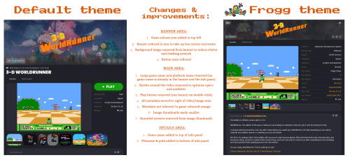
This is a rework of the default theme, as there were a number of things I wanted to change. See the second screenshot for a list of the changes made. Most of the changes were to the game details pane. I also removed the rounded edges from the boxes in the main grid view. The platform tree is the same.
Overall I wanted to maximise the use of available screen area and show as much metadata as possible, minimising the necessity to scroll. Some scrolling is still required to view the retroachievements and related games, but for general game browsing often no scrolling is required to see the banner, images, metadata and notes. The very latest default them has returned to having the related game in a separate tab; I might update this theme at some point to incorporate that (now done with version 2 of this theme).
I have an ultrawide monitor and this theme makes good use of the extra screen real estate. If your monitor isn't quite as wide you can resize the game details pane to your satisfaction. Also, I have a separate marquee screen on which the banner is displayed. That's why I kept the scratched arcade marquee aesthetic with the clear logo in the game details pane. It probably fits the theme better than the marquee anyway.
A few things I'd like to change with updated versions (any help with these would be appreciated):
- the height of the image preview area; videos fill the space well, though for the images it only uses around 80% of the available height. It looks OK but it's something I want to improve
- I'd like to have Retroachievements in a separate tab, like "related games" has; same for MAME high scores
Edit: Please update to the latest version (2.2) - some dependencies might have been missing in the previous versions
Edited by Retrofrogg
What's New in Version 2.2 See changelog
Released
Version 2.2 is a maintenance release; I just repackaged the files in the zip.

