Mister Slimm
-
Posts
7 -
Joined
-
Last visited
Mister Slimm's Achievements
")
4-Bit Adder (2/7)
1
Reputation
-
 Wonderful to see another LaunchBox theme and this is a great-looking and practical one. Superb. Request: I would like the search box to become focused when you press the Search button (is there a keyboard shortcut for Search, I never found one).
 -
 Mister Slimm changed their profile photo
 -
I am not the original author of this very slick LaunchBox custom theme so I hope that they are okay with this. I have added Badges to the main view, and the Badges menu to the menu bar. LBPlex.zip
-
Ah! This is what happens when I try to remember all the steps I went through. We also have to add the following entry to the UserControl.Resources element: <windows:ImageToSourceConverter x:Key="ImageToSourceConverter" x:Name="ImageToSourceConverter"/> I will set up a new post with an updated LBPlex.
-
Right, yeah, I had that, too! You have to add this line to the UserControl element at the top of the file (I added it after the xmlns:controls line): xmlns:windows="clr-namespace:Unbroken.LaunchBox.Windows;assembly=Unbroken.LaunchBox.Windows" I do not remember if I had to do anything else.
-
<ListView ItemsSource="{Binding Badges}" Background="Transparent" BorderThickness="0" VerticalAlignment="Top" HorizontalAlignment="Right" Margin="-21,2,-21,0" Visibility="{Binding BoxVisibility}"> <ListView.ItemTemplate> <DataTemplate> <Image x:Name="BadgeImage" Source="{Binding Path=Icon, Converter={StaticResource ImageToSourceConverter}}" Width="20" Margin="0,0,0,5" RenderOptions.BitmapScalingMode="HighQuality" ToolTip="{Binding Name}" /> </DataTemplate> </ListView.ItemTemplate> <ListView.ItemContainerStyle> <Style TargetType="ListViewItem"> <Setter Property="SnapsToDevicePixels" Value="True" /> <Setter Property="Margin" Value="0" /> <Setter Property="Padding" Value="0" /> <Setter Property="Background" Value="Transparent" /> <Setter Property="BorderThickness" Value="0" /> <Setter Property="FocusVisualStyle" Value="{x:Null}" /> <Setter Property="Background" Value="Transparent" /> <Setter Property="Template"> <Setter.Value> <ControlTemplate TargetType="{x:Type ListViewItem}"> <ContentPresenter x:Name="ContentPresenter" HorizontalAlignment="Stretch" VerticalAlignment="Top" SnapsToDevicePixels="{TemplateBinding SnapsToDevicePixels}" /> </ControlTemplate> </Setter.Value> </Setter> </Style> </ListView.ItemContainerStyle> </ListView> So I copied this section from the Default/BoxesContentView.xaml and pasted it into the BoxesContentView.xaml for the new theme in the same place. For NoshOnThisTwice LB, it went at the end of this element just before the closing /Grid tag: <ListView.ItemTemplate> <DataTemplate> <Grid Margin="{Binding Margin}">
-
I am not the original author of this lovely LaunchBox custom theme so I hope that they are okay with this. I have added Badges to the main view, and RetroAchievements score and Badges menu to the menu bar. I also fixed the Play/Edit/Configure/Delete buttons so that the text displayed correctly for me. I hope it works for you, too. NoshOnThisTwiceLB.zip
-
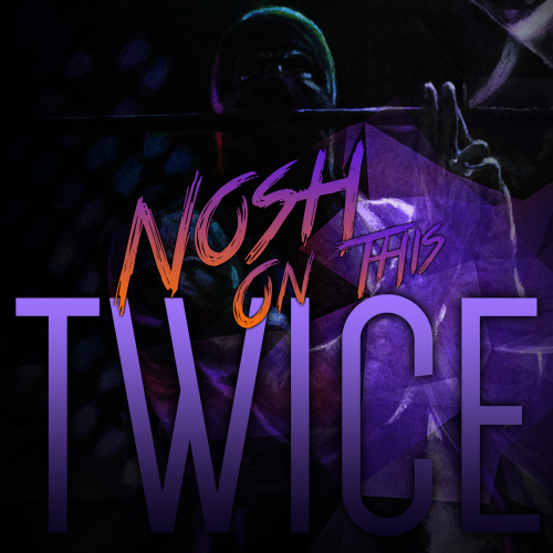 Please find attached a version of this excellent theme with Badges and RetroAchievements and Badges menus. Love this theme! NoshOnThisTwiceLB.zip

