-
Posts
57 -
Joined
-
Last visited
Recent Profile Visitors
The recent visitors block is disabled and is not being shown to other users.
NightShadowPT's Achievements

16-Bit Artificial Intelligence (4/7)
7
Reputation
-
Well, it is fixed now. Finally Nvidia addressed the sharing problems...
-
Unfortunately no... still having the same problem :(
-
Hi! I seem to be facing the same problem… network storage not showing on Launchbox (but correctly mapped and working on the Shield) im on version 1.0 of Launchbox and version 9.0.1(33.1.0.283) of the Nídia Shield. Any ideas?
-

Retro Faeran's Theme Stream - Big Box Theme Creation
NightShadowPT replied to faeran's topic in Custom Theme Tutorials
Damn... this theme looks positively beautiful. Looks like a current/next gen console GUI. Is it already available for download? -

Startup Theme... help a noob
NightShadowPT replied to NightShadowPT's topic in Custom Theme Tutorials
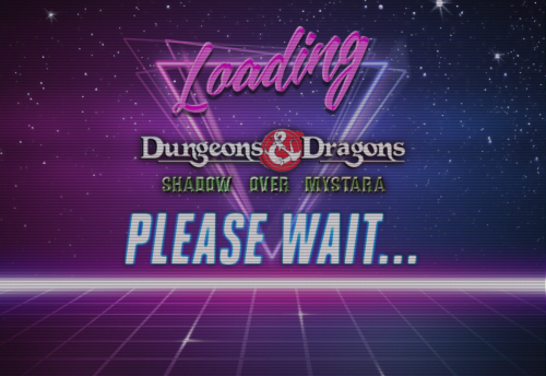
Hi, Coming back to this thread after some time to show you the final Result. Thanks for the help! This is the Code I used: <UserControl xmlns="http://schemas.microsoft.com/winfx/2006/xaml/presentation" xmlns:x="http://schemas.microsoft.com/winfx/2006/xaml" xmlns:mc="http://schemas.openxmlformats.org/markup-compatibility/2006" xmlns:d="http://schemas.microsoft.com/expression/blend/2008" mc:Ignorable="d" d:DesignHeight="562" d:DesignWidth="1000" HorizontalAlignment="Stretch" VerticalAlignment="Stretch" FocusVisualStyle="{x:Null}" BorderThickness="0" Margin="0" Padding="0" Background="#000"> <Canvas Name="Canvas"> <Grid Height="{Binding ElementName=Canvas, Path=ActualHeight}" Width="{Binding ElementName=Canvas, Path=ActualWidth}"> <Grid.Background> <SolidColorBrush Color="Black" /> </Grid.Background> <Grid.RowDefinitions> <RowDefinition Height="3.3*" /> <RowDefinition Height="2*" /> <RowDefinition Height="4.7*" /> </Grid.RowDefinitions> <Grid.ColumnDefinitions> <ColumnDefinition Width="1.5*" /> <ColumnDefinition Width="7*" /> <ColumnDefinition Width="1.5*" /> </Grid.ColumnDefinitions> <Image Grid.Row="0" Grid.RowSpan="3" Grid.Column="0" Grid.ColumnSpan="3" Source="LAUNCHBOX_ROOT_FOLDER/StartupThemes/NightShadow/Images/Loading.jpg" RenderOptions.BitmapScalingMode="HighQuality" /> <Image Grid.Row="1" Grid.Column="1" Source="{Binding SelectedGame.ClearLogoImagePath}" VerticalAlignment="Center" HorizontalAlignment="Center" Stretch="Uniform" RenderOptions.BitmapScalingMode="HighQuality" Margin="15"> <Image.Effect> <DropShadowEffect BlurRadius="45" Direction="-90" RenderingBias="Quality" ShadowDepth="1" /> </Image.Effect> </Image> <Image Grid.Row="0" Grid.RowSpan="3" Grid.Column="0" Grid.ColumnSpan="3" Source="LAUNCHBOX_ROOT_FOLDER/StartupThemes/NightShadow/Images/Scanline.png" RenderOptions.BitmapScalingMode="HighQuality" /> </Grid> </Canvas> </UserControl> This is the Loading Screen: -

Startup Theme... help a noob
NightShadowPT replied to NightShadowPT's topic in Custom Theme Tutorials
Thanks for the help, I'll try this out when I arrive home later today. I do have a question through, are the numbers in the Height and Width definitions a percentage of the total screen size? Thanks -

Startup Theme... help a noob
NightShadowPT replied to NightShadowPT's topic in Custom Theme Tutorials
Hi, Doing some experimentation... unfortunately, if I mess something on the file, my mouse pointer disappears and I need to reboot the PC, so progress is slow. This is how it's looking like at the moment. A few things I'd like to do and would like some help: - For the first image (Loading.jpg), how can I use either: a) it's exact pixel size b)stretch it to the screen size? - For the second image (the clear logo), how can I center the image and limit it's size? <Canvas Name="Canvas"> <Image Source="pack://siteoforigin:,,,/StartupThemes/Big Logo/Loading.jpg" Stretch="UniformToFill" RenderOptions.BitmapScalingMode="HighQuality" Height="{Binding ElementName=Canvas, Path=ActualHeight}" Width="{Binding ElementName=Canvas, Path=ActualWidth}" /> <Image Source="{Binding SelectedGame.ClearLogoImagePath}" VerticalAlignment="Center" HorizontalAlignment="Center" Stretch="Uniform" RenderOptions.BitmapScalingMode="HighQuality" Margin="15,15,15,15"> <Image.Effect> <DropShadowEffect BlurRadius="45" Direction="-90" RenderingBias="Quality" ShadowDepth="1" /> </Image.Effect> </Image> <Image Source="pack://siteoforigin:,,,/StartupThemes/Big Logo/scanlines.png" Stretch="UniformToFill" RenderOptions.BitmapScalingMode="HighQuality" Height="{Binding ElementName=Canvas, Path=ActualHeight}" Width="{Binding ElementName=Canvas, Path=ActualWidth}" /> </Canvas> Thanks in advance for any help. Cheers, -
Hi! I'm looking to create a Startup theme (for when you launch a game) and a Game Over theme, but I'm not sure where to start. I'd like to start by something simple like: 1x Image with a Black Background (black.JPG) 1x ClearLogo of the game being launched centered in the page 1x Scanline effect JPG to overlay on top of the previous 2 (scanlines.jpg) This sounds like easy to implement, but I've been fighting with the XAML file and havent been able to do it until now. Any pointers? Thanks in advance
-
Ok, on every Theme folder, you have a file called GameMarqueeView.xaml You need to edit that file for the Theme you're using (e.g.: C:\Launchbox\Themes\Default\GameMarqueeView.xaml) and force the Height and Width, alongside using "Stretch" on both the Vertical and Horizontal Alignment. Here is the content of my file, for the theme "City Hunter 2": <UserControl xmlns="http://schemas.microsoft.com/winfx/2006/xaml/presentation" xmlns:x="http://schemas.microsoft.com/winfx/2006/xaml" xmlns:mc="http://schemas.openxmlformats.org/markup-compatibility/2006" xmlns:d="http://schemas.microsoft.com/expression/blend/2008" xmlns:transitions="clr-namespace:Unbroken.LaunchBox.Wpf.Transitions;assembly=Unbroken.LaunchBox.Wpf" xmlns:i="http://schemas.microsoft.com/expression/2010/interactivity" xmlns:cal="http://www.caliburnproject.org" mc:Ignorable="d" d:DesignHeight="900" d:DesignWidth="1600" HorizontalAlignment="Stretch" VerticalAlignment="Center" Style="{DynamicResource UserControlStyle}"> <UserControl.Resources> <Style x:Key="UserControlStyle" TargetType="UserControl"> <Setter Property="FocusVisualStyle" Value="{x:Null}" /> <Setter Property="BorderThickness" Value="0" /> <Setter Property="Margin" Value="0" /> <Setter Property="Padding" Value="0" /> <Setter Property="Background" Value="Black" /> </Style> </UserControl.Resources> <Grid VerticalAlignment="Stretch" HorizontalAlignment="Stretch"> <Image Source="pack://siteoforigin:,,,/Themes/_Realistic Marquee FX/Realistic Marquee FX Subtle Only Plexi.png" RenderOptions.BitmapScalingMode="HighQuality" Stretch="Fill" Panel.ZIndex="99" HorizontalAlignment="Center" VerticalAlignment="Center"/> <Image Source="{Binding Path=SelectedGame.MarqueeImagePath}" Panel.ZIndex="1" Stretch="Fill" HorizontalAlignment="Center" VerticalAlignment="Center" RenderOptions.BitmapScalingMode="HighQuality"><Image.Effect><DropShadowEffect BlurRadius="99" /></Image.Effect></Image> <Image Source="{Binding Path=SelectedGame.MarqueeImagePath}" Panel.ZIndex="0" Stretch="Fill" Opacity="0.5" RenderOptions.BitmapScalingMode="LowQuality"><Image.Effect><BlurEffect Radius="99"/></Image.Effect></Image> </Grid> </UserControl> Hope it helps
-

How can I make the videos always show gameplay?
NightShadowPT replied to NightShadowPT's topic in Game Media
Thanks, that fixed it. Was this setting changed during the last update? I am 100% sure that I did not change this... -
Hi, I must have done something wrong (and can't find my way back) because all my games are now displaying those "fancy transitions videos" instead of the gameplay videos I always had. Can someone point me in the right direction to fix this? Thanks
-
Have you tried the MS-DOS version of LaunchBox?
-

Strange behavior downloading Media from Emumovies (?)
NightShadowPT replied to NightShadowPT's topic in Noobs
Yeah, that makes sense. Thanks. -
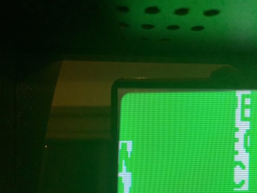
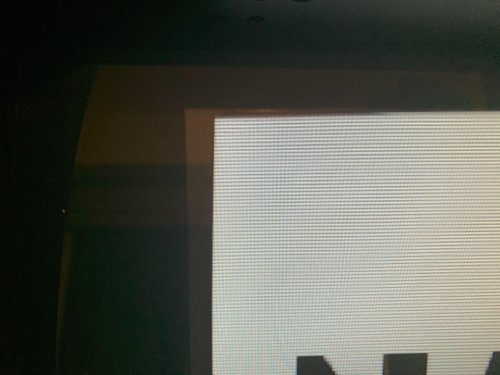
Hi, This one may be a bit tricky to explain, but I'll do my best. Here is the setup: Arcade Cabinet witha 19" LCD Monitor, using HLSL to simulate a CRT Emulator: MAME 0.220 Emulated System: Neo Geo MVS The problem (besides my OCD :)): Some Neo Geo games seem to be slightly cropped (?) on the sides while others seem to use the whole screen. The problem is that the ones that are slightly cropped, ruin the "3D" illusion of having a CRT because some of the HLSL effects are not applied to the sides of the image (only to the top and bottom). To illustrate the problem, I am attaching two pictures. The first one was taken while the NeoGeo was booting up, occupying the whole screen. Note the top-left corner. It is rounded and the line on the side has a fading to black effect. The second one, was taken after the game loaded. If you look at the top left, the corner is no longer rounded (because the side is cropped) and because of that, the line does not get the fading to black effect. I know I cannot play with the screen adjustments in MAME because that would move the whole screen, not just the "emulated image" inside. Is there any solution/option I can use to remediate this and extend the emulated image to the whole screen? Apologies if I'm not making much sense, but any help will be much appreciated. Happy to answer any questions. Thanks in advance.
-
Check your mame.ini file and play with it a bit. (remember to backup the original file in case you mess up the configuration)


