-
Posts
81 -
Joined
-
Last visited
-
Days Won
11
Content Type
Profiles
Forums
Articles
Downloads
Gallery
Blogs
Everything posted by Arcanthur
-
Updated video in the first post to reflect latest changes. Added a subtle blurred video effect behind the metadata. I attempted to use the selected video (which works in the Community Theme Creator), but it appears BigBox doesn't like 2 of the same video being played at the same time. Had to use random gameplay video. Maybe it's a bug in BigBox, but I'm not sure. I tried playing with z-order / and visibility conditions, but nothing would allow 2 of the same video to be played.
-

Can we create "buttons" for custom navigation?
Arcanthur replied to Arcanthur's topic in Big Box Custom Themes
I was afraid that would be the case. Unfortunately that kind of thing is beyond my scope, so unless somebody wants to partner up and help make my theme a bit more unique / feature rich, then I'll just be doing a more basic version. -
Thanks! Yeah I definitely plan on doing some sort of vertical list view. After I consider this viewtype feature complete I'll move on to the others.
-
Yep, eventually I'll work on those too. I thought about it but I'm not quite sold on the idea, though I might offer the option to use either.
-
Thanks! Just updated first post with the latest changes. New metadata labels, and scrolling details text.
-
Is there any way we can create buttons, or links to open specific portions of a theme? Such as press up or down to highlight a button to open the settings menu, or go directly to the platform list? Sorry if it's been addressed before, as I was trying to find a theming Wiki to see if there was something to reference but I couldn't find anything.
-
Thanks, updated the first post with a video of where I am now.
-
Made the background a bit darker and tweaked some colors, and updated the header design. I'd like to incorporate some form of tabbed interface if possible. Preferably the tabs would be selectable, but if not, just a simple breadcrumb would be ok.
-
If the "A" is just a text label, could we potentially call what the user has set for that input and display it?
-
Yeah, I may incorporate some more iconography for the headings. The problem with making the text smaller is readability from a distance. Small text is fine on a computer monitor but when playing 6-10ft away it's not very legible, at least not for my old eyes. BTW, I do appreciate the criticism. Hopefully I don't come off as dismissive to your critiques.
-
Thanks, kind of what I was intending when I titled it "minimal".
-
Cool, I'll play around with a few ideas, though I suppose I should have not used the word "minimal". I changed the title to minimal-ish, as I don't want the theme to be just a blank screen with icons.
-
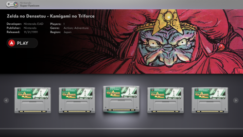
That leaves two options, remove the synopsis or the other metadata. Here's what each would look like: Alternatively, I could create a separate view with just carts and a title. No fanart.
-
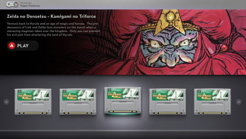
Hey guys, I've started development on my new theme Shade. After several mockup iterations, learning how to use CTC, and having to start over completely, the theme is starting to take shape and I'm starting to develop a cohesive style that I can use for other view types. Eventually I plan to complete my cart packs for at least a few systems to use with the horizontal viewtype. In the meantime, I've made it so that any cart image should go nicely with the layout. Theme is WIP. *UPDATE* Redesigned the Horizontal Cart View to reflect the design of the list view. Both views are almost complete now. BigBox8.mp4 BigBox10.mp4 BigBox11.mp4
-
-
That's understandable, I know they won't be for everybody. I am trying to be cognizant of the angle though, and to make the transition as subtle as I can while still showing the bottom. For instance, I just edited the Super Famicom cart design to better reflect those ideas. I angled the side ridges slightly so the transition to the bottom wouldn't be as stark.
-
-
Thanks! I don't typically use cart artwork either, but I feel like part of that is lack of consistency. The carts that I've scraped are generally scans, and while some of them are high quality, the minor differences in color grading from cart to cart, and items not lining up 100% give it kind of chaotic appearance when looking at a large collection. That's why I wanted to create something really detailed and unique, but most importantly consistency when scrolling though carts in each system.
-
I'm aware that the angle doesn't represent what would be possible in physical reality. However, this is a stylistic choice that I made so that the cart front wouldn't be skewed. I understand that it may not be for everyone, and I respect that opinion. One could perceivably just cut the bottoms off and be left with a standard front facing cart. I'm totally fine if someone wants to do that after the fact, but I plan to proceed with this style. I do appreciate the criticism though.
-
-
-
-
-
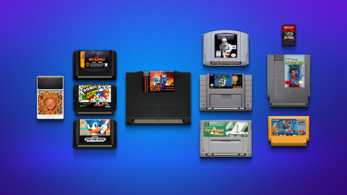
I've started working on cartridge front artwork for multiple systems. But I need help adding the label artwork for each game and naming each file appropriately. Much like the bezel project, this is a massive undertaking, and I'd rather spend my time creating the cart art so I can get more systems done, while the labels are done for each game. I can create easy to use PSD templates if anyone is interested in helping with this project. Let me know if you'd be interested in helping out and I will set you up with a google drive link with psd's and we can create some fresh, high quality art. Here are the systems I've done so far:




.thumb.png.616b3b58344fb522053235af3756fe77.png)

.thumb.png.c2c3ea3e73ad598b658903edd34bba67.png)
.thumb.png.71b6e8e1efee9a13b61c19bbb2a35c54.png)
.thumb.png.bd251e6d7f140037a99827c72f346b3b.png)
.thumb.png.b43cba1e715e0dae2ad2811054b3b7d6.png)
.thumb.png.15475413a9a3cd680f97129e89238600.png)
.thumb.png.3c57d171c1ea45fab3320e40fbbddee0.png)

.thumb.png.41a3a9f23e0935356b8a9e6d414a7375.png)
.thumb.png.951e12c884ed0a77c2ba9e39e66cef67.png)
.thumb.png.0e49988161574f664e048dd8010b8651.png)

.thumb.png.b55f85874d7eb340a0d4bb9d02b15fe9.png)
