Jump to content
LaunchBox Community Forums

Eclipse 0.0.018

   (6 reviews)

6 Screenshots

About This File

 Eclipse

Eclipse for BigBox is a different kind of theme.  Rather than using the normal theme engine, it uses a plug-in to build the user interface from the ground up.  The goal for this plug-in is to provide: 

  • Netflix style user interface with multiple lists of games on the screen at one time
  • Voice search
  • Random game function


Platform list view

Eclipse - Platform List.png


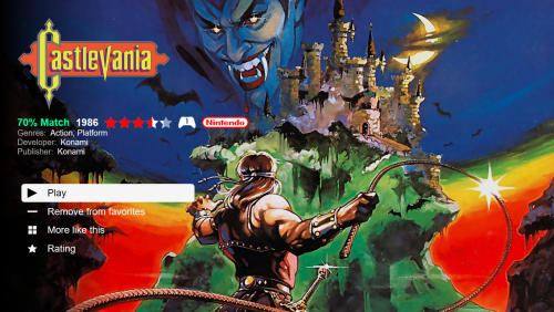
Game detail view

Eclipse - Game Details.png


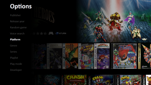
Options for categorizing games

Eclipse - Options.png


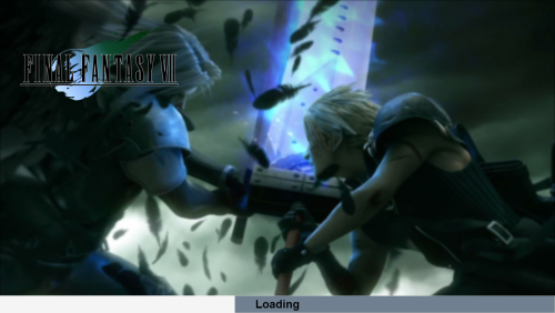
Startup theme

Eclipse - Startup Theme.png


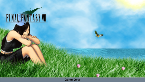
Shutdown theme

Eclipse - Exit Theme.png


Attract mode (screen saver)

image.png


Demo


Installation Instructions
1. Download: https://forums.launchbox-app.com/files/file/3220-eclipse/
2. Extract the contents to a folder
3. Inside the Eclipse folder is a folder called LaunchBox
4. Copy the Plugins, StartupThemes, and Themes folders
5. Go to your Launch Box installation folder and paste the copied folders
6. Open Big Box
7. Esc to get to options
8. Select Options > Views
9. Set Theme to Eclipse
10. Set Platforms List View to Platform Wheel 1
11. If you want to use the startup theme, Options > Game Startup
    - Uncheck Show "Loading Game..." Message
    - Check Enable Startup Screen
    - Startup Theme: Eclipse
    - Minimum Startup Screen Display Time: 5 seconds
    - Maximum Startup screen Display Time: 5 seconds
    - Check Hide Mouse Cursor on Startup Screens
12. Go back - the first time the theme starts will take a long load time to generate the image cache
13. NOTE - If you get any errors, you can check the log file called Eclipse.txt in your LaunchBox folder and message me on the forums to let me know

General usage
- Up, Down, Left, Right - moves around
- Enter - selects something
- Escape - cancel or go back - pressing it will get you back to the BigBox settings where you can exit the application
- Page Up - pick a random game
- Page Down - voice search

Bezels
- Bezel images can be displayed around the preview videos
- The system will first look for a game specific bezel. If not found, it will look for a platform specific bezel. If not found, it will look for a default bezel. 
- A few default bezels are provided with the installation. You can delete them from the folders specified below if you prefer the videos without bezels.

Game specific bezels
- The system tries to find a game specific bezel image in the following order:

1. In plug-in media directory:
..\LaunchBox\Plugins\Eclipse\Media\Bezels\{PLATFORM}\{CleanGameTitle}.png

- Here {CleanGameTitle} replaces any invalid characters with an underscore. Characters like ' and : cannot appear in file names so they are replaced with an underscore
- For example: A bezel file for the game "19XX: The War Against Destiny" should have the following path and file name ..\LaunchBox\Plugins\Eclipse\Media\Images\Arcade\Bezel\19XX_ The War Against Destiny.png

MAME bezels
- If a game specific bezel isn't found in the plug-ins media folder as described above, then the program will look into the MAME installation folder. In order for MAME bezels to work, installing the bezel project for MAME would create files with this structure:

..\LaunchBox\Emulators\MAME\artwork{game.ApplicationFilePath}"Bezel.png"

Retroarch bezels
- Bezels installed by the bezel project for retroarch will go into a folder location like this:

..\LaunchBox\Emulators\Retroarch\overlays\GameBezels{RetroarchPlatform}{game.ApplicationFilePath}.png

Platform specific bezels
- These are used if there are no game specific bezels found
- You can specify a different image for horizontally and vertically oriented games so that they fit appropriately
- The platform specific bezel image files must have the following file names and locations:
..\LaunchBox\Plugins\Eclipse\Media\Bezels\{PLATFORM}\Horizontal.png
..\LaunchBox\Plugins\Eclipse\Media\Bezels\{PLATFORM}\Vertical.png

System default bezels
- These are used if there are no game specific or platform specific bezels found
- You can specify a different image for horizontally and vertically oriented games so that they fit appropriately
- The default bezel image files must have the following file name and location:
..\LaunchBox\Plugins\Eclipse\Media\Bezels\Platforms\Default\Horizontal.png
..\LaunchBox\Plugins\Eclipse\Media\Bezels\Platforms\Default\Vertical.png

Looking for feedback

I'm looking for any suggestions that would make this theme better.  What's currently on my list for improvements:

  1. New option to add a game to a playlist from the game detail screen
  2. New option to display game manuals from the game detail screen
  3. Improve image cache logic to better detect differences between LB images and plugin image cache
  4. Use VLC for video playback 
  5. Option to flip box art 
    1. This could be expanded a bit more to 
  6. Show achievements in game details
  7. Improvements to the options side-panel that opens up under the gear (add some icons and make it look a little less "blah")
  8. Several ideas for configuration options
    1. Default category and list to pick when opening 
    2. Minimum number of games required to be included in a category
      1. This would allow you to eliminate lists don't have more than 1 game showing in the series category for example
  9. Improvements to the loading screen to make it prettier
  10. Performance improvements for loading times by doing more work in the background
  11. Overhaul of entire codebase
    1. Support for any resolution or aspect ratio - currently this only works (well) on 16:9 screens
    2. Make game lists more dynamic - the implementation of the lists uses a bunch of static image controls 
    3. Localization

If anyone thinks of anything that could make this theme better, I'd be interested to hear it!

Source Code
If you're interested in the source code, it's (not pretty and it's) available here: 
https://github.com/AtomFry/Eclipse


Edited by Fry
Adding suggestion


What's New in Version 0.0.018   See changelog

Released

Added setting under Other, "Display eclipse options on escape".  Default behavior is when you press escape from the game list, it opens the side pane to let you select which metadata field you want to group lists.  Uncheck this box and pressing escape will bypass this pane and go straight to the BigBox settings.

  • Like 14
  • Thanks 1
  • Game On 2
  • Unusual Gem 7

User Feedback

Recommended Comments


Does anyone know why the videos wont play on the latest version? I have all my videos working in other themes but this one can't see them. Not sure why.

Link to comment
Share on other sites

I believe there is an issue with .webm videos and this theme. Are your videos webm?  MP4 should be working. Let me know and I can take a look. 

Link to comment
Share on other sites

I have 2 PCs one Dell and a Rog Ally on my Dell the videos play, my Rog ally the videos won't play. Both are the same video MP4 files. I am using version 0.0.016 

I used banner box on both and the videos (MP4) play fine, copied the 3 folders to Launchbox as expected and worked on Dell and Rog only thing not working on Rog Ally is Videos not playing. But all the videos are there. Both are running at 1080P so its not an aspect thing. I used VLC for both as well as Windows Media Player) Banner box both ran, yet again on Rog Ally no videos. I even did a new install of Launch box. Rebooted multiple times after changes, just never shows the video.

Link to comment
Share on other sites

That's odd.  This theme builds the UI from scratch and uses a MediaElement which is basically windows media player so I'm surprised that videos are working with Banner Box using windows media player but not with this theme.  I haven't tested this in Windows 11 or on a Rog Ally so I'm not real sure what the issue might be.  Are you running Windows 11 on the Rog Ally?  Since I can't reproduce the issue it's tough for me to diagnose the problem.  I could add some extra logging around the video files that it's trying to play and see if we can figure out what's going on there.  I'm not sure how much troubleshooting you're up for with this theme.  If you're up for trying a one-off version with extra logging and testing it out and sending me the logs then I can throw something together.   

Link to comment
Share on other sites

@oriyen one thing to check on your Rog Ally is the "disable videos" setting.  In LaunchBox, select Tools > Manage eclipse and on the other tab, make sure disable videos is unchecked: 

image.thumb.png.3b3d746aaa75cdae880aef8a24786c62.png

Link to comment
Share on other sites

@Fry Thanks for all your help after messing aroudn with it I accidently over optimized my Rog Ally and blew out the OS and rebuilt and got it working and have testing it a lot. 

I love this theme its amzing. I got the Rog for myself and my kids to play and they use netflix all the time so this has made it easy for them to navigate

One question, not sure its possible. Would it be possible to add "profiles" I use the Custom Fields Name and Value. And was hoping it was possible to have something that grabs that field as a filter ones that have the Name "Profile" value "kid" for example you then only show all games with this. If there is no custom name or value it will will show in the Default profile and perhaps a PIN of some sort, not sure if that requires something from launchbox side.

  • Like 1
Link to comment
Share on other sites

@oriyen glad to hear you got things working!

Regarding profiles, the TLDR is - I'll put it on my list of things to do but it may be a good long while before I get to it.  In case you're interested in the details, here's my thoughts on it.  

I'm a little torn on whether adding this feature is worth the effort, it's probably something that I wouldn't use.  I have a kiddo and what we do is to have a playlist for my kiddo's favorite games and set that to be the 2nd list after the history list.  So when he starts up our arcade, the last game he played is there in the history list and if he wants to play something else, he goes down one list and can see all his favorites.  That has worked well for us so far because my kid cares about less than 100 games so that all fits fine in a single list. 

That being said, my approach just facilitates what he wants to play, and doesn't really protect him from getting into stuff he shouldn't be getting into.  I don't have much content that I worry about.  But I get the idea of wanting to have legit profiles like in Netflix.  If I were to go forward with it, I'll need to: 

  • Create a screen that lets you define an arbitrary list of profiles
  • Create a screen that prompts you for the profile you want to use in BigBox when the plug-in starts up
  • Pin number access - this feature will require me to finish up the on-screen keyboard functionality to let users key in their pin 
  • Some mechanism for filtering games - there are lots of options here but your idea on using custom fields is pretty good.  What I don't love about this approach is that you would have to decorate every single game with a custom field value to allow it to be displayed in a profile.  That can be a lot of work to maintain if you have a lot of games.  So maybe an option in the profile to specify whether the custom field is allowing or restricting the game from a profile.  If you just want to remove a handful of games then you set it to restrict and set that custom field on the handful of games.  If you just want a handful of games included then you set it to allow and set the custom field value on the handful of games.  There are some other alternatives like metadata filters in the profile to specify things like what ratings are allowed in the profile.  Then you could drive the profile access through ratings.
  • Apply filtering on the game lists when loading the plug-in
  • Playlist management - additional feature to associate playlists to profiles

None of these are too bad but all together it's quite a bit for something I probably won't use.  I'll include it on my backlog of things to do and after I finish up adding the on-screen keyboard and bringing in custom fields to display in game details, I will have a few of the building blocks out of the way. 

In the meantime, I always like to mention, the code is posted and anyone is welcome to pull it down and make whatever changes they like.  I would be more than happy to do a code-walk through and provide a little guidance to anyone who is interested in writing some WPF code to achieve stuff like this.  

Edited by Fry
Link to comment
Share on other sites

@oriyen I too have a few kiddos at my household, and have found that there is a (slight) workaround for not having profiles in Launchbox. I utilize flex launcher as a simple gui tool to choose a specific profile for each member of my family. Once the profile has been chosen, I have an AHK script that imports a specific "data" folder into the launchbox root directory that is specific to the user, and then boots Bigbox. Having specific data folders for each person helps because it essentially acts as a profile for each person. This is nice, because the kids have no access to more mature games, and it also lets them have a game list tailored specifically to their tastes.
This is definitely a workaround, and there is some leg work you have to do to get it running.

@Fry Piggybacking off of what most people have said on this thread, this theme is amazing! I have some overall thoughts, and a couple of issues I am running into:

Let me first say that this theme is absolutely something that I have been craving for on my end. I love Launchbox, but have really enjoyed what Playnite has to offer with the ability to easily navigate through different platforms without having to work your way in and out of different platforms.

The way the startup theme works in conjunction with the theme itself is very well done! Overall, this has become my go to theme, and use it daily with my family in the living room.

Now, here is a list of issues I'm encountering, along with a possible suggestion for (hopefully) future implementation :
 

  • The game covers don't have any space between them, and can make the theme feel a bit cramped
    • it would be great to have an option to increase the space between game covers (horizontally)
    • I have generated a slight workaround for this, but it requires more legwork on my end
  • When navigating up on the top menu of the homescreen, you go to a context menu for your currently selected game, that gives you the ability to "play" or go to the game menu.
    • While this is fine, I would much rather just have the ability to scroll up similarly to how I scroll down. Launchbox provides an option to directly play a game from the homescreen, so it doesn't provide much benefit, and I have found myself annoyed with this feature as a whole.
  • I have the "open setting pane on left press" disabled (which i appreciate!) but still see the gear icon on the homescreen on the leftmost side of the games.
    • It would be nice if that icon disappeared when the option was disabled

Thanks again for everything!

  • Like 1
Link to comment
Share on other sites

15 hours ago, bigwhitebuddha said:


  • The game covers don't have any space between them, and can make the theme feel a bit cramped
    • it would be great to have an option to increase the space between game covers (horizontally)
    • I have generated a slight workaround for this, but it requires more legwork on my end
  • When navigating up on the top menu of the homescreen, you go to a context menu for your currently selected game, that gives you the ability to "play" or go to the game menu.
    • While this is fine, I would much rather just have the ability to scroll up similarly to how I scroll down. Launchbox provides an option to directly play a game from the homescreen, so it doesn't provide much benefit, and I have found myself annoyed with this feature as a whole.
  • I have the "open setting pane on left press" disabled (which i appreciate!) but still see the gear icon on the homescreen on the leftmost side of the games.
    • It would be nice if that icon disappeared when the option was disabled

Thanks again for everything!

Hi @bigwhitebuddha, glad you’re liking the theme so far. These are some great suggestions and I think each of them would be relatively easy to implement. I’ve been a little swamped lately so I’m not sure when I’ll have time to get to these but I will slot them ahead of the other items I’ve been working on since I should be able to knock them out quick. One question regarding the first request to add some space between the boxes, I’m curious what resolution are you are running at?  I’ll have to look a bit closer but I think I have a 4 pixel margin hard coded on the game boxes which I believe would be 8 pixels between both box margins. I might be wrong, it’s been a little bit so I can look closer. Either way im just curious, adding a setting to specify how much space you want between boxes should be pretty easy. The other two should be pretty simple as well. 

Link to comment
Share on other sites

@Fry So, I use it both in 1080p and 4k (depending on which TV I am using). Both options still show the boxes to be a bit cramped for my tastes. If possible, I think that's where adding the ability to increase or decrease this amount via the eclipse editor would be great!

Also, I do really like the editor! I like that I have the ability to tweak the theme to my liking.

  • Like 1
Link to comment
Share on other sites

Cool thanks for confirming about your resolution. Adding a setting for space between boxes shouldn’t be too much trouble, it’s just a matter of finding some time for it 

Link to comment
Share on other sites

@Fry Sorry, I've got one more for you 😀:

  • The screensaver (Which is awesome BTW) only activates in the following conditions
    • In the game menu
    • in the context menu on the home screen

It would be nice to have the screensaver activate when on the home screen

Link to comment
Share on other sites

@bigwhitebuddha I was able to put together the first three requests, I'll have to look into the one about the screensaver, didn't get time to look into that yet.

You can toggle off the show options icon to hide the options icon

You can toggle off the display featured game setting to skip the full screen featured game at the top of the list and just have it keep cycling upwards

You can use the margin tab to increase or decrease the space between game images 

image.thumb.png.922bbfbaf37e75e2af0aeded53e39c48.png

image.thumb.png.cba090289c2e85a3c1bea7d94a50b79b.png

image.thumb.png.fdca24a052faabd88c1ab2e363bf9715.png

  • Like 1
  • Thanks 2
Link to comment
Share on other sites

Super minor update, added a setting under Other, "Display eclipse options on escape".  When checked it follows the previous default behavior so that when you press escape from the game list, it opens the side pane to let you select which metadata field you want to group lists.  Uncheck this box and pressing escape will bypass this pane and go straight to the BigBox settings.  I liked the idea of that side pane originally but I generally just display games by platform so I figured I'd get rid of it with an option.

  • Thanks 1
Link to comment
Share on other sites

Glad it’s working for you @bigwhitebuddha. Would you be able to add some clarification on the request around the screen saver?  When you say you’d like the screensaver to display on the Home Screen, could you show a screenshot of which screen you mean or help me with a description of the screen?  It should display after the timer elapses on any screen but there may be a bug that I’m not aware of keeping it from displaying. 

Link to comment
Share on other sites

Hey boss did that search option for people streaming to Shield devices (Can not use voice) set up yet?

I know you are very busy... I asked you a year back... Definitely know it is not an over night thing. 

Link to comment
Share on other sites

1 hour ago, Kinglifer said:

Hey boss did that search option for people streaming to Shield devices (Can not use voice) set up yet?

I know you are very busy... I asked you a year back... Definitely know it is not an over night thing. 

Yeah this is still on my radar.  It's the main feature I've been working on when I've had time to work on this project but time has been super limited.  So far, I've got a new search option that opens an onscreen keyboard and when you input values into the keyboard, it will present a list of matching metadata values as possible filters.  I need to take it further and allow you to select from the filters and have it filter the game list with the selected filters.    

Here's how it's looking at this time.  I'm still working out the layout and how it should all be incorporated into the overall theme.

image.thumb.png.f129b5fc8ba45306917d5e8688cebe43.png

Edited by Fry
  • Like 1
Link to comment
Share on other sites

On 9/4/2023 at 8:59 PM, Fry said:

Yeah this is still on my radar.  It's the main feature I've been working on when I've had time to work on this project but time has been super limited.  So far, I've got a new search option that opens an onscreen keyboard and when you input values into the keyboard, it will present a list of matching metadata values as possible filters.  I need to take it further and allow you to select from the filters and have it filter the game list with the selected filters.    

Here's how it's looking at this time.  I'm still working out the layout and how it should all be incorporated into the overall theme.

image.thumb.png.f129b5fc8ba45306917d5e8688cebe43.png

Listen to me... LOL... LISTEN!


This is like crack cocaine lol... WOOOOAH.... that looks sweet. 

  • Haha 1
Link to comment
Share on other sites

Hey, sorry to make ANOTHER request, and I know you said you don't have much time to work on this, but is there a way I can get the actual name of the game to appear somewhere? Sometimes, with Japanese games for example, I can't tell what the game is called from just looking at the logo or boxart? No worries if not though, I realise this is a pretty niche request!

Link to comment
Share on other sites

Absolutely no worries, don’t hesitate to request changes, I will just add anything to the backlog and then I can get to it when I can get to it. 
 

Regarding adding the game titles for visibility where game logos are not clearly showing you the title, I’ve had the same thought to display the title somewhere. I feel adding the text kind of messes up the aesthetic of the theme. It does display the game title if there is no clear logo for the game so I need to figure Out a good looking design for showing both. This would be simple to add if I can just settle on the visual design. 

Link to comment
Share on other sites

Some ideas about displaying the game title

I could add an option to include the game title somewhere in the main screen, maybe right under the logo and above the details.  If the option is on, it would show the game title for every game and if it's off it wouldn't show the game title. I'm not a huge fan of this because I think adding the game title in the main view would look kind of messy.

I could add a new function to the page up or page down options that lets you hit page up or page down and it would toggle between logo and title as text.  I think a button to toggle between logo and title would be cool but I hate to give up one of the page up/down options. 

I could add an option to include the title on the game details screen.  I think including in the game details isn't too bad since it wouldn't clutter the main interface and it's not too common to have a game you're not sure about, but if you're skipping game details then this wouldn't be ideal. 

I could add a custom field that you could specify on a game by game basis.  If a game has the custom field with a value of true then it would show the title as text instead of the logo.  This could work well if there's only a small handful of games to deal with but at that point it may make more sense to just create a custom logo with legible text.  

Link to comment
Share on other sites

I absolutely love this theme however am finding issues with the voice search it is not working.

The error that is coming up it "The language for the grammar does not match the language for the speech recognizer"

I am in Australia and have my languages set to English Australia

  • Like 1
Link to comment
Share on other sites


Join the conversation

You can post now and register later. If you have an account, sign in now to post with your account.

Guest
Unfortunately, your content contains terms that we do not allow. Please edit your content to remove the highlighted words below.
Add a comment...

×   Pasted as rich text.   Paste as plain text instead

  Only 75 emoji are allowed.

×   Your link has been automatically embedded.   Display as a link instead

×   Your previous content has been restored.   Clear editor

×   You cannot paste images directly. Upload or insert images from URL.

×
×
  • Create New...