About This File
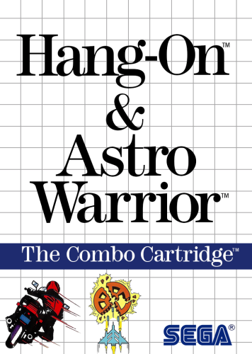
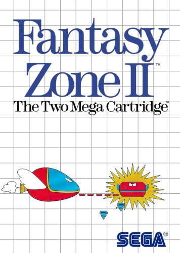
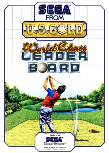
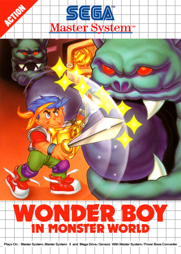
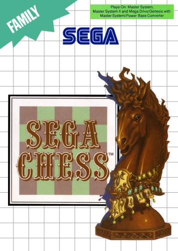
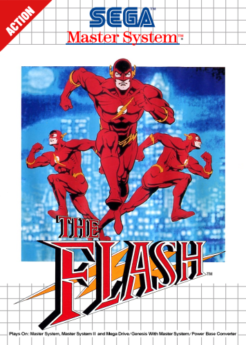
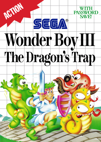
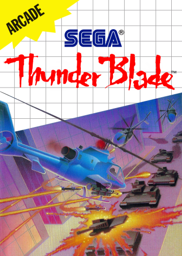
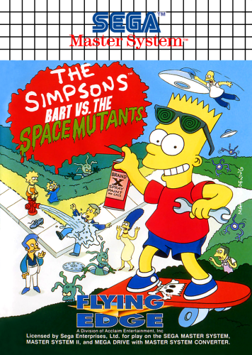
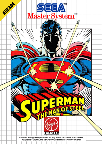
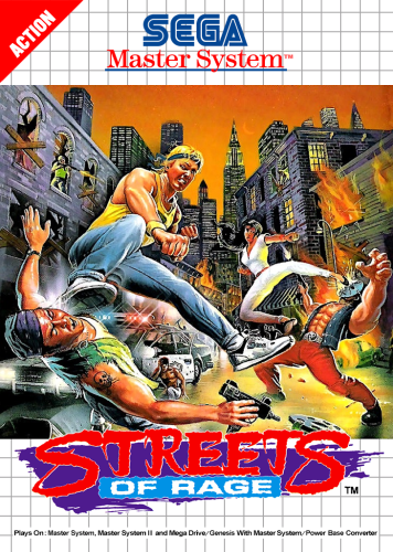
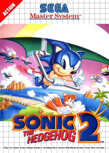
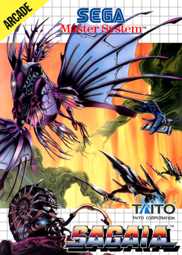
Phew. This was a SET! Sega Master System 2D Box fronts. What a deceptively simple looking set. It wasn't necessarily complicated. Just really, really tedious. Mostly due to the fact of the rampant inconsistency of almost every element. Especially the various title fonts. To quote a member of the smspower.org forums, "Apply excessive, inconsistent kerning to get the authentic look.". It was never just a matter of typing in a game title. Literally every single letter on every single cover had different kerning that needed to be applied to it in order to match the original cover. Literally no two letters had the same kerning. It was outrageous! Sometimes the dot for a lowercase "i" would have it's own kerning independent from the letter. Sometimes the dot would not be included at all. Sometimes there were mixed font sizes within the same word. Sometimes one letter was subscript by .05 for no good reason. Sometimes there was "TM', sometimes there wasn't. Sometimes there was a "TM" with one font for the T, and another for the M. Sometimes there was an ®, sometimes there wasn't. Sometimes the ® had white under, sometimes it was clear. Sometimes the ® was blue, sometimes it was black. Sometimes there was whiteout behind the SEGA logo, sometimes there wasn't. Sometimes there was whiteout only on a certain portion of the S from blue SEGA logo, sometimes there wasn't. etc., etc. You get the idea.
Speaking of, there's several different versions of that blue SEGA logo. Which was a task in and of itself. All the logos I came upon online had a large opening, or "inner triangle" on the letter A. Whereas, the actual SMS boxes have a small inner triangle of white. But it still has to sort of keep the overall angle of that entire line that makes up the left angle and goes down to the foot of the A. Of course, that angle also doesn't follow a straight line.. It ever so slightly diverges off the angle it starts from in order to end up making the upper left part of the inner triangle more inward than it normally would be. Might not be explaining it well enough. But that was a thing!
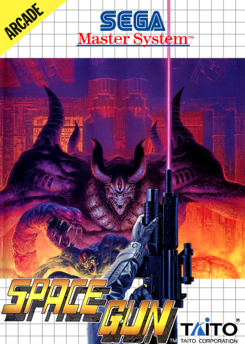
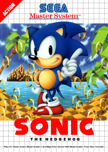
There's also about 12 or so variants of the "Sega Master System" logo found on some boxes. That one was a doozy.
The logo with the "bulb" of the tail of the letter "y" being in-line with the blue line, but not above it, while still having the skinny part of the letter y swoop under the blue line took quite a while. You wouldn't think it, but it isn't just the font typed with special kerning. It is actually two sets of different kernings on that letter. One for the skinny swoop part that goes under, and one for the bulb. But the skinny swoop doesn't go so far under as to leave a gap through which you can see the white background. Oh no way,...it rides that blue line. Which was custom skewing after all the kerning was done. Because it always wanted to show a gap, no matter what I did with the kerning. So I had to rasterize the layer and skew it manually until the bulb part was squished juuuuuust enough to not go over the blue line, and the swoop went under, but not too far! lol. Layered over each other; eraser, clone, 1px brush in red to fill in manually,..etc., etc. And each version had some slight variation. Like the horizontal rule blue line has a gap,.......the blue line is now black! The line is now at the bottom of the bulb of the letter "y". The line is now above it! The red "Master System" type is tall in this one,...but it's short in this one! ok sorry, moving on!
Even the gray grid was inconsistent in nature. I took an example selection from a box front in photoshop, and filled my canvas with that selection to make a nice crisp new grid. Then brought the opacity down to try to match it up to the original grid, and noticed that when one square was exact, a few rows down it wouldn't be. If I matched it exactly to say, the middle row, then it slowly went out of alignment moving out from the equator. So in an effort to add some consistency to a set that was becoming increasingly tedious as I went through it, I just made a grid matching a really nice hi-res scan from one box, and used that throughout the entire set.
Speaking of adding consistency. Due to the nature of the scans available, and how they sometimes were skewed, or didn't resize directly into my canvas perfectly (most did, but not all) I did end up settling on some versions of the box that kept artwork elements in the same spot across different boxes from that same design. That way, I didn't always have to move things by very small increments just to match a scan absolutely perfect. Also, some boxes came with elements way off-center by design. Sometimes it looked fine, but other times I went with logos and such that were closer to center.
Different publishers were also given license to use their own variations of fonts and logos as long as it fit the general theme of the Sega Master System it seems. Such as the "action" triangle having a slightly different font and coverage area on certain games by certain publishers, and Flying Edge using a 100% black grid versus the normal light grey grid. The Strider II box used a different font on the Sega Master System logo, that is only found on one other box front in the entire set. Tecmagik had their own fonts and style, as did Parker Bros., just to name a few examples.
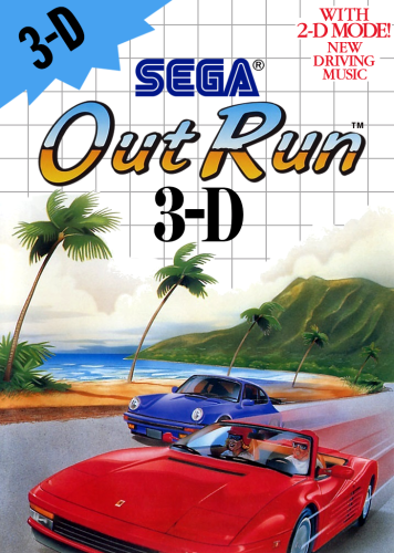
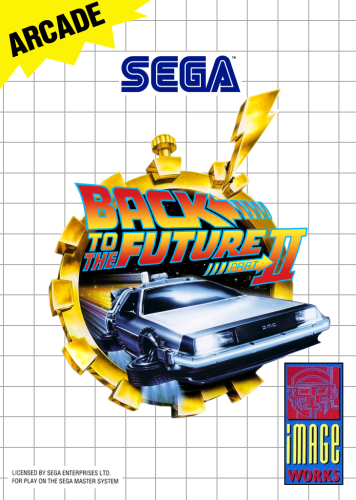
Most of the work/time spent was matching fonts and creating a new fresh set of type, and the pen tool on 1200-1600% zoom in order to cut out all the artwork assets. I tried to match everything I could with clean new examples, however there were times when the scan was high quality, and I didn't feel like spending half an hour matching the individual kerning of each letter on two lines of small font, so I would just cut out the actual artwork from the box and use that since it was so clean. Conversely, there are a few boxes that have some elements that might not be hi-res. I just hit a wall sometimes, and did not want to re-create a small gray square that has some type in it. There also were certain times that I did not feel confident in being able to re-create certain things, so I would just use the full actual scan and call it good. Only had to do this for a handful of boxes out of the entire set. Full artwork boxes were sometimes just used "as-is". The Addams Family and Bart Simpson vs. the World are examples of this. I thought about getting the actual box to scan, but ebay prices dissuaded me lol. Some boxes like Terminator 2 Judgment Day, I was able to use a movie poster and fresh logos for it. For that one specifically, I included a version both with the shotgun, and without. Just for fun. Since Sega had it censored out. Back to the Future II was a composite of a few different elements to get a real clean looking artwork centerpiece. There were a few "one-off" style boxes, like the Master System Classic line, and a few Activision black boxes with silver grid. For the Master System Classic box front I used the full scan from "The Ottifants" as my template, and cut out the part where the artwork is showing through the ripped hole. I also had a little fun and made a version of Outrun that has the ferrari car cut out from the Mark III box.
I've included every single game's PSD file as well. That way if you ever need to make any type of box, it's all there. I didn't make one Master Template, so you'll just have to search through for games that have certain elements you'd want/need to include on a box, and bring those elements over to the new file. For example, if you need to add the green "Plays on Master System" rectangle, take it from a game like Spider Man. And if you need the "Light Phaser Series" pink seal, take it from Gangster town.
For as tedious as it was, this was still a very interesting set, with all of its variations and differences. I wasn't ever really into the Sega Master System as a kid. My friend had one that I played a handful of times. But working through this set, I've somehow grown an appreciation for the way the boxes were designed. So, with all that rambling done, enjoy!
P.S. this webpage helped start me on the correct path in terms of fonts, and What the font was an invaluable tool in helping to find other fonts used on these boxes.
Edited by damageinc86
What's New in Version 1.1 See changelog
Released
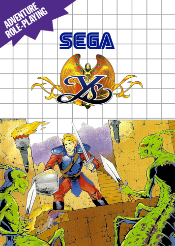
Fixed Ys - Vanished Omens. Add "Ys - Vanished Omens(fixed).zip".

.thumb.png.88b5535d01f612592ba5e7eafa5b4041.png)
.thumb.png.b295eefe114b71e99f11ca6b92548ac4.png)
.thumb.png.e6b75d645243738dc8d25b0d27e460e2.png)
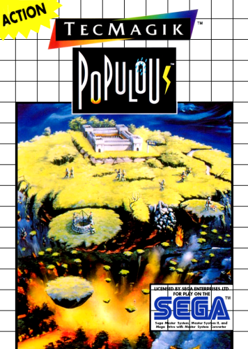
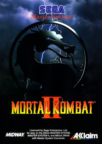
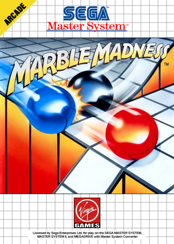
.thumb.png.f36fb003fd6608a925bbe6ecf797433d.png)
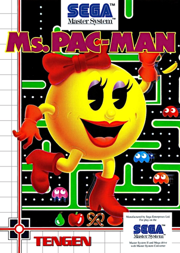
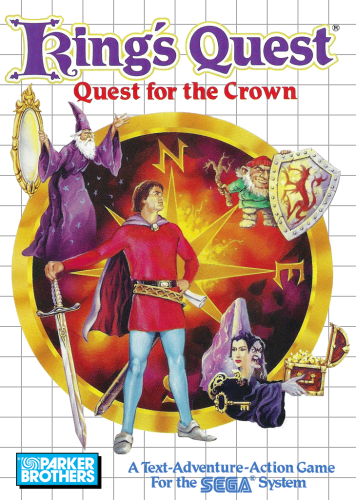
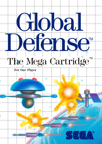
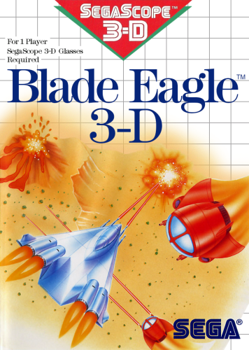

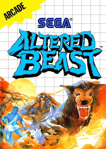
.thumb.png.f28123419d2b9e0f6be0c4fdc078992f.png)
.thumb.png.77ca5d195070c472d448a086dd1c6388.png)
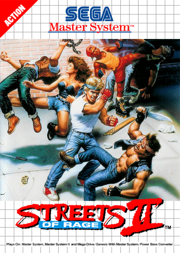
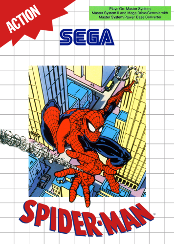
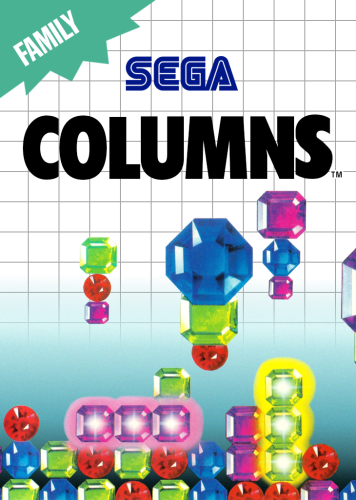
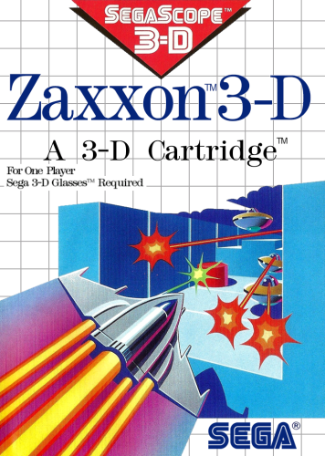
.thumb.png.66527fb553245cfc8e875ee506419283.png)
.thumb.png.2c9b49079d66e258fc19c594fb5872cd.png)
