

damageinc86
-
Posts
1,427 -
Joined
-
Last visited
-
Days Won
2
Content Type
Profiles
Forums
Articles
Downloads
Gallery
Blogs
Files posted by damageinc86
-

Retroarch Vertical Games configs with LB Vertical, Vector, & Horizontal Playlists + vertical.ini & horizontal.ini mame lists.
By damageinc86 in Playlists
Here I have a full set of vertical configs for my mame setup running through retroarch using the MAME 2010 & FBNeo cores. I'm using matsus-4k-bezels retroarch bezel pack, along with the Duimon-Bezel-Project linked there, that uses the amazing reflection shaders with a bezel as a background image. I went through and manually rotated the screen in retroarch and then saved game overrides for each game that needed to be rotated.
First off, all vertical roms need to be copied over to their own folder. Included is a powershell script (rom_copy.ps1) that will use the vertical.txt from the same folder and copy those files to "roms_vert". You will have to open that script file in a text editor and replace the $sourceFolder, $destinationFolder, and $filenameListPath with your own directory locations. Then that script will look for "vertical.txt" in the directory specified, I chose to already put it in a "roms_vert" folder, and copy over the files that match that list, into the "roms_vert" folder. That will leave those same files in your initial roms directory, as I did not want to delete them initially because I didn't know how things were going to go. But i provided another script that should go back and delete those original copies if needed.
So in LB I bulk changed rom path to the "roms_vert" directory, and then in I loaded the MAME 2010 core in retroarch, launched a vertical game from that directory, set Video->Output->Video Rotation to 270 deg, then saved that as a Content Directory Override. That took care of a vast majority of the rotation needs of the games. So the remaining games either needed to be set to 90 deg, or 180 deg, and saved as a Game Override. So, in theory, once you do that process, launching from your "roms_vert" folder, and set the Content Directory override, all the other per-game configs that are in the MAME 2010 config folder i provided, should fill in the gaps of all the games that aren't the base 270 deg Content Directory Override.
I also used the FBNeo core for 102 games out of my setup. I copied those over into the MAME 2010 configs as well, in case people didn't need to use FBNeo for anything, like I had to. Those I manually edited per-game to add the "Use Custom Command-line Parameters" area of the Edit->Edit Metadata/Media->Emulation window. Found the correct format to launch a different core somewhere on the forums (thank you to whoever posted that). It is "-fullscreen -L "cores\fbneo_libretro.dll" for my application. Just F.Y.I.
I think that should cover it. Hopefully it can help someone who is working on their Arcade setup using Retroarch.
71 downloads
(0 reviews)0 comments
Submitted
-
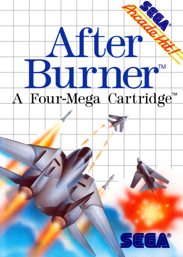
Sega Master System 2D Box Front Set
By damageinc86 in Sega Master System
Phew. This was a SET! Sega Master System 2D Box fronts. What a deceptively simple looking set. It wasn't necessarily complicated. Just really, really tedious. Mostly due to the fact of the rampant inconsistency of almost every element. Especially the various title fonts. To quote a member of the smspower.org forums, "Apply excessive, inconsistent kerning to get the authentic look.". It was never just a matter of typing in a game title. Literally every single letter on every single cover had different kerning that needed to be applied to it in order to match the original cover. Literally no two letters had the same kerning. It was outrageous! Sometimes the dot for a lowercase "i" would have it's own kerning independent from the letter. Sometimes the dot would not be included at all. Sometimes there were mixed font sizes within the same word. Sometimes one letter was subscript by .05 for no good reason. Sometimes there was "TM', sometimes there wasn't. Sometimes there was a "TM" with one font for the T, and another for the M. Sometimes there was an ®, sometimes there wasn't. Sometimes the ® had white under, sometimes it was clear. Sometimes the ® was blue, sometimes it was black. Sometimes there was whiteout behind the SEGA logo, sometimes there wasn't. Sometimes there was whiteout only on a certain portion of the S from blue SEGA logo, sometimes there wasn't. etc., etc. You get the idea.
Speaking of, there's several different versions of that blue SEGA logo. Which was a task in and of itself. All the logos I came upon online had a large opening, or "inner triangle" on the letter A. Whereas, the actual SMS boxes have a small inner triangle of white. But it still has to sort of keep the overall angle of that entire line that makes up the left angle and goes down to the foot of the A. Of course, that angle also doesn't follow a straight line.. It ever so slightly diverges off the angle it starts from in order to end up making the upper left part of the inner triangle more inward than it normally would be. Might not be explaining it well enough. But that was a thing!
There's also about 12 or so variants of the "Sega Master System" logo found on some boxes. That one was a doozy.
The logo with the "bulb" of the tail of the letter "y" being in-line with the blue line, but not above it, while still having the skinny part of the letter y swoop under the blue line took quite a while. You wouldn't think it, but it isn't just the font typed with special kerning. It is actually two sets of different kernings on that letter. One for the skinny swoop part that goes under, and one for the bulb. But the skinny swoop doesn't go so far under as to leave a gap through which you can see the white background. Oh no way,...it rides that blue line. Which was custom skewing after all the kerning was done. Because it always wanted to show a gap, no matter what I did with the kerning. So I had to rasterize the layer and skew it manually until the bulb part was squished juuuuuust enough to not go over the blue line, and the swoop went under, but not too far! lol. Layered over each other; eraser, clone, 1px brush in red to fill in manually,..etc., etc. And each version had some slight variation. Like the horizontal rule blue line has a gap,.......the blue line is now black! The line is now at the bottom of the bulb of the letter "y". The line is now above it! The red "Master System" type is tall in this one,...but it's short in this one! ok sorry, moving on!
Even the gray grid was inconsistent in nature. I took an example selection from a box front in photoshop, and filled my canvas with that selection to make a nice crisp new grid. Then brought the opacity down to try to match it up to the original grid, and noticed that when one square was exact, a few rows down it wouldn't be. If I matched it exactly to say, the middle row, then it slowly went out of alignment moving out from the equator. So in an effort to add some consistency to a set that was becoming increasingly tedious as I went through it, I just made a grid matching a really nice hi-res scan from one box, and used that throughout the entire set.
Speaking of adding consistency. Due to the nature of the scans available, and how they sometimes were skewed, or didn't resize directly into my canvas perfectly (most did, but not all) I did end up settling on some versions of the box that kept artwork elements in the same spot across different boxes from that same design. That way, I didn't always have to move things by very small increments just to match a scan absolutely perfect. Also, some boxes came with elements way off-center by design. Sometimes it looked fine, but other times I went with logos and such that were closer to center.
Different publishers were also given license to use their own variations of fonts and logos as long as it fit the general theme of the Sega Master System it seems. Such as the "action" triangle having a slightly different font and coverage area on certain games by certain publishers, and Flying Edge using a 100% black grid versus the normal light grey grid. The Strider II box used a different font on the Sega Master System logo, that is only found on one other box front in the entire set. Tecmagik had their own fonts and style, as did Parker Bros., just to name a few examples.
Most of the work/time spent was matching fonts and creating a new fresh set of type, and the pen tool on 1200-1600% zoom in order to cut out all the artwork assets. I tried to match everything I could with clean new examples, however there were times when the scan was high quality, and I didn't feel like spending half an hour matching the individual kerning of each letter on two lines of small font, so I would just cut out the actual artwork from the box and use that since it was so clean. Conversely, there are a few boxes that have some elements that might not be hi-res. I just hit a wall sometimes, and did not want to re-create a small gray square that has some type in it. There also were certain times that I did not feel confident in being able to re-create certain things, so I would just use the full actual scan and call it good. Only had to do this for a handful of boxes out of the entire set. Full artwork boxes were sometimes just used "as-is". The Addams Family and Bart Simpson vs. the World are examples of this. I thought about getting the actual box to scan, but ebay prices dissuaded me lol. Some boxes like Terminator 2 Judgment Day, I was able to use a movie poster and fresh logos for it. For that one specifically, I included a version both with the shotgun, and without. Just for fun. Since Sega had it censored out. Back to the Future II was a composite of a few different elements to get a real clean looking artwork centerpiece. There were a few "one-off" style boxes, like the Master System Classic line, and a few Activision black boxes with silver grid. For the Master System Classic box front I used the full scan from "The Ottifants" as my template, and cut out the part where the artwork is showing through the ripped hole. I also had a little fun and made a version of Outrun that has the ferrari car cut out from the Mark III box.
I've included every single game's PSD file as well. That way if you ever need to make any type of box, it's all there. I didn't make one Master Template, so you'll just have to search through for games that have certain elements you'd want/need to include on a box, and bring those elements over to the new file. For example, if you need to add the green "Plays on Master System" rectangle, take it from a game like Spider Man. And if you need the "Light Phaser Series" pink seal, take it from Gangster town.
For as tedious as it was, this was still a very interesting set, with all of its variations and differences. I wasn't ever really into the Sega Master System as a kid. My friend had one that I played a handful of times. But working through this set, I've somehow grown an appreciation for the way the boxes were designed. So, with all that rambling done, enjoy!
P.S. this webpage helped start me on the correct path in terms of fonts, and What the font was an invaluable tool in helping to find other fonts used on these boxes.
577 downloads
- sega master system
- 2d box pack
- (and 1 more)
-
.thumb.png.62b68a32f7d0a822828eb4d6733eca85.png)
Nintendo Game Boy Advance 2D Box Fronts
By damageinc86 in Nintendo Game Boy Advance
Here is my Game Boy Advance 2D front box art set for your enjoyment! I found that the various existing sets of front box art for this system were severly lacking in quality and attention to detail. When I noticed that I was beginning to have to replace more and more box fronts with my own work, I finally decided to just start from scratch and work my way through the entire set one by one to correct errors/poor photoshop work that I had been coming across, as well as attempt to find higher quality source art altogether.
Detail work included:
Hours upon hours zoomed into 400-1200% with clone tool to get rid of dust specks.
Hand-drawing shadows, lines, and artwork elements that were missing, needed re-done, or were part of a damaged area of a scan. Bringing shadow, mid, and highlight levels within spec, and a myriad of other adjustments/edits.
Many images needed extensive compositing from alternate sources such as box art elements from a different system, pieces from different box art regions, movie posters, game advertisements/promo materials, logos from other more high quality sources (but the same as used on GBA box), etc. I did take some artistic liberties if the situation called for it. Mostly with brush work, cloning out scratches, dust specks, digital artifacts, and cropping.
For certain games I included Alternate versions of the box if I ended up finding some. Stuff like Player's Choice versions, "plays on DS" versions, different promo stickers, or holo-stickers, etc.
The different "sidebars" should all be correct as well. Those with the "only for" triangle, and those without. When in doubt, I cross-referenced with an actual box on ebay to figure out which style I should put on the box. There were a few one-off sidebars that were PAL style, but also had the "only for" triangle on it. And I think there was a sidebar that had the "Gameboy Advance" logo off-centered to allow space for the "only for" triangle, but it actually wasn't printed on the box for some reason.
I also bought the following games off ebay and scanned them in myself:
3 Game Pack! - Candy Land + Chutes and Ladders + Original Memory Game
3 Game Pack! - Ker Plunk! + Toss Across + Tip It
American Idol
Backyard Football
Bratz - Rock Angelz
Crouching Tiger Hidden Dragon
Dave Mirra Freestyle BMX 3
Defender
Disney's Kim Possible 3 - Team Possible
Fear Factor Unleashed
Franklin the Turtle
Frogger's Journey - The Forgotten Relic
High Heat Major League Baseball 2002
Hobbit, The - The Prelude to the Lord of the Rings
Hot Potato!
Incredibles, The - Rise of the Underminer
Land Before Time, The
Madden NFL 2004
Mary-Kate and Ashley Sweet 16 - Licensed to Drive
Mission Impossible - Operation Surma
Muppets, The - On with the Show!
Pitfall - The Lost Expedition
Planet Monsters
Shawn Palmer's Pro Snowboarder
SpongeBob SquarePants - Revenger of the Flying Dutchman
Sports Illustrated for Kids - Football
Star Wars - Episode II - Attack of the Clones
Of course, once you get on a roll with things like this and are several hundred in, there is the possibility for errors. Definitely had some episodes of blurry vision from staring at these pixels for too long. I may have done something incorrectly and not realized it. If anything strikes you as needing attention, please feel free to let me know. Template is included in case you need to make your own artwork, or feel like contributing back into this set with higher quality source art.
Template details: Parts from Shenske's template shared on thecoverproject site serve as the PAL Box, and shadow layer. Main GBA silver bar/logo is from a template shared by shonasof on reddit, and the centered logo for boxes without the "only for" triangle was hand cut/extracted from an existing box front found on GameFaqs by myself.
Also totally fine to share and re-post this anywhere.
416 downloads
(1 review)0 comments
Updated
-
Crylen's Bordered Logos + PSD
By damageinc86 in Platform Clear Logos
This is a set of bordered logos from my hyperspin days made by Crylen. It includes what edits I have personally made for my collection so far (platform and playlist logos), and the full PSD that is organized with folders and layers to easily make further edits and add to it.
742 downloads
- bordered clear logos
- clear logo
- (and 1 more)
-
BannerBox Bordered Clear logo Banners
By damageinc86 in Platform Banners
Here are my files that I used to create banners for use with my personal collection since I switched to the Banner Box theme by @faeran They incorporate Crylen's framed clear logos, several different fan art Top images, and a few different System art images. Included is also my community theme creator folder to see how it was all put together, and to edit (just have to point it to your launchbox install instead), along with all associated working images and PSD files used. Also included my Banner Box PSD folder that I used to work on playlists and anything else that needed to be done.
818 downloads
-
cityhunter Optional Edit of City background video (CityHunter Theme)
By damageinc86 in Custom Themes
I wanted a little slower motion video of the city background video that came with the CityHunter theme, so I searched and ended up finding the original video it all came from, called Retrowave
Putting it here so it's in a central location instead of buried within a thread, just in case anyone else wants to give it a try.
201 downloads
- theme
- background video
- (and 1 more)
(0 reviews)0 comments
Submitted


.thumb.png.62b68a32f7d0a822828eb4d6733eca85.png)
