

blattacker
-
Posts
43 -
Joined
-
Last visited
Content Type
Profiles
Forums
Articles
Downloads
Gallery
Blogs
Everything posted by blattacker
-
 I hadn't considered doing this before, but if you could post (either here or in a message) a mockup of how you'd like it to look, I could see if it's something I could do. Alternatively, there's always the Community Theme Creator you could try out. I think it's moved to a paid model with Patreon, but if you're willing to pay a developer, this could be an alternate approach.
 -
Square theme or modifying existing theme aspect ratio to 1:1
blattacker replied to RVZ's topic in Big Box Custom Themes
I don't have a 1:1 aspect ratio to test it on, but my theme Sleipnir was coded to be fully responsive, and should, in theory, resize correctly on a 1:1 aspect screen, if you'd like to give it a try! If it doesn't work, let me know, I can work on getting it to respond correctly! -
Help learning to edit custom theme
blattacker replied to ELDOAMark's topic in Custom Theme Tutorials
For adding the total number of games, you'll just want to add a text element with the binding ActivePlatform.TotalGameCount (or SelectedPlatform.TotalGameCount) in the area you want it in. The different data bindings are listed in the documentation PDF in the themes folder, if you haven't taken a look at it yet. Positioning is a bit harder to explain (especially when my morning caffeine hasn't quite hit my brain just yet), but I'll do my best to explain my process. I will say, you mentioned having a bit of programming experience, if any of that happens to include building responsive front-ends, you'll probably have an easier time understanding, as it works pretty similar to something like CSS grids. You'll essentially have to edit the grid/set up your own. The key element you'll be dealing with (when using the following method) is going to be a Grid element. These are responsive elements that will resize to take up all the space available to them. The grid can further be split up into rows and columns, and this allows elements to be placed in specific locations within the grid, as long as a grid cell exists for it. The columns and rows can be as large or as small as you like, there can be as many of them as you need to create the layout you're going for, and they don't need to be equally sized. I don't know if there's a different way to do this, but I build my layouts essentially with percentages. So, for example, having my columns start at 0%, 25%, 50%, and 75%. As a note, the mentioned percentages are obviously just an example, actual numbers would vary depending on the layout That I've seen, XAML doesn't seem to understand percentages exactly. You basically tell it how many "parts" each column/row takes up. As an example, if you wanted one column to be 25% of the width, another column to be 50%, and the third column to be the remaining 25%, you could say that each column takes up 1 part, 2 parts, and another 1 part respectively The math shakes down so that each Definition is a fraction of the total. So, in the above example, 1 part, 2 parts, 1 part is 4 totals parts, so 1/4 (25%) 2/4 (50%) 1/4 (25%). Because of this you can really use any numbers you want, as long as the ratio is the same. For example, saying 5 parts, 10 parts, 5 parts or 25 parts 50 parts 25 parts would both make the same column widths as 1, 2, 1. If you're ever having a hard time with the math, sometimes I find it's easier to just use the percentage numbers. So in the above case, 25, 50, 25. As long as your numbers always add up to 100, you'll know that the numbers listed are the specific percentages. Once you've got the numbers figured out, you just have to tell the code how many columns/rows you need and how many parts they take up. You'll do this using Grid.ColumnDefinitions and/or Grid.RowDefinitions Example code (using the 25% 50% 25% example above and having 3 equally sized rows) <Grid.ColumnDefinitions> <ColumnDefinition Width="1*" /> <ColumnDefinition Width="2*" /> <ColumnDefinition Width="1*" /> </Grid.ColumnDefinitions> <Grid.RowDefinitions> <RowDefinition Height="1*" /> <RowDefinition Height="1*" /> <RowDefinition Height="1*" /> </Grid.RowDefinitions> In the above example, you'll notice there's an asterisk after the number. This is what tells the code that you want these sizes to be relative. If you're using the percentage number trick listed above, the easiest thing to do is literally just write the percentages and replace the % symbol with an asterisk. Once the grid is set up, you simply need to tell the code which column(s)/row(s) you want your element to live in. You'll do this using "Grid.Column"/"Grid.Row" on your element. Key thing to remember here is that the rows and columns are 0 indexed (so the first column/row is column/row 0, not column/row 1). If you want the item to span multiple columns/rows, you'll need to add the "Grid.ColumnSpan"/"Grid.RowSpan" property to it. Example code for an element that exists inside the above-defined grid, where it should be in the middle column, but span the entire height <TextBlock Grid.Column="1" Grid.Row="0" Grid.RowSpan="3" Text="Some text" /> The last thing to mention is that you can place another Grid object inside of a parent Grid, with specific column/row placing for even more precise placement. Extending the above example, let's change the TextBlock into a Grid object, split that grid up into different rows, and then place some TextBlock elements inside of the child Grid <Grid Name="ParentGrid"> <Grid.ColumnDefinitions> <ColumnDefinition Width="1*" /> <ColumnDefinition Width="2*" /> <ColumnDefinition Width="1*" /> </Grid.ColumnDefinitions> <Grid.RowDefinitions> <RowDefinition Height="1*" /> <RowDefinition Height="1*" /> <RowDefinition Height="1*" /> </Grid.RowDefinitions> <Grid Name="ChildGrid" Grid.Column="1" Grid.Row="0"> <Grid.RowDefinitions> <RowDefinition Height="1*" /> <RowDefinition Height="3*" /> </Grid.RowDefinitions> <TextBlock Name="Header" Grid.Row="0" Text="A Headline" /> <TextBlock Name="Content" Grid.Row="1" Text="Content displayed under the headline" /> </Grid> </Grid> This results in a layout where, in the top row of the center column, there is another grid with 2 rows, one 25% of the height, and the other 75% of the height. Both rows contain a TextBlock element which will appear visually stacked. I hope that was helpful! I think at some point there was a video on the Unbroken Software YouTube that went over this in a much cleaner way, but I'm not able to find it right now, unfortunately. In any case, please let me know if you need anything explained in more depth! -
I will first preface this by saying I'm not sure if this is supported or even possible in Big Box. With that out of the way, I'm trying to build a masonry-style layout for the Wall views in Big Box so that collections with games at different aspect ratios (as a very simple example, North American SNES game cases tending towards landscape and Japanese SNES/SFC games tending towards portrait) can still display nicely without any odd sizing issues. From what I can tell, this is not something that can be accomplished using coverFlow. The spacing between items seems to be an offset, rather than, for example, setting a specific pixel (or relative unit) margin between items. I've tried using other controls to display the games in the view to circumvent this, but as soon as I replace the coverFlow control with something else (for example, an ItemsControl), Big Box seems to lock up. It's not throwing an error, but it's not displaying any games or details, nor does it allow you to navigate or leave the view. I'm not sure if this is due to a missing binding on the replacement control, or if there's something else going on here. If anyone has any ideas or suggestions, or if you know for certain that what I'm trying to do is not possible, please let me know! Alternatively, if I'm missing something incredibly simple, please don't hesitate to call me out on it either!
-
Theoretically, if you use the Community Theme Creator to create or edit a theme (or if you dive into the code of the theme you use, if you're comfortable with that), you could use Item Templates to have Big Box essentially create the item on the fly, ensuring that every item would have one.
-
Progress update: Additional platform-specific views have been added. Now any platform that had a platform specific view in the Default theme has one in Sleipnir. Over time, this may get extended to even more views, it just depends on what kind of progress I make on the full version 2 of the theme. Please keep an eye out for, and keep informing me of, any issues you may notice during use!
-
Mini Consoles Theme - RetroSai Nostalgia - Form over Function
blattacker replied to Saieno's topic in Big Box Custom Themes
Just in case this hasn't been checked yet, every time I've run into an issue where the default theme is loaded instead of the selected theme, but there's no error message, this has been because of the way the folder is extracted, which I think @Saieno might be alluding to with their line of questioning. If you go into the "Mini Consoles Theme" folder, you should not be presented with another folder that says "Mini Consoles Theme". Depending on how you extracted the zip file, the extraction may have produced a folder inside a folder. If this is the case, simply cut and paste the contents of the interior "Mini Consoles Theme" folder into the exterior "Mini Consoles Theme" folder, and remove the now-empty interior one. -
The text file is how I've been working so far, I'm developing the theme on a different computer than my collection is on, so I'm no stranger to that method. It wasn't really a question of not having any reference, it's just a bug related to this initially being a personal project. That being said, the default view is created with DVD aspect ratio in mind (likely why you're seeing the Wii have a correct view). Any system that used DVD cases (or a similar aspect ratio) should just natively work. In any case, hopefully in the next couple weeks I'll be working a little bit less overtime at my day job and can put some more focus on this project. I have some really neat ideas that I'm looking forward to trying to implement.
-
Unfortunately, that is a byproduct of the method I'm using to generate the wall view. I currently only have custom views for the systems I have on my own personal machine, though I do plan on eventually getting them all covered. Systems with variable aspect ratio covers, however, will likely continue to cause issues. I have an idea for a fix for this in the future, but I'm entirely unsure if it will work or how long it will take. Since Dreamcast and PlayStation use similar (or identical) aspect ratios, so you should be able to go into the "Views" folder, into the "WallGamesView" subfolder, and create a copy of the "Sony Playstation" file and rename it "Sega Dreamcast" and that should fix the issue with that particular system. The same process should work for any systems that have the same aspect ratio as another system that is present. The longer platform titles overflowing off the right side of the screen was actually an intentional stylistic choice I made. The default behavior is to shrink the text to fit on the line, but I really like the look of it overflowing to the side. I figured with the image and the clear logo in the top left, the full title wasn't necessary. I can look into making an alternate version with your requested behavior though. Thank you for trying it out! Feedback like this is really important because it gets me seeing issues that I would never have run into on my own (especially considering I was only making this theme for myself, and a friend convinced me to put it online). The performance boost going to a hand-coded (versus the CTC) is wild, isn't it?
-
I have uploaded the version fixing the file references issue (allowing you to rename the folder, if so desired), the file versioning issue (so that the default folder name now more accurately reflects the version number), and the text scaling in the "games available" section of the header. Please let me know if they all work for you, and if you notice any other issues!
-
Alright, couple quick updates for you: I've figured out the relative file reference, I was apparently making it more difficult than it needed to be, so starting with the next update (sometime this week hopefully), renaming the folder shouldn't cause anything to break. I've also found the issue you noticed with the available games count, I thought I had it set up to scale with the content size, but it looks like I may have forgotten that, so that is fixed in the coming version! I've tested it with a collection of over 1000 games just to be sure that it will continue to scale correctly, as well!
-
Hmm...I cannot seem to recreate the issue on my end, even on a separate computer with a fresh install of LaunchBox/Big Box. From that error window, if you navigate to the indicated folder ( S:\Emulation\LaunchBox\Themes\Sleipnir 2.0 WIP\Media\LayoutImages), do you see an image in that folder? And/or is this folder location where LaunchBox and the themes are installed? As far as the naming conventions go, I have been naming them accordingly previously, but this version was named as such because it was never intended to go live. It's been uploaded simply because I don't have time to work on it, but didn't want to leave the slower version up in the meantime. Proper naming conventions will resume once I have free time to work on the theme again. Editing to add: Are you changing the name of the folder after extraction? If so, this will be the cause, as the theme as it's coded right now uses file references at the install level, not the theme/folder level (that will likely be fixed in the future, I was unfamiliar with XAML's syntax and was having trouble referencing the files any other way), so the folder name must match the folder name in the reference (ie the downloaded folder) exactly. If you renamed it to keep a backup of older versions, I can assure you that the current version titled 2.0 WIP is functionally identical to every other version with the same name, other than fixed file references compared to the original versions. Alternatively, if you have changed the folder name and want it to retain that changed name, you can go into every xaml file in the "Views" folder (and subfolders) and do a find and replace, replacing "Sleipnir 2.0 WIP" with whatever your new folder name is.
-
That issue should be fixed now, please download the theme again and let me know if it seems to be working!
-
You are absolutely right, I changed the folder name and forgot to update the references, I'll have that fixed by the end of the day today, my apologies!
-
As a picture is worth a thousand words, I'm attaching a video and some stills of the progress that has been made. The version shown in the video and stills is the version that is currently uploaded. Sequence 01_1.mp4

-
A new update has been added! Unfortunately due to some wild changes happening in my day job, I've been unable to work on this project properly for some time now. I've gotten it into a functional state, where I feel comfortable uploading it for anyone who enjoyed the theme but didn't like how sluggish it was. Main improvements/updates: I've switched the theme from using the CTC to using custom-written code. This has made the theme significantly more responsive, and is more what I had in mind when I set out on this project. The TextFiltersView is a proper view now, rather than being a PlatformWheelView where the image for the platform was just a text element, also increasing responsiveness. I've utilized custom shapes/SVG files for the layout of the top bar, rather than having it be background colors of containers. This allows the layout to be much more friendly to resolution/aspect ratio changes. The theme as a whole has been built with resolution/aspect ratio responsiveness in mind. Relative units/scale converters have been used everywhere I could think of, so, in theory, this theme should work on any screen. To-Do List: The TextFiltersView no longer has the "endless scrolling' functionality of the original theme, I'd like to restore that while keeping everything actually text-based. The PlatformWheelView is currently missing entirely, I would like to restore that. I'm unsure if I'll be restoring it with the Banner Box banners again, or if I will wait to include it until I've created my own banners. The SystemView from the original theme is currently missing entirely. I have yet to rebuild it, which is a priority for getting the theme back to what I would call a "semi-finished" state. The TextGamesView layout is currently essentially copied and pasted from the WallGamesView, with only the required changes to make it work with the TextGamesView. I need to retool it so that it matches the original theme/vision for this theme. Most game/platform specific icons/images are currently missing fallback values, and will just not load in the case of a missing value. Adding fallback values for these items is low-priority, but still on the list. Platform-specific WallGamesView files have only been created for the systems present on my test machine. Any other systems will default to DVD spacing, which may cause overlap or obnoxious gaps between items. The game videos in the WallGamesView are currently not present and are just screenshots to test placement. Adding the gameplay videos back in is low-priority and may be excluded from the final theme depending on the impact to the theme speed. The game notes section in both the WallGamesView and the TextGamesView scroll stupidly fast to test functionality. This should be adjusted to a more readable rate. Further updates/a proper version 2.0 will come eventually, but my chipping away at this project is getting slower and slower as my day job is expanding my working hours. That being said, I still have a laundry list of new features I'd like to add as I get the time. These include (but are not limited to): Custom startup and shutdown screens Custom startup video Alternate views (eg different levels of greyscale for the WallGamesView) Alternate/Customizable color palette (Possibly platform specific color palettes) (Not entirely sure this one is possible, but it's something I'd like to look into) Different/smoother transitions between views As always, please let me know what you think, and if you find any glaring issues! I may not be able to update and iterate as often as I'd like to, but rest assured this project is ongoing!
-
Another thing to note is that, especially if you just need things defined, ChatGPT can be a wonderful tool. It walked me through creating a custom greyscale effect plugin. Though, as with the above resource, some coding knowledge may be required just to sort of understand the basics of reading the code you're writing. If you have absolutely 0 previous coding knowledge (dating myself a bit here, but imo even just basic back in the day MySpace HTML would probably be enough to have you in the right mindset) I'd suggest just quickly going through a couple free lessons on a site like Codecademy. Just enough to the point where you feel like you understand what you're doing a little bit (C# may be a good starting point for this scenario), no need to pay for a full account or anything.
-
An updated version of this theme should be available within the next week or two. I've remade the thing from the ground up with custom code, which allowed me to make it significantly more responsive, and I've also been able to fix the scaling issues the previous version had. Base views have all been completed, and I'm now just working on making slight adjustments for platform-specific views to get sizing/spacing all good. I've taken all comments on the theme download page into consideration, but if anyone has any eleventh hour suggestions they want to make before I finish up this new version, please let me know! Examples of Fixed Scaling
-
Is it ever possible to have a theme without slowdowns?
blattacker replied to Daliant's topic in Big Box Custom Themes
Expanding on this a bit, I have noticed a similar issue (including with the theme I made) but also that the default theme does not seem to suffer this issue. I had assumed that this slowdown had to do with utilizing the Community Theme Creator to build the theme, and had planned to learn enough XAML to redo the theme from the ground-up by hand (under the assumption that CTC may be loading in things that weren't being used, and I could therefore pare down the code a bit to make it more responsive). Was this a correct assumption to make and/or an advisable course of action? -
 I might do a version without the bar, though with the bar, my own preference/goal is to have it line up with the background grid. For that, I may adjust the platform title area to also end at a grid line so we can both be happy ahaha! Going point by point: I agree the system font is small, though that was largely intentional, I was unable to make it larger without the menu needing to scroll, and I could not get that to look decent. I will try to fix that as I learn more about XAML and/or the CTC I tried full greyscale but didn't like how it looked. In the next version, though, I will make an alternate wall view with full greyscale to give people the option. Very good point, will definitely be implementing in the next update. As a subpoint, the banner view is largely a placeholder as I design my own banners with dimensions that make more sense with this theme, but due to the sheer number of supported/identifiable platforms, this is an extremely long-term project for me. Also as a general update, there will be future updates to version 1 of the theme using the theme creator, so please keep the suggestions (and/or bug reports) coming, but also I am working on version 2 which will be hand-coded to hopefully be a bit more responsive, as I've noticed the wall views are particularly sluggish
 -
The file should be fixed now, sorry for the delay! Please let me know if it works for you now!
-
The update will need to wait until I'm home from work, unfortunately. It seems as if something got corrupted in the upload when I uploaded a quick fix to one part, and now the archive doesn't seem to want to work even with 7zip.
-
I can confirm that the file does not seem to unzip with Windows' built in archive utility. The archive was originally made with 7zip, which likely has something to do with this. I'm creating a new version compatible with other archive utilities now!
-
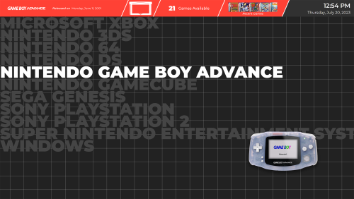
Sleipnir View File About: This theme is inspired by Pegasus Frontend's default theme. I personally really love the look of Pegasus, but vastly prefer the functionality of Big Box, so this is me doing my best to combine both worlds. Excluding those credited below, all other custom assets were created by me. As a note: This theme was designed in 4K for use on a large television. Scaling issues present in previous versions have been fixed, to my knowledge. This WIP upload is intended to get fresh eyes on the project and help to identify issues I may not be running into with my limited usage, as well as provide a better version of this theme than was currently available during a period of time where I don't have as much free time as I have previously. Credits: Genre Icons: Game Icons Platform Clear Logos: v2 Platform Logos Professionally Redrawn + Official Versions, New BigBox Defaults 2.1.0 Platform Banners (Present only in legacy versions): BannerBox 2.1 Platform Media: System Media - Stencil Platform Images 1.0. Platform Images: COLORFUL Hardware PNG media (1x1) 1.1 Finally, many thanks to @y2guru for the Community Theme Creator. While this version no longer uses the CTC, I would have never started on this journey, nor gotten nearly as far, without it. Submitter blattacker Submitted 04/16/2023 Category Custom Themes
-
Version 1.5.5
805 downloads
About: This theme is inspired by Pegasus Frontend's default theme. I personally really love the look of Pegasus, but vastly prefer the functionality of Big Box, so this is me doing my best to combine both worlds. Excluding those credited below, all other custom assets were created by me. As a note: This theme was designed in 4K for use on a large television. Scaling issues present in previous versions have been fixed, to my knowledge. This WIP upload is intended to get fresh eyes on the project and help to identify issues I may not be running into with my limited usage, as well as provide a better version of this theme than was currently available during a period of time where I don't have as much free time as I have previously. Credits: Genre Icons: Game Icons Platform Clear Logos: v2 Platform Logos Professionally Redrawn + Official Versions, New BigBox Defaults 2.1.0 Platform Banners (Present only in legacy versions): BannerBox 2.1 Platform Media: System Media - Stencil Platform Images 1.0. Platform Images: COLORFUL Hardware PNG media (1x1) 1.1 Finally, many thanks to @y2guru for the Community Theme Creator. While this version no longer uses the CTC, I would have never started on this journey, nor gotten nearly as far, without it.- 13 comments
-
- 11
-

-


