Jump to content
LaunchBox Community Forums

Play Box 3 1.0.3

   (0 reviews)

8 Screenshots

About This File

Happy New Year 2020 to all


NOTE THIS THEME IS BUILT FOR STEAM STYLE BANNERS FOR THE FAVOURITES & RECENTLY PLAYED BOX IMAGES. 
This is Play Box 3, A continuation of Play Box 2. 
I have redesigned this theme for a more modern look of Steam Big Picture Mode or TV Media Center Graphical User Interfaces.
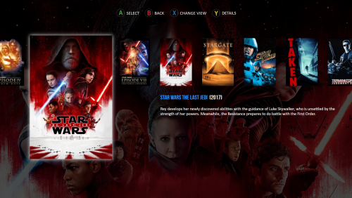
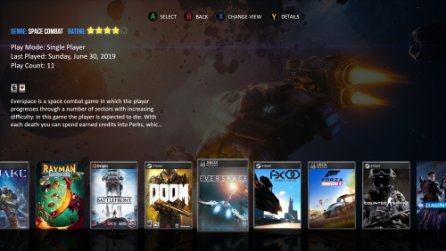
All games & apps that have been added as your favourite & recently played now have a Steam Banner style shortcut on the Home Screen for quick access. Platform & Games views now have faded backgrounds for artwork.  
Included in my theme is alternative control layouts for Microsoft XBOX One & Sony Playstation 4 & a collection of steam Banners for games of various platforms.
There are 2x Platform views & 6x Game views to choose from all with menu controls, All the videoborder views from my previous Play Box Themes are there.
Important note**If  the artwork & videoborder views do not display properly for a platform on your system, there will most likely be naming conflicts between your platforms & files in my theme. To fix this issue, you must locate these files in the background & videoborder folders of my Play Box theme then change the names to your actual platforms name.


Installation 
Unzip the Play Box 3 folder to your Launchbox /Themes directory. 
Setting up Steam Banners
Make sure you set Platform & Game images as Steam Banners within the game options in Launchbox. Then for them to be used in the theme correctly set the priority of the boxes view to prioritise Steam Banners first - if you ever want to revert this it is then simply a case of lowering the priority of the steam banners in the boxes list rather than having to remove or reorganise images. To do this open Launchbox and go to Tools --> Options and in the window that appear select Box Front Properties in the Images section and use the Up button to move the Steam Banners to the top of the list.


Big thanks to Jason Carr, CriticalCid & RetroHumanoid for there Unified themes which has inspired me to create my videoborder views.
And a big thanks to BlazingRyuu for his Device Icons which i have slightly edited to scale to my theme.

What's New in Version 1.0.3   See changelog

Released

Replaced PlatformWheel3FiltersView with a view that has a video, Platform details & has shortcuts for Favourites only & adjusted some of the Device Widgets/Icons.


LaunchBox Big Box 28_05_2020 22_55_12.png

  • Like 9
  • Unusual Gem 2

User Feedback

Recommended Comments

This theme looks great!! ? Wow I love the modern look to it. I have a question:

Is it possible to make a View for scrolling through games that uses Steam Banners instead of box art? I tried the Horizontal Wheel 1, 2, and 3, but they all squish in the banners because the formatting is made for box art I think. I use steam banners for everything, even non-steam games, I make them myself, so I highly prefer a view dedicated to that.

Edited by fawkesyeah
Link to comment
Share on other sites

This theme is excellent! I especially like the categories/platforms view which helps make BigBox shine with a very professional and elegant touch. My only (2) gripes are related to the games text view and the games wheel view. The games text view really needs something else on the screen besides (only) text, possibly box artwork, gameplay video, or both on the right side? As for the games wheel view, it looks amazing with unique artwork for each platform, but the wheel artwork seems a little too small and sticks out in a not so good way. It would also be nice to have a vertical wheel, possibly as an option instead of the curved/circular wheel already there. But of course these are all very subjective gripes and with that being said, keep up the good work! 

Link to comment
Share on other sites

On 1/11/2020 at 2:32 PM, fawkesyeah said:

This theme looks great!! ? Wow I love the modern look to it. I have a question:

Is it possible to make a View for scrolling through games that uses Steam Banners instead of box art? I tried the Horizontal Wheel 1, 2, and 3, but they all squish in the banners because the formatting is made for box art I think. I use steam banners for everything, even non-steam games, I make them myself, so I highly prefer a view dedicated to that.

No problem, I  previously thought about doing a view for steam banners in my next theme I’m working on so I will have a look at what I can do.

Link to comment
Share on other sites

On 1/11/2020 at 3:10 PM, bundangdon said:

This theme is excellent! I especially like the categories/platforms view which helps make BigBox shine with a very professional and elegant touch. My only (2) gripes are related to the games text view and the games wheel view. The games text view really needs something else on the screen besides (only) text, possibly box artwork, gameplay video, or both on the right side? As for the games wheel view, it looks amazing with unique artwork for each platform, but the wheel artwork seems a little too small and sticks out in a not so good way. It would also be nice to have a vertical wheel, possibly as an option instead of the curved/circular wheel already there. But of course these are all very subjective gripes and with that being said, keep up the good work! 

Thanks for the feedback, I’m very grateful as I’m trying to create a theme as modern as possible. My only limitations is the CoverFlow wheel in the platform & games views as I would like to be able to navigate vertically & horizontally like you can in the favourites & recently played boxes/banners. I will add a cover art & video for you in the games text view & look at the wheel in the games wheel view also as soon as I get time as I’m working on another similar theme. Stay tuned for updates.

  • Like 1
Link to comment
Share on other sites

15 hours ago, daz said:

Thanks for the feedback, I’m very grateful as I’m trying to create a theme as modern as possible. My only limitations is the CoverFlow wheel in the platform & games views as I would like to be able to navigate vertically & horizontally like you can in the favourites & recently played boxes/banners. I will add a cover art & video for you in the games text view & look at the wheel in the games wheel view also as soon as I get time as I’m working on another similar theme. Stay tuned for updates.

Sounds great and thanks a lot for the quick reply! Yep, the games text view looks incomplete, but I'm sure with a couple of extra things like the cover art, videos, etc. it will be perfect

Link to comment
Share on other sites

I just installed this theme and it looks really great! I was wondering exactly which views were used in the images above, as well as where to get steam banner images for emulated-non steam games. I also think it'd be cool to add a view that utilizes game videos!

Link to comment
Share on other sites

On 1/24/2020 at 7:37 PM, davbedwards said:

I just installed this theme and it looks really great! I was wondering exactly which views were used in the images above, as well as where to get steam banner images for emulated-non steam games. I also think it'd be cool to add a view that utilizes game videos!

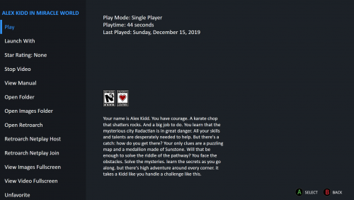
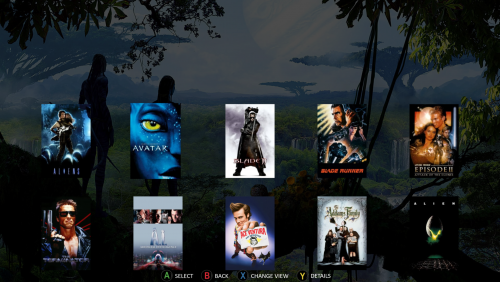
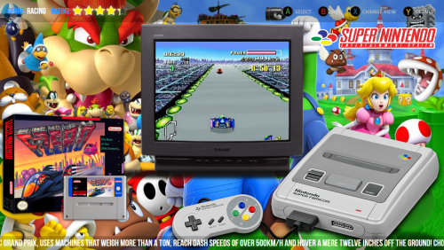
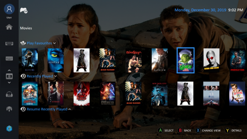
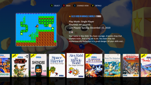
In response to the question by davbedwards, 1st & 2nd images are PlatformWhee3lFiltersView & PlatformWheel4FiltersView, 3rd image is HorizontalWheel2GamesView, 4th image is TextGamesView, 5th image is HorizontalWheel1GamesView, 6th image is HorizontalWheel3GamesView but I have now changed this to Steam Banners only, 7th image is WallGamesView & the final image is WheelGamesView. As for Steam Banner Images the ones supplied in my theme I created myself. there may be certain sites that provide non steam banner images.

Edited by daz
Link to comment
Share on other sites

Wow! I really like all of the latest updates to this theme. Only thing I noticed was that the "ListBoxScrollCenterNS" plugin was included but not implemented into the textlistview. However, I was able to easily find a way to add the code in there, for anyone who wants the games list centered. (check the file below). Also, what would be nice is to have the same fanart view on the textlistview which is used in the platforms/systems list view. In other words, it would be nice to have something like this which is already available:

sample1.thumb.jpg.5b248d82b863c514634ee4d87727a1e6.jpg

with this for the games-list view

sample2.thumb.jpg.586d4a61ec7967e5ccc50ef2217f82ad.jpg

And that would be the icing on the cake! :) 


TextListView.xaml

Edited by bundangdon
Link to comment
Share on other sites

So I really like the look of this theme, but I have to ask why is it so huge? Most themes, even good looking themes, are between 100 - 200 MB while this one is almost 900MB! Anyway, I love the look and appreciate the work you put into this so thank you. :D

Link to comment
Share on other sites

Hi

The theme is so large because of all the content I have included. It is mostly because of all the videoborder files I have created for the WheelGamesView .

Link to comment
Share on other sites

Hey @daz am loving this theme. There is a couple of issues with PlatformWheel2FiltersView I hope you wouldn't mind fixing please. 

Untitled.thumb.png.d84dc4e81daeb988b8c01d675c196845.pngThe most played game overlaps into the video. Any chance you could push the video to the right hand side please.

Also I cant select any of the recent games. Pressing right on controller doesnt focus/select the recent games. But works fine on the other platform views. Not sure if thats just my issue?

Thanks for this cool theme.

Link to comment
Share on other sites

Thanks for your interest in my theme jayjay. In regards to the video position i could move this however I have been in contact with jason & he has informed me that the default platformwheel2filtersview was not built for the purpose of recent & favourites shortcuts. I have tried to find a workaround for this but without success. I will therefore be redesigning the platformwheel2filtersview.

sorry to everyone who downloaded play box 3 for that view file as I thought it was a bug in my LaunchBox version & did not test in other versions earlier.

Link to comment
Share on other sites

Join the conversation

You can post now and register later. If you have an account, sign in now to post with your account.

Guest
Unfortunately, your content contains terms that we do not allow. Please edit your content to remove the highlighted words below.
Add a comment...

×   Pasted as rich text.   Paste as plain text instead

  Only 75 emoji are allowed.

×   Your link has been automatically embedded.   Display as a link instead

×   Your previous content has been restored.   Clear editor

×   You cannot paste images directly. Upload or insert images from URL.

×
×
  • Create New...