

fawkesyeah
-
Posts
53 -
Joined
-
Last visited
fawkesyeah's Achievements
")
16-Bit Artificial Intelligence (4/7)
5
Reputation
-
 Definitely interesting in a wall view for this theme! Please release
 -
 @faeran Great theme! I'd love to see a future update with Wall view 3 or 4 being like #2 but replacing the images with steam banners, and remove the clear logo, but keep the video auto playing. I tried to do it myself, but I've come to find that the time requirement learning all the xaml configs is a bit steep for me. Thanks!
 -

New WallView Grid Games Behavior 11.10
fawkesyeah replied to nicolasonline's topic in Big Box Custom Themes
I've tried changing the BorderThickness value, and while it does change the thickness of that box's border, it does not reduce it's width. It also causes all neighboring games to scrunch together. See below: BorderThickness: 20 BorderThickness: 15 BorderThickness: 30 What I want is BorderThickness 20 but with the red box width itself to just be reduced, so it fits the size of the steam banner image. The height already does fit fine, no matter what I set.
-
New WallView Grid Games Behavior 11.10
fawkesyeah replied to nicolasonline's topic in Big Box Custom Themes
How do I change the width of the (in my case, red) selector/border? I see "BorderThickness" but not a way to change how wide the box is
-
New WallView Grid Games Behavior 11.10
fawkesyeah replied to nicolasonline's topic in Big Box Custom Themes
Updated my post above again. Somehow I have a habit of updating it right as you post a reply haha! Copy pasting here, with a screenshot: ----------------------- Edit: Ok I am playing with the other values and it turns out I can fit more columns this way. So the idea being that adding the height/width to the border allows me to increase or reduce the size, so I can fit more or less on screen at a time. Very cool. I'm starting to get the hang of it.
-
New WallView Grid Games Behavior 11.10
fawkesyeah replied to nicolasonline's topic in Big Box Custom Themes
Ok I've replaced Boxes with Steam Banners, like this? <coverFlow:FlowImage ImageType="Steam Banners" VerticalAlignment="Stretch" HorizontalAlignment="Stretch"/> However I'm not certain how to add the "Borders Height" you mentioned. Is this right? <Border Height="215" Width="460" BorderThickness="30"> Using that, the sizing is uniform, but it seems to mess up the zoom/spacing so every image is far apart again. May have to re-tweak the other settings to fit it. Perhaps worth noting, I am seeing the stretching behavior in The POC theme as well. However it tends to correct the image sizes automatically after about one second of being on the screen. -
New WallView Grid Games Behavior 11.10
fawkesyeah replied to nicolasonline's topic in Big Box Custom Themes
I updated my post with the xaml, let me know if I should still PM it. -
New WallView Grid Games Behavior 11.10
fawkesyeah replied to nicolasonline's topic in Big Box Custom Themes
New issue/question, not sure if this is a bug report or just something wrong with my xaml. With only the minimal changes noted above, I'm noticing this odd issue. When I start scrolling down the rows, every very bottom row seems to have its images stretched. However, as soon as I move in any direction, left/right/up/down, that bottom row within view will correct itself, but then I move down another row, and the row below that will be stretched too, until I move left/right/up/down.. Example below, I moved down one and up one again, the stretching is gone. Also note, if I move all the way to the bottom, all rows remain correctly sized, until I hit ESC to exit this screen, then go back in, the stretching happens all over again. Attached my xaml file in case it's easier to look at that way. WallGamesView.xaml
-
New WallView Grid Games Behavior 11.10
fawkesyeah replied to nicolasonline's topic in Big Box Custom Themes
Hmm. I tried leaving this at 0,0,5. However the columns are shifted left. The leftmost column is cut off and there is blank space on the right side. This is fixed with using -1,0,5. Not sure if it matters, but I'm running at res 3840 × 2160. Perfect! I used the Find In Files feature of Notepad++ to see how it was done in other themes I have (e.g. The POC) and mimic'd the format. The winning number was NavigationRows="-3", that made the top row always start cleanly at the top! I found it now. <Setter Property="BorderBrush" Value="Transparent"/><Setter Property="Opacity" Value="1"/> the value was 0.2 and I changed it to 1, now all rows are fully opaque! Just what I wanted.
-
New WallView Grid Games Behavior 11.10
fawkesyeah replied to nicolasonline's topic in Big Box Custom Themes
Another question for anyone who may know: Is it possible to disable the fading of the rows above and below the current one? See screenshots above. I'm looking through the WallGamesView.xaml file but nothing sticks out to me as the control for this. And, to have the initial screen start with rows at the top, rather than in the middle of the screen? -
New WallView Grid Games Behavior 11.10
fawkesyeah replied to nicolasonline's topic in Big Box Custom Themes
Thanks, had just updated my post with that right as you posted. -
New WallView Grid Games Behavior 11.10
fawkesyeah replied to nicolasonline's topic in Big Box Custom Themes
Brilliant, thank you. I'm crafty with Notepad++ and was able to find and make the change right away. I reduced the spacing just fine. I changed the columns number to reduce from 7 down to 6, however all it does is make a blank space where the 7th column was. It does not resize everything to be bigger. Any ideas? Update: I figured it out. I was able to "zoom" the screen using the orthographic camera section below where the spacing is. Changed position from 0,0,5 to -1,0,5 and width from 15 to 12.5. Result below:
-
How possible would it be to adapt this theme to work with Steam Banners in any of the wall views? I primarily use LB/BB for steam/pc games, so steam banners are what I use for almost all games. Thanks
-
New WallView Grid Games Behavior 11.10
fawkesyeah replied to nicolasonline's topic in Big Box Custom Themes
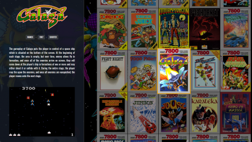
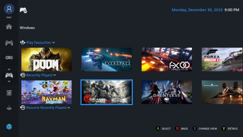
I have a question, sorry if this is not the right place to ask: Is it possible / how do I reduce the amount of space between items in a wall view? For instance, I am using the Default bigbox theme (although same goes for The POC, etc) and I am using this for displaying the Steam Banner of games (I do not use box art for browsing games, I use LB/BB primarily for PC games). Wall 1 shows the Steam Banners as expected, however there is a lot of blank spacing between them. Screenshot below, I want the banners touching at all sides, so that more are on the screen at once. Wall 2 is a bit different, it appears to be a gameplay screenshot with a logo on top, with less spacing between. I like this spacing. However I want Wall 1 to have this type of minimal spacing. An extension of my first question is this: Can I change how many columns there are, to allow each banner to be bigger?
-
 This theme looks great!! ? Wow I love the modern look to it. I have a question: Is it possible to make a View for scrolling through games that uses Steam Banners instead of box art? I tried the Horizontal Wheel 1, 2, and 3, but they all squish in the banners because the formatting is made for box art I think. I use steam banners for everything, even non-steam games, I make them myself, so I highly prefer a view dedicated to that.


