About This File
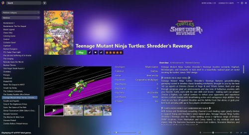
Airy is a minimalistic theme designed to allow the game's background image to show through. I was growing weary with how defined many themes look with the side panel and game details having hard borders that really made the UI look like 3 segmented columns. This attempts to let the UI flow quite a bit more, let it "breathe" if you will.
This theme gets a lot of inspiration from the Beats, Steamy, and Big Details themes as well and attempts to offer a lot of what those themes offer in a slightly different context to address issues some users have with those themes.
Changes from default:
A lot of the top menu items are removed and you will need to use the hamburger menu via the icon in the upper left corner.
Search/Filter section is now visible even when the side bar is hidden
This theme utilizes a list view similar to Steamy in that all games are listed on the left and the rest of the window is used to display the games details
The progress bar is displayed in the top center section of the screen when needed
The controls bar is the same as from the Beats theme and utilizes more iconography than text
What's New in Version 1.4.1 See changelog
Released
Fixed styling on cloud indicator


Recommended Comments
Join the conversation
You can post now and register later. If you have an account, sign in now to post with your account.