-
Posts
49 -
Joined
-
Last visited
Content Type
Profiles
Forums
Articles
Downloads
Gallery
Blogs
Everything posted by nicolasonline
-
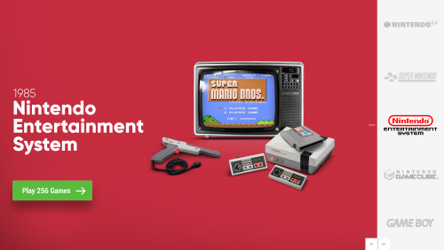
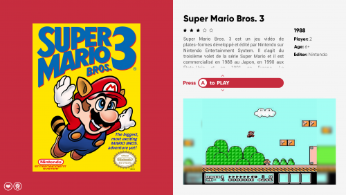
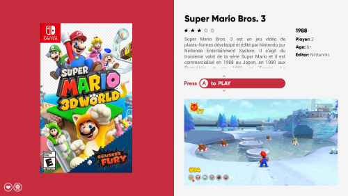
@faeran thanks for the reply and your insight I do want to confirm that the screenshots I posted happen to be my custom theme, but unfortunately I had the bug occur to me with all installed themes that have the "Wall View" including the default one. The difficulty in identifying why and when it happens is challenging. But there are a couple of things that helped pin down the problem. I have 2 different PCs, the old one and the newly purchased one. The old one has Windows 10 with LB 12.14 that I upgraded to 13.12. The new one has Windows 11 that I did a clean install of LB 13.12 and upgraded to the latest 13.14. I don't remember having this issue on the newly installed 13.12, it only started once I upgraded to 13.14, hence my original post. I also never had this issue on 12.14 on my old PC but once I upgraded to 13.12 the issue started arising. In essence having the two machines have helped me find that it's a common problem I've had replicated twice. And on both machines, the issue was replicated on any theme. I'm guessing that does fall in line your idea that the jump from 12.14 to 13.12 might have something to do with it, but it theory shouldn't happen from 13.12 to 13.14 but it did. I did a clean install of 12.14 on my new machine and the issue is completely gone. I wonder if doing a clean install above any certain version would resolve the problem including a clean install of 13.14. But I guess noting my experiences here, if someone encounters something similar in the future it will be easier to pinpoint what causes this behavior and why it's manifesting in some cases and not in others. Thanks again for all your help
-
@bbweiners thanks for the follow-up and added information. Unfortunately, upon coming back home I'm realzing that even 13.12 has the same issue. I've downgraded to 12.14 (simply because it's the last update file I have on my old PC) and so far the bug has actually disappeared (tried multiple times and reboots). @faeran thanks for your follow-up. It's a very basic custom theme I made. I'm gonna attach here if anyone wants to try. I'm in Platform view and just jumping into the Platform to see the games, I go into Wall View and this is what happens, I have a few random pieces of missing artwork. Usually going back out of the wall view and directly back into it fixes the problem. And I checked the cache image sizes of the artwork, they're all standard under 1mb and under 1500x1500, thumbnails generated are obviously smaller in weight and size. If you have any other questions, feel free to ask! Thanks again Nintendo.zip
-
An update for the records. Downgrading to 13.12 has resolved the issue.
-
Since the previous update a few days ago I started getting a Wall View bug where some of the Artwork of the games will not be displayed. But I can go over the missing box art and launch the game. I have to exit the Platform and re-enter the platform for the Box Art to show up again. I tried clearning All Image Caches and re-generating all images but the problem persists. I just updated to 13.14 and the problem is still there. Never had this issue before. Any ideas? Examples of opening the platform then exiting and re-entering the platform to re-populate the missing Artwork.
-
Good to know. Thanks for your assistance with this
-
After doing some digging in the changelogs I found out this was implements to the Change View as a feature improvement in version 12.5 Is there an official place I can download older versions of Launchbox? Thanks
-
In version 11 when assigning a Shortcut to Switch a Theme or Switch a View, and you'd press that Shortcut key, the Theme or View would just Toggle/Cycle through every time you pressed the shortcut. In version 12 it seems that everytime one presses the Shortcut, a popup list menu shows up for the either the Theme selection or the View selection, and you have to manually select the Theme or View you want then confirm. It no longer toggles through the Themes or Views without any popup menu. I tried going though all the Options and Settings to see if I was missing something, am I missing something? Or is this the new standard behavior for switching Themes and Views? Thanks Edit - Forgot to Add the Screenshots below. The "Popup" screen is what I wanna avoid - and go back to the behavior of just cycling through the views/themes without the screen
-
"Game Over" Exit Screen - Shutdown.xaml?
nicolasonline replied to nicolasonline's topic in Big Box Custom Themes
Thank you so much @Retro808 can't believe I missed that -
Hello, I am putting the finishing touches on my custom theme. But I cannot find a way to edit the exit screen of a game that shows "Game Over". Want to edit the color, font, background etc. I saw on a post here from a while back that apparently the default theme has a shutdown.xaml file. But I can't seem to find it in the default theme or any of the other community themes. Tried doing a search within system and style theme files to find it and can't seem to locate the code. If anyone can point me towards its location would be much appreciated thanks! nick
-
When launching a Nintendo 3DS game from BigBox, it opens in Citra perfectly in fullscreen, but if I want to access to the "Game Pause" screen via my Controller hotkey, it doesn't show the "Game Pause" screen automatically. I have to Alt+Tab to get to it. The interesting thing is that the Game Pause screen actually opens as an extra "Big Box" Window. This works flawlessly with Dolphin and RetroArch but for some reason cannot get it to work with Citra. Any ideas would be appreciated!
-
Hey @C-Beats I do indeed confirm it has been resolved! I'm so excited and happy about 11.10's new views and thankful to you and @Jason Carr for your constant follow-up and diligence. I genuinely had a fun time troubleshooting with you guys! Looking forward to designing my first theme for the community and If I come across anything else I'll let you know, thanks again!
-
Hey @C-Beats I have had a chance to test the beta 2 update in regards to the Grid Jump issue. The issue has unfortunately not been resolved. But the good news is that some changes have happened, which could point to the source of the problem. Change # 1: The good news is that now a Grid with 15 Games no longer jumps (it did in Beta 1) as you can see below: b.mov Change # 2: The bad news is that now a Grid with 10 Games is jumping (it did not in Beta 1, and it also did not do this in final release of 11.10) as you can see below: a.mov Finally the problem persists (as it did with Beta 1 and final release of 11.10) with a number under 10 games, like 9, as you can see below: c.mov I hope those differences can help, let me know if there's anything else you'd like me to try out!
-
Awesome! Will check out to see if it resolves the NavigationRows jump issues with specific number of games. Thanks
-
That's so strange? Are you using the Property SelectedItemZPosition in the CoverFlow? It has to have a relatively larger value than ItemZPosition like below relative to CameraZPosition? And it's still not working? CameraZPosition="2" ItemZPosition="2" SelectedItemZPosition="2.5"
-
Honestly am torn between v4 and v4.2? I love the contrast of v4. Maybe in v4.2 if the red space is increased a little bit along the x axis? As it goes just a tiny bit beyond the midpoint, it might look a bit better closer to 2/3 of the way along the x-axis cause it's all red? (The effect is less visible in v4 cause of the white contrast on the left).
-
the eternal battle between form and function. It's a tough decision but from what I can tell going through this thread and previous versions, it seems like the majority aren't bothered by the lack of text list view. Though yes it would be nice to have. I guess the real question is over the long term which would be more pleasing/give the most utility. Also I think a huge bonus is the WallGamesView grid, that was such a highly requested feature because it gives a very good zoomed out view of everything, one could argue, philosophically similar to what a text view does (a little bit). My vote is still between TGV1 and 3, but would be happy with anything that comes out even 4!
-
It's my pleasure @viking! I'm definitely voting TGV3 after your latest mockups! It looks amazing. As for the Platform3 mockup below, yeah I didn't even think about the code when I did the mockup haha sorry about that. But I did try and dig up some xaml properties for quite a bit and tried a few things but have come short. Maybe @C-Beats can point us in the right direction? Is there a way to set selected="false" to a Desaturated property? Or reduced opacity on for the non-selected items on the CoverFlow? If it's hard to be done by code or not possible, I think I may have a couple workarounds I may test tonight For Opacity: create a Rectangle PNG image (578px by 2160px) at the exact size of the white selector area, that is the same color as the off-white background with a gradient transparency at exactly location of the middle selected logo. So having 2 gradient points and 3 photoshop bucket markers. Like this when the logo wheel is turning, the transition from the transparent non-selected version to its selected fully opaque version is very smooth due to the gradient overlay. Check out the file I attached below and gradient points set at 35% vertically and 65% vertically, like this the space between 35 to 65 allows any sized selected logo to fully appear but at the same time creating the faded out non-selected logos. For saturation I'm gonna try something similar with a couple extra steps in the code, but it may not work at all, I'll report back. Merci encore!
-
Salut viking ca va? Love all the work you've been doing. Just wanted to chime in with my opinion on the TextGamesView My vote definitely goes to TextGamesView1 or TextGamesView3. I think the decision is difficult because both are really nice obviously but I think for TGV1 (oh le train) it's probably better when one is sitting close to a smaller screen like on your PC monitor, but with TGV3 it looks much better on a TV and those Context Mockups you made on the TV really helps to visualize that. Since I'm gonna be using it mainly on my TV (I don't know if there are numbers on what percentage of BigBox users are TV vs Monitor) but that could help in the decision also. But yeah I'm probably leaning more towards TextGamesView3 because of that reason. I think the only thing that could be cool to try out with TGV3 would be to find a solution to not having the blurry video to fill that space under the video if it's in 4:3. I know it's difficult because to fill that space with 4:3 is hard. So I tried different solutions, but I think what could potentially be a good candidate would be to actually take a cue from TGV1 and give it some more breathing room and reduce the size of the 16:9 space so that the video actually aligns with the text above on the vertically. Like this the "blurry" 4:3 behind the video would actually not feel so cramped. It could also work great for regular 16:9 videos as I did a quick mockup below. Maybe if all videos were 16:9 then keep it stretched out as it is is good, but yeah this might be a good solution for both, what do you think? My vote in any case goes to TGV3, but if either TGV3 or TGV1 make it, would be amazing! Finally about PlatformWheels3 , it seems like it has been voted out/discarded. I may be too late, but just wanted to say I absolutely love it! I know what you mean with it seeming a bit off, and I agree, so I tried to play around with something. I think a huge difference helped when I removed the shadow, as most of all your other stuff don't have shadows. And I reduce the opacity of non-selected platform clear logos as well as their saturation and it could be an idea? If at some point in the future you decide to bring it back. Cannot wait to check out the new features and views once they're out. Thanks again for your amazing work!
-
awesome. will do when the next push is out! Also forgot to confirm that I also have the missing icons in LaunchBox
-
Hey @C-Beats Was able to go through the fixes you guys put out. This is what I found: The below point has been confirmed fixed from my end: The below point has been confirmed fixed from my end: Unfortunately this issue below has not been fixed, I'm assuming this is "Grid jumping" when selecting items in a grid: If the total games I have are 6, 7, 8, 9 or 15 total games the whole grid jumps up/down by 1 row. If I have any other amount of total games like 5, 10, 12, 14 etc then behavior is normal and as expected. You can see the behavior from the Video No. 1 below. In Video No. 2 I show the desired behavior of it working correctly by simply adjusting the amounting of games for the same platforms. I also included my WallGamesView.xaml if you want to try and replicate it from your end. Thanks 1.mov 2.mov WallGamesView.xaml
-
Amazing, thanks so much @C-Beats for remembering and notifying me ! You guys work fast, wasn't expecting to be able to test everything so soon. Will do that as soon as I wake up tomorrow morning (European time here). Will update you guys tomorrow. Wish you all a great evening!
-
New WallView Grid Games Behavior 11.10
nicolasonline replied to nicolasonline's topic in Big Box Custom Themes
Awesome. will do. I tried to solve for the maths to guess what actually went wrong behind the scenes for fun. After getting into prime numbers and stuff I gave up -
New WallView Grid Games Behavior 11.10
nicolasonline replied to nicolasonline's topic in Big Box Custom Themes
hey @C-Beats Just wanted to give a little update. It might be a moot point as you stated you have already fixed this in development as we speak, but thought I'd just update my findings just in case. I originally stated: "... if the Total amount of Games in the WallView is equal to 6, 7, 8 or 9 Games when placing the selector on that 2nd row the whole 2 rows jump down together." I have now found that this also includes 15 Games. I included 2 videos below showing a grid with 14 games (no jumps) and one with 15 games (jumps). Thanks 1.mov 2.mov -
New WallView Grid Games Behavior 11.10
nicolasonline replied to nicolasonline's topic in Big Box Custom Themes
hey no problem glad I could help! One thing I'd like to point out @fawkesyeah : 1. You said you changed the Orthographic camera position from 0,0,5 to -1,0,5. Try to change that back to 0,0,5 as from my experience it can affect the behavior of the grid different the more games are added/removed. the only thing you should be changing to adjust the view spacing for a cleaner one-size fits all should be the Width property within the orthographic camera. Try it that way and see if you can get the same result by keeping 0,0,5. 2. To have the initial screen start with rows at the top you need to add a property called NavigationRow or NavigationRows="1" I forgot which one it is I'm not on my PC right now. It should be in the documentation PDF that's included in LaunchBox/Themes/ 3. To disable the fading you need to delete the lines that mention the Style Trigger for xxxIsRow="boolean" and opacity="0.2" or something like that as I recall. You can also change the border selector color within that same style trigger noted just above. You can look up "hex color code" online and find the color you want and just plug that in where it says "white" I think is the default. Hope this helps! -
New WallView Grid Games Behavior 11.10
nicolasonline replied to nicolasonline's topic in Big Box Custom Themes
Yes you can do that but you will have to open the .xaml file. Go to the following folder on File Explorer: LaunchBox/Themes/ and here duplicate the Default folder and name it something you'd recognize Go into BigBox and in Manage Themes load the newly created folder name it should appear there Go back into the File Explorer and under the new Folder name you gave the duplicate go to Views so it should be like this: LaunchBox/Themes/NewName/Views/WallView.xaml and Right-Click open with Notepad Then do a Find in Notepad and search for coverFlow:flowcontrol there you should be able to add within the brackets how many columns and rows you want by changing the number and you can change the spacing X,Y by changing the numbers Once you change everything in Notepad just save the file and quickly go back into BigBox and reload the game view and the changes should be updated You can go back and forth doing this until you're happy with the results Hope this helps

.thumb.png.03ec51e5109323f2ed136f26af2c02aa.png)
.thumb.png.9703cd536491d2fa05308bec5dc458bb.png)
.thumb.jpeg.a6193ee3e88f1f94d9de9fa167721c0a.jpeg)
.thumb.jpeg.1e989c641a3c414492140290a7c8429a.jpeg)
