-
Posts
4,027 -
Joined
-
Last visited
-
Days Won
54
Content Type
Profiles
Forums
Articles
Downloads
Gallery
Blogs
Everything posted by Zombeaver
-
"Dammit, you're not the only hero!" Normal: Scanline: Scanline (150% Scale):
-
Jason Carr said It's probably not image quality so much as the method used in reduction. That's certainly a possibility, yes. I've tested running it through a number of different resampling algorithms and they all came out fine though - Lanczos, B-Spline, Mitchell, Bell, Triangle, and Hermite all look fine when resampled to 32%. I'm going to try actually saving resampled (small) images and seeing how they look in Big Box, that way I can take as much workload off of it as I can. EDIT: Yep, I definitely think there's something a bit off with the image quality in Big Box. Same image order as before, but this time the top image is at 100% size (resampled beforehand). The bottom is how that same image appears in Big Box EDIT 2: I guess the next step would be to determine the exact resolution that it's changing it to in Big Box so that it's not resampling it all all. 32% of my original size is close but it's not pixel-perfect; Big Box is actually outputting something a little smaller than that. EDIT 3: The image as seen in Big Box appears to be exactly 400 pixels wide. I resampled my image down to 400 pixels wide and tried again. It doesn't appear to have made a difference. I'm really trying here
-
A bit of creepiness for the PS2: Normal: Scanline: Scanline (150% Scale):
-
Jason Carr said The problem with the scanlines in Big Box isn't because the image quality is reduced; it's just that they're a lot smaller in Big Box. @Jason that doesn't coincide with what I'm seeing (below). Jason Carr said Since the scanlines are so close together, there's no room in the image for the scanlines once the size is reduced. Unfortunately scanlines get hairy really quick when you reduce the size of an image and there's not really anything we can do about that. You could try spacing them out a bit more, but then it would look silly at the large size. I understand that, that's what prompted the alternate 150% scanline scale in the first place. The problem I have with accepting this is that I can take one of these images and just straight up resize/zoom (no resampling whatsoever) and it looks clearer than what I'm seeing output by Big Box. Here's an example: The bottom is how it looks in Big Box. The top is the exact same image, no resampling, just zooming back to 32% size. There is a very clear disrepancy there. Is there some particular reason why a higher image quality option couldn't be added as a toggle like for the cover flow images?
-
DOS76 said Keep'em coming! You seem to be really enjoying yourself. I am actually haha alexis524 said Zombeaver, that MGS PSX logo is nuts!!! very smooth. Thanks! That one actually took quite a bit more time than the others; it was a bit more complicated than most of them. I think it turned out pretty well alexis524 said thanks for the different shader options to choose from. Yeah, the more options the better in my book. Unfortunately, for the time being you're best off just using the normal versions of these because you won't be able to see the finer details in Big Box yet. Some Zelda goodness: Normal: Scanline: Scanline (150% Scale):
-
And now for some MGS smexiness. When it's all said and done I'll have these packed up into separated folders so you can just drag out whichever style you prefer. Normal: Scanline: Scanline (Alternate): Scanline (150% Scale): Scanline (Alternate) (150% Scale):
-
Kirsten Marie said Those are awesome @zombeaver!!! Thanks for sharing! Sure thing! I'd make these for myself anyway so I might as well share! So I made a quick stop by the house to check these out in Big Box. As I feared from the get go, none of the scanlines are visible in Big Box, even at 150% scale. It seems like there's some serious downsampling and/or filtering going on for clear logos. I did a little digging in the options menu to see if I could find anything that would help, and noticed that in the "General" section there's a setting for "Coverflow Image Quality" which, by default, is set to "High (Slow)" but has a step above that - "Highest (Slowest)". As I kindof anticipated, however, this doesn't seem to have any impact on the quality of the clear logos. @Jason any chance of getting a similar option for clear logos? Pretty pretty please? If you want me to submit a Bitbucket ticket for that, I can. I know, I know... picky/OCD/anal/what-have-you... I won't deny it.
-
DOS76 said Yeah they look great in full screen thanks for making these up bro! No problem! I'm just worried about how they're going to look when scaled in Big Box. I think the scanlines might be too dense to scale correctly unless it's in a 25% increment. Based on my testing last night, Big Box seems to scale these down to right around 32-33% of their full size. I made another one at 150% scale on the scanlines to test. I think it looks bizarre in full screen but it seems to scale significantly better so maybe that would work; it's hard for me to say without being at home to test them out in Big Box. Normal (diagonal): Scanline: Scanline (150% scale):
-
Dude, @DOS76 thanks for giving me the scanline idea! I messed around with that for a bit and these are what I came up with. I get that not everybody digs scanlines so I'll still be doing both versions of each going forward. I'm not sure if it'll even show up in Big Box properly since I'm not at home at the moment to test (I know the diagonal ones don't). EDIT: Dear god when scaled down in the forum they look awful (which probably doesn't bode well for what they'll look like in Big Box). If you click on them and see them full size you'll see what they're actually supposed to look like
-
DOS76 said Yeah they are nice I like how they look like they have scan lines. I have a pattern overlay of diagonal lines to add a little visual interest. I actually hadn't thought of making them look like scanlines (horizontal instead)... Hmm. Unfortunately, Big Box seems to downscale them to some degree because you can't even see the lines when they're in Big Box :(
-
Some Contra 3 action:
-
Okay, here are some alternates for Arcade, 2600, and CPS-1 logos and a new one for CPS-2. I think these are all a pretty good improvement but the others are still there in case anyone prefers them. I think the 3DO one was already okay as is.
-
Thanks guys! Yeah, you're definitely not wrong about the legibility - I was actually very aware of that fact while designing these. The problem is that the approach I've taken to the text is to use them as a semi-transparent color filter for the background image and, because of that transparency, they're inherently less legible... but I think it looks cool haha. It's been a bit of a balancing act between [more transparent - looks cool - less legible] or [more opaque - looks less cool - more legible] I agree that the arcade one is probably the most dubious in this regard. I had a couple of ideas this morning for improving legibility without sacrificing the look that I'm going for, so I'm going to try those out. Stay tuned!
-
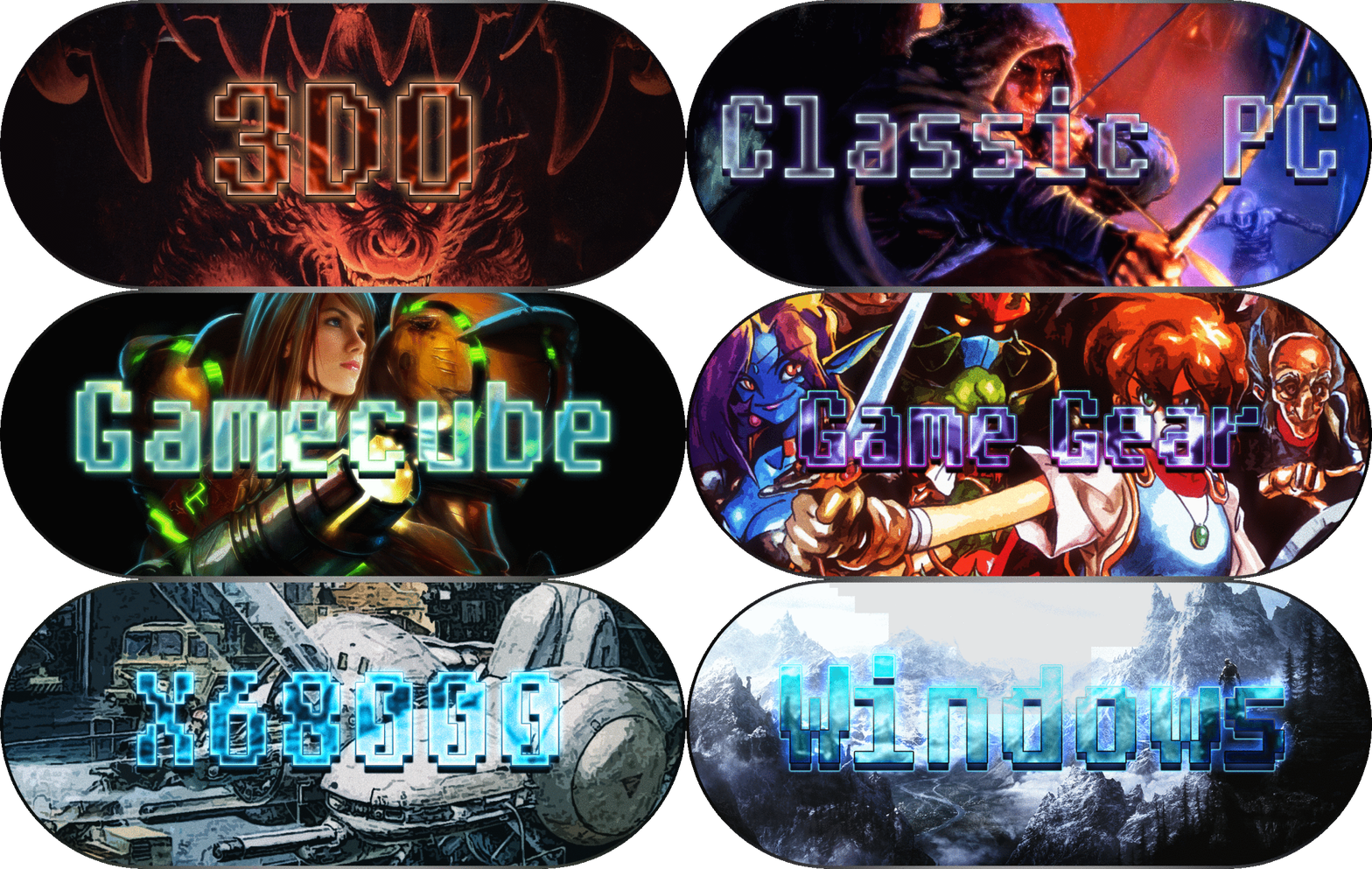
These are now available in the downloads section! The images need to go in Launchbox -> Images -> Platforms -> [platform name] -> Clear Logo. Delete the old logo (if present) and refresh your image cache in Big Box. Enjoy! Version 2 Post: Version 1 Post: Original Opening Post:
-
Dude, you should totally do more of these. It definitely gets my vote!
-
No, it's the same here. Can't say as I'm too impressed at the moment. Performance seems to be... not exactly amazing, and a number of games that were problematic for Mupen seem to still be an issue for Parallel; and there are some that seem to be completely messed up like Banjo Kazooie. It seems extremely preliminary to me.
-
No, no custom menu. The menu comes up okay but only if I don't launch directly into a game via LB, and only if I'm using 1.3.5. If I just start RA, start the Mupen core, load a game, the menu comes up fine. If I launch directly into a game through LB, and try to pull up the menu, it crashes. If I do the exact same thing with 1.2.2 it works just fine. I also tried taking the Mupen core from my 1.2.2 folder (which isn't the newest one) and using it to replace the newest one in 1.3.5. It still crashes.
-
I've also developed a weird problem... If I start an N64 game via Launchbox, hitting F1 to pull up the Retroarch UI crashes Retroarch... The games seem to play fine but it crashes on F1. If I start Retroarch by itself, and then load the Mupen64plus core, load the game, and then hit F1? It works just fine. No idea what's going on there... I don't have any unusual command line parameters in Launchbox for it - just the normal -L "cores\mupen64plus_libretro.dll". EDIT: As a temporary workaround I've created a new emulator entry in LB for "Retroarch 1.2.2 - N64" and directed it to my 1.2.2 RA folder rather than the 1.3.5 one. And it's working as normal through LB. I suspect it's the result of changes made to 1.3.5 and or the Mupen core but for whatever reason it always crashes if I hit F1 after the game is loaded if it's launched through LB.
-
It's insta-crashing for me as well. The weird thing is that the instructions they have on the post specifically about paraLLEI aren't what I'm seeing: When RetroArch 1.3.5 gets released Download the new RetroArch 1.3.5, go to ‘Online Updater’, go to ‘Core Updater’. From there, go to ‘Experimental’, and download Mupen64plus HW. This will download the Vulkan-enabled Mupen64plus core. "Experimental"? I don't see anything like that in the Core Updater, but there is an N64 entry that just outright says it's paraLLEI (not "Mupen64plus HW"). I have a GTX 780 and my drivers are up to date:
-
Windows is there now!
-
Their stable builds subsection has 1.3.5 listed now... but it doesn't have Windows - just Android, Apple, Nintendo, and Playstation.
-
I would assume it's just because it's not 1.3.5 official yet. I'm looking through their forums but I don't even see any mention of the missing 1.3.5 download. Weird... Surely to god I'm not the only guy who spends a Friday night working on emulators...right?
-
bundangdon said SentaiBrad said This right here: http://www.libretro.com/index.php/first-ever-revolutionary-n64-vulkan-emulator-coming-soon-only-for-libretro-parallei/ I am excited! If you go to the retroarch nightly builds webpage, you can download the latest (nightly) version and in the latest cores you can find this new n64 'parallel' core. However, when I tried loading the core and loading a game, the program crashes on me every time. I'm not sure if it's just me, but perhaps this is an unstable build or I need to make some adjustments to my original settings. Anyone else tried this out yet? Do your video card and current drivers support Vulkan? Nvidia page AMD page
-
Yeah all I'm seeing in their download section is 1.3.4 currently.
-
Beatlemaniac19 I think that's the right approach. I try to keep things in a historical context but also keeping in mind what preceded and followed it and seeing the lasting (or not) legacy of that game. Part of the reason I really like PSX is because it's kindof a treasure trove of experimental titles given that 3D was so new. A lot of what we take for granted today hadn't been established at that point and developers tried things that might leave some people scratching their heads. Some of it worked and, of course, some of it didn't. But I appreciate it when games do (or at least attempt) something unique and take chances. Take the game Sentient, for example. The game, even by the standards of the time, is completely hideous. It's also extremely unique, with one of the most expansive conversation/interaction systems I've ever seen in a game (you can even choose your facial expression for conveying your dialogue) and some really interesting storytelling methods. It's an outer-space-social-sim-survival-game...thing... It's by no stretch of the imagination a perfect game, in fact, it tries a number of things that simply don't work well, but I appreciate how much it just does its own thing in its own way, conventions be damned. I feel like outside of the indie scene so many of today's games are just so formulaic; scrambled and regurgitated stories and gameplay tropes. It all just seems too safe these days. I guess that's to be expected when you have shareholders to report to. There are exceptions, sure, but by and large most of my hopes for the future of gaming are in the quirky, off-kilter indie games we've seen explode over the last 5 years or so.

3.jpg.742da72ac43a94705002c210c5b6f7fd.thumb.jpg.f8fc1cacc611a7156fb5cc60847b357f.jpg)


