
thimolor
-
Posts
398 -
Joined
-
Last visited
-
Days Won
12
Content Type
Profiles
Forums
Articles
Downloads
Gallery
Blogs
Posts posted by thimolor
-
-
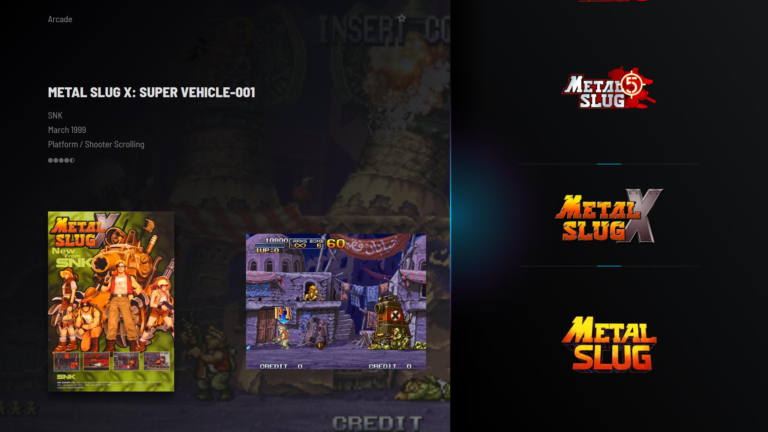
Some progress. Added few views and tweaked the overall look. Waitin for the new Creator Tool to do the new wall views also.

-
 1
1
-
 2
2
-
-
10 hours ago, Dan Patrick said:
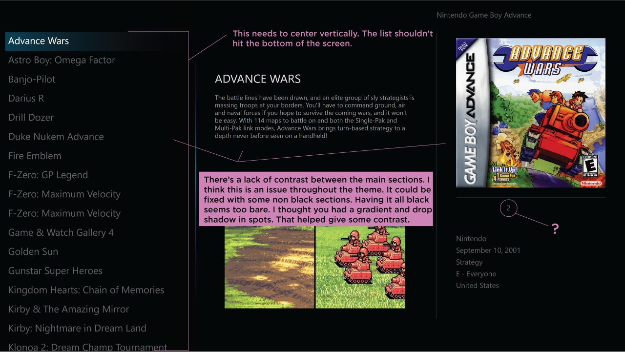
Hey thimolor, I finally got some time to look at the theme in Big Box. It seems slightly different than what I remember. Namely the gradients and drop shadows that helped separate the major sections of each screen seem to be absent. Looking at your screenshots from earlier posts on this thread, maybe my system isn't loading the theme correctly. I'm running the latest updates to my knowledge and I'm running it at 4k 3840x2160 at 225% scaling for Windows.
I circled that little number 2 on my screenshot. Is that supposed to be the number of players? It didn't land in the right position somehow.
Also I made a note about the text lists. They are not centered vertically. The list hit the bottom of the screen but still had a decent sized gap at the top of the screen.
Hopefully you can figure out these issues. I did want to say that the animations look smooth and really nice! I especially like how the smaller groups of info (year, genre, region etc) animate in. Really cool.
It seems you have the wrong font (should be barlow, see the theme folder/fonts), no icons and no background images, no glow.. this is why you don't see the gradients. Something wrong with your setup. Are the assets in the theme folder (media/Theme Assets/)? The text list cannot be centered when doing responsive theme. It will cut the bottom list item, and it just looks broken, when the list is not aligned to bottom. Only way to change this, is to make the list height 100% (this is something I will try out.)
-
 1
1
-
-
Thanks, no more testers needed.
-
1
-
-
Who wants to to test this theme?
-
1
-
 1
1
-
-
14 hours ago, Dan Patrick said:
I tried to come up with a critique and nothing came to me! The changes you've made make sense. As long as you don't do any drastic changes you're golden! I enjoy your other themes but this is your magnum opus.
I just realized I never sent you my Sega CD Logo somehow. I drew the logo earlier but it got overlooked amongst all my files. It's quite accurate I believe. I've included my version of it here if you want it.
I promise I won't overhaul the theme anymore. Some tweaking and testing with different aspect ratios. Thanks for the logos again.
-
1
-
-
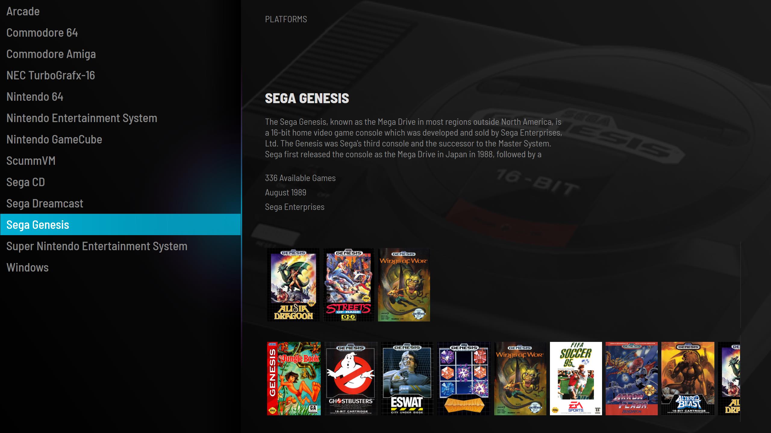
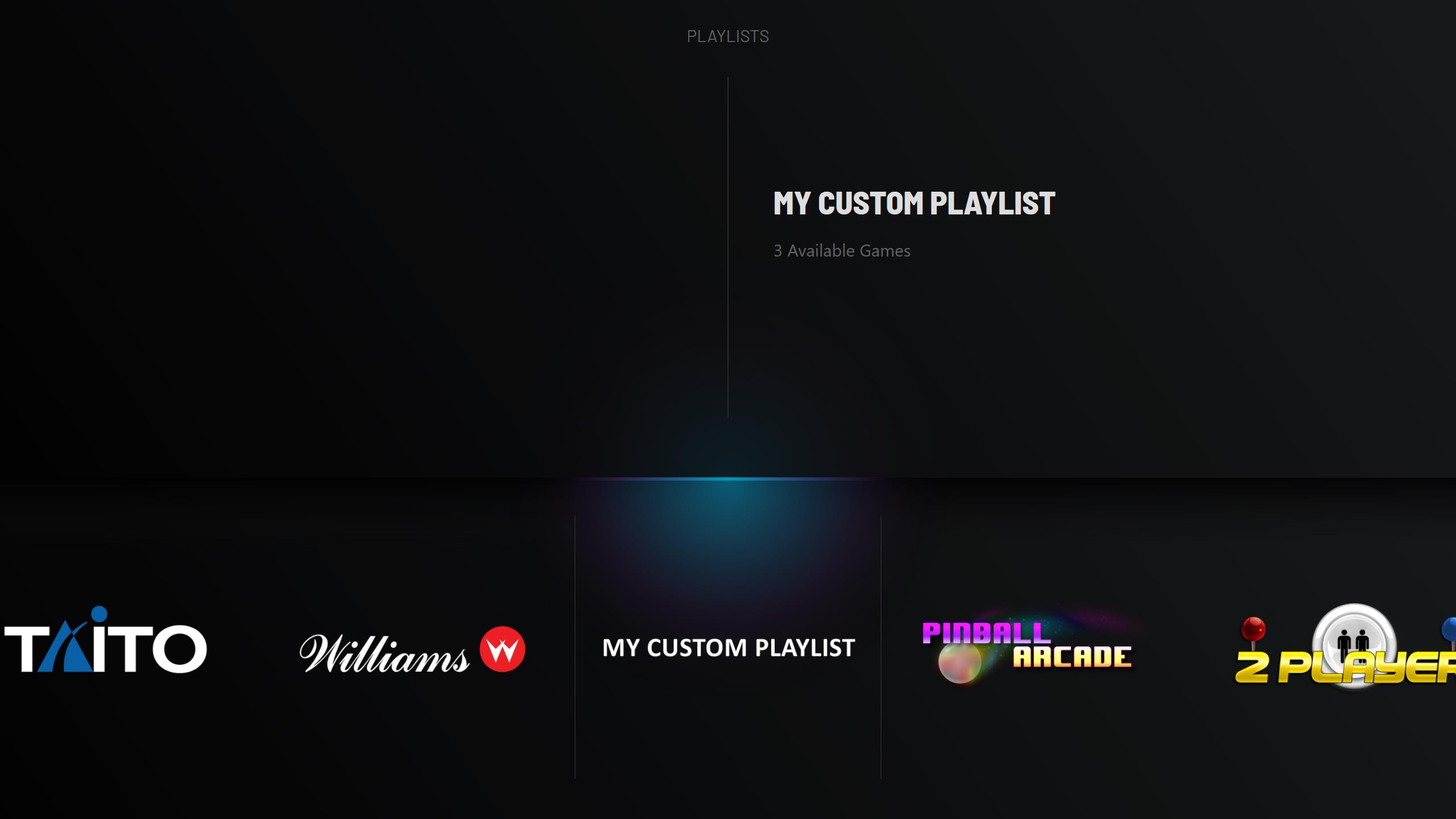
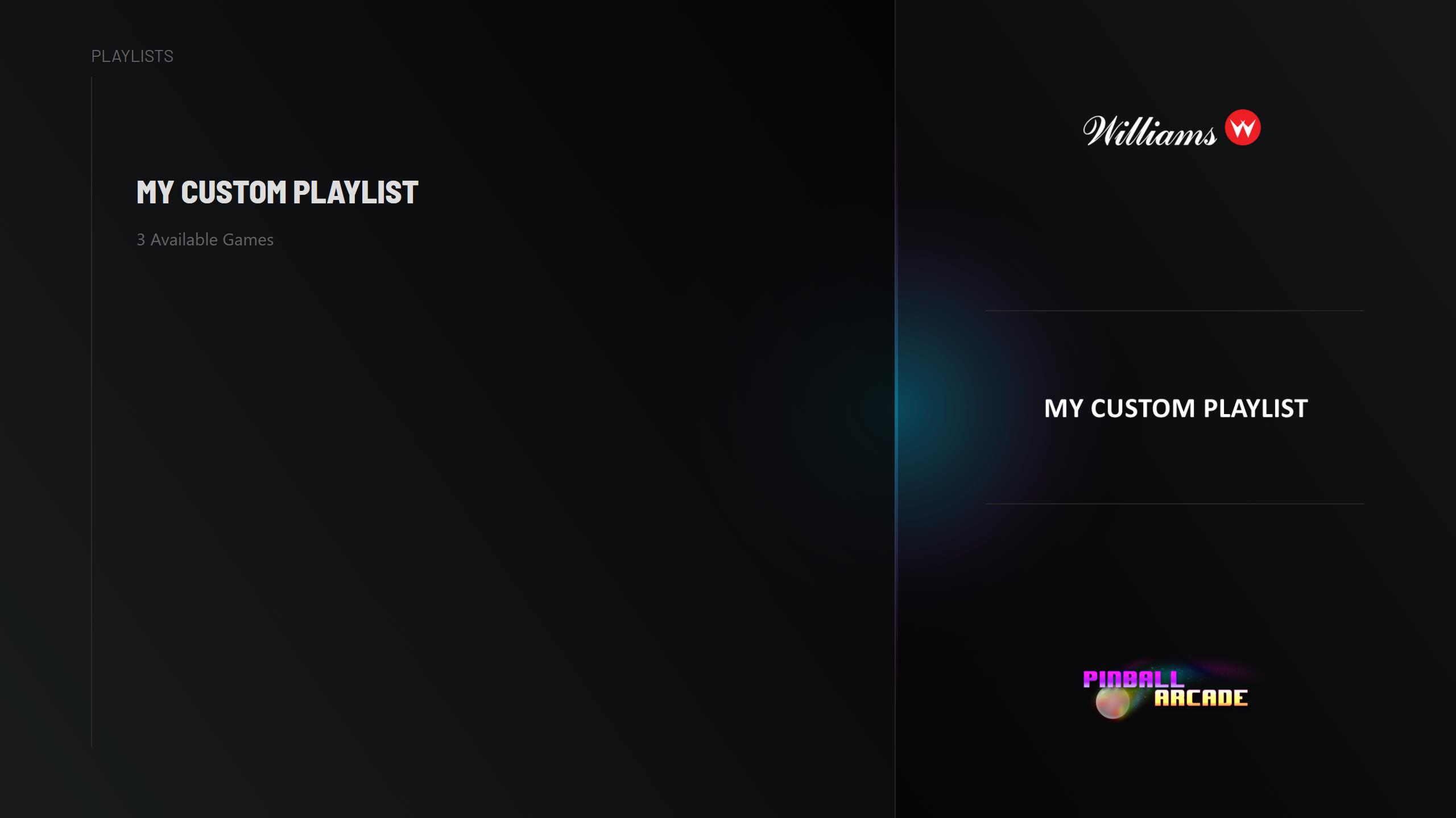
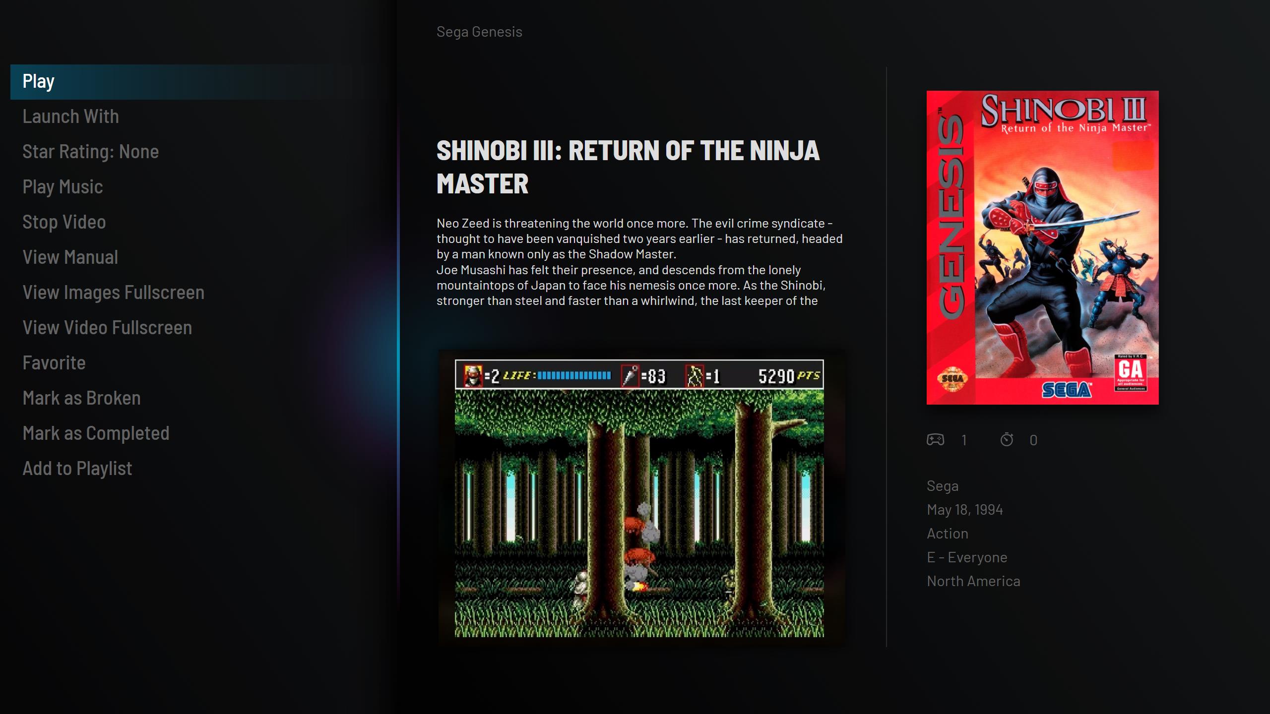
This is slowly becoming my never ending story. Making a lot of little tweaking everywhere and adding better support for custom playlists (no custom banners or logos needed, theme still looks fine and not broken). Making sure, that you can use what ever art you choose to. If you don't want to use device images, you can use fan art instead. No need for photoshop templates.
-
2
-
-
5 hours ago, Dan Patrick said:
Love the name Pulse! That's so good! A cool sounding word and it fits the glowing line. The positioning of the title and details looks a lot better there. I have to agree with you about the circles. The blue is honestly nice but a bit too popping. Maybe the other icons should be grey also. It seems a little funny to have only one thing pop with that blue(other than the glow itself).
Glad you like the icons! This is simply my favorite theme. I may be a little biased because I helped a little, but still. Love it!
One tiny thing I just thought of, I like how you have the lines for the selected logo at the bottom in that image . Are those two lines darker than the rest of the lines? It's just is a little hard to see those. I think the lines work well there. Maybe make them a bit more visible.
Thanks, The lines are the same gray (#292929). I just added some pulsating animation in sync with the glow, so they get dimmer.
-
1
-
-
I know my name. It's going to be called: Pulse
-
2
-
-
19 hours ago, Dan Patrick said:
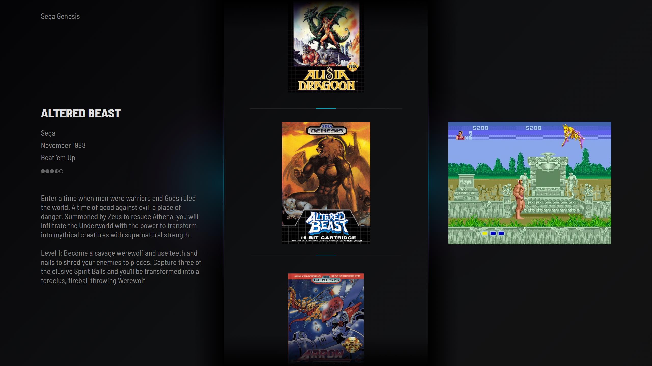
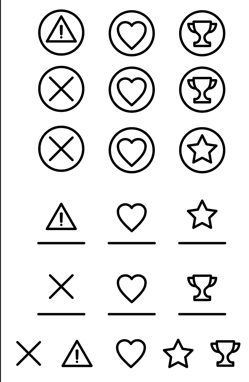
Nice! I do enjoy those circles. The blue is not bad really! I like how it's tied to the same color as the glow. The completed, favorite, broken look nice. For some reason, I drew some new icons for you to look at. I tried to simplify the trophy a bit and also rethink the broken icon. Your current icons are literally, perfectly fine though. The only one I had qualms about was the broken icon. It's a bit unclear to me. I don't have your blue so you'd have to recolor them. I just made them black. I included a vector pdf if you want to change it. Theres 5 icons 2 possible for broken and completed and the same heart favorite. You won't hurt my feelings if you don't want to use them. I did them on a whim. No big.
I still think the info could go up a touch closer to the title. Also should the title and all its info be centered in the upper section? Not sure. The theme's great! I'm nitpicking here.
I also included a new coloring for 2 logos Neo Geo AES and NEC Supergrafx. Both were pretty off and now are more vivid and much closer to the original imo.
Nice icons! I will use these. I agree with the broken robot, it was bad. I think I will make the circles gray. They pop too much now. Making other minor adjustments also. I will put the info closer to the title also there is now 48 px. I will try 32-40 px space there.
-
1
-
-
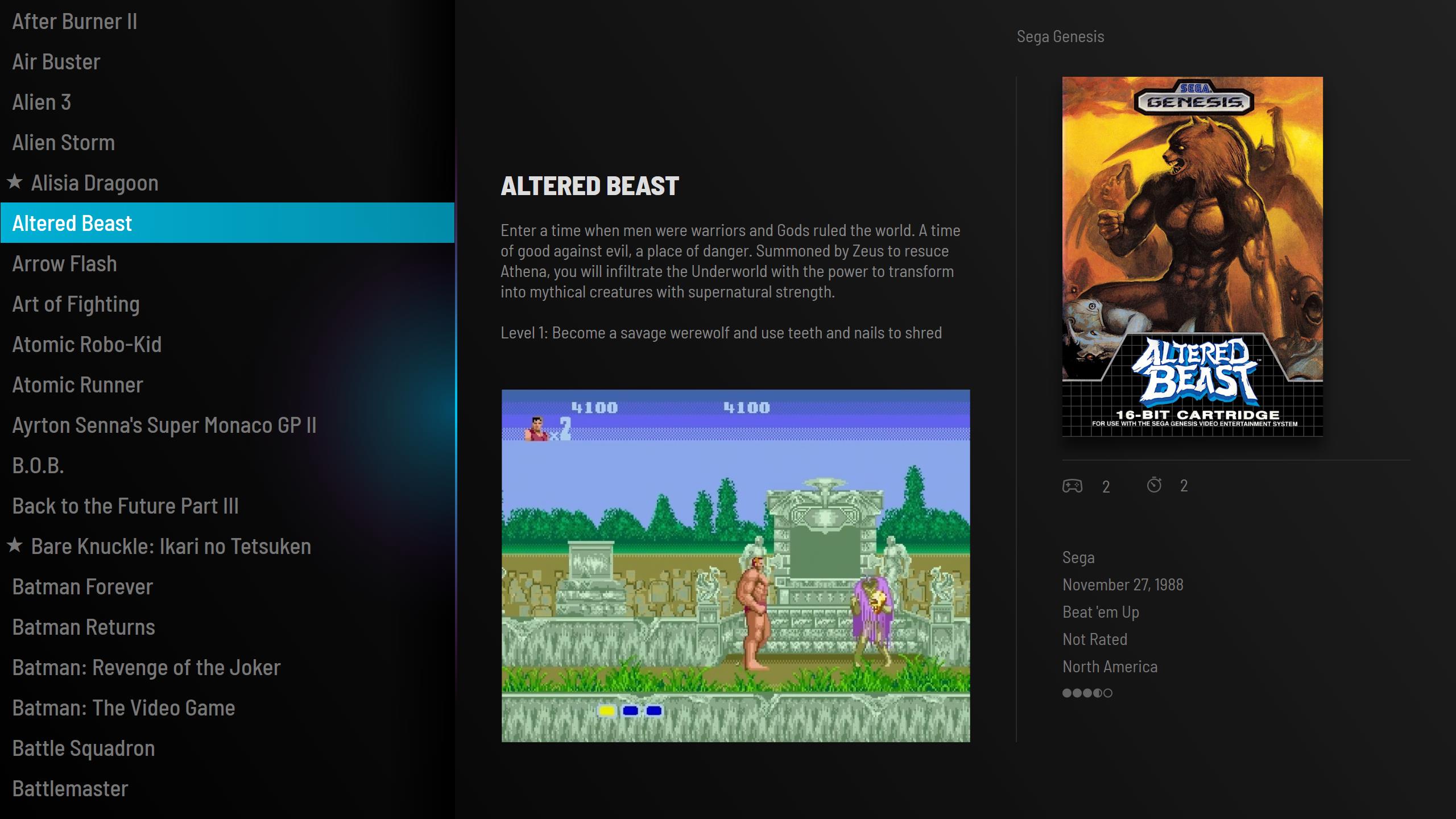
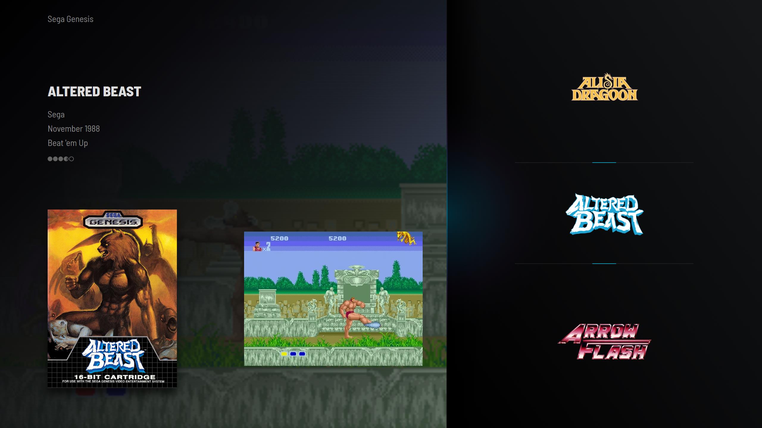
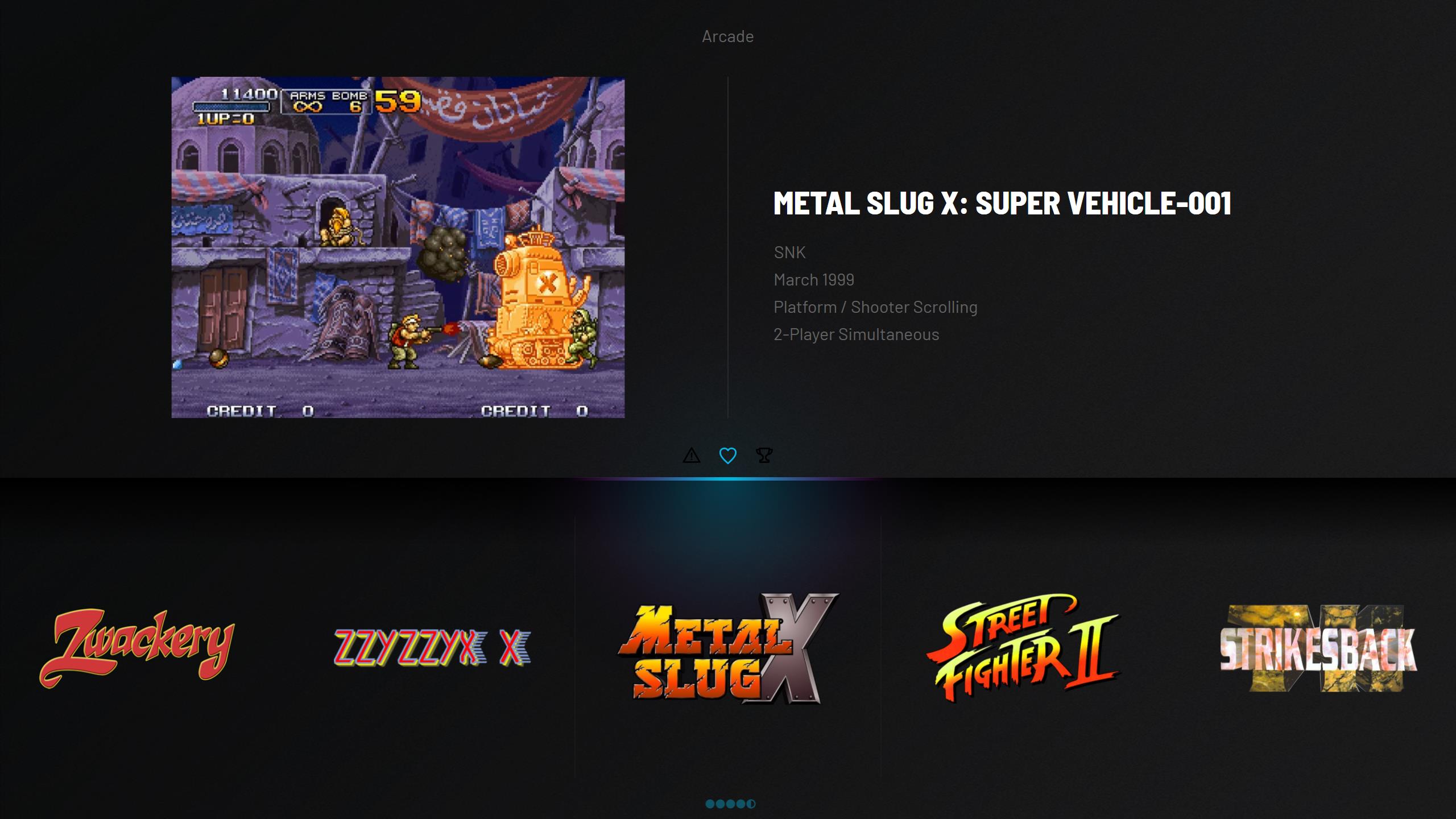
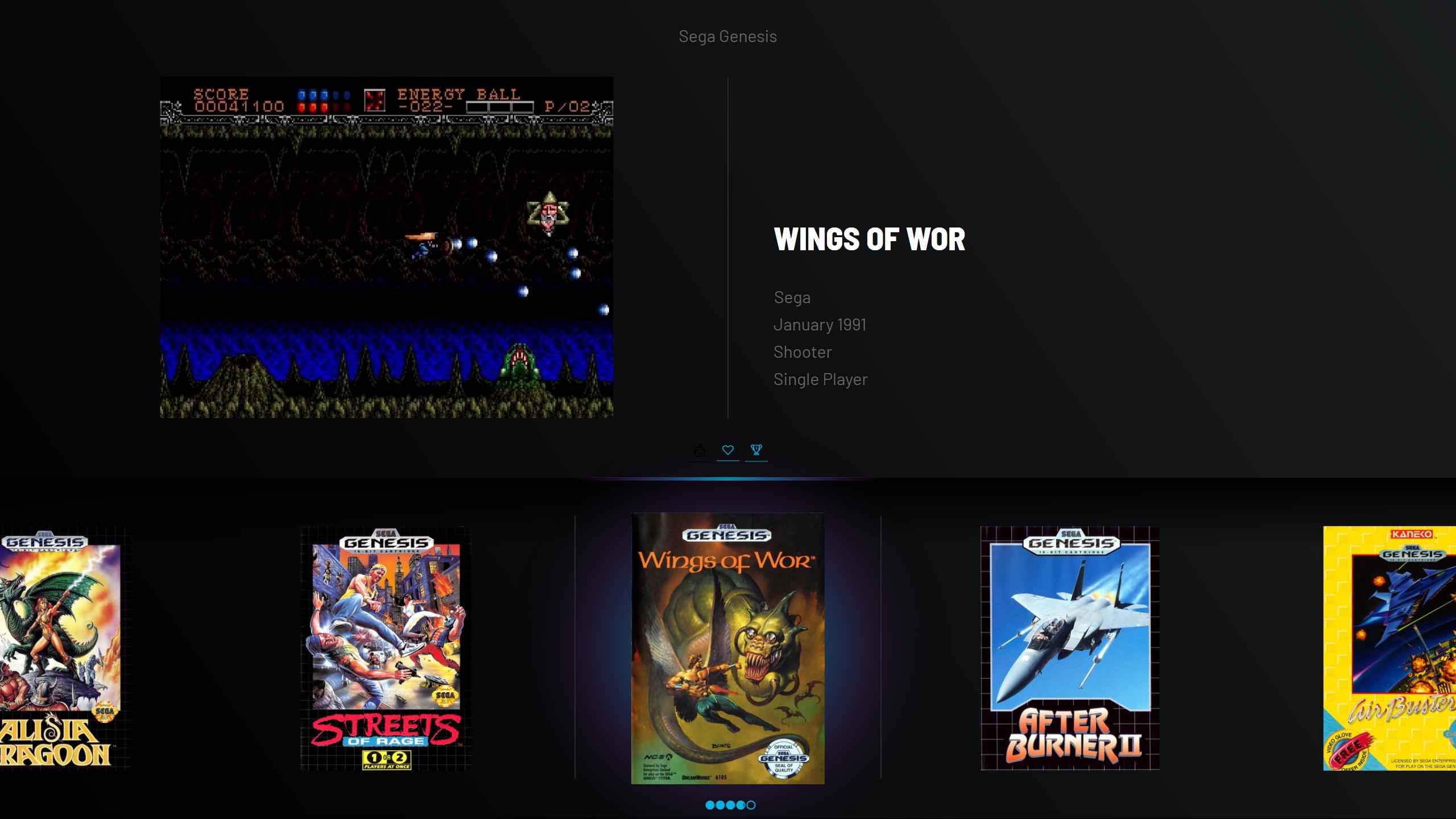
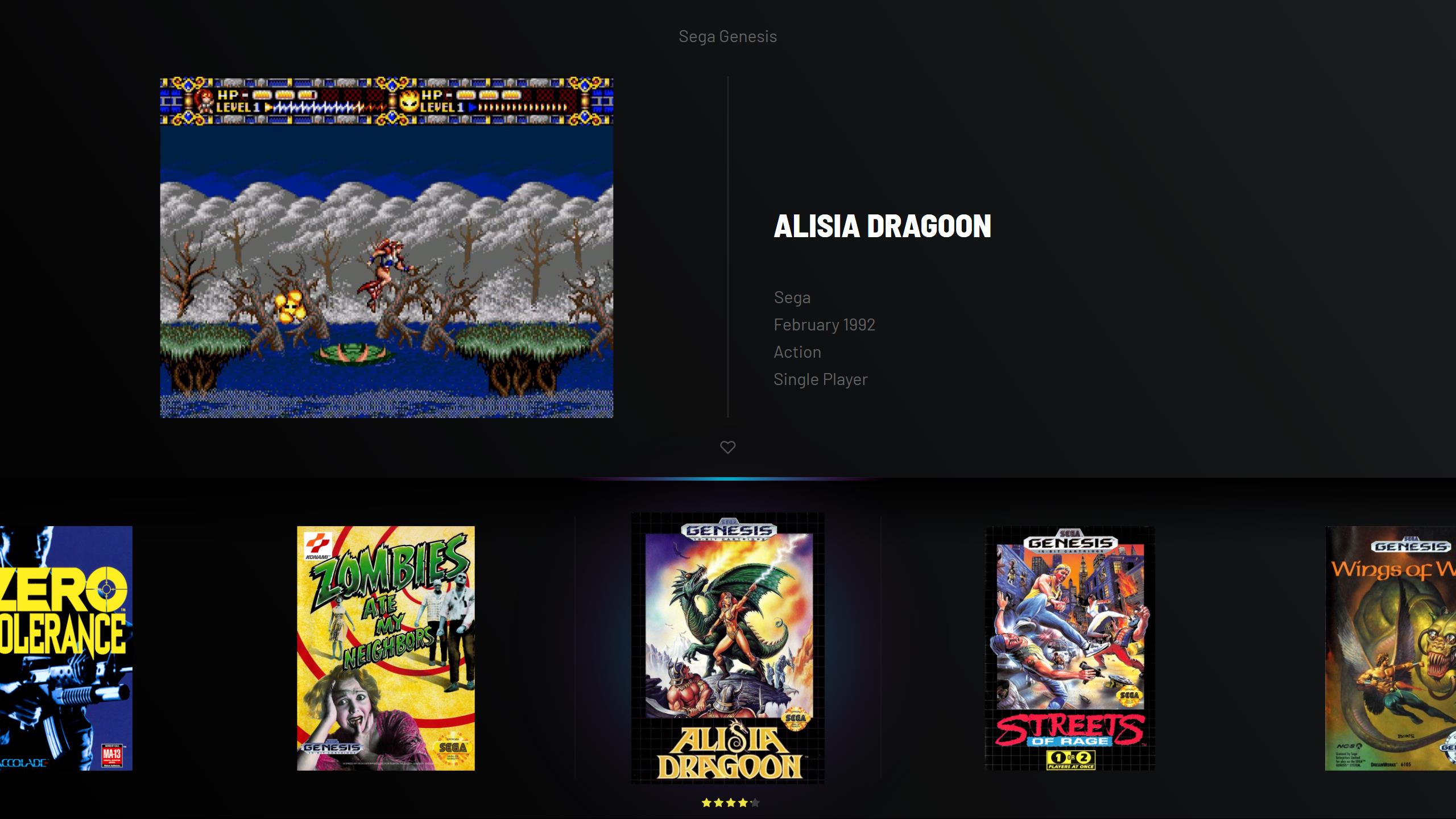
I just had to put some color, sorry Dan. Rating circles use the same blue from the glow as do the icons (completed, favorite, broken).
-
57 minutes ago, Dan Patrick said:
Man! That looks great! Amazing job! I think the rating under the box works well but what if you replaced the stars with the circles from your previous theme. I thought those circles looked clean. I imagine it as the same light grey used elsewhere. If you think the stars work better than I still think it should be the light grey. The only other thing is, I think the info below the title should be a tiny bit closer to the game title. I can't wait to use this theme. Excellent stuff!
You shall have your improvements
-
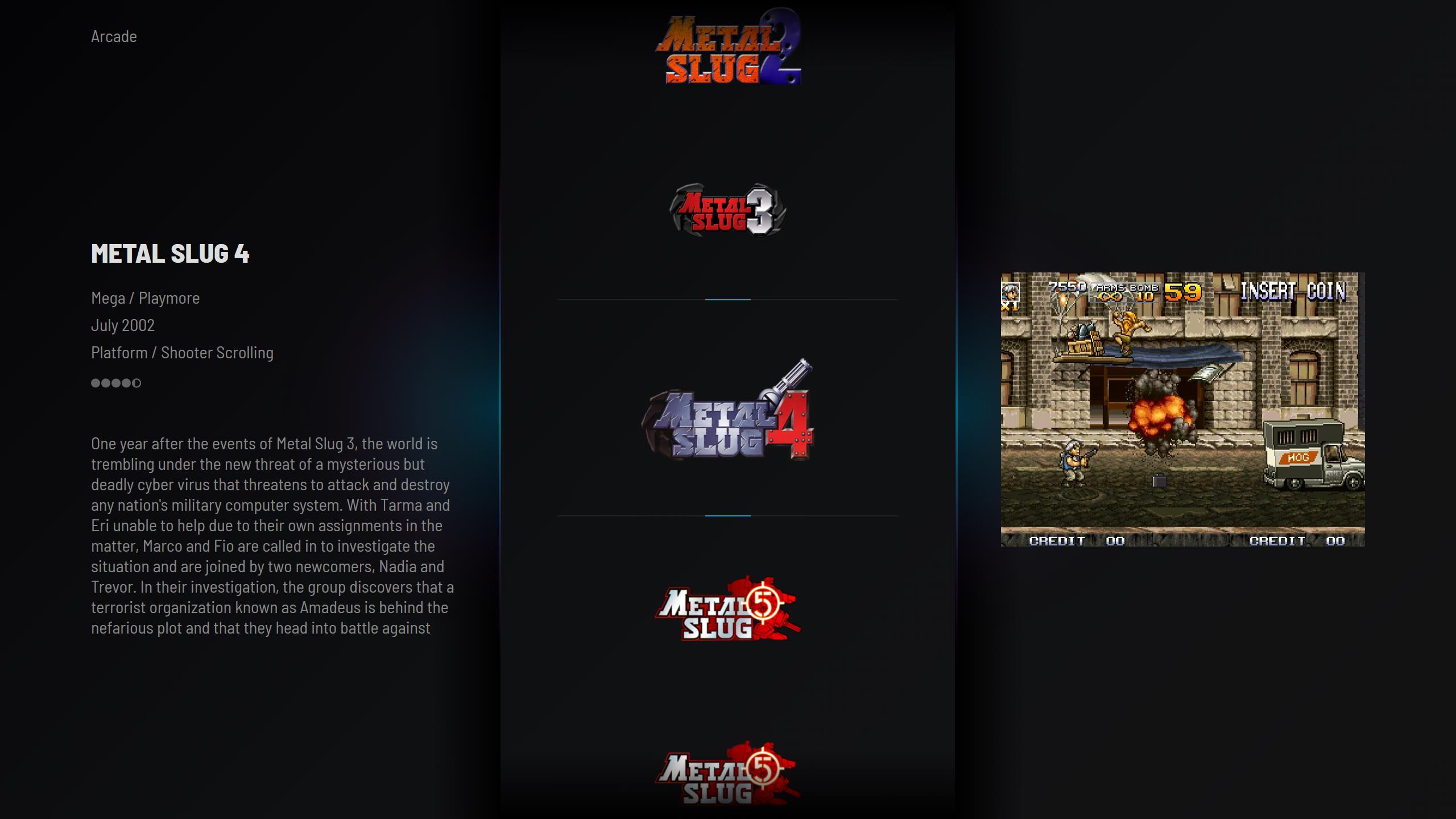
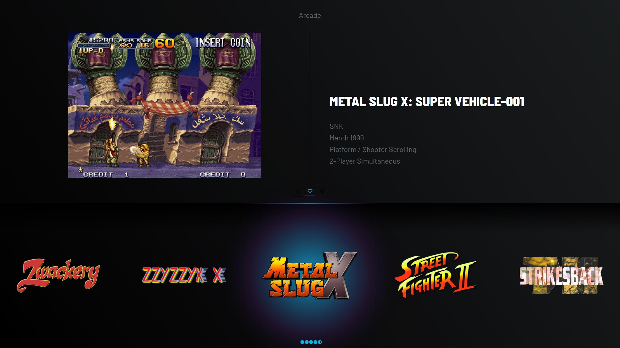
I think I will settle with this one. The shadow above the boxes was a great idea Dan. Needed to add more space between the boxes to work better with horizontal boxes and 4:3 ratio. The view has quite a lot of subtle animations. Now I have to implement these tweaks for the other views also.
-
1
-
-
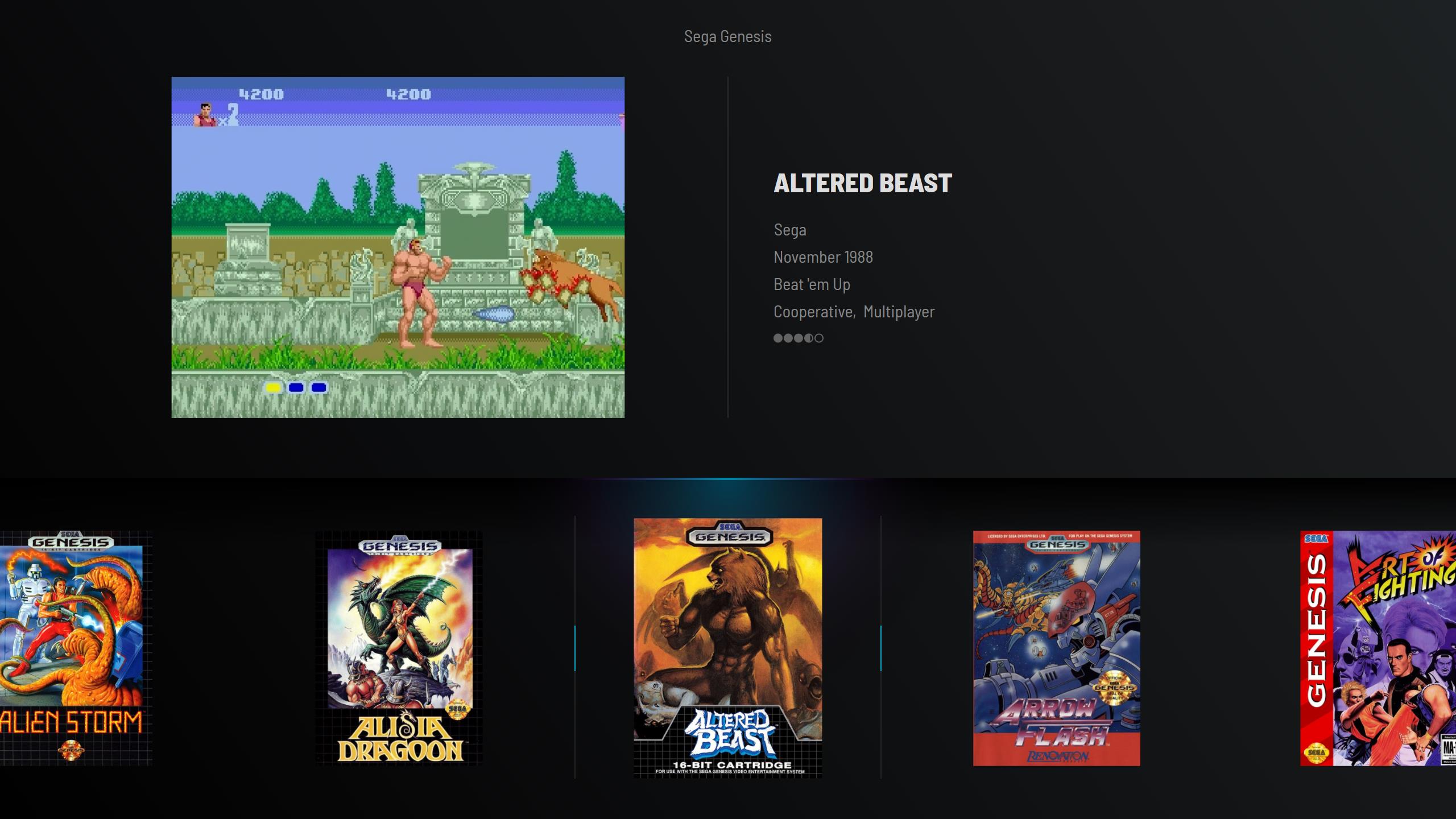
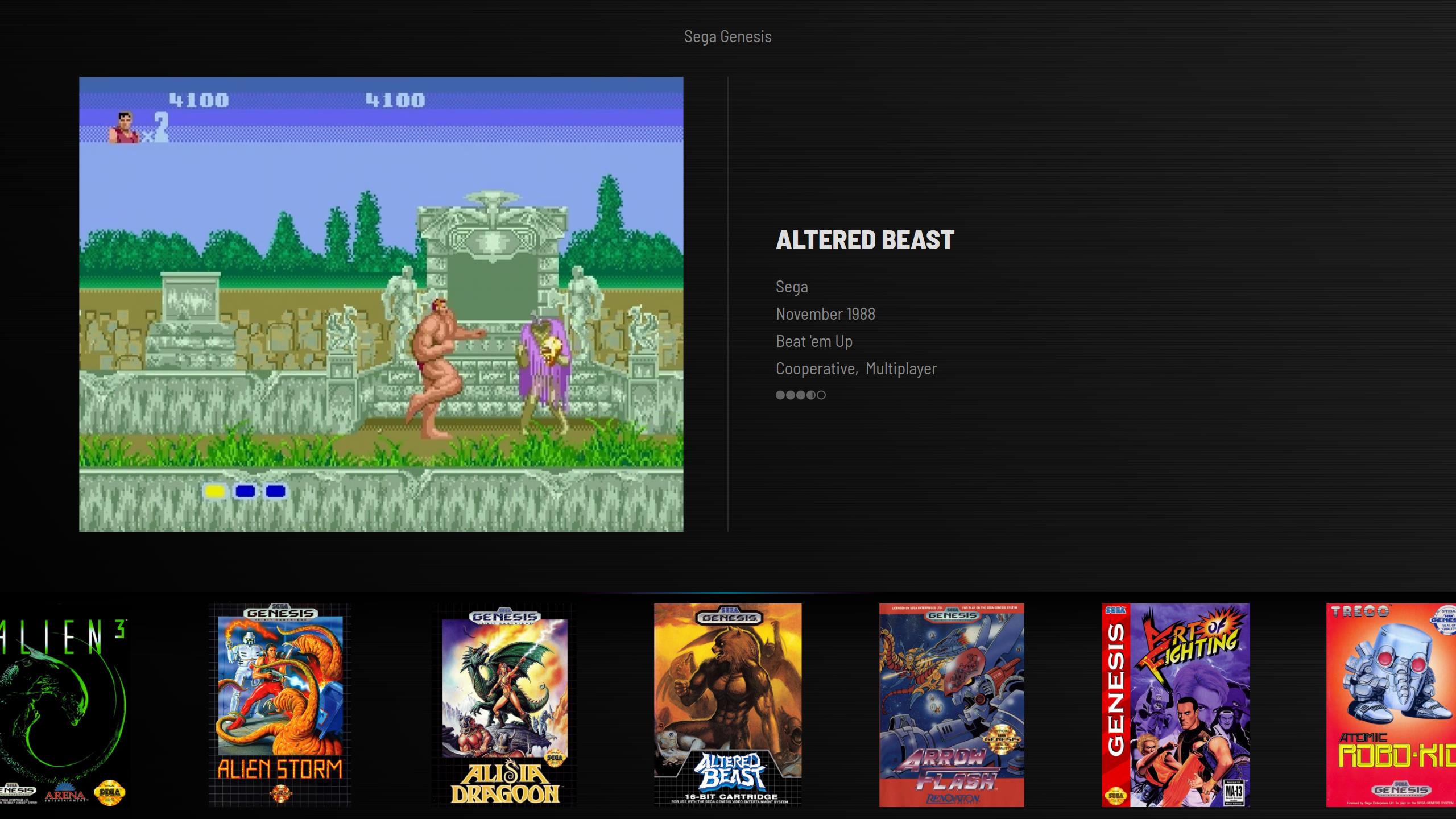
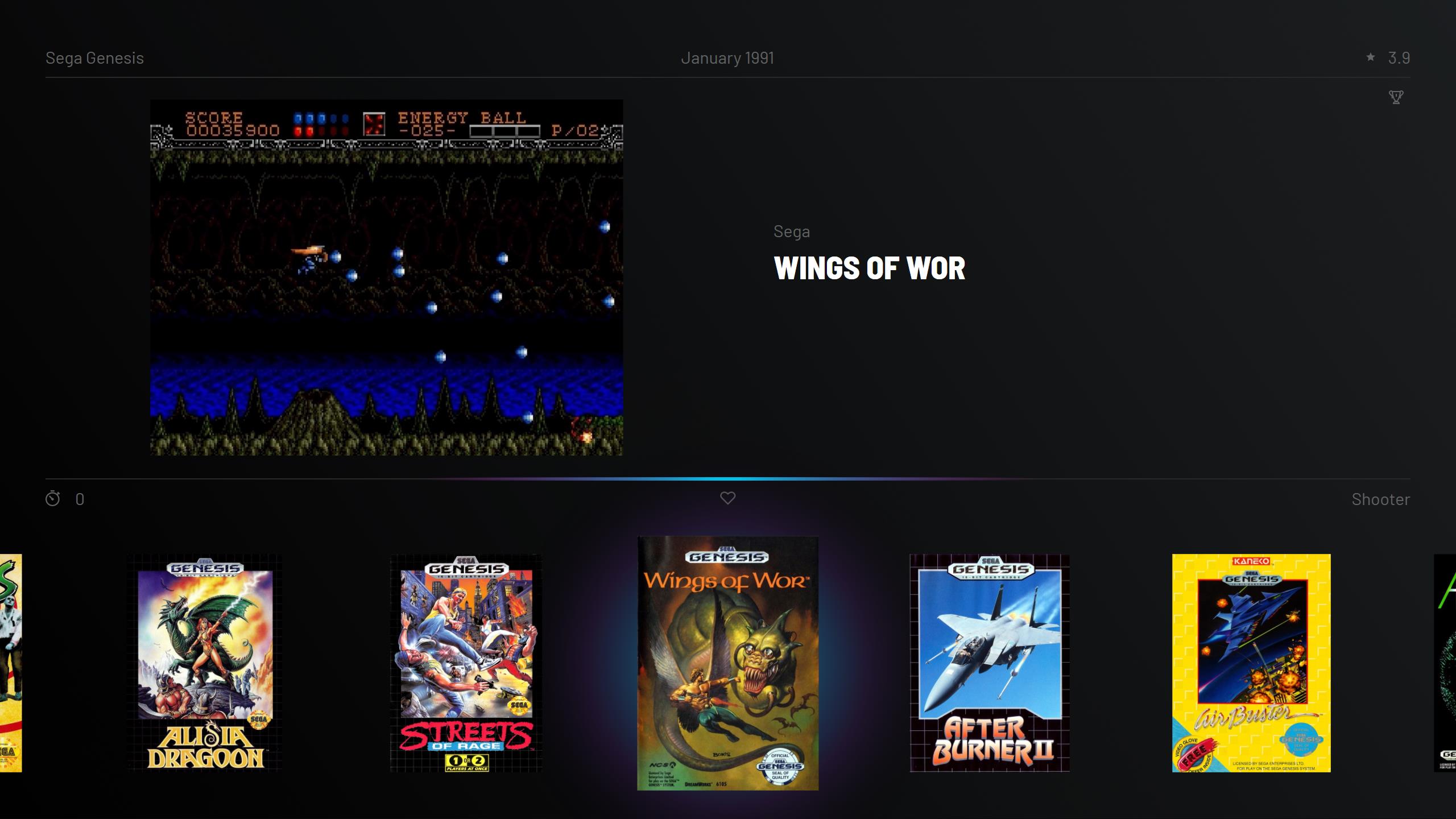
I personally don't like the sections that are now clearly visible (top right info, top left video/screenshot, bottom wheel). Trying to fade the gap between them a little. I now used the same background for both sections and widened the separator lines to full width, put the glow behind the box art, favorite symbol above the box art. This composition would scale batter to different aspect ratios and allow for better video aspect support also.
-
2 hours ago, damageinc86 said:
well that's an interesting take on the "wheel". I can't decide if I like it or not lol. I think I do? haha.
I kind of liked it also, but still decided to remove the roundness. It highlighted the selected game well and the motion was nice, but it did not seem to fit in the overall look of the theme.
-
1
-
-
Now playing with colors. Midnight made me change the gray to purple. Now it's more inline with the glow and light strip.
-
1
-
-
@Dan Patrick would not trust web developers to get the colors right in there
(I have some experience in that...). It seems they have used many different red tints there. They may have changed the color for the mini, who knows.
For my eyes, this one has more the original snes red: https://commons.wikimedia.org/wiki/File:SNES_logo.svg
And looking at these packages, it should be more vibrant than it is on that website you linked:
-
1
-
-
@Dan Patrick Well PC Engine seems to be too orange, I think Super Nintendo red should be brighter: https://commons.wikimedia.org/wiki/File:SNES_logo.svg, same with the Super Acan, the colors should be brighter. And Sega 32X red also seems to be too dark/orange. https://www.amazon.co.uk/SEGA-MK-84001-32X-console/dp/B0007ZNH5I. These are my gut feelings mostly. It's really hard to get the exact original colors without any brandbooks and original source material.
The theme name started as BareBones, because I wanted to make something really simple. Now it does not look that anymore. So your right, I should change the name. Thanks for the examples. Midnight could be a good starting point for the new name.
-
1
-
-
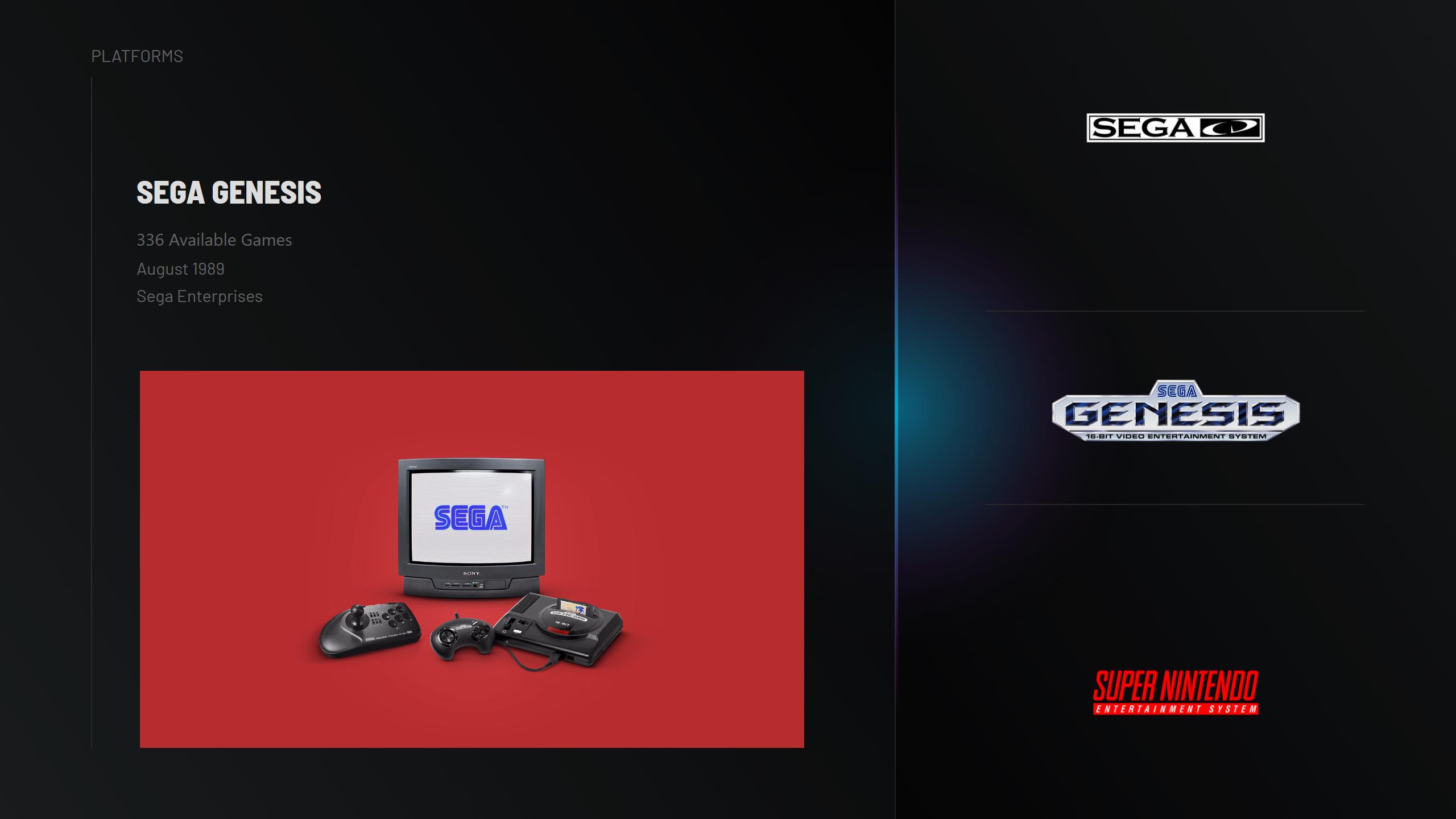
4 hours ago, Dan Patrick said:
Thanks! I didn't even think about the platform view top section to be connected like that. That's such a good, simple solution for that. I literally love that! Happy to see the "available games" part figured out too! That looks great! Dude, this theme is dope!
I made a very rough and quick video showcasing an animation technique I think you could try. The 4k/hd version of the video is still processing. It's a subtle bounce that has to be created manually with 2 different animations. I couldn't explain it without a little video. Anyway, I was thinking that bounce effect would look great for the platform images as they come in.
Wow, I like how you are pixel perfect
I must say i will disappoint you with the logos provided with the theme. I used many logos from your zips, but some had different color. I'm not sure what are accured colors, but the ones you provided, some had darker colors that looked like CMYK variations. I'm trying your animation, and I think I got it working. Looking at it and deciding if it's a keeper.
-
1
-
-
How about this Dan?
-
1
-
-
1 hour ago, Dan Patrick said:
Thimolor this theme continues to impress! It's awesome! I'm all for the simpler logo idea. Having two images of the console was a little redundant anyway. I have alternate colors and versions for all of the logos I gave you. If you want a different version of one just ask and I can get it to you asap! I see that the amount of glow you have varies per view. I personally think a couple of the views could have the glow paired back just a touch. I love the amount of glow you show in your text games view. That's the perfect amount to me personally. I think it does make sense to allow for a little more glow on that vertical wheel you show in your last screen shot but imo still toned back just a hair.
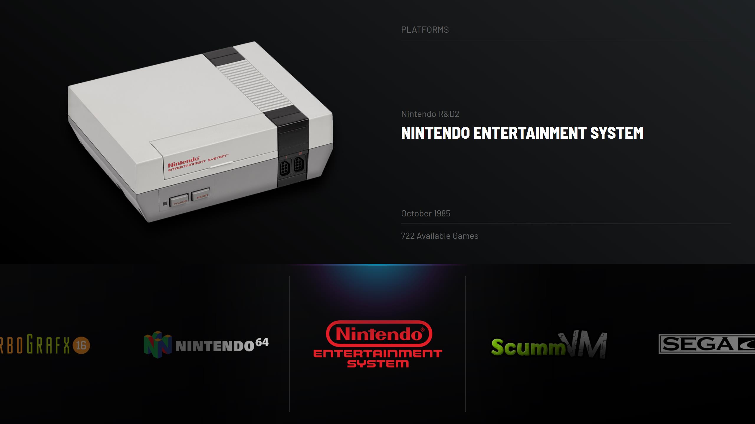
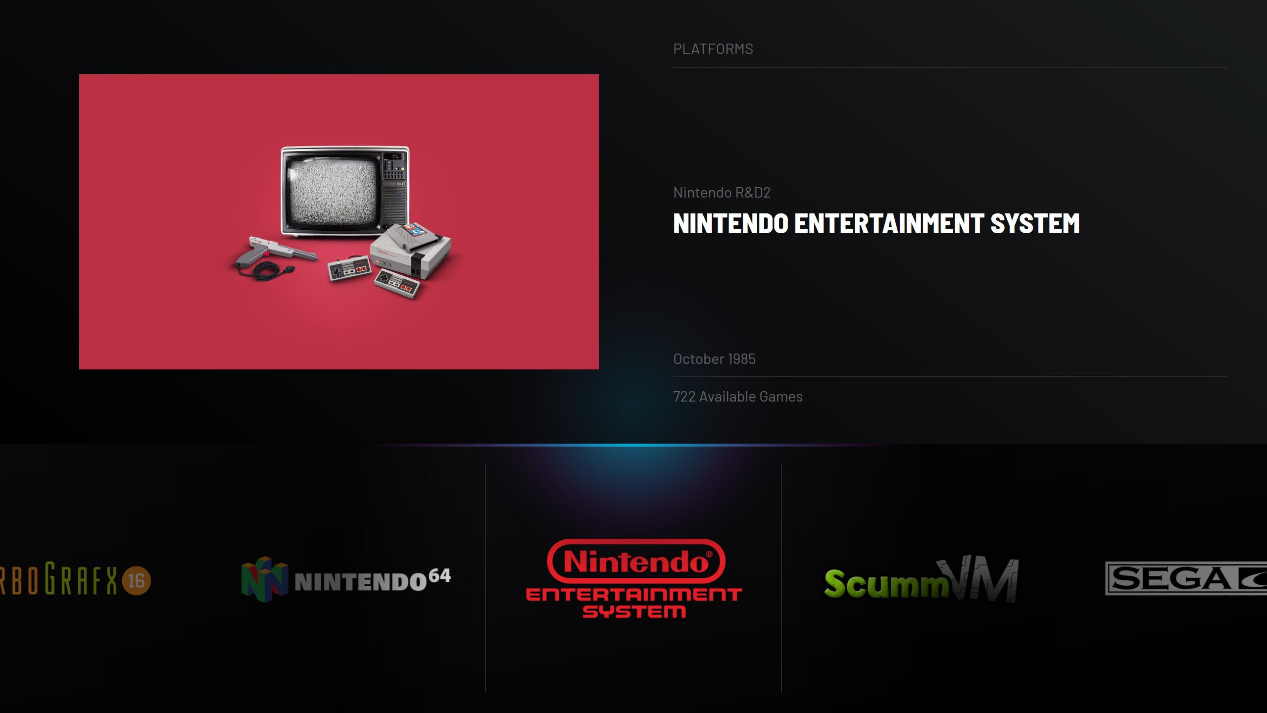
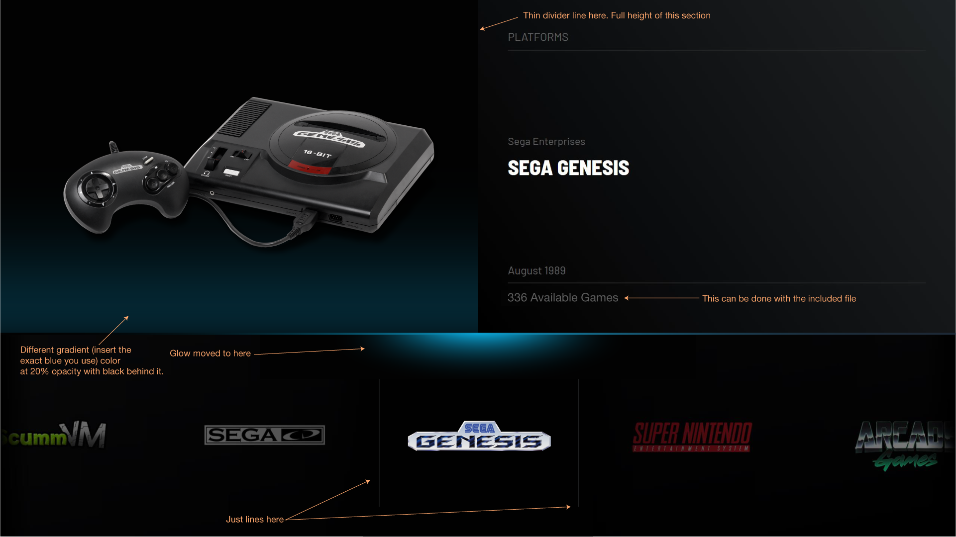
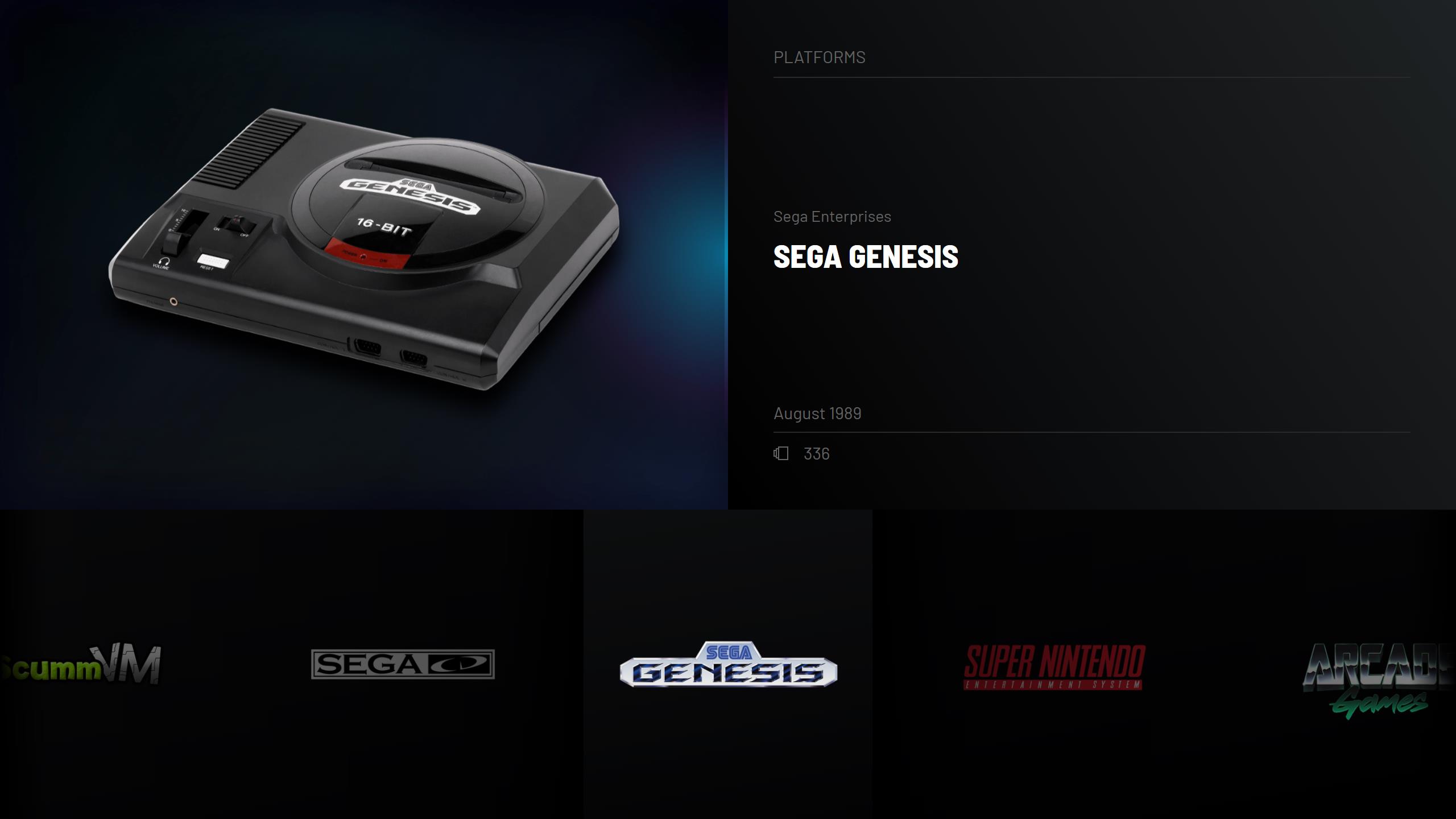
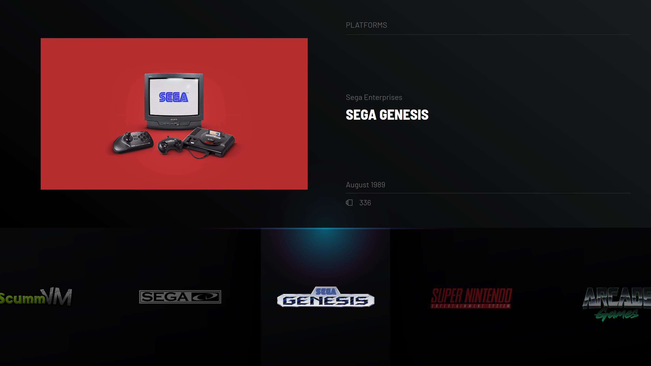
On the platform images views...I got a screenshot edit I quickly worked up. It's all the same except a couple ideas I had. I altered the glow (insert your colors because I don't know the exact blue you use). I'm not a huge fan of the bobbing up and down of the platform image. Instead , I’d recommend just a fade in and slide upwards about 15 pixels or so that would happen in maybe half a second then it stops smoothly. That's just me. Overall I love that view though!
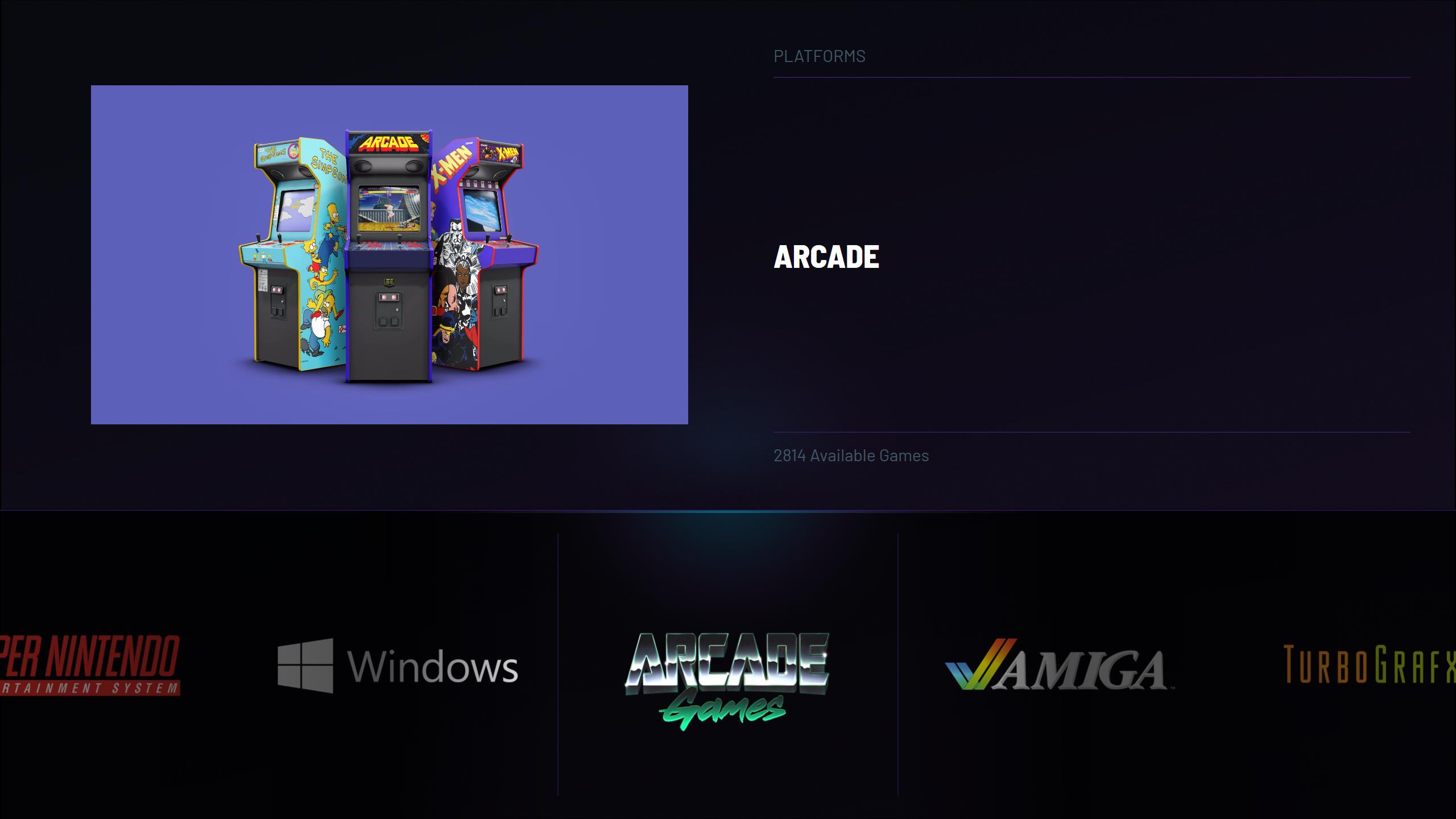
Also I've been meaning to tell you about a trick to get the "336 Available Games" thing to work. I have done this myself and I know it works. I got the tip from Retro Faeran. It's on this video at exactly 2:51:46
https://www.youtube.com/watch?v=Wv5d1e8KOIc&t=10306s
You have some nice ideas for the platform view, I will try those in the next demo. Your right about the glow and bouncing animation. Need to fix those. I think that after these changes I could give you a beta version to test the theme. You have sharp eyes, so you could spot something that needs changing. Thanks for the code!
-
1
-
-
7 hours ago, thimolor said:
You need banners for the store platforms (Steam, Ubisoft, ...)?
Not a stupid question at all. I know the pain of having to make compilcated assets to a theme. This time I have tried to make sure, that the assets are easy to make, or not needed at all. Actually the theme only uses one custom asset (platform view banner for one view). I figured that not everyone is willing to make their own assets, so the other view uses clear logos and videos instead. The custom asset is made with photoshop and it uses filters. I'm trying to make a simplified version of that, so it should work well on free applications such as Gimp. The only things needed for a banner are some kind of background image and a logo.
Decided to ditch the custom banners. Now using only logos. The logos will require a transparent canvas (empty space aound) to work.
-
6 hours ago, Patsy Heart said:
Quick and probably stupid question, will you release any of the assets for this? I usually separate PC games by the store they're bought from and I was wondering how hard it'd be to make images for those that match this set.
You need banners for the store platforms (Steam, Ubisoft, ...)?
Not a stupid question at all. I know the pain of having to make compilcated assets to a theme. This time I have tried to make sure, that the assets are easy to make, or not needed at all. Actually the theme only uses one custom asset (platform view banner for one view). I figured that not everyone is willing to make their own assets, so the other view uses clear logos and videos instead. The custom asset is made with photoshop and it uses filters. I'm trying to make a simplified version of that, so it should work well on free applications such as Gimp. The only things needed for a banner are some kind of background image and a logo.
-
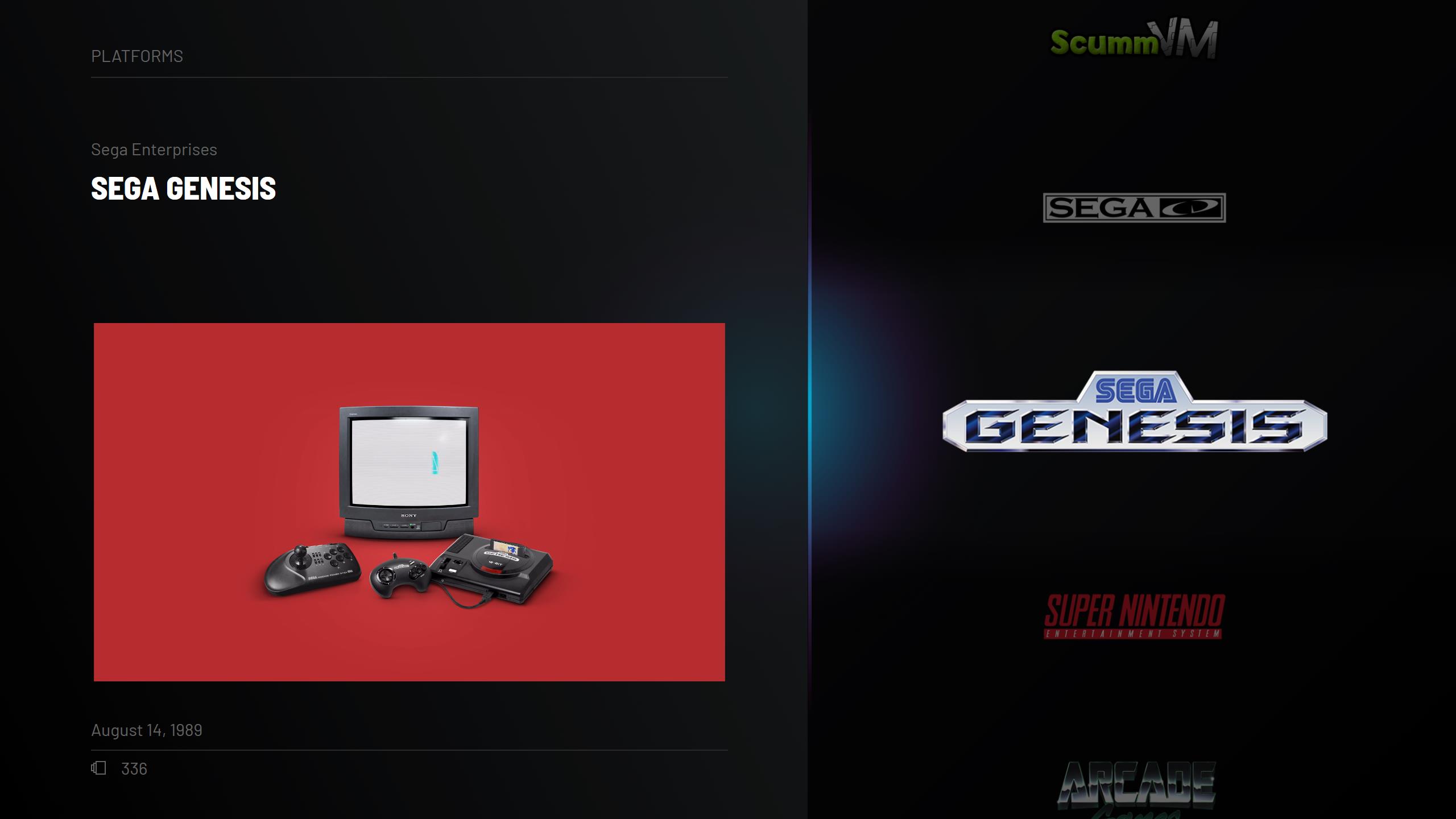
Almost there:
Credits to Viking for the platform videos + arcade device image.
-
Small demo of BareBones theme. Things to do: banners, device images and system view. I don't think I will be making any more different views for this one.
-
 1
1
-


Pulse Theme
in Big Box Custom Themes
Posted
No, I don't want to use my time adding stuff to those anymore. Actually I would like to remove them completely after I finish Pulse. I know you didn't want to hear this, but I just don't want to revisit my old work because it looks bad now")