


About This File
Introduction
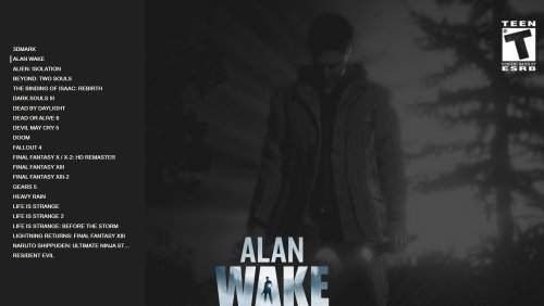
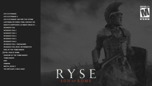
This is my first attempt with Theme Creator. I have been watching Unbroken Software's Youtube Channel and the Theme Workshop videos. I just want to say that I borrowed heavily from the "Tilt" theme to make this. I initially set out just to try and make a simple wall view but had fun trying to learn some of the different Wheel's and the theme creator stuff.
Just an fyi, I can't code at all so apart from what I used from the Tilt workshop files and the Colorful theme everything was done in the Theme Creator. I will try and give credit for everything that I used below. The theme workshop files have really helped me begin to learn the theme creator and I feel comfortable now that I could probably make a design in Photoshop and recreate it in the Theme Creator.
I initially set out just to try and make myself a simple wall view for the Tilt Theme but had a good time using it to learn.
Notes
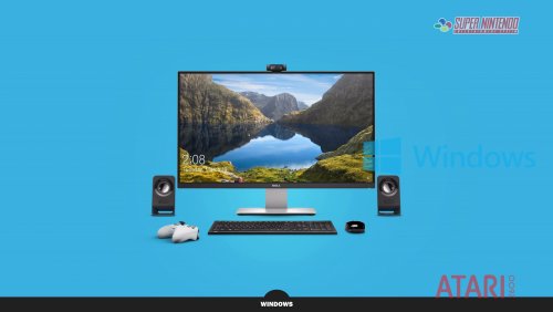
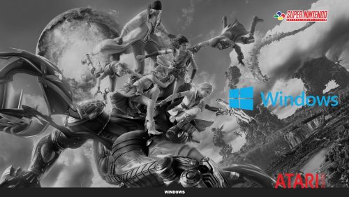
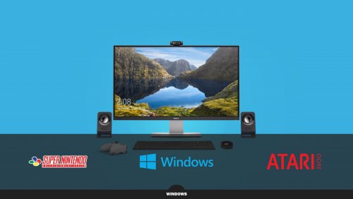
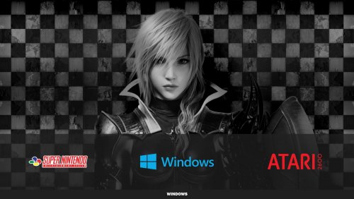
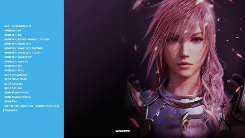
I did all this using a 55" LG 4k TV. I tested out a few different resolutions and didn't notice any problems. If you happen to run into any issues please let me know and I can try and figure out how to fix them. I know what little animation I used might be kind of janky but I will try and get better with that.
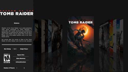
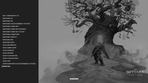
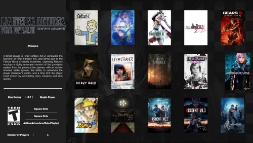
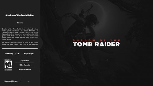
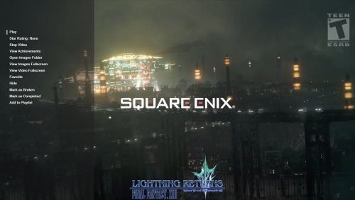
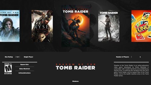
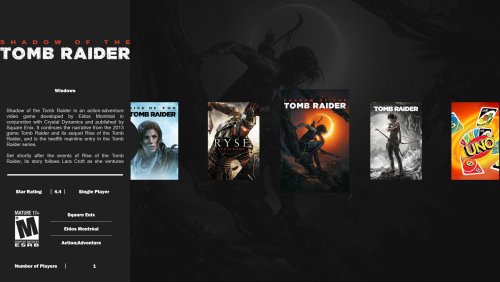
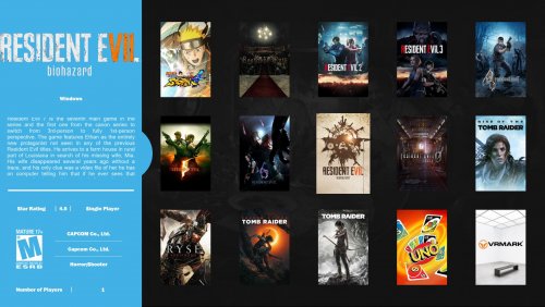
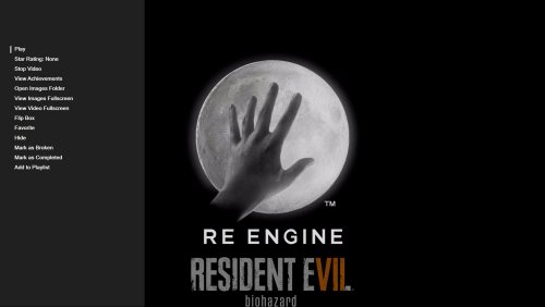
I also didn't set any of the image views to play a background video except for a couple of the platform views that play the Colorful Theme. The Game List Text view will play a video and if you click on any game the Game Info Screen will fade out into video as well.
I prefer the Colorful Video by @viking for the platform videos but I think any should look ok.
Installation
- Just download the .zip file for the version of the theme you want.
- Open the .zip file and place the folder in your Launchbox/Themes folder. OR
- Use your preferred software to extract it to your Launchbox/Themes folder.
-
Switch between the different views until you find one you might like
")
Credits and Special Thanks
- I want to give a huge Special Thanks to @faeran and the Unbroken Software Youtube Channel for the Theme Workshop videos. These are a great help. I used the .xaml file from Faeran's "Tilt" theme as well as the theme colors that change on platform switches. I don't know how to code my own .xaml files yet.
- Download Tilt Here
- I also want to give a huge Special Thanks to @viking I changed some of the platform colors around to match up with his Colorful Videos and used the Platform Clear Logo images. I also love the "Colorful" theme and it's a big inspiration.
- Download Colorful Here
- Last but not least I'd like to thank @y2guru for the Community Theme Creator. With my extreme lack of coding ability I wouldn't even be able to play with making themes if it weren't for the Community Theme Creator.
Find it here:
Edited by jhayes0027
What's New in Version 1.0.1 See changelog
Released
No changelog available for this version.


Recommended Comments
Join the conversation
You can post now and register later. If you have an account, sign in now to post with your account.