Jump to content
LaunchBox Community Forums

Neptune 1.72

   (3 reviews)

4 Screenshots

About This File

The newest version of this theme requires version 13.3, or higher.

A LaunchBox Custom Theme I developed to help me understand the code behind themes. Because of this, most items within the XAML files are commented, which were added in order to help me keep track of what was going on. Sources of inspiration include the Lambda theme and GOG Galaxy.

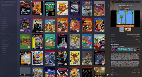
The notable item this theme accomplishes is the tab approach to the Game Details Page.

Please feel free to use parts of this theme in your own creations.


Installation

  • Extract the Neptune folder into LaunchBox\LBThemes
  • In LaunchBox, open Options, under Visuals > Main Window Theme and select Neptune from the dropdown.

What's New in Version 1.72   See changelog

Released

  • The advanced search hint popup has been added
  • Like 15
  • Thanks 6
  • Game On 1
  • Unusual Gem 1

User Feedback

Recommended Comments

Will definitely check this out. @faeran, based on your knowledge, would it be possible to make a dual-screen theme? For example, to have the system tree and games list on one screen, with the game details pane (including info, video, snapshots etc) on the other? This is something I would really like to do if possible. 

Link to comment
Share on other sites

3 hours ago, Retrofrogg said:

Will definitely check this out. @faeran, based on your knowledge, would it be possible to make a dual-screen theme? For example, to have the system tree and games list on one screen, with the game details pane (including info, video, snapshots etc) on the other? This is something I would really like to do if possible. 

Currently not possible, but is on my list of things I'd personally enjoy tackling.

Link to comment
Share on other sites

That would be awesome @C-Beats. Would open up a world of possibilities theme-wise, enable a more immersive experience and really make use of the available screen real estate! 

Link to comment
Share on other sites

Trying this out now @faeran. First impressions:

Platform tree and game images view are nice and clean, due to the dark grey background. There seems to be a tiny amount of change to the background when a game is selected; does an image load in the background but just very dark or with maximum transparency? I think it would be nice to have this effect a bit more visible. In the game images view, is the box art faded a little? When you hover the mouse cursor over a game it brightens. I'm not keen on having the artwork faded - would rather show it properly.

I like the way that the selected platform is clearly highlighted in the platform tree. Would it be posslbe to also highlight any parent platforms/categories for the selected platform? This way the user can quickly see which platform category, platform and playlists is being selected.

In terms of the game details pane, I love the tabs. Much better than scrolling through one big list. It would be great to have 3 tabs however - for game description, info and images. Currently the game description and game info are grouped together in the same tab, necessitating the game info to be in a much smaller font and in a different colour text - and still necessitating scrolling in some cases. A separate tab would allow the game info to be displayed properly in all its glory. I note that for MAME, the MAME high scores is in a separate tab, which is nice.

I'm not a big fan of the top half of the front box image being displayed in a slightly faded fashion at the top of the game details pane - especially when the game video plays over the top of it. It's a bit distracting, cluttered looking and also likely a duplication of media as most users would probably be browsing by front box art anyway (though 3D boxes probably come a close second). Faded fanart or screenshot might serve better here. The video itself could probably be made a bit bigger.

Do you think it would be relatively easy for me (a coding n00b), given that you have commented most items within the XAML files, to make the above adjustments?

Edit: perhaps not so easy lol. My rudimentary attempt at creating an extra tab failed. I just copied the below in the hope that it would add an extra tab:

                            <TabItem Header="Info 2">
                            <ScrollViewer VerticalScrollBarVisibility="{Binding ScrollBarVisibility}">
                                <StackPanel Orientation="Vertical" HorizontalAlignment="Center">
 
                            </TabItem>

But on starting Launchbox I get the error " An error occurred while parsing the custom GameDetailsView. The default view is shows instead. Details on the error are below: System.Windows.Markup.XamlParseException: The 'Stackpanel' start tag on line 223 position 34 does not match the end tag of 'Tabitem'. Line 230, position 21."

Something else - in the image tab, thumbnails are shown, which is great. However, some are incorrectly labelled (despite being correctly labelled in Launchbox, according to the game edit window) and some images are missing altogether. See the Bomberman II image tab for NES below:

image.thumb.png.48874a07d8b1adb0cfa8610e8952051b.png

The thumbnails only show 4 images though there are actually 10. It shows the game cartridge under screenshots. Also, it doesn't show any of the box artwork (front, back, 3D), advertisement flyer or anything else. It would be great to have the images grouped here under box art (including cart/disk/etc), screenshots, other (including advertisement flyer, clear logo) and fanart.


Edited by Retrofrogg
  • Like 3
Link to comment
Share on other sites

Thanks for the comments!

21 hours ago, Retrofrogg said:

Trying this out now @faeran. First impressions:

There seems to be a tiny amount of change to the background when a game is selected; does an image load in the background but just very dark or with maximum transparency? I think it would be nice to have this effect a bit more visible.

There's actually a couple things going on here. There is a color that goes overtop the main background image. The change you see is the game's background image (if you have this turned on in the options). There's a blur effect that a user would also control for this image within the options as well. The only thing the user cannot control here is the color that goes overtop this image. This can be adjusted within the theme files itself.

21 hours ago, Retrofrogg said:

In the game images view, is the box art faded a little? When you hover the mouse cursor over a game it brightens. I'm not keen on having the artwork faded - would rather show it properly.

This is the same effect as in the default theme. When you see it "brighten" it's a white color that goes overtop the image to make your mouse over selection stand out a bit more. There may also be a Black color over the rest of the images to dim them out a little, but if there is, it would be very slight, and just for a little bit of color control.

21 hours ago, Retrofrogg said:

I like the way that the selected platform is clearly highlighted in the platform tree. Would it be posslbe to also highlight any parent platforms/categories for the selected platform? This way the user can quickly see which platform category, platform and playlists is being selected.

This is a tough one. Remember that any parent item can also be independently selected from its child. Therefore, how do you tell exactly which item you are selected if multiple items look the same? There's a possibility here for some changes, but would have to think on how to best handle that.

21 hours ago, Retrofrogg said:

In terms of the game details pane, I love the tabs. Much better than scrolling through one big list. It would be great to have 3 tabs however - for game description, info and images. Currently the game description and game info are grouped together in the same tab, necessitating the game info to be in a much smaller font and in a different colour text - and still necessitating scrolling in some cases. A separate tab would allow the game info to be displayed properly in all its glory. I note that for MAME, the MAME high scores is in a separate tab, which is nice.

Good idea, although I probably won't be including this in the main version of the theme. I'd be glad to help you out with doing this in PM.

21 hours ago, Retrofrogg said:

I'm not a big fan of the top half of the front box image being displayed in a slightly faded fashion at the top of the game details pane - especially when the game video plays over the top of it. It's a bit distracting, cluttered looking and also likely a duplication of media as most users would probably be browsing by front box art anyway (though 3D boxes probably come a close second). Faded fanart or screenshot might serve better here. The video itself could probably be made a bit bigger.

This should be controlled by a user's image priority setting and not theme specific. The theme itself is just telling it to put a background image in that spot. Go into Options > Background Priorities and deselect anything you don't want to see, like any of the box images. I usually try and put all the different Background images and a Screenshot - Gameplay image in there.

The video will scale to the size of the window, with a max height, so it doesn't overtake the rest of the content. That max height can be adjusted in the theme files.

21 hours ago, Retrofrogg said:

Something else - in the image tab, thumbnails are shown, which is great. However, some are incorrectly labelled (despite being correctly labelled in Launchbox, according to the game edit window) and some images are missing altogether. See the Bomberman II image tab for NES below:

image.thumb.png.48874a07d8b1adb0cfa8610e8952051b.png

The theme would not actually be controlling this. My guess is that either your Screenshot image priorities includes Cart images, or that the Cart image is mislabeled as a screenshot. A little investigation should clear that up for ya.


Send me a PM and I can do my best to guide you through adding a new Tab in Game Details.

  • Like 1
Link to comment
Share on other sites

On 10/1/2021 at 5:24 AM, Retrofrogg said:

Will definitely check this out. @faeran, based on your knowledge, would it be possible to make a dual-screen theme? For example, to have the system tree and games list on one screen, with the game details pane (including info, video, snapshots etc) on the other? This is something I would really like to do if possible. 

That would be really neat. It would also be nice to have separate menu that pops up when you select a game, similarly to how Steam does it. This theme is looking really clean though, I don't believe I'll ever switch from it.

Link to comment
Share on other sites

Wow. Wow wow wow! Finally a modern minimalist theme that does work in portrait mode. Absolutely gorgeus. Thank you so much, this got me excited about Launchbox again! Please keep supporting and tinkering with it! I tried editing themes with Visual Studio but could not wrap my head around it, so i try to give the best feedback I can.

1709187149_Screenshot2021-12-03121946.thumb.jpg.6efa260c65fe19daf7e733db8f813ac2.jpg

- The control bar and the displayed items seem to overlap, both in portrait and landscape mode. Did i setup something wrong? When i change the vertical spacing LB adjusts the space between the boxes but not the one between top and first row. Is it possible to adjust this?

752294722_Screenshot2021-12-03121911.thumb.jpg.26e3457288a57c9f0d47e5fc8a2d422b.jpg

- Is it possible to hide this status bar? It bugs from day one that I have to see this in every theme with every sort option except "title".

- I know this seems to be a bit nitpicky, but why not rename the "Retro Achievements" tab into "Achievements"? So that tab would be valid for everyone, collecting retro or modern games..


Untitled-1.thumb.jpg.f3a60df7d4865211d095a9e7f8b16a78.jpg

I have to share this because it looks so beautiful to me. Thank you again and again and again.

Link to comment
Share on other sites

Thanks @Kylus12.

1 hour ago, CathMowr said:

- The control bar and the displayed items seem to overlap, both in portrait and landscape mode. Did i setup something wrong? When i change the vertical spacing LB adjusts the space between the boxes but not the one between top and first row. Is it possible to adjust this?

This is a design choice. It wouldn't be easily changeable without editing the theme files. It allows for the most vertical space on any size screen.

1 hour ago, CathMowr said:

- Is it possible to hide this status bar? It bugs from day one that I have to see this in every theme with every sort option except "title".

This is not possible. Like you noticed, some "Arrange by" options sort the games (like title), and in those circumstances, they don't have those separators because they are not needed. However, most are groupings, and if you remove the grouping title, you wouldn't know when one grouping ends and the other begins. Without that context, the grouping wouldn't actually make much sense.

1 hour ago, CathMowr said:

- I know this seems to be a bit nitpicky, but why not rename the "Retro Achievements" tab into "Achievements"? So that tab would be valid for everyone, collecting retro or modern games..

This is a good idea, I'll add it to the next update.

Link to comment
Share on other sites

Hi, 

I was wondering what settings I needed to enable to get the sidebar/info section to work the way you have it? With the fanart behind at the top and the text centered and tabbed etc? I have the theme enabled properly near as I can tell and it doesn't seem to have those features. Lovely theme! Thanks so much for making it. 

Link to comment
Share on other sites

22 minutes ago, red36 said:

Hi, 

I was wondering what settings I needed to enable to get the sidebar/info section to work the way you have it? With the fanart behind at the top and the text centered and tabbed etc? I have the theme enabled properly near as I can tell and it doesn't seem to have those features. Lovely theme! Thanks so much for making it. 

You should not have to do anything. The theme is coded to look the way it looks. Can you share a pic of what you are seeing? Just a pic of what the theme looks like when you choose it. The whole view of the them would be helpful, versus just a section of the theme you are talking about.

  • Like 1
Link to comment
Share on other sites

1 minute ago, Retro808 said:

You should not have to do anything. The theme is coded to look the way it looks. Can you share a pic of what you are seeing? Just a pic of what the theme looks like when you choose it.

image.thumb.png.1155647e2e6daaf6837bf0ab9f4184d6.png

Link to comment
Share on other sites

2 minutes ago, red36 said:

image.thumb.png.1155647e2e6daaf6837bf0ab9f4184d6.png

That does not look like you have the right theme. Can you post a pic of the entire LB theme window.

Did you unzip the theme and place it in the correct folder \LaunchBox\LBThemes\

  • Like 1
Link to comment
Share on other sites

@red36 Yeah, that folder name is not correct. When it was extracted from the zip it should have named the folder Neptune.

Rename it just Neptune and test. Then when inside the Neptune folder you should see these files/folders.

Screen Shot 2021-12-03 at 2.56.21 PM.png

  • Like 1
Link to comment
Share on other sites

2 minutes ago, Retro808 said:

@red36 Yeah, that folder name is not correct. When it was extracted from the zip it should have named the folder Neptune.

Rename it just Neptune and test. Then when inside the Neptune folder you should see these files/folders.

Screen Shot 2021-12-03 at 2.56.21 PM.png

UHG! Sorry, stupid mistake on my part. Thanks so much!

Link to comment
Share on other sites

2 minutes ago, red36 said:

UHG! Sorry, stupid mistake on my part. Thanks so much!

No worries. When you extract LB/BB themes be mindful the folder name cannot be changed. So open the zip and drag the theme folder to its destination.

  • Like 1
Link to comment
Share on other sites

22 hours ago, faeran said:

This is a design choice. It wouldn't be easily changeable without editing the theme files. It allows for the most vertical space on any size screen.

I already got used to it. Of course it would be nice if it just hid itself while not being used, just popping up when you hover near it, but i guess this is not in the realm of possibilities with Launch Box.

22 hours ago, faeran said:

This is not possible. Like you noticed, some "Arrange by" options sort the games (like title), and in those circumstances, they don't have those separators because they are not needed. However, most are groupings, and if you remove the grouping title, you wouldn't know when one grouping ends and the other begins. Without that context, the grouping wouldn't actually make much sense.

Would it be possible to change the style of the bar to fit in with the theme? It just drives me crazy to always have this ugly standard bar crash the style of a theme. I get that its wanted when you sort by "studio" or something where you want to know the nominator, but with some orders it just makes no sense - so having it look like it belongs to the theme would already make a big difference.


By the way - i noticed my game details not showing the developer, just the publisher - twice. Looks like this.

854480554_Screenshot2021-12-04124216.thumb.jpg.3340e173dd70d0495b20007ec9820b3d.jpg

I checked if the info is correct, and it is. Did i do something wrong? And how to get images shown in the "Images" Tab? My entries are populated but I cant find out which Definition to check where to get something showing up there..


Thanks for replying and taking my thoughts into account, very much appreciated!

Link to comment
Share on other sites

Hello! This is a fantastic theme, but I did run into an issue. I'm not sure if the issue originates from the theme itself or if it's a Launchbox issue. 

The URL used when clicking on a Retroachievement to view the achievement in in a browser is incorrect. The url section "/achievement/#####" should use a lowercase "a" but the link is passing an uppercase "A" and results in a page loading error on Retroachievements.

As an example:
https://retroachievements.org/Achievement/49122
https://retroachievements.org/achievement/49122

Link to comment
Share on other sites

16 hours ago, Panthon13 said:

Hello! This is a fantastic theme, but I did run into an issue. I'm not sure if the issue originates from the theme itself or if it's a Launchbox issue. 

The URL used when clicking on a Retroachievement to view the achievement in in a browser is incorrect. The url section "/achievement/#####" should use a lowercase "a" but the link is passing an uppercase "A" and results in a page loading error on Retroachievements.

As an example:
https://retroachievements.org/Achievement/49122
https://retroachievements.org/achievement/49122

Not a theme issue, but thanks for bringing it up.

Link to comment
Share on other sites

Join the conversation

You can post now and register later. If you have an account, sign in now to post with your account.

Guest
Unfortunately, your content contains terms that we do not allow. Please edit your content to remove the highlighted words below.
Add a comment...

×   Pasted as rich text.   Paste as plain text instead

  Only 75 emoji are allowed.

×   Your link has been automatically embedded.   Display as a link instead

×   Your previous content has been restored.   Clear editor

×   You cannot paste images directly. Upload or insert images from URL.

×
×
  • Create New...