

Yorrick36
-
Posts
18 -
Joined
-
Last visited
3 Followers


Yorrick36's Achievements
")
8-Bit Processor (3/7)
41
Reputation
-
For anyone else looking for a fallback options, I did find this in the feature definition on Feedback: So placing custom Clear Logos there should remedy the issue. Also: This is likely what needs to be done to use Clear Logos in the original location. I can't confirm this solves the problem quite yet, I'll try later tonight and update.
-
Super excited for the media pack feature released with the new version. However, I've run into an issue with the Platform Clear Logo packs and want to know if this behavior intentional. I applied a pack (white border), and noticed that my custom playlist and platform category logos that were not part of the pack no longer show when selected, defaulting to the backup text. Is this intended behavior? Should we expect future submissions to be relatively complete and mutually exclusive to any custom platform/category/playlist media we may have in their original folders in Launchbox/Images? I can workaround it for now by manually adding these local logos to the pack folder, but can get a bit tedious as I add more or modify existing media.
-
Perfect, uniform and matching Box Art for all your games...every time!
Yorrick36 replied to Osirix's topic in Game Media
I tend to use https://www.steamgriddb.com/ when I'm looking to fill media. There's a fairly large number of games outside of steam that have a lot of user submitted covers/logos. -
So, I've had a similar want with my setup, but for game series. My solution was to utilize the Platform Category menu and created Playlists/Categories for the game fields that are supported less than platforms and playlists, and it works pretty well! You can add the full range of media and videos to each playlist you make and customize the hierarchy on the page as much as you want. See below (my category isn't as fleshed out yet)

-
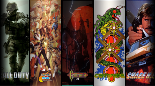
I just finished uploading part 3 of my game series playlist set, and can be found here: Preview of some of the new stuff:
-
Added Part 3!
-
First feature poll I've participated in. Excited to see the results!
-
Bumping the thread to say that part two the above pack was just uploaded. It covers the rest of the Ds and through the Ks to Klonoa, now around 170 in total.
-
 sure, throw them on here and I'll incorporate them into the list.
 -
Unfortunately, no. It's been slow going since the first dump. I burned out a bit getting through what is available, so I've been taking a break lately, and working at a slower pace. Good news is I'm definitely still working on it, and I'm sitting on about 25 new ones so far. I'll have them up when I get closer to ~80 like Part 1.
-
Recently I've been wanting to make my playlist media more robust in BannerBox (and other themes), and I resolved to find images and create banners for a select number of game series from my collection. Roughly 80ish images are ready to download in the Games Series Playlist Media Pack, which represents about a fourth of what I plan to make. I welcome any feedback anyone has or adjustments I should make. Here are a few examples of the format:
-
Miscellaneous Playlist Clear Logos View File Clear logos for my most general playlists in my platform category hierarchy. I plan on adding more downline logos as they are made. Submitter Yorrick36 Submitted 01/28/2021 Category Playlist Clear Logos
-
Version 1.0.0
928 downloads
Clear logos for my most general playlists in my platform category hierarchy. I plan on adding more downline logos as they are made. -
Game Series Playlist Media Pack View File I'm working on adding my curated games series categories into playlists in my platform category hierarchy, and I'm uploading the fruits of the media labor. Included are clear logos taken and modified from the launchbox DB, a 16:9 fanart wallpaper for select views, a rounded 4:3 image for banner/device folders, and a Slim banner to use in BannerBox or AllNightLong. Submitter Yorrick36 Submitted 01/28/2021 Category Playlist Media Packs
-
Version 1.2.0
1,078 downloads
I'm working on adding my curated games series categories into playlists in my platform category hierarchy, and I'm uploading the fruits of the media labor. Included are clear logos taken and modified from the launchbox DB, a 16:9 fanart wallpaper for select views, a rounded 4:3 image for banner/device folders, and a Slim banner to use in BannerBox or AllNightLong.


