Jump to content
LaunchBox Community Forums

Simple Detailed Pause Theme 1.0.2

   (0 reviews)

3 Screenshots

About This File

Ok, so this is a re-make of the PausePie theme by @faeran. He made a very nice and clean pause theme that I love and have used since it was first released, Thank you Faeran! I modified and tweaked it quite a bit so that it would match the startup theme I made called Simple Detailed Startup. Credit goes to faeran for the original work, most of which is still in use. Please enjoy this pause menu and keep on gaming!

@faeran, I will be glad to remove this if you request at anytime.

What is it?

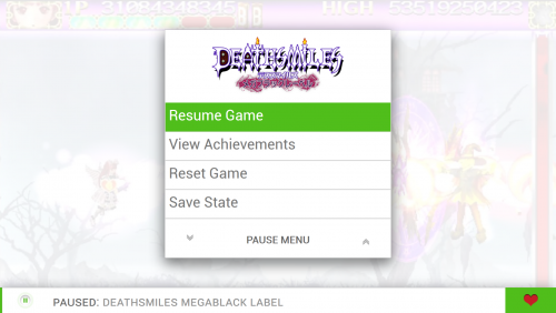
  • This is a very simple pause menu with some basic animated GIF's.
  • It displays info about the game and artwork. 
  • Designed to go best with the Colorful Theme by @viking

How to use it:

  • Just unzip this to your Launchbox PauseThemes folder and then select it in BigBox and Launchbox.

I hope I am not forgetting anything, please let me know if you have any problems or questions.

PS: I have also made a Startup Theme to match.


What's New in Version 1.0.2   See changelog

Released

Updated: Just made better image alignment and place holders. Little smoother now.

  • Like 6
  • Thanks 1

User Feedback

Recommended Comments

I really like it. Nice work!

Constructive tip: make the left and right padding values of the clear logos more than 0, so there is a small white border all around (i.e. in the Alien vs Predator example you shared you can see the choke on the sides).

Link to comment
Share on other sites

This looks great, Ill try it tonight. I love the Colorful theme, so this will be a perfect addition.

Suggestion:
I am trying to find a good solution for showing my controls for each game (especially for MAME). There is a specific folder that BigBox uses for showing this image, it is called "Arcade - Controls Information", which is where you store the games controls layout image (ones I have created specifically for my arcade sticks/spinner/ball/buttons).  It would be nice if you could somehow add another text selection in the Pause screen called "Show Controls" that will bring up the image stored in the games  "Arcade - Controls Information" folder. Is this even possible?
Thanks for listening to my suggestions!

Link to comment
Share on other sites

3 minutes ago, Kondorito said:

I really like it. Nice work!

Constructive tip: make the left and right padding values of the clear logos more than 0, so there is a small white border all around (i.e. in the Alien vs Predator example you shared you can see the choke on the sides).

Yep, That is exactly what I need to do. I will add that in both my startup and pause themes. Thank you for the tip!

  • Game On 1
Link to comment
Share on other sites

4 minutes ago, ItchyRobot said:

This looks great, Ill try it tonight. I love the Colorful theme, so this will be a perfect addition.

Suggestion:
I am trying to find a good solution for showing my controls for each game (especially for MAME). There is a specific folder that BigBox uses for showing this image, it is called "Arcade - Controls Information", which is where you store the games controls layout image (ones I have created specifically for my arcade sticks/spinner/ball/buttons).  It would be nice if you could somehow add another text selection in the Pause screen called "Show Controls" that will bring up the image stored in the games  "Arcade - Controls Information" folder. Is this even possible?
Thanks for listening to my suggestions!

I love that idea, I am currently working a few similar ideas to this. Right now the pause menu only shows the available options that the platform or emulator offers and I do not know how to change it. But, in time a may figure it out. I will drop you a line if I do. That would be a cool addition!

Link to comment
Share on other sites

1 hour ago, cemfundog said:

I love that idea, I am currently working a few similar ideas to this. Right now the pause menu only shows the available options that the platform or emulator offers and I do not know how to change it. But, in time a may figure it out. I will drop you a line if I do. That would be a cool addition!

Great to hear you want to add it. Please do let me know when/if you add it and I can help beta test it for you if needed. I think it will be a great addition for people like myself that have their own custom arcade sticks and controllers.

Link to comment
Share on other sites

Also really love the look and simplicity of it!! I have a hard time with bright whites so I adjusted a couple color values to match the dark view of the Colorful theme. Now it's all in sync and not burning my retinas. ?

Link to comment
Share on other sites

20 hours ago, ShawnS said:

Also really love the look and simplicity of it!! I have a hard time with bright whites so I adjusted a couple color values to match the dark view of the Colorful theme. Now it's all in sync and not burning my retinas. ?

Care to share your dark version? Thanks!

Link to comment
Share on other sites

Sure thing! I just changed the main background color and bottom bar to the 2 shades of COLORFUL's dark theme. And since the pause gif looked a little funky on dark, I switched it to the .png. I was going to darken the background on the scroll list buuuuut I got lazy. Turns out it isn't too bright for me with the background toned down. 

Default.xaml

  • Like 1
Link to comment
Share on other sites

1 hour ago, ShawnS said:

Sure thing! I just changed the main background color and bottom bar to the 2 shades of COLORFUL's dark theme. And since the pause gif looked a little funky on dark, I switched it to the .png. I was going to darken the background on the scroll list buuuuut I got lazy. Turns out it isn't too bright for me with the background toned down.

Got it. I was going to ask you how you managed to work with the grey texts in this theme so it does not get drowned in the background color (if you reversed the colors or something).


Link to comment
Share on other sites

I figured it would just take some adjusting of more colors, but I'd also have to edit the GIF arrows or remove them.

If I ever get super ambitious, I'd like something like your pause screen but with the menu moved to the left and the control panel image for the loaded game above the Notes/description of the game. 

Link to comment
Share on other sites

Join the conversation

You can post now and register later. If you have an account, sign in now to post with your account.

Guest
Unfortunately, your content contains terms that we do not allow. Please edit your content to remove the highlighted words below.
Add a comment...

×   Pasted as rich text.   Paste as plain text instead

  Only 75 emoji are allowed.

×   Your link has been automatically embedded.   Display as a link instead

×   Your previous content has been restored.   Clear editor

×   You cannot paste images directly. Upload or insert images from URL.

×
×
  • Create New...