Jump to content
LaunchBox Community Forums

Unified Lives! 4.4

   (1 review)

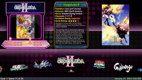
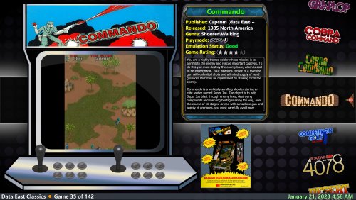
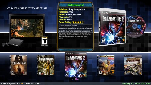
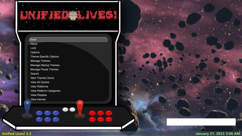
6 Screenshots

About This File

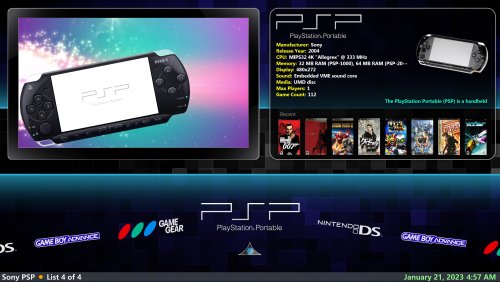
 This theme is my re-take on the excellent Unified-Refried theme and I called it 'Unified Lives!'.  The goal is to present more information to the user during game selection as well as using more graphic assets to complement the display experience.  I hope you like it!  

- An informative game card that shows many details of the currently selected game.

- 6 Game wheel views.  2 vertical, 3 horizontal and 1 text. 

- 4 Platform/playlist views

-  Single views for game and platform text views (these are necessary views)

- Marquee, box 3d, disc, cd, 3d cart and front flyer images are all used.  Visibility rules determine how they appear, depending on platform and also file availability.

- Supports different aspect ratios.  If it doesn't look right on yours please let me know!  

- Wheel Badges for Favorite, Completed and Broken games. 

- Created with Community Theme Creator 2.5

- Dynamically changing theme images based upon current platform/playlist. just like Refried.  

** Rename 'background' folder to enable fanart.

** Rename the 'Devices' folder to always show a random game screenshot in platform/playlist views.

** Place your choice of fanart in 'fanart fallback' folder when game or platform fanart does not exist, a random image is chosen

** ESRB icons.  If you don't want them, delete or rename the icons.  The 'Not Rated' icon is renamed due to the number of titles without rating.  Remove the exclamation from the filename to see it.

*** Do not overwrite previous versions of the theme, replace the folder.  Folder and file structure can change between versions! 

Edited by Rob_G


What's New in Version 4.4   See changelog

Released

- Reworked platform views some more.  Vertical platform/playlist views have a refreshed layout.  I think this one is good.  
- Tweaked options page
- Tweaked game views slightly (info grid spacing on vertical views)
- Fixed text list selected item transparent background
*** Platform\playlist views will show a random game screenshot (with rating) if there is no device image present.  If you don't want to see device images and prefer the random screenshot for everything, just rename the Devices folder.  You can always add more device images if anything is missing.

 I am pretty much happy with where it is now...
  • Like 22
  • Thanks 2

User Feedback

Recommended Comments


1 minute ago, y2guru said:

Yes because I am assuming you have multiple "Selected Item Videos" and 1 is displayed based on aspect ratio

 The video is actually not the issue, but the 'video border' element aspect ratio.  I changed the stretch to 'fill' and that fixes alignments, albeit with a bit of noticeable uniformity loss on really wide or narrow views.  The video aspect ratio is always correct.  The video border stretch has to remain anyhow because that is integral for it to look proper in both 16:9 and 16:10 which identify both as 'widescreen'.  The uniformity difference is negligible there.  I'm going to fix everything else in 2.3 because I haven't quite figured out the wheel on 2.5 yet and I don't like the results so far.

image.thumb.png.80ba970a794c2f53b7a0d597db73c790.png

Link to comment
Share on other sites

On 12/1/2022 at 1:58 PM, Jlapers said:

I wish I could use your theme with my 21:9 monitor. I don't know if it's something you plan to do. Any way, great work!

 Let me know how 3.3 works for you.  The graphics should line up now, albeit they will be stretched a bit. 

 When CTC 2.5 is out and I have time to release under that, I will look at using the aspect visibility rules.   

Link to comment
Share on other sites

It works fine, thank you so much :)
 I had to change this line in themesetting.xml: <Force16X9AspectRatio>false</Force16X9AspectRatio> otherwise the theme don't display properly on my screen.

I don't know if videos in 4:3 ratio could be display in full screen (see the screens caps in attachment) however, it seems to work perfecty with 16:9 ratio videos.

game-view.jpg

platform-screen.jpg

Link to comment
Share on other sites

2 hours ago, Jlapers said:

I don't know if videos in 4:3 ratio could be display in full screen (see the screens caps in attachment) however, it seems to work perfecty with 16:9 ratio videos.


 Not with CTC 2.3.

 CTC 2.5 has some design in it for this.  I'll get it sorted out when it's released.  

Rob


Link to comment
Share on other sites

Thank you very much for the changes and for you help!
I'm not a very active user on the forum but I'm glad to see there is a good community here.

  • Like 1
Link to comment
Share on other sites

 I really spent A LOT of time on this version.  I go over even the little details with a fine tooth comb until it's where I want it to be.  I DID NOT do anything different for aspect ratios in this version.  They still work, it's just that media is either stretched or compressed depending on the ratio of the display (like the last version).  

 Fan art is a mixed bag.  Some is great, some is bad.  I also noticed some is widescreen, some is 4:3.  Fanart is uniformly stretched to fill. 

 CTC2.5 doesn't have a proper curve for wheels and I tried my best to implement the curved wheels.  It was A LOT of work as I indicated in the notes.  I don't understand all of the settings.... 

 When fanart is enabled, there's a momentary visible default background between some transitions, like switching to the game play wheel.  I think I can fix that with an opacity animation to hide it.  For next version I guess.


Rob


  • Like 1
Link to comment
Share on other sites

So I love the theme but I seem to be missing the ability to scroll through games on the wheel as its missing? Any idea on what settings to change to have the wheel populate?image.thumb.png.4a50709ee9019cb7443a42faf795c018.png

Link to comment
Share on other sites

1 hour ago, Talphadogg said:

So I love the theme but I seem to be missing the ability to scroll through games on the wheel as its missing? Any idea on what settings to change to have the wheel populate?image.thumb.png.4a50709ee9019cb7443a42faf795c018.png

 That's weird.  I would suggest going into big box options, selecting image cache and refreshing all images.  Do images show on platform wheels?  

  Perhaps  try resetting your big box settings if that fails.

Rob  

Link to comment
Share on other sites

51 minutes ago, Rob_G said:

 That's weird.  I would suggest going into big box options, selecting image cache and refreshing all images.  Do images show on platform wheels?  

  Perhaps  try resetting your big box settings if that fails.

Rob  

Yeah the platform wheel works fine and I tried refreshing the image cache for all images and also tried forcing game wheel to populate however both failed. :( I've tried every option for getting the game wheel to populate and some do but never with clear logos. The ones that do are coverflow which is Horizontal 3 and any text based game list where they just have the name of the game in text format instead of clear logos. When you say "try resetting your big box settings if that fails" what specifically are you referring to? 

image.thumb.png.5c6599ec793fe319defb0c74431b7654.png

image.thumb.png.bbc40d7e6f9ddfb89a71abf63095049e.png

image.thumb.png.bde259002f69b7ee8597ced526bc5360.png

Link to comment
Share on other sites

4 hours ago, Talphadogg said:

Yeah the platform wheel works fine and I tried refreshing the image cache for all images and also tried forcing game wheel to populate however both failed. :( I've tried every option for getting the game wheel to populate and some do but never with clear logos. The ones that do are coverflow which is Horizontal 3 and any text based game list where they just have the name of the game in text format instead of clear logos. When you say "try resetting your big box settings if that fails" what specifically are you referring to? 

 What version of Big Box are you running.  You need to be running the latest beta version (13.2).

Rob

Link to comment
Share on other sites

Loving the new Fan art backgrounds for games. Quick question, is there any way to darken them? some are so bright they clash with the text, art. Cheers :)

Link to comment
Share on other sites


On 1/4/2023 at 8:14 AM, Rob_G said:

 What version of Big Box are you running.  You need to be running the latest beta version (13.2).

Rob

Ah I'm on the 13.0 build that might explain it. How do I go about upgrading to the beta?

Link to comment
Share on other sites

6 hours ago, Talphadogg said:


Ah I'm on the 13.0 build that might explain it. How do I go about upgrading to the beta?


Link to comment
Share on other sites

Liking the new additions but I ain't keen on the new marquees top left covering the system logo, looks messy with the logo popping out . Is there a way to disable these? Thanks :)
 

Screenshot (566).jpg

Link to comment
Share on other sites

On 1/15/2023 at 9:42 AM, Lukeyboy67 said:

Liking the new additions but I ain't keen on the new marquees top left covering the system logo, looks messy with the logo popping out . Is there a way to disable these? Thanks :)
 

 It shouldn't be doing that and is a visibility condition bug.  Thanks for letting me know and I will fix it shortly.  I may have it fixed already since I reworked a few visibility conditions anyhow.  :)

Rob

  • Like 1
Link to comment
Share on other sites

On 1/17/2023 at 5:57 PM, stino2004 said:

can't seem to get the vertical games to to ever display, only horzontal wheels appear even after multiple image cache refreshes.

 Are you using the latest version of BigBox?

 Do images show in vertical platform wheels?

Link to comment
Share on other sites

 Anyhow here is some of what is coming up in the next version to be released in the next day or two.  And I'm finally getting over my cold...  Or maybe it was covid.. I dunno, I was sick and in the house for a week!

- Genre includes a secondary genre tag if it exists
- Color conditioning on Arcade Emulation status.  Green is good, orange is imperfect and red is preliminary (non working)
- Color conditioning on ratings.  4+ is Gold, 2-5 is silver and below 2 is bronze.  This applies to both community and your ratings
- Last played date and count are also collapsed if you never played the game.  
- Game and platform counts will appear in the status bar along with selection number.
- Corrected an unnecessary duplication of blur effect on wheels.
- Created new box wheel template.  It now moves the same as clear logo wheels.  Before it was backwards! (HorizontalGameWheel3)  
 

image.thumb.png.760c689bfe9fbd825d39bc9a26570922.png


  • Like 1
Link to comment
Share on other sites

The new release is great but I've found a few problems. The visibility condition bug is still present....

1897667908_Screenshot(576).thumb.png.2eee546e0548d029f03f0aec9c37c6ce.png


Some platforms boxart isn't showing up.....

352788998_Screenshot(578).thumb.jpg.9a6f99ece7f07e7e63ee0cd6a246632c.jpg

Playlists show logos instead of boxes.

1724394067_Screenshot(577).thumb.jpg.3628a853db9a99f2db35570610c819ce.jpg

Link to comment
Share on other sites

10 hours ago, Lukeyboy67 said:

The new release is great but I've found a few problems. The visibility condition bug is still present....

1897667908_Screenshot(576).thumb.png.2eee546e0548d029f03f0aec9c37c6ce.png


Some platforms boxart isn't showing up.....

352788998_Screenshot(578).thumb.jpg.9a6f99ece7f07e7e63ee0cd6a246632c.jpg

Playlists show logos instead of boxes.

1724394067_Screenshot(577).thumb.jpg.3628a853db9a99f2db35570610c819ce.jpg

Are you just overwriting the theme folder?  That's your issue then.  Judging by your screenshots, you have non-arcade images in the videoborder folder.  When a videoborder image is present for a playlist or platform, the theme assumes it is an arcade cabinet image.  That's all I have in there except for _default.png (and the older original default).  The theme used to include the colored video frames that came with Refried, but I don't use those any more to keep the theme size down.  I also replaced the default square border because I wanted to do something unique and not just keep relying on other peoples artwork.  You can always change _deault.png to whatever you want as long as the size and opacity layers match identical.   

 For arcade cabinets, the visibility priority goes likes this:

 Marquee
 Then fallback background with clear logo
 Then fallback background with text

  I am not sure what is up with the second image, but that's the recent games listbox.  I have zero ability to control how it works, but it should be showing game boxes for recent games.  Do you have image priorities changed in bigbox or launchbox settings?  I also use the thumbnaillistboxview.xaml(?) from the default theme.      Something is not right with your box images?

 Just use a clean 'Unified Lives' theme folder, don't overwrite what you have already.

 I will ponder the colored frames for now.  It just makes visibility rules more a lot more tedious.  They can't be in the same folder, that's for sure.  I don't want to even go down the path of separate configs for different platforms..  Too much!

Rob


Edited by Rob_G
  • Like 1
Link to comment
Share on other sites

Rob, I like the improvements you’ve made in version 4, but I ended up going back to version 3. I prefer vertical wheels and in version 4, I felt that the platform vertical wheels had too much wasted space compared to say Platform Wheel 3 in version 3. I like the combination of Platform Wheel 3 and Vertical Wheel 1 in version 3 over the wheel options in version 4. But this is all personal preference.  

Link to comment
Share on other sites

Yes, I was overwriting the theme folder, I used a fresh download and now it works great! Thanks for your reply @Rob_G ! Loving this theme, just what I've been looking for, cheers 👍

Link to comment
Share on other sites

3 hours ago, Drivin33 said:

Rob, I like the improvements you’ve made in version 4, but I ended up going back to version 3. I prefer vertical wheels and in version 4, I felt that the platform vertical wheels had too much wasted space compared to say Platform Wheel 3 in version 3. I like the combination of Platform Wheel 3 and Vertical Wheel 1 in version 3 over the wheel options in version 4. But this is all personal preference.  

 I am not 100% happy with the vertical platform wheels either and will be changing them for sure.  Are you ok with the horizontal ones?  It's really just the wasted space?    

 Question:  Is the recent game listbox useful?  I like the concept, but I don't know if and how it can be customized.      

  For now, just copy PlatformWheel3FiltersView.xaml and PlatformWheel4FiltersView.xaml from the older version into the views folder of the latest version.  Then you have the best of both worlds.


Rob


Edited by Rob_G
  • Like 1
Link to comment
Share on other sites

5 hours ago, Drivin33 said:

Rob, I like the improvements you’ve made in version 4, but I ended up going back to version 3. I prefer vertical wheels and in version 4, I felt that the platform vertical wheels had too much wasted space compared to say Platform Wheel 3 in version 3. I like the combination of Platform Wheel 3 and Vertical Wheel 1 in version 3 over the wheel options in version 4. But this is all personal preference.  

 A quick mockup of alternate layout for vertical wheel platform.

image.thumb.png.49e451ff9467a5c43198e7dbbd56f072.png  

  • Like 1
Link to comment
Share on other sites

Same here with the vertical wheels. I liked v3 when they were more centered; now they are on the upper side of the screen.  I do love all the other improvements! Especially the animated pointers!! great work!

Picture2.png

Link to comment
Share on other sites


Join the conversation

You can post now and register later. If you have an account, sign in now to post with your account.

Guest
Unfortunately, your content contains terms that we do not allow. Please edit your content to remove the highlighted words below.
Add a comment...

×   Pasted as rich text.   Paste as plain text instead

  Only 75 emoji are allowed.

×   Your link has been automatically embedded.   Display as a link instead

×   Your previous content has been restored.   Clear editor

×   You cannot paste images directly. Upload or insert images from URL.

×
×
  • Create New...