Jump to content
LaunchBox Community Forums

Slipstream Theme 1.0.1

   (6 reviews)

17 Screenshots

About This File

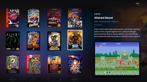
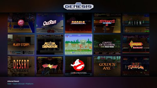
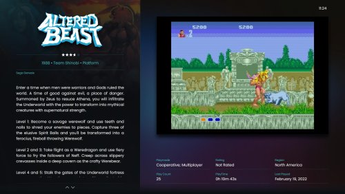
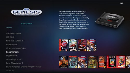
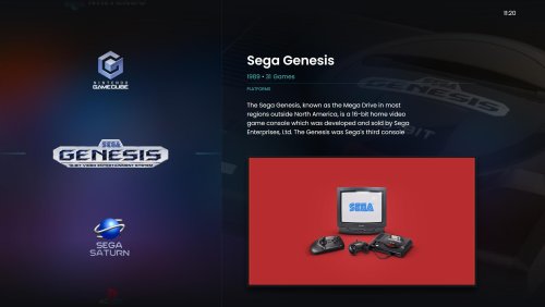
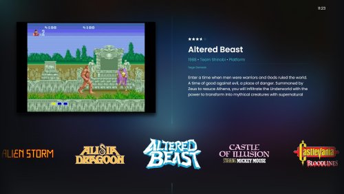
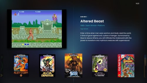
Slipstream was designed to be modern, dark, responsive, clean and easy to use theme for BigBox. Performance was also one of the priorities.

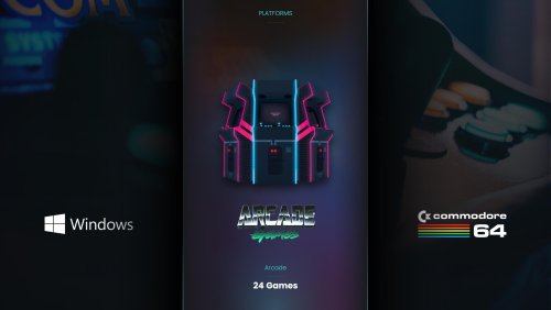
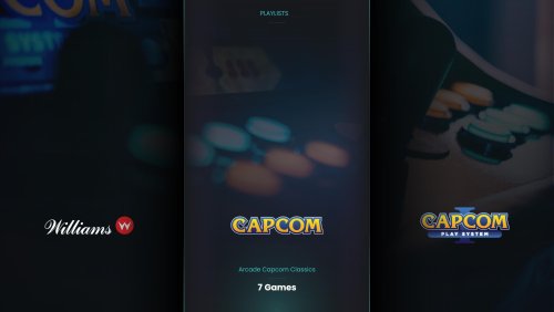
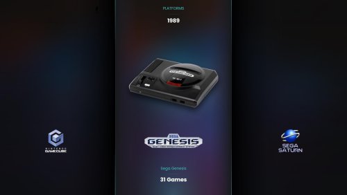
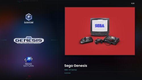
Views in the theme:

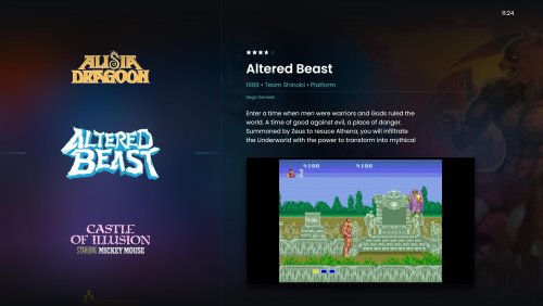
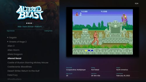
  • TextGamesView
  • HorizontalWheel1GamesView
  • HorizontalWheel2GamesView
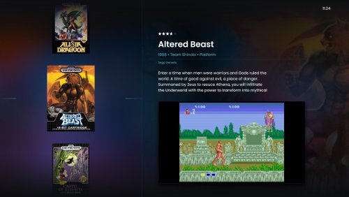
  • WheelGamesView
  • Wheel2GamesView
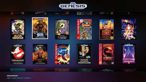
  • WallGamesView
  • Wall2GamesView
  • Wall3GamesView
  • TextFiltersView
  • PlatformWheel1FiltersView
  • PlatformWheel2FiltersView
  • PlatformWheel3FiltersView

Recommended assets for views:

  • Gameplay Screenshot 1 (this is critical because there is no fallback)
  • Selected Item Video
  • Box Art Front
  • Clear Logo
  • Fan Art
  • Device
  • Banner

Platform images:

I have included a set of images, BUT if you have a huge collection you will most likely need to update and add some images. Should be easy though, because theme does not use any custom made images.

Additional themes for Slipstream

Thanks:

  • y2guru (CTA)
  • Viking (platform videos and snapshots)
  • LaunchBox Community (assets for games and platforms and support)
  • LaunchBox Team (for the best FE for gaming)

Special:

This theme is dedicated to the brave men and women of Ukraine

Support:


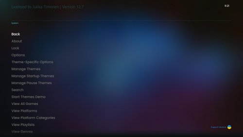
What's New in Version 1.0.1   See changelog

Released

TextGamesView

  • Playmode changed to Max Players
  • Like 10
  • Thanks 6
  • Game On 1
  • Haha 1
  • Unusual Gem 4

User Feedback

Recommended Comments

This theme is very nice but I found a bug with this theme. When I select this theme, my startup and pause themes are stuck on the pulse themes and changing them in settings does nothing. If I remove the pulse startup and pause themes folders from their directories, it reverts to default startup and pause themes and nothing happens if I try to change the startup and pause themes to something else. However if I select any other BB theme except this one, then the pause and startup themes change and work correctly.

Edited by Azgorath
Link to comment
Share on other sites

Wow, I'm really not sure why the theme would affect the startup and pause themes in any way. I just checked and installed one startup theme and I had the same problem. I fixed this by applying the startup theme twice from BigBox options... I know, sounds silly. Don't really know why this happens, but sounds to me like a bug in LaunchBox itself.

Link to comment
Share on other sites

8 hours ago, kylec2425 said:

I'd pay money for a vertical version of this.. $$$

Give that money to charity and I just might make vertical version happen. At least I will upload the CTC files for everyone who wants to make changes.

  • Like 2
Link to comment
Share on other sites

I've recently bought launchbox and have tried lots of different themes in the last few weeks but this definitely my favorite. The subtle and perfect use of all available art is brilliantly implemented! Just perfect! I did have one question as I've been following this themes development I noticed in your earlier mockups that you use a larger video/screenshot area as shown in this mockup:

Big Box Screenshot - The Keep - TextGamesView - 2022-02-12 21.32.30.jpg


Is there any reason why you didn't implement it in the end but chose to go for a smaller square? Of course it's not ideal considering aspect ratio but I quite liked this look.


Link to comment
Share on other sites

On 3/4/2022 at 11:12 PM, banggun said:

I've recently bought launchbox and have tried lots of different themes in the last few weeks but this definitely my favorite. The subtle and perfect use of all available art is brilliantly implemented! Just perfect! I did have one question as I've been following this themes development I noticed in your earlier mockups that you use a larger video/screenshot area as shown in this mockup:

Big Box Screenshot - The Keep - TextGamesView - 2022-02-12 21.32.30.jpg


Is there any reason why you didn't implement it in the end but chose to go for a smaller square? Of course it's not ideal considering aspect ratio but I quite liked this look.


Thanks. I liked it too, but the aspect ratio issues broke the view. If used with 4:3 video and screenshot assets the view would work, but as soon as you load widescreen or vertical content the view would not work well. Also the aspect ratio of tv or monitor impacts this as well. There were just too many compromises and I had to decide which is more important: visuals or usability. Chose the latter. 

Link to comment
Share on other sites

Yeah I can understand it is a bit odd. For me I started using the colourful theme that also uses the fixed 4:3 ratio on the side and I think it just crops from the center it's a little distracting at first but I got used to it. Still I like this theme better :)

Link to comment
Share on other sites

On 4/18/2022 at 1:14 PM, zetec-s-joe said:

Great theme :) could I ask what sounds you use with the theme? thank you

Thanks. Yes you can. I use the default BigBox sounds.

  • Thanks 1
Link to comment
Share on other sites

Two some what major issues with this theme for me.

1. I can't seem to find a way to skip through lots of games, like some kind of menu that will pop up after scrolling for a while to hit a game starting with a specific letter.

2. I'm seeing all sorts of performance issues such as going into the big box menu then out, the theme locks up.

Nice looking theme though. I'll be keeping my eye out for updates. Thanks for the contribution to the community. Keep up the good work.

Link to comment
Share on other sites

Love the theme, thank you for the work!
Im trying to use this on a 7" screen portable and things are a bit small.  Is tehre any change for an optional layout for game selection with bigger cover art and smaller screenshot?  Ive done a badly done quick mock up here.  Ive also tried a larger central image for selection and a shadow behind the  box art.  Ive also brought the images closer together.  Is this possible? Or are you able to tell me how to modify it like this? Ive never altered a theme but i can try!

Slipstream game select.jpg

Edited by topcatuk
Link to comment
Share on other sites

On 8/15/2023 at 2:59 PM, topcatuk said:

Love the theme, thank you for the work!
Im trying to use this on a 7" screen portable and things are a bit small.  Is tehre any change for an optional layout for game selection with bigger cover art and smaller screenshot?  Ive done a badly done quick mock up here.  Ive also tried a larger central image for selection and a shadow behind the  box art.  Ive also brought the images closer together.  Is this possible? Or are you able to tell me how to modify it like this? Ive never altered a theme but i can try!

Slipstream game select.jpg

Sorry for the late response. You can edit the theme with the Slipstream CTC-files and CTC-tool. My support for the themes has ended unfortunately. You could seek advice from other theme makers that are active.


Link to comment
Share on other sites

Is it possible to change the wall game view to be smaller pictures than the 5x3 grid? Would be nice on a big TV to fit more games on the screen.

Link to comment
Share on other sites

Join the conversation

You can post now and register later. If you have an account, sign in now to post with your account.

Guest
Unfortunately, your content contains terms that we do not allow. Please edit your content to remove the highlighted words below.
Add a comment...

×   Pasted as rich text.   Paste as plain text instead

  Only 75 emoji are allowed.

×   Your link has been automatically embedded.   Display as a link instead

×   Your previous content has been restored.   Clear editor

×   You cannot paste images directly. Upload or insert images from URL.

×
×
  • Create New...