Jump to content
LaunchBox Community Forums

Flikbox 1.5

   (2 reviews)

10 Screenshots

About This File

flikbox-1.thumb.png.ab9192d0e1e0201a040a8a52bc403cd7.png

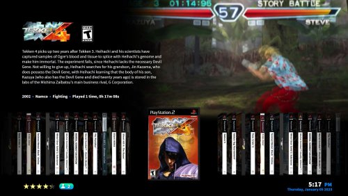
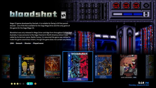
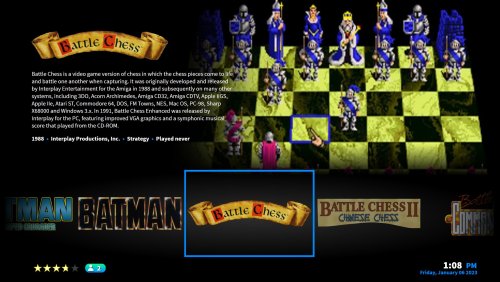
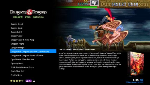
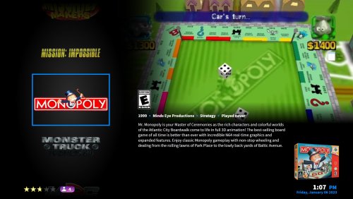
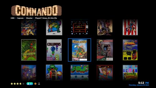
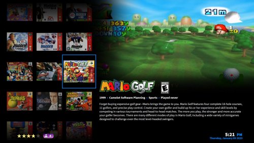
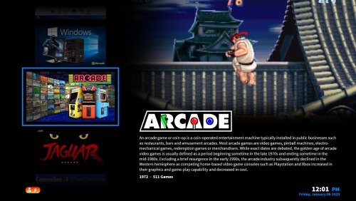
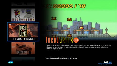
This is very my first attempt at making a Big Box theme from scratch using the Community Theme Creator. I had previously fiddled around with other people's themes to get a feel for the software. I made this for a friend who wanted a familiar, easy to read theme similar to how he has his Kodi set up. I've based this on a simple, Netflix type of layout, trying to be basic while still giving all the info you need as fast as possible. The main aims are speed, simplicity and legibility.

The theme works best with video snaps rather than any type of themed video.

VIEWS INCLUDED:
System
Text List
Horizontal Coverflow
Horizontal Wheel (boxes)
Horizontal Wheel (logos)
Horizontal Coverflow
Vertical Wheel (boxes)
Vertical Wheel (logos)
Full screen Wall
Wall with game info

I've used the brilliant system boxes from Styphelus found here. Many thanks to them for their hard work. Also, it uses the Source Sans Pro free typeface which is included in the zip. Also, of course, thanks to y2guru for the Community Theme Creator, and Faeran's very helpful Youtube videos. I no longer provide the system logos as Dan Patrick's awesome set have been that I was previously using have been incorporated into the main Launchbox collection. I also have removed the system images, mainly for size purposes but also just so people can use whatever they want to.

I've uploaded a matching startup theme here.

Edited by AsparagusTrevor
New version 1.5, updated details


What's New in Version 1.5   See changelog

Released

CTC files added

  • Like 6
  • Thanks 2
  • Game On 1

User Feedback

Recommended Comments

Fantastic!
Hey @AsparagusTrevor

The theme is really beautiful and from the little I've tested it performs well.
I found some points of improvement. I'm sure you probably know a lot of them. I ask you, are you open to feedback and suggestions for improvement?


  • Thanks 1
Link to comment
Share on other sites

Absolutely, I'm definitely up for any feedback and ideas how to improve, thank you. I know there are still a few quirks and rough edges but I'm sure there's likely to things I haven't come across myself too.


EDIT: I've fixed a couple of things this morning (some pieces which seemed to load in before the rest) and I've got a couple more to tweak and will upload an updated version soon.

EDIT 2: I've now uploaded a version with some fixes and tweaks.

Edited by AsparagusTrevor
  • Like 1
Link to comment
Share on other sites

On 4/23/2022 at 4:25 AM, AsparagusTrevor said:

bsolutely, I'm definitely up for any feedback and ideas how to improve, thank you. I know there are still a few quirks and rough edges but I'm sure there's likely to things I haven't come across myself too.

@AsparagusTrevor, thank you for your goodwill!
As I said, Flikbox is beautiful and performs very well. I've been using it lately and found some interesting improvement points. Other points however are aesthetic and obviously you should approve.

Well, let's start with the aesthetics:
Maybe it was intentional, but I noticed none of the game view show their platform logo. Is that OK?
The data/time item is interesting and many people want it. But I think at certain screen location end up limiting creativity. Maybe you could try other locations or even remove it completely.

Now to the suggestions. The following images are mockups. I have no skill with creating themes. OK, let's go!

Our theme focuses on black and uses beautiful dark gradients. I particularly love it so much. But it's important to create some kind of backlight for some objects, like these logos and box, so they don't mix too much with the black background:


Black_Box_Logo.thumb.png.6144cb10428ca514a026917b4e233d94.png

Next, most suggestions focus on selected objects. I increased the clear logo size and moved some object positions:
A1_A2.thumb.png.8bd25bfbdc4b9e8547bd01d1b92cd4b0.png

B1_B2.thumb.png.4f5f0c92eac8089d4560b186496b0a04.png

C1_C2.thumb.png.d068c03e56c8ac283990c1069ec67234.png

D1_D2.thumb.png.9242d263bcf1fc749d9f3380e3ace193.png

E1_E2.thumb.png.fc748ff378b8deeb513c05d542e05a20.png


The next view has a redundant element, which is the Clear Logo on top and on the wheel.
You can add a selection ring to highlight the selected logo game or better, change the code to use another element on the wheel:

F_1_F2_F3.thumb.png.e8250c1909eab6df45fe4949cd006e69.png
 

In this wall view, the clear logo and the database game info are conflicting with the game boxes. All of them can dynamically change size or position depending on the selected game. So the area to their right should always stay clean.
You could lock the clear logo area. But it can be bad for very wide logos.
I encourage you to try the other wall views themes. If you still want to modify yours, I have two suggestions:

G1_G2_G3.thumb.png.db6fbb3be053c4dfc990e6cdb5d2d335.png

Well, that's all for now!
I hope you will consider some of these changes, really relevant points. Keep up your good work, my dear. This theme could get even better!

Edited by soqueroeu
  • Like 1
  • Thanks 1
  • Game On 1
Link to comment
Share on other sites

@soqueroeu Thanks very much for taking the time to come up with such concise suggestions. I will definitely look into your changes and see what I can do to improve. It's good for other people to give feedback as we don't all have the same needs and setups, plus of course it's always good to have an outside eye to look over things. I especially agree with the suggestions of extra views which is something I do plan on adding.

There are some things I do want to wait for the next CTC update for before altering, wheels in particular I find quite difficult to tweak currently. I mean absolutely no disrespect to the amazing work done on the CTC, it's a truly special piece of software, but I currently find all the different properties a bit baffling especially without being able to see the results of any adjustments made, so I'm quite excited by what the 2.4 update will bring.

  • Thanks 1
Link to comment
Share on other sites

@AsparagusTrevor I've been using your theme as my default and I really like it a lot....   The only slight issue I have is that all the videos play in 16x9 (I think)... but most of my video previews are in 4x3 so those look stretched and I have some that are 21x9 as well and those look squished a little...   Other that than I really like the theme and I'll continue to use it as my default....  also one more thing....  I really don't like seeing the time while I'm gaming..   That makes me stressed out and it's something I don't want to think about or be aware of..... Is it possible to remove the clock?  

Edited by Zoomtra
  • Thanks 1
Link to comment
Share on other sites

@Zoomtra Thanks for your kind words and also your constructive criticism - I'll see what I can do for the next release, which I'm waiting on the next version of the Community Theme Creator for. Funny you should mention the video aspect ratios - I struggled for a more elegant solution for them when they're 4x3 or vertical, I wanted to crop them but the CTC wasn't playing ball with that, so I opted for stretching to fit the space. I'm happy to hear you're a fan overall though, as I initially designed it for the needs of a friend it covers a lot of his wants, but as I know other people are using it also I'm happy to adapt and cater for a wider audience.

Edited by AsparagusTrevor
Link to comment
Share on other sites

Almost perfect theme! I only had to make a single tweak to get rid of something that I find absolutely nasty. If you're like me and can't stand the nasty fake scanlines added to all the video snaps just go into Themes>Flikbox>Media>Theme Assets and rename or delete scanlines.png and those nasty scanlines will vanish. 

Otherwise, amazing theme. Maybe in a future update add some sort of option to turn those scanlines on/off without having to dig through the assets to remove them. Not everyone likes artificial scanlines.

  • Thanks 1
Link to comment
Share on other sites

On 8/14/2022 at 9:33 PM, Retoru said:

Almost perfect theme! I only had to make a single tweak to get rid of something that I find absolutely nasty. If you're like me and can't stand the nasty fake scanlines added to all the video snaps just go into Themes>Flikbox>Media>Theme Assets and rename or delete scanlines.png and those nasty scanlines will vanish. 

Otherwise, amazing theme. Maybe in a future update add some sort of option to turn those scanlines on/off without having to dig through the assets to remove them. Not everyone likes artificial scanlines.

Thank you for the kind words, I know the scanlines are an acquired taste, funnily enough I did actually remove them on the next version I started work on as I lost taste for them too. Unfortunately I don't think it's possible to add a proper toggle for stuff like that.

Full disclosure, I do have another theme in the works which is an off-shoot of this one, a bit more eye candy but still keeping the same layout and functionality, and I've worked on optimising everything further to keep it all snappy. It will be a separate theme as it does have enough aesthetic changes to warrant its own entry. I'm just waiting, semi-patiently, for the next version of the Community Theme Creator before I release that as I hit a bit of a functionality wall with what I was trying to achieve, but I can't wait to share the updates. I'm happy to share a beta though if anyone is interested in trying it out.

Link to comment
Share on other sites


21 minutes ago, AsparagusTrevor said:

Thank you for the kind words, I know the scanlines are an acquired taste, funnily enough I did actually remove them on the next version I started work on as I lost taste for them too. Unfortunately I don't think it's possible to add a proper toggle for stuff like that.

Full disclosure, I do have another theme in the works which is an off-shoot of this one, a bit more eye candy but still keeping the same layout and functionality, and I've worked on optimising everything further to keep it all snappy. It will be a separate theme as it does have enough aesthetic changes to warrant its own entry. I'm just waiting, semi-patiently, for the next version of the Community Theme Creator before I release that as I hit a bit of a functionality wall with what I was trying to achieve, but I can't wait to share the updates. I'm happy to share a beta though if anyone is interested in trying it out.

I'd give it a look once you've got the beta ready 

Link to comment
Share on other sites

Just downloaded your theme and its sooooooo nice. Officially my main theme as of today.

I do have some minor quality of life requests.

It would be nice if it could skip the platform select screen and load directly into the last platforms game library and I could press up or down to toggle between the platforms with maybe a clear logo for the platform in the bottom center . Then have maybe the start button on the controller/ dedicated key can be the search function.

Is there a way to maybe add an easier way to search all games based on max player? Right now its I have to view all games>choose max players>equal to>type number.  Was curious if maybe when going to search there could be something to cut that process down to a button to just select players.

Last thing I thoroughly enjoyed from using the Eclipse theme was there was a button to choose a random game.

The dream for when I have people over or when me and the kids and wife are playing is to be able to select the amount of players and hit random game and it selects from those games for that many players. I would pay someone to make this a reality lol

Thankyou so much for making this work of art. Its beautiful and the family and I thankyou for your hard work 


Edited by joey4187
  • Like 1
Link to comment
Share on other sites

On 10/14/2022 at 10:57 PM, joey4187 said:

Just downloaded your theme and its sooooooo nice. Officially my main theme as of today.

I do have some minor quality of life requests.

It would be nice if it could skip the platform select screen and load directly into the last platforms game library and I could press up or down to toggle between the platforms with maybe a clear logo for the platform in the bottom center . Then have maybe the start button on the controller/ dedicated key can be the search function.

Is there a way to maybe add an easier way to search all games based on max player? Right now its I have to view all games>choose max players>equal to>type number.  Was curious if maybe when going to search there could be something to cut that process down to a button to just select players.

Last thing I thoroughly enjoyed from using the Eclipse theme was there was a button to choose a random game.

The dream for when I have people over or when me and the kids and wife are playing is to be able to select the amount of players and hit random game and it selects from those games for that many players. I would pay someone to make this a reality lol

Thankyou so much for making this work of art. Its beautiful and the family and I thankyou for your hard work 


Thank you for your kind words also, I'm glad someone else has managed to find a use for the theme.  It was always intended as a quick, easy and familiar way to access our libraries and I'm really happy it seems to scratch that itch for a lot of people.

Regarding your requests, unfortunately  a lot of them are beyond the capabilities of the Community Theme Creator, but I will look into what is possible when the next version is released.

Edited by AsparagusTrevor
Link to comment
Share on other sites

@AsparagusTrevor This is an excellent theme and the overall look and feel is very professional looking! My only gripe is that the (black) background in most of the views isn't all that pleasing on the eyes, and it would be nice to have fanart or platform art in the background to give it some variety. Just a minor gripe, but if you could add that in there or possibly make it an option somehow, it would be great

Edited by bundangdon
Link to comment
Share on other sites

5 hours ago, bundangdon said:

@AsparagusTrevor This is an excellent theme and the overall look and feel is very professional looking! My only gripe is that the (black) background in most of the views isn't all that pleasing on the eyes, and it would be nice to have fanart or platform art in the background to give it some variety. Just a minor gripe, but if you could add that in there or possibly make it an option somehow, it would be great

I have a feeling you might like the next theme I am working on...

  • Like 1
Link to comment
Share on other sites

Join the conversation

You can post now and register later. If you have an account, sign in now to post with your account.

Guest
Unfortunately, your content contains terms that we do not allow. Please edit your content to remove the highlighted words below.
Add a comment...

×   Pasted as rich text.   Paste as plain text instead

  Only 75 emoji are allowed.

×   Your link has been automatically embedded.   Display as a link instead

×   Your previous content has been restored.   Clear editor

×   You cannot paste images directly. Upload or insert images from URL.

×
×
  • Create New...