
Hexxxer
-
Posts
133 -
Joined
-
Last visited
-
Days Won
3
Content Type
Profiles
Forums
Articles
Downloads
Gallery
Blogs
Files posted by Hexxxer
-
.thumb.png.8758957b66b9baad089ad59db7bad845.png)
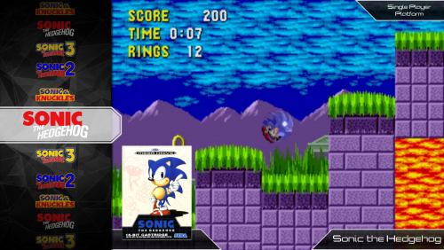
sega genesis Genesis State
By Hexxxer in Custom Themes
Genesis State is the first of a couple themes I plan on producing specifically meant to emulate the feeling of the original game systems box art styles.
This theme is purely for use with the Sega Genesis emulators (you can use it for other systems but why would you?). It currently has one view for game play style videos.
Looking for some feedback and ideas on how to improve it. Let me know. I plan to add some more views based on feedback.
Thanks to @eatkinola for use of his Themer addon, I used it to create the random video background effect.
722 downloads
-
Futurestate Theme
By Hexxxer in Custom Themes
Updated to 3.0 See Details in Change log
A elegant and modern feeling theme that tries to keep details to a minimum.
Warning
Must be using Launchbox 7.1+ to use the theme
Unique Features
6 custom views Images were created from scratch especially for this theme Different view based around 16:9 or 4:3 videos Custom Favorite, Broken and Completed symbols Default Black and White theme that blends with most images Custom Futurestate Background Videos Simple Views with liberal use of game information on selection pages Install instructions
Works with Launchbox version 7.1+
Do a clean unzip into your themes folder, it is recommended to not right over a previous version Make sure to install the font inside the Font Folder if you would like to use the custom font
Alternative Views
Alternative view are views requested by users that alter the default theme. I try to fulfill requests if they are reasonable but may not update the files in newer iterations.
*use at your own risk*
Futurestate no info wheelgamesview.zip - This is a 4:3 Game View that removes all text over top of the game video.
Futurestate Themes
*Download the skins in the Themes download tab
There are a few variations for skinning Futurestate in the works. To use these create backup of your existing Images/Theme folder and copy the contents of the zip files over top of the original locations.
Put my Photoshop skills to the test! Request one and I will see what I can do!
**These files over write the default Futurestate skin!
Futurestate Ruby
Futurestate_Skin-_Ruby.zip
Also check out the RetroState theme located here by Scottad! @Scottad
Futurestate_Skin-_Ruby.zip
4,102 downloads
-
themes HexControls
By Hexxxer in Third-party Apps and Plugins
A collection of custom user controls to make custom themes easier.
I will be updating the tool periodically with new features.
Install for use
Download HexControls.dll place the file in the plugins folder in your theme Screenshots Control.
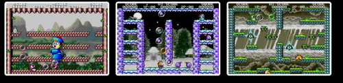
Description
A control to randomly display a list of screenshots available for a game. It will stretch itself to the bounds of the container it is placed in.
Default Use in a Theme
<Hex:Screenshots/> Advanced Use
Using the properties below will allow the user to effect the maximum number of screenshots shown, spacing and border controls
Properties
ScreenshotBorderColor: Border Color ScreenshotPanelOrientation: "Vertical" or "Horizontal" Direction Screenshot span ScreenshotMaxImages: Number of maximum screenshots shown (Default is 4) ScreenshotBorderSize: How thick the border around the screenshot is. Setting the bordersize to zero will remove the border ScreenshotCornerRadius: Curve around all edges of a scrrenshot ScreenshotMarginSize= Space Between each screenshots edge Example
<Hex:Screenshots ScreenshotBorderColor="Blue" ScreenshotPanelOrientation="Vertical" ScreenshotMaxImages="10" ScreenshotBorderSize="15" ScreenshotCornerRadius="13" ScreenshotMarginSize="5" Grid.Column="15" Grid.Row="3" Grid.RowSpan="15" Grid.ColumnSpan="15"> </Hex:Screenshots>
Star Rating
Default Use in a Theme
In a Game view call <Hex:StarRating /> Pretty much it for the default use. The control will size to whatever space it is placed in. This will get you a red star with white border for an on star and a black star with white border for an off star.
Advanced Use
I've set up the control to allow users to do two things:
Modify the color properties for Star On/Star Off and their border Modify two Star vectors layered on top of each other; this has been created to allow for more vibrant star designs using transparency. Properties:
ColorOnStarOneFill - On Fill Color for Star one
ColorOnStarOneBorder - On Border Color for Star One
ColorOnStarTwoFill - On Fill Color for Star Two
ColorOnStarTwoBorder - On Border Color for Star Two
ColorOffStarOneFill - Off Fill Color for Star One
ColorOffStarOneBorder - Off Border Color for Star One
ColorOffStarTwoFill - Off Fill Color for Star Two
ColorOffStarTwoBorder - Off Border Color for Star Two
StarsMarginSize - Margin Between Each star
BorderStarOneSize - Size of the Border for Star One
BorderStarTwoSize - Size of the Border for Size Two
So, using these settings
<Hex:StarRating Panel.ZIndex="1000" Grid.Column="11" Grid.Row="1" Grid.ColumnSpan="10" Grid.RowSpan="3" HorizontalAlignment="Left" VerticalAlignment="Top" ColorOnStarOneFill="#BBC49A6C" ColorOnStarOneBorder="#11111111" ColorOnStarTwoFill="#BBC49A6C" ColorOnStarTwoBorder="#11FFFFFF" ColorOffStarOneFill="Black" ColorOffStarOneBorder="White" ColorOffStarTwoFill="#66000000" ColorOffStarTwoBorder="White" StarsMarginSize="10" BorderStarOneSize="8" BorderStarTwoSize="20" SnapsToDevicePixels="True"/>
Will give you a result like this.
71 downloads
- custom user contols
- star rating
- (and 1 more)
(0 reviews)0 comments
Updated
.thumb.png.8758957b66b9baad089ad59db7bad845.png)

