
thimolor
-
Posts
400 -
Joined
-
Last visited
-
Days Won
12
Content Type
Profiles
Forums
Articles
Downloads
Gallery
Blogs
Everything posted by thimolor
-
Version 1.0.0
311 downloads
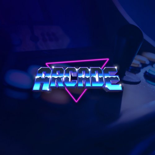
Hi, this is a template to make more banners to my BigBox Theme "AllNightLong". All current assets included (logos & devices). Credits: This theme uses some of the device images from EmulationStation theme Tronkyjared (https://github.com/cowboyjeeper/tronkyjared). Many device images and system logos are taken from Wikipedia. -
AllNightLong Theme Banner Template (psd) View File Hi, this is a template to make more banners to my BigBox Theme "AllNightLong". All current assets included (logos & devices). Credits: This theme uses some of the device images from EmulationStation theme Tronkyjared (https://github.com/cowboyjeeper/tronkyjared). Many device images and system logos are taken from Wikipedia. Submitter thimolor Submitted 05/20/2020 Category Platform Banners
-
Yes of course! Give me few days. I will clean the template file and add it to the download section. It should include the logos, devices and the effects.
-
? ... you shall have your screenshot background. I will make it today and then i'am going to take a break.
-
sorry. I knew that it's a risk choosing a color scheme for the theme. You can always change the background images to your likings: AllNightLong\Media\Custom Assets I realized that I have left few unused backgrounds there and then it hit me. I could do few color variations in the custom assets folder. I will just rename the files better. So everyone can change the background color to their liking. So if you can't stand blue color you can change the background yourself. Made few alternatives. The views use the same background.

-
This theme was deleted by the author. This page is left for archival purposes only.
-
Made one more wheel to the theme. And the Game Details view has changed once again. The fullscreen videos are too heavy (for my i5 at least) so I decided to optimize a little. The box art will slide off-canvas and the video appears after that. I have uploaded the theme now for approval.
-
Made big change for the game details view. It's so hard to get this view right for me at least. Decided to add the video as a background. That way the screen does not get cramped and you still get a good view about the gameplay.
-
I would be grateful if more would test this theme. 3 more people could get it now. I'am considering releasing this the next weekend, but before that I need to be sure that it's working for all because I don't have the time to give support after the release.
-
Progress is today's word.
-
NO MORE TESTERS NEEDED. Hi you few. Who wants to test my theme? I need three testers to who I will send private download link. I'am getting blind with my designs and need some input. I need to know, if there are missing images besides the custom playlists. Also I want to know how this runs with older systems. The lowes I have been testing is i5 4690k. Also I need to know are the theme images too dark. Is the text readable. Thanks!
-
Still doing this... and had to redo many things. Wanted more color and did a template for the platform images.
-
More little tweaks... I just can't stop.
-
 Exactly like that! How did you do it?
 -
Here's a picture to explain better. Not so goot at english... I just want empty space all around the listboxitems, like Jasons default theme.
-
Hmm, the problem did not get fixed. I added only the padding and color to your preset. Am I putting the padding value in the wrong place? I cant find any working samples from google <Border x:Name="Bd" Background="{TemplateBinding Background}" BorderBrush="{TemplateBinding BorderBrush}" BorderThickness="0" SnapsToDevicePixels="True" Padding="20,10,20,10" Margin="0,0,0,0">
-
And another update. Just can't keep my hands out of this project: I think I'am almost there. Have to make more views, but after testing this, I was quite happy and not wanting to change back to Jason's Default Theme (which is awesome). By the way. This works at least 16:9, 16:10 and 4:3 also.
-
Tweaked version. I added only padding to the listBoxItems.
-
Sorry, bad example. Here's a better screenshot. Look how the dots cut off.
-
Hi, and thanks for the editor! It's really nice and I have been finally doing my own theme with it. I have one problem, that I can't solve myself right now. The text menus padding and border doesn't work correctly. The padding and border is adding width to the list items and they overflow the container. Here's an image.
-
Lots of little changes. Tired now and taking a break for a few days.
-
I think you will have to wait for at least three weeks I'am trying to perfect this, so it's going to take a while. Just tested on my tv and I wasn't happy with it. I'am also adding some fading animations. There are also some custom artwork to be made for the platforms.
-
Hi, new demo in Youtube:
-
Added more consistency across the screens. And color indicates now what screen I'am scrolling.
-
Now the first version of the Horizontal Game View. I'am also going to make text view because it's just easier to search from a big catalog that way. Focusin on the flow of the UI. With vertical screen transitions, this will work nicely, the Game Detail View will fade over because it looks different. Font sizes are a bit smallish right now. I may need to increase them.


