Jump to content
LaunchBox Community Forums

Default Vertical 1.0.1

   (0 reviews)

11 Screenshots

About This File

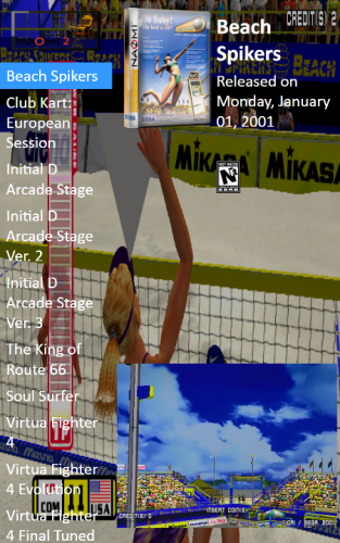
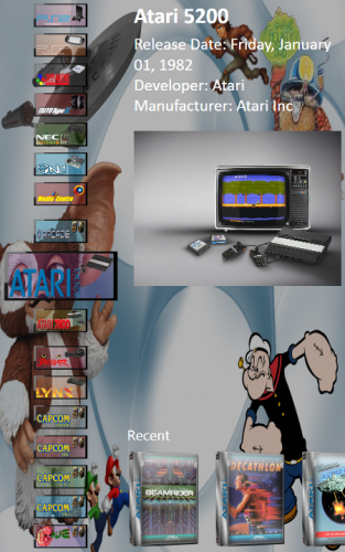
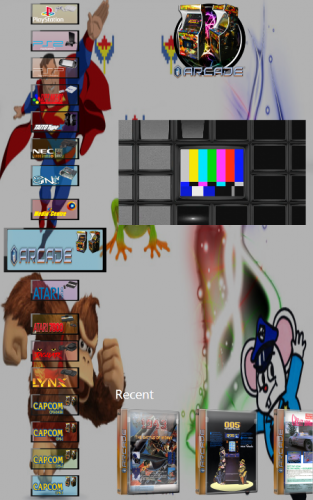
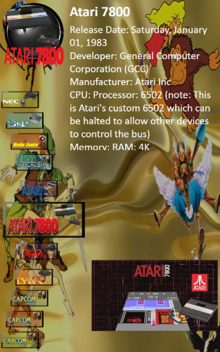
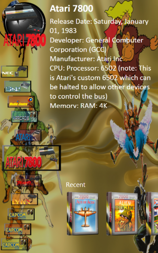
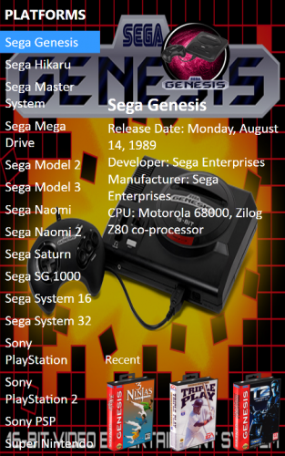
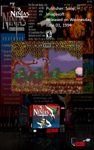
Hi as promised here is the Default BigBox Vertical theme specifically for Vertical Screens, Arcade Machines etc.

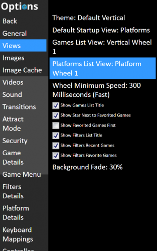
Unzip and place unzipped file in your LaunchBox theme Folder.  You should now be able to scroll and see your menu items in the BigBox and Options Screens.  All Background Images and Background Videos will fill the entire screen so it is advisable to have Vertical Videos for your Platforms and Games, if not please be advised that normal Platform Videos and Game videos will fill the entire screen if you set show Platform or Game Videos in settings.

This is a work in progress as Jason said that when he has time in the new-year he will sort out the fonts sizing that is needed in certain aspects of the menu and options screen which currently cannot be done in xaml, but i have used a alternate method for the time being in order that you will be able to see what you are navigating in these menu's.

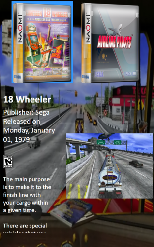
Platform and Game Views are reworked to take advantage of Vertical monitors.

For people having trouble on some views please be advised that the New Views recently added are not skinned for Vertical Orientation yet.
Below is a list of working Vertical Views

Working Views Platforms
Platform Text List with Details
Platform wheel 1, 2, 3, 4

Working views Games:
Coverflow
Coverflow with Details
Text List with Details
Vertical Wheel 1
Horizontal boxes with Details

Also note that as this is the default theme reworked by me it is still solely the property of @Jason Carr and UnbrokenSoftware.


Thanks to @Jason Carr for allowing me to manipulate this theme for Vertical Machines.


So Happy Christmas to All and a Very Merry NewYear.


What's New in Version 1.0.1   See changelog

Released

Reverted to the Default Scrolling Platform Notes

  • Like 4

User Feedback

Recommended Comments

Looking good so far but definitely needs some font resizing which you said Jason needs to implement. I tried it out on my 16:9 monitor rotated and while everything fit and was readable the fonts were way too big and game names were taking up like 3 lines text. Maybe it looks better on a 4:3 monitor rotated vertically.

Link to comment
Share on other sites

@lordmonkus Yes definitely needs font resizing but as this is only the first draft it will eventually be all ironed out in future updates with the help of @Jason Carr and i wanted to get this out there for people who wanted a working Vertical Theme before Xmas, it looks well on a 16.10 monitor as that and a 15.4 monitor is all i had to work on.

Link to comment
Share on other sites

I had issues with the video sound playing while the video is black then it comes in dark and pixelated then finally adjust to the normal color no clue what is causing it.

Link to comment
Share on other sites

@DOS76 was that background videos by any chance i think it has to do with the resizing of the canvas, but hopefully all issues will eventually be ironed out in future updates.

Link to comment
Share on other sites

Thanks for doing a vertical theme. Without this I'd have to abandon Bigbox on this cabinet. It'd be nice to have some font options, though!

I see no other vertical monitor options here at all. :(  Using a 19" 4:5 in an arcade cab with only vertical oriented games/roms.

Link to comment
Share on other sites

Is this still the latest version of this theme?  This is the only option out that I could find.  Thanks!

Link to comment
Share on other sites

Any updates on font resizing? I'm on win10 with a 16:9 monitor at 1080p in portrait mode and the font is so big. I looked through a lot of xaml files for anything with a fontsize and lowered them to all 10 from 34 and no change to anything. 

Link to comment
Share on other sites

Just downloaded this, unfortunately as others have said there is rather poor font sizing on my 1200x1920 screen, I would definitely like an updated version.

BigBox Vertical 1200x1920.jpg

Link to comment
Share on other sites

On 6/25/2019 at 1:05 PM, exodus_cl said:

hi guys!

Any update on the font sizing?  ☹️  

@Jason Carr


Thanks for any info 

At this point, I would recommend using Vertigo by faeran instead:

The styling is much better fitted to a vertical setup, rather than just adapted from the default theme.

Link to comment
Share on other sites

Join the conversation

You can post now and register later. If you have an account, sign in now to post with your account.

Guest
Unfortunately, your content contains terms that we do not allow. Please edit your content to remove the highlighted words below.
Add a comment...

×   Pasted as rich text.   Paste as plain text instead

  Only 75 emoji are allowed.

×   Your link has been automatically embedded.   Display as a link instead

×   Your previous content has been restored.   Clear editor

×   You cannot paste images directly. Upload or insert images from URL.

×
×
  • Create New...