Jump to content
LaunchBox Community Forums

The POC - A Nice View of the New Walls 1.4

   (4 reviews)

3 Screenshots

About This File

This theme requires LaunchBox v11.10 or above.
---------

The new LaunchBox update is here, and with it comes many new Big Box theming features. The highlight amongst them is a brand new Wall View.

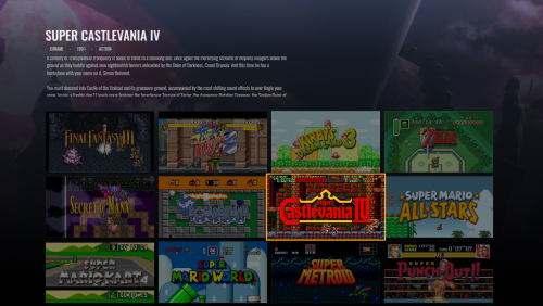
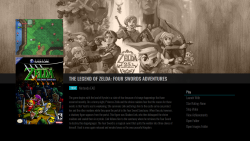
This theme showcases the new wall view by providing 2 inspired views utilizing the new Wall View CoverFlow wheel.

What kind of things can the new CoverFlow wheel do? Download this theme and take a look.

WallView1.thumb.png.3942f99cc4bdbb5ca2732fb970c5ff46.png

WallView2.thumb.png.aa45cec2185d9ade2fbcd1edd45a9e18.png


The views use the following artwork:

  • Clear Logos
  • Screenshots
  • Background Fanart
  • BoxArt - Front
  • Game Videos

Don't forget to set your screenshot image priority to screenshot - gameplay.

Have fun.

Thanks to @PlayingKarrde for clarifying that this theme is loosely based on a couple different themes from the Pegasus frontend.


What's New in Version 1.2   See changelog

Released

  • Fix a potential issue making the game details view not work when navigating by genre, publisher... etc
  • misc. code as been tweaked and theme has been published using latest beta build
  • Like 20
  • Thanks 5
  • Unusual Gem 6

User Feedback

You may only provide a review once you have downloaded the file.


FlyLeaf

   3 of 3 members found this review helpful 3 / 3 members

very great theme which works great with the new update.

and exactly what it descripes too.

  • Like 1
Link to review
zerel


This is easily one of the best looking themes. Minimalistic, simple but amazingly beautiful. Also a very good Proof Of Concept of what we can do with Big Box new version.

Highly recomended with Emumovies gameplay video collections

  • Like 1
Link to review
Dan Patrick


Awesome work faeran! This theme is more than just a proof of concept. It's a great theme!

  • Like 1
Link to review
eskibeat


This theme is almost perfect, but just wanted to point out that there is some artwork misalignment with the boxes in wall view when looking at Nintendo Switch or 3ds... Switch loads with a huge margin above the first row, 3ds loads with no margin at all and top of the first row slightly clipped. Apart from that - incredible work!

  • Like 1
Link to review
×
×
  • Create New...