About This File
While I am not the original creator of the LaunchBox / BigBox logos, I have the best versions available in this collection. After roughly 30 hours, I have redrawn and perfected the recognizable cube shape and have multiple variants for multiple use cases.
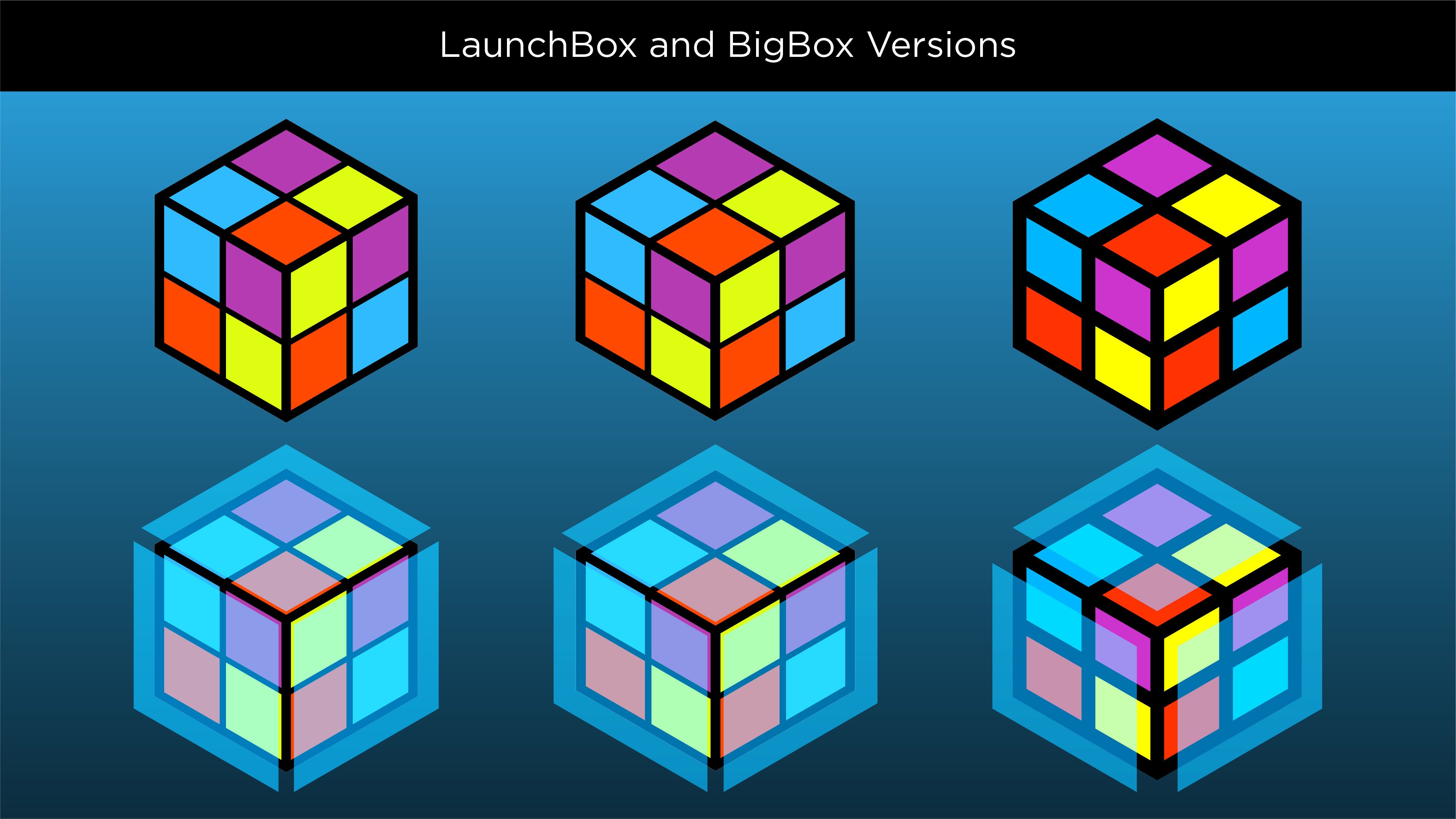
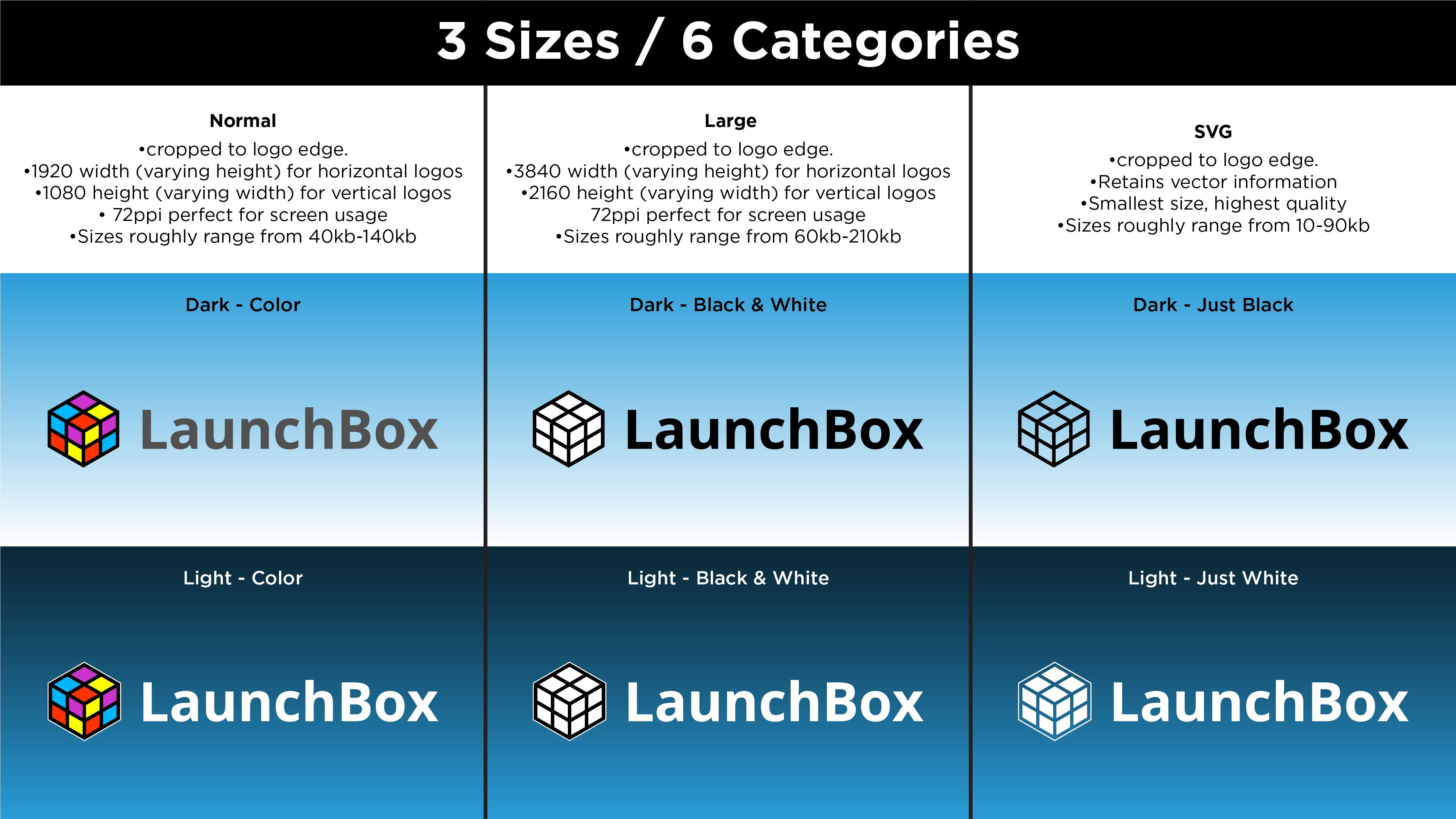
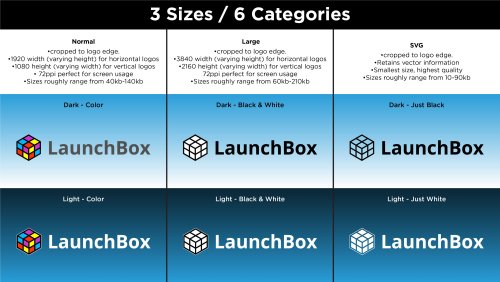
All previously used versions are available here, as well as new versions that are slightly different. All my drawings use perspective correct line work making these the best versions of these logos. They come in three sizes Small (1920x1080 max), Large (3840x2160 max) and SVG which is a vector file type. A lot of the BigBox logos can’t be properly saved in SVG format so I included vector PDFs for all logos as well.
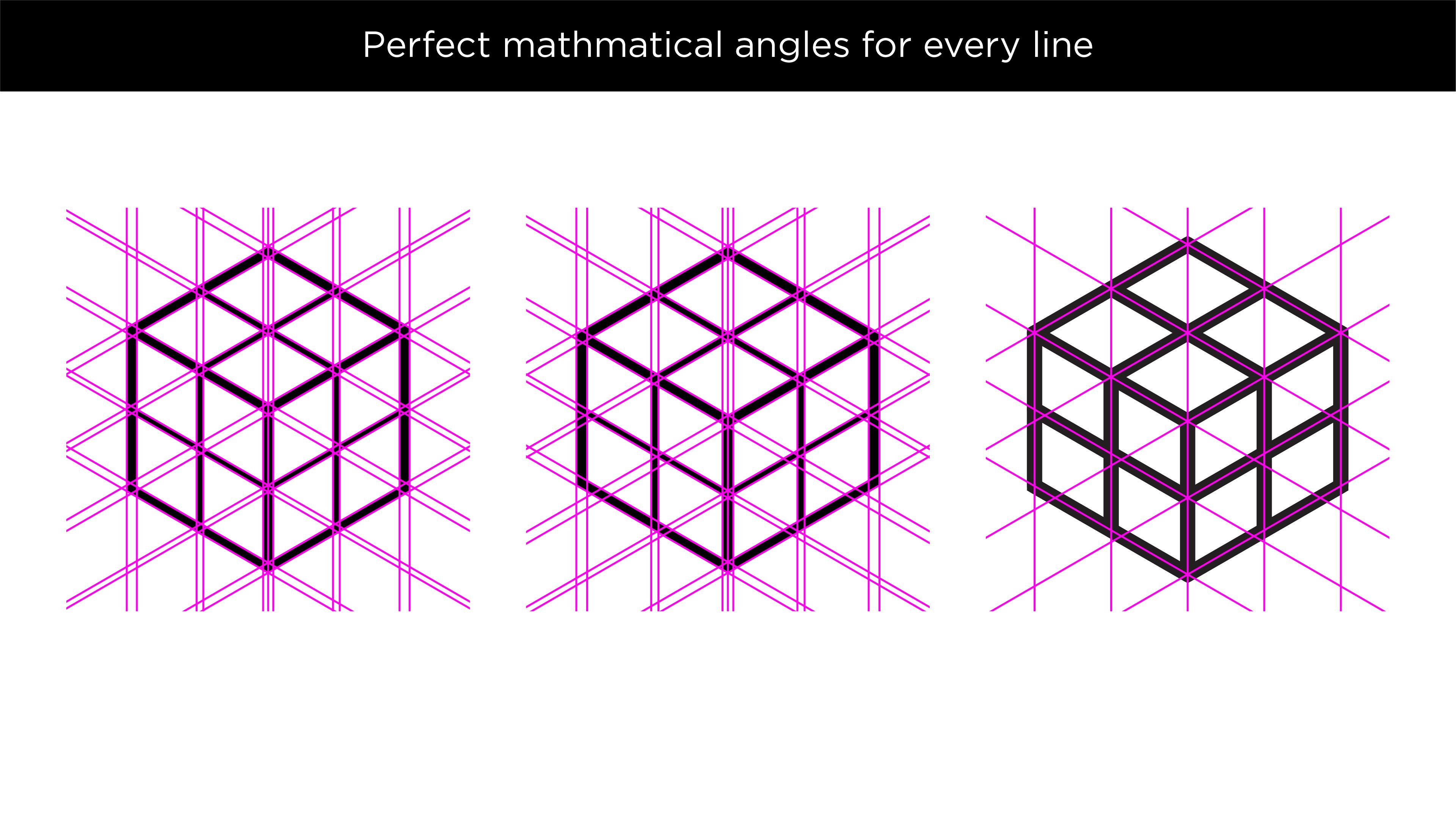
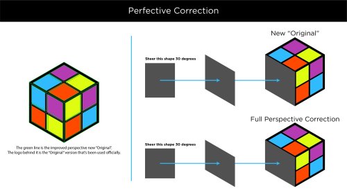
The LaunchBox logo had some uneven shapes which I corrected. In addition, I noticed the entire LaunchBox logo is not a perfect cube. Its sides are actually rectangles. I never noticed this until now. Once I saw it, I created a separate perspective correct version. I created a further revised version as well, with thicker lines, consistent line widths and punchier colors.

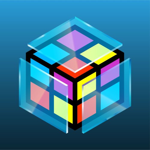
The same standard goes for the BigBox logos. The thicker LB logo also has a glass BigBox variant which took a solid amount of work to get right. I really tried to make the glass thick enough to not be too busy and easily visible large or small. I went back and forth on every shade of every gradient until I felt it looked pretty good against dark and light backgrounds.
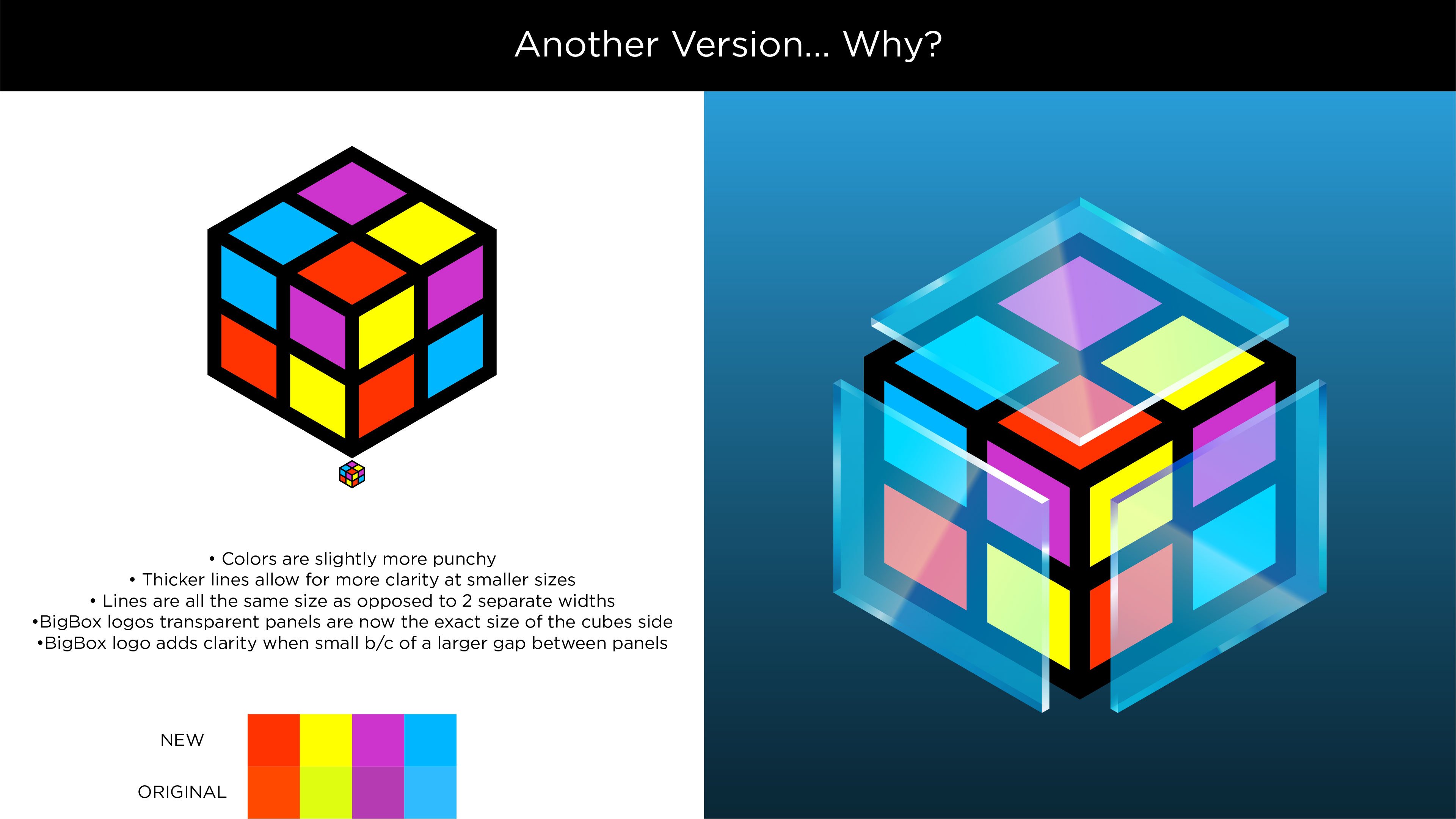
The only versions that are official are the original taller designs. I wanted to improve them as much as I could while still keeping all of the artist’s intent. Feel free to use these how you’d like. I’ll always appreciate credit.
If you like what you see here, please also check out my extensive platform logo collection:
Edited by Dan Patrick








Recommended Comments
Join the conversation
You can post now and register later. If you have an account, sign in now to post with your account.