
About This File
- Update 7/2/2019: The SlimDX library was replaced with the SharpDX library because SlimDX hasn't been updated since 2012. Hopefully this will alleviate any of the problems with the plugin not working. @Jason Carr, @viking, @shro2016 and anyone else I missed.
A few custom controls to add extra functionality to BigBox themes. Read the documentation included in the download.


Install:
Place GrilaBBControlsPlugin.dll and SlimDX.dll SharpDX.dll and SharpDX.XInput.dll in either LaunchBox\Plugins or the plugins folder of a specific theme
Initialize:
Open a new or existing BigBox theme in Visual Studio and add a reference to the project. Browse to the directory you copied the files to in the first step and select GrilaBBControlsPlugin.dll.
Define:
In any views you wish to utilize the controls, add the plugin to the namespace.
Ex. xmlns:g="clr-namespace:GrilaBBControlsPlugin;assembly=GrilaBBControlsPlugin"
Use:
Use like any other element by prefixing the namespace defined in the previous step (a quick selection box should appear after typing the namespace prefix) and select the desired control.
Customize:
There are exposed properties for most of the controls that allow the user to customize their appearance as they wish. Below is a list of all available properties that can be changed:
GrilaTime – a more customizable version of the built-in time control:
• Any normal TextBlock options like foreground, font family, font style, etc.
• GrilaTimeFormat is a string defining the DateTime format. Default is set to “h:mm tt” for 12 hour time with AM/PM indicators and no date. Set this however you wish to get the info you want. Good examples of DateTime formats can be found here: https://msdn.microsoft.com/en-us/library/8kb3ddd4(v=vs.110).aspx
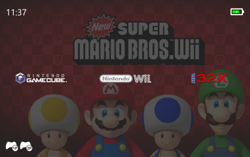
GrilaPowerStatus – shows device power status, battery charge status, and battery level
• GrilaBatteryBorderColor – the color of the battery outline (default Black)
• GrilaBatteryBorderThickness – the width of the battery outline (default 15)
• GrilaBatteryCornerRadius – the radius of the battery corners (default 5)
• GrilaBatteryProgressForeground – the color of the battery level progress bar (default Lime)
• GrilaBatteryProgressBackground – the background color of the battery level progress bar (default #111111)
• GrilaBatteryProgressMargin – the margin between the battery outline and the battery level progress bar (default 0)
• GrilaChargeIconForeground – the color of the charging symbol when the battery is charging (default BatteryOutlineBorderColor)
• GrilaPlugIconForeground – the color of the plug symbol when the device has no battery (desktop system) (default BatteryOutlineBorderColor)
GrilaControllerStatus – shows the connection state and battery level (if wireless) for up to 4 xinput controllers
• GrilaControllerColor – the color of the controller(s) (default Black)
• GrilaControllerLightOnColor – the color of the charge level indicator lights when on (default Lime)
• GrilaControllerLightOffColor – the color of the charge level indicator lights when off (default Black)
What's New in Version 1.0.0 See changelog
Released
No changelog available for this version.