-
Posts
162 -
Joined
-
Last visited
-
Days Won
3
Content Type
Profiles
Forums
Articles
Downloads
Gallery
Blogs
Everything posted by niglurion
-
That's a good point @wallmachine. For the first one, it's related to BigBox itself. You can try to remove every translation but beyond that, I'm afraid I can't do anything. The second point is fexed in the last version, thanks to you (v0.5.4) And for the last point, it's related to me . I prefer like this and we have only 5 views to customize. So I had to make a choice.
-
Last update (0.5.3) before I leave: Because I was not satisfied with the wheel views, I changed the looking of the UI and adjusted backgrounds size according to it. I think it's the best and main view of this theme now. From now, I will work on games views for a release around the end of the next week. Sorry for these multiple updates, but I am rarely happy of what I'm doing. I always want to fixe/change/correct/reajust a lot of things... EDIT: A video:
-
there are 3 blinking arrows in whole, it depends on the view (two in the header bar, one in the bottom). And it's here from the beginning. Glad you notice that (really)
-
-
A first update in order to avoid the problem of Favorites and/or Recent games. Thanks to @AeronNL Also, I fixed some visual bugs and added a header bar. I prefer like that, Better visual impact. I've a ton of new ideas for this theme, it's far from finished
-
Then... you will be disappointed... This isn't working on a 4:3 monitor. Because all the UI was designed for 16:9, everything will be stretched. For 4:3, we have to remake every element and adjust it in every .xaml. Like create a new theme, in fact. But it's something I will work on later, I think. It will stays in the back of my mind and won't go away if I don't do anything about it For the question about the "Favorites" box, not for the moment... But I plan to add a lot of tweaks and it may be a new option, yes.
-
one day, for sure But there is already more than 30 plateforms completed
-
Some details: There is still much work to accomplish: a lot of banners to make and I want to customize games lists like the systems UI. I'll be on holidays for more than a week, and so, if there're some bugs (or other things), please wait . You can make banners yourselves if you want to. It's relatively easy: create a .PNG with the same dimensions as others and name it as you want. You can also copy the blank .png (like SNK NeoGeo per example) for any other plateform I didn't cover. Don't hesitate to post your comments here
-
Metallic Theme View File A metallic theme with or without videos. 16:9 monitors HIGHLY recommanded Features: 5 views for plateforms list New navigation system New UI Background + Banner for every system Video: Instructions: Extract archive in "LaunchBox\Themes" Choose Metallic in Options > Views > Theme Disable "show Filters Favorite Games" in Option > Views. I advise to change Options > Transitions > Background Transition to "Slide Vertical" Todo List: Complete Banners Add new views for games lists Submitter niglurion Submitted 08/26/16 Category Big Box Custom Themes
-
Version 0.5.4
6,266 downloads
A metallic theme with or without videos. 16:9 monitors HIGHLY recommanded Features: 5 views for plateforms list New navigation system New UI Background + Banner for every system Video: Instructions: Extract archive in "LaunchBox\Themes" Choose Metallic in Options > Views > Theme Disable "show Filters Favorite Games" in Option > Views. I advise to change Options > Transitions > Background Transition to "Slide Vertical" Todo List: Complete Banners Add new views for games lists -
Good to know! Maybe I will need this solution quickly thank you again.
-
Thank you but it's not working on the view I'm working on. Maybe it's because I took the TextFiltersView.xaml as a starting point. Maybe I should have taken another one Thank you @elborra. I will remember the name for the next time. Anyway, fortunately, I found an alternative to my problem (hell yeah!).
-
Does anyone know how to bind the Plateform Title on a PlateformView? I just want the title and not the details below. My best guess is that, but it's not working (of course): <TextBlock Text="{Binding Path=FilterTitle}" Visibility="{Binding TitleVisibility}" > I know the title comes from FilterDetailsView.xaml but I need it alone... I'm already using this .xaml elsewhere. (it's for a new theme I plan to finish tomorrow). Maybe @Jason Carr can help me? Or maybe extract the title or details of FilterDetailsView.xaml and insert in another one? But my tests aren't very conclusive...
-
I'm not sure to understand what you're asking for, @ThePolish, sorry Yes, I'm aware. Of course. But I've already explain that in an earlier post in this topic: I've chose to use fan-arts and delete others panels because transitions of the "big" images were not associated with the backgrounds like I wanted to. Or, in more simple terms, it wasn't the result I wanted. It's that simple. Another point is with only one background, I could manage to make a good rendering and avoid nastsurprises with bad superpositions of images. What's more, not all systems have good big images to display (like a lot of Arcade Systems, the Virtual Console, Daphne, and so on...). So, yeah... this theme isn't for videos lovers, sorry.
-
Weird, Albert Odyssey is working for me... And i use the RA core. But I have the same problem for one or two other games which are working for you ... So that doesn't surprise me. Proof:
-
Aw, my mistake, I thought I'd added these versions right in the folder. You can now download them aside in the download section. Sorry.
-
You can emulate it with Project64. It's the best atm. But... 10 games... And not very interesting
-
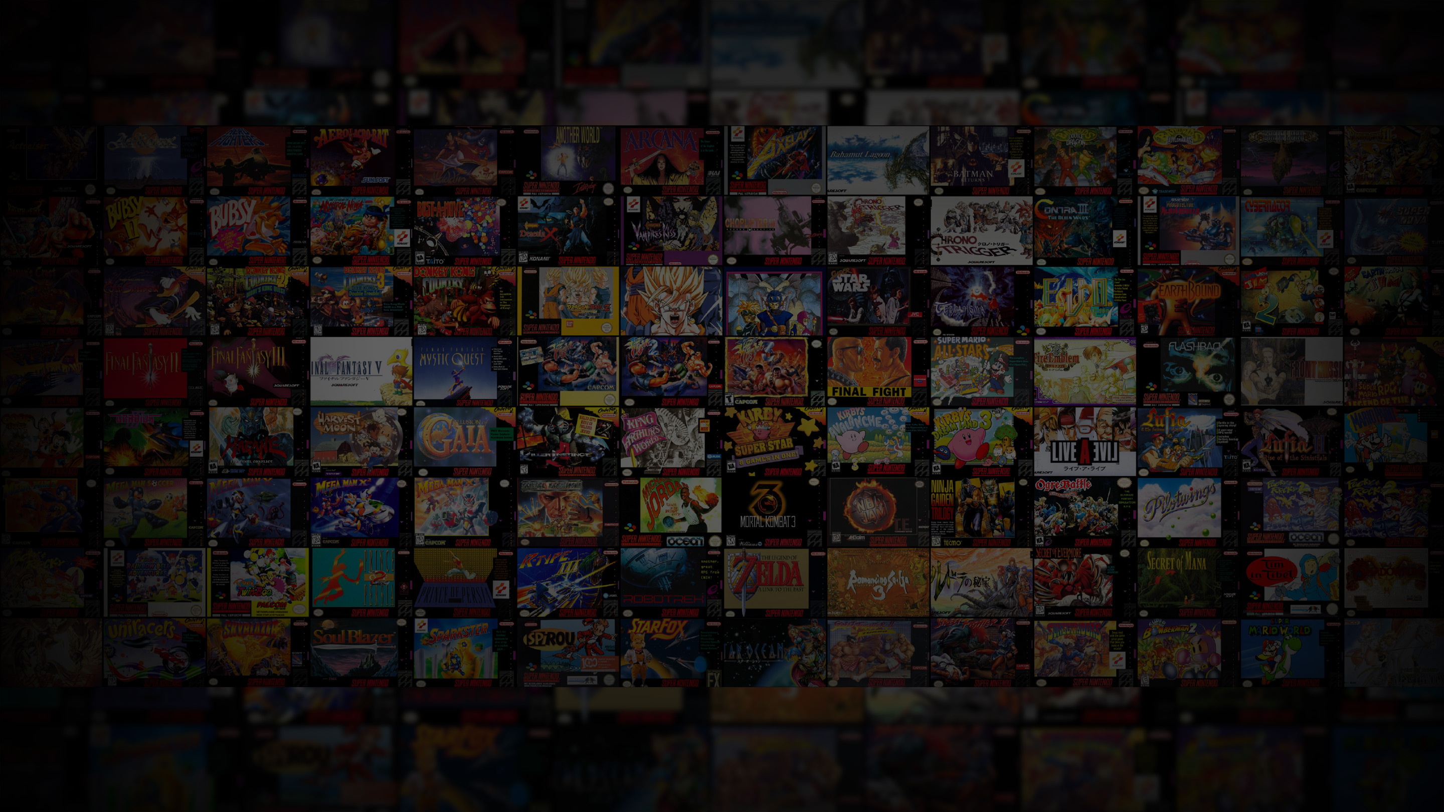
Ok, It's a lot of work yeah. I prefer make everything myself (better for uniformity), but if you want to help or make your own background, no problem. I like to share and see what people can do with it You can find the .PSD here: http://www.mediafire.com/download/nd65x34gphc1p8p/grid-backgrounds.psd For the grid covers, I just import all covers I grabbed in a new document in InDesign (2850x1107...yeah weird dimensions...) and adjust them in a grid (ctrl+shift+d). Then I export it in PDF at a high resolution output and import it directly in the PSD in the dynamic layer named "main-image". Some systems are trickier because there are not enough games or it's too specific (Daphne). You have to make a full art patchwork (like I did for CPS 1 or 3, or virtual console). Capcom Play System Capcom Play System II Capcom Play System III Nintendo Famicom Super Nintendo Entertainment System (USA) Nintendo WiiWare (it's virtual console) They are already done (don't forget you have a folder named "alternative versions" in the theme image folder fanart, there is the USA version of SNES for instance). Just rename it like your system name and it will be ok. And I admit I have trouble seeing interest in some plateforms of your list. Like Super Game Boy or PSP Minis... There are Game Boy and PSP games... Why do we have to separate them? But I understand that some of us are perfectionists I'll make the main missing backgrounds this week, but if anyone want to help, don't hesitate to post yours here
-
Thank you @johnugamer, I've corrected the background darkening. It's automatically at 0 now. I've changed it only for the archive CleanBG.zip (it's not necessary for CleanBGnosystems). However, I couldn't force the slide vertical transition... @elborra has found a great way to force some transitions, but we can't force a Slide Vertical Transition at the moment. So I can only advise to manually change that in Options > Transitions > Filters Game Boxes Transition > Slide Vertical
-
Thank you, you helped me a lot for my theme
-
The final version is online, to accompany the new official version of Launchbox: 6.8. It will be the last version of this theme (unless someone wants new backgrounds) Now, we just have to extract the theme in the theme folder and... that's all. Everything is working right out of the box, thanks to @Jason Carr. I must admit that create gifs like those I posted earlier is a real nightmare for systems 32bits+. And it's a really time consuming. I prefer use those gifs in a new theme. I have a new idea, and I prefer to put CleanBG aside for now. I think it's ok like that. And as a teaser for the next one, let's say it will be much more "metallic"
-
yes, when the next official update will be pushed, this theme will be repack like that. Nothing to do on you side. We talked about it severous time already, in another thread It's a very new option for theming BigBox (and the best). But for now, we assume the large part of users don't use the beta version. So... wait
-

Request and Question for Custom Logic
niglurion replied to CriticalCid's topic in Big Box Custom Themes
Yes, these are good suggestions. I'd like to play with that. Particularly the third and sixth -
yes, when the next official update will be online, I'll make three new versions pre organized. Don't worry, it's already complete. It's just a matter of time now before Jason put online the update.
-
I made another gif today, the Game Boy one. Not very inspired but I've got more than 40-50 systems to cover... So, let's move to the next one . Search sprites takes longer than make the gif, lol. Now, we've got two or three months of work i guess. Maybe less if someone want to help (800x450 pixels. I use Adobe Animate + import and export in Photoshop). Here's a video (stuttering is from the video):
