

Retrofrogg
-
Posts
1,375 -
Joined
-
Last visited
-
Days Won
8


Recent Profile Visitors
8,142 profile views


Retrofrogg's Achievements
")
128-Bit Self Aware (7/7)
570
Reputation
-

NES - Complete Accurate USA Box Art (704 images)
Retrofrogg commented on Jolu42's file in Nintendo Entertainment System
.thumb.png.a3faa9242d29b969fb5b963419165153.png) Doesn't the NES set exist already? What's the difference between this set and existing sets?
Doesn't the NES set exist already? What's the difference between this set and existing sets? -
The double jewel case doesn't appear when you go to edit platform then 3D model settings. It's in the list, but when you select it the preview window is blank.
-
The bulk media downloader doesn't seem to be working for me.
-
When viewing games in list view, the column headers are often missing. They come and go; the problem seems to be intermittent: @JoeViking245 helpfully pointed out that if you exit LB in boxes view, then restart LB, then switch to list view, the problem isn't there. But if you exit LB in list view, then restart in list view, the problem is there.

-
I've noticed with the latest beta that the 3D box model icon doesn't always show as it should. When I'm browsing games, sometimes it loads correctly and sometimes it doesn't. Here it doesn't load: And if I move onto another game or two then come back, it loads:
-
Screenshot priorities doesn't seem to be working for platforms? I have banner deselected, but banner images still appear on the image carousel.
-
PopCap Standardized Fanart - Box - Front and Clear Logo Set (71 Games)
Retrofrogg replied to donarumo's topic in Game Media
Was just adding PopCap games to my collection and this set is a godsend! Thanks! -
Having an issue with the latest beta where Launchbox will crash during the import game process. I drag the game into Launchbox, get past the first couple of import windows but then it crashes and I have to force quit. Edit: after a while it stopped doing it and has since worked. I'll continue to monitor the issue.
-
Huge Mame Marquee Collection including many in 4K resolution
Retrofrogg commented on Mr. RetroLust's file in Arcade
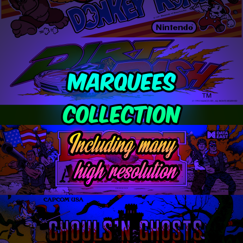 These are great. Have you linked in with the guys that do the MAME artwork sets (which are updated every few months)? Some of these are better than the ones in the official set.
 -
I'm getting this error; any help appreciated: Attempted to access a path that is not on the disk. App: LaunchBox Version: 13.27-beta-2 Theme: Frogg 2 Type: System.IO.DirectoryNotFoundException Site: Vlc.DotNet.Core.Interops.VlcLibraryLoader GetOrCreateLoader(System.IO.DirectoryInfo) Source: ThirdScreenSupportLib at Vlc.DotNet.Core.Interops.VlcLibraryLoader.GetOrCreateLoader(DirectoryInfo dynamicLinkLibrariesPath) at Vlc.DotNet.Core.Interops.VlcManager..ctor(DirectoryInfo dynamicLinkLibrariesPath, String[] args) at Vlc.DotNet.Core.VlcMediaPlayer..ctor(DirectoryInfo vlcLibDirectory, String[] options) at Vlc.DotNet.Forms.VlcControl.EndInit() at ThirdScreen.Screen3Form.Screen3Form_Init(Int32 width, Int32 height, Point location) at ThirdScreen.Screen3Form..ctor() at ThirdScreen.ThirdScreen_SystemEventHandler.third_screen_init() at ThirdScreen.ThirdScreen_SystemEventHandler.HandleSelectionChanged(IPlatform platform_override, IGame game_override) at ThirdScreen.ThirdScreen_SystemEventHandler.HandleSelectionChanged() at ThirdScreen.SettingsForm.SettingsForm_FormClosing(Object sender, FormClosingEventArgs e) at System.Windows.Forms.Form.WmClose(Message& m) at System.Windows.Forms.Form.WndProc(Message& m) at System.Windows.Forms.NativeWindow.Callback(HWND hWnd, MessageId msg, WPARAM wparam, LPARAM lparam) Recent Log: 22:10:41 Exception
-
Just updated and noticed a possible bug with the video preview area. I'm not sure if it is reading the xml properly. I'm using my own custom theme which removes the rounded edges of the viewing area. Currently, when I select a new game the viewing area is rounded on the left side but squared on the right. However, if I interact with the area in any way (including hover), the squared area quickly becomes rounded.
-
I have some which I’d be happy to share when I get back home at the weekend. Starting up a thread for folks to share what they have would seem sensible; is that OK with you @C-Beats? I know that putting game manuals on the Launchbox database wasn’t allowed?
-
Mr. RetroLust's - Mame 4K - Lights Out - Realistic Bezels / Artwork
Retrofrogg replied to Mr. RetroLust's topic in Game Media
Wow, this project is still going strong, good work! -
This sounds very interesting, but I'm not clear from the description what it is or what it does exactly! Maybe add in an ELI5?
-
Scan for Added ROMs seems to be taking ages recently
Retrofrogg replied to EvoluZion3's topic in Troubleshooting
I'm still struggling with this issue. Just did a scan for removed roms for my TurboGrafx-16 platform, and it found the 2 missing roms in about 5 seconds. I then scanned for added roms, and it took about 2 minutes to find the 2 new ones. Launchbox is running on a local SSD; the roms are on my Synology NAS (local network folder). I doubt that it's the NAS that is the issue, as I've always had the roms there and generally didn't have this issue. The ROMs are the No-Intro collection (.zip). Any ideas @AstroBob? Happy to help by providing further info or diagnostics if I can.

.thumb.png.a3faa9242d29b969fb5b963419165153.png)