Jump to content
LaunchBox Community Forums

PASC V3.zip 1.0.1

   (2 reviews)

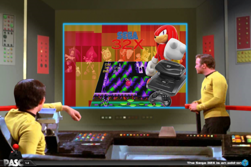
9 Screenshots

About This File

Enhancements

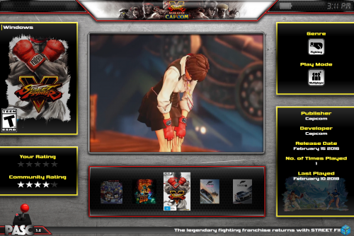
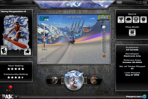
·       The UI has been re-designed

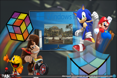
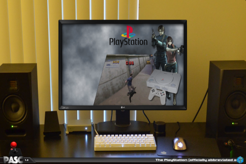
·     5 Views per Platform and Game (4 x Horizontal and 1 Text)

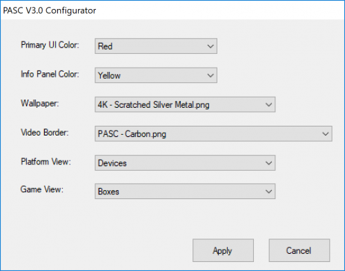
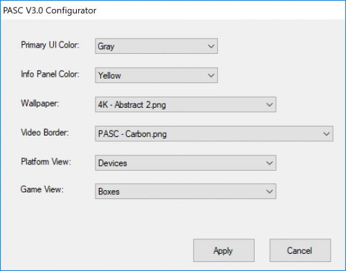
·       The supplied Configurator.exe makes it easy for the end user to personalize the Theme from color options, wallpaper, video borders, video border overlays and the use of Clear Logos, Boxes etc..

·       Contains a new plugin, game genre and play modes are now represented with the use of icons!! The typical “Action;Platformer;Shooter” text is no more!

·       Code and graphics have been optimized, ensuring the user experience is not degraded even when the Theme is running on a lower spec system.


Note:  Theme works very very well on a GPD Win2, no performance issues whatsoever.


Thank you to the following: -


@HugoBR

@harryoke

@Grila

@eatkinola

@Undertherainbow


A very special thank you to @Rincewind, his valuable time, contributions and ideas pushed me to develop a far greater theme than I had originally planned or imagined.


Setup

1. Unblock the .zip file once downloaded

2. Install the 3 fonts located in the fonts subfolder

3. Click the PASC V3 Configurator.exe  - This will allow you to personalize the appearance.


Customization Examples

image.thumb.png.824bddb50cd70e1b5c548c9f114d434c.pngimage.thumb.png.44141dc5ebb5a6f361c7dcd5cd46e7cd.pngimage.thumb.png.4fac8fd117c463e6667d229eae22254d.png

PASC_V3.rtf


What's New in Version 1.0.1   See changelog

Released

Very minor tweaks as I am now able to test the theme on a GPD Win2:-

  • Increased Clock and Scroll text font size
  • Increased the brightness of the Connected Controllers, Battery Status and Clock
  • Toned down the shadowing effect on the Information Panels
  • Increased font size on the Configurator.exe 
  • Like 8
  • Thanks 2

User Feedback

Recommended Comments

Great Theme y2guru, congratulations ! Way better than the preview versions ?. Simple, clean, efficient.

Now, like before, I will make my suggestions:

- For the view that shows the blurred background image, I think that it is better to not move offscreen the info panels. What do you think ?

- Can you make a clear logo for the TurboGrafx-16 ??  

Link to comment
Share on other sites

Hi Hugo and thankyou,  I am working on a massive update to this and you will be able to control many parts to it.


yes I’ll do the turbo grafx16

  • Like 1
Link to comment
Share on other sites

2 minutes ago, Avo_Skorm_1986 said:

could u do one that says collections as well? as im using retrohumanoids platform videos, and he has collections instead of playlists?

edited original reply and added "Collections"

Link to comment
Share on other sites

The release of your editor is near so i downloaded this theme that i've never tried before because i thought that didn't fit my style. OMG what a mistake! what an insane amount of work was put into this, i love Eatkinola's themes because of the easy customization, and this is possibly the most customizable theme on LB.

Smooth as very few other themes and...for those with decent skills in photoshop but no idea about programming is perfect. Seriously dude, you deserve more recognition, the configurator is also top and it's going to save me a lot of time.

Now i can't wait to see your editor, it's going to be amazing!

Link to comment
Share on other sites

1 hour ago, qu1r0s said:

The release of your editor is near so i downloaded this theme that i've never tried before because i thought that didn't fit my style. OMG what a mistake! what an insane amount of work was put into this, i love Eatkinola's themes because of the easy customization, and this is possibly the most customizable theme on LB.

Smooth as very few other themes and...for those with decent skills in photoshop but no idea about programming is perfect. Seriously dude, you deserve more recognition, the configurator is also top and it's going to save me a lot of time.

Now i can't wait to see your editor, it's going to be amazing!

Thank you so much for your kind words! yes the style is not to everyone's tastes, but I was shooting for something that was a little different in terms of look and user customization.   it was a ton of work for sure but I learned a great deal regarding graphics creation (my weakest area) and it was an early experiment to see how much user customization could be done within a theme,  that work led to the creation of the editor.    Like you, I cannot wait for the editor to be completed because I would love to see what others come up with.

  • Like 1
Link to comment
Share on other sites

Join the conversation

You can post now and register later. If you have an account, sign in now to post with your account.

Guest
Unfortunately, your content contains terms that we do not allow. Please edit your content to remove the highlighted words below.
Add a comment...

×   Pasted as rich text.   Paste as plain text instead

  Only 75 emoji are allowed.

×   Your link has been automatically embedded.   Display as a link instead

×   Your previous content has been restored.   Clear editor

×   You cannot paste images directly. Upload or insert images from URL.

×
×
  • Create New...