Jump to content
LaunchBox Community Forums

Bad Old Monkey 1.0.6

   (2 reviews)

5 Screenshots

About This File

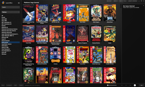
This theme is not a drastic change from the default but I did change some things about Jasons default theme that did not suit my personal preference.

I will no longer be updating this theme, I have no desire to try and keep up with changes Jason makes or new features added. So if anyone wishes to take this theme and release they are free to do so.

*Requires 8.6 Beta 1 or newer

Things I changed:

  • Reduced vertical space between platform names.
  • Shifted platforms text slightly left.
  • Removed gap at the bottom of the Game Details panel.
  • Removed gap on the right hand side of the Game Details panel.
  • Shifted scroll bar in the main game window closer to the Game Details panel.
  • Reduced font size of "Platform Name" at the top of Launchbox.
  • Reduced the space between the top of box art to the top of the Launchbox window.
  • Adjusted the "Platforms" panel dropdown menu so that it shows all entries without having to scroll.
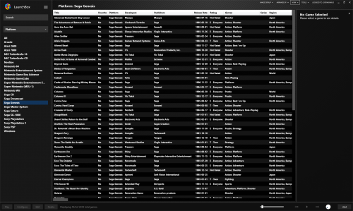
  • Enlarged the vertical and horizontal scrollbars in List View.
  • Reduced the vertical space between the games in List View.
  • Reduced the height of the column headers in List View.

Install instructions:

Copy the Bad Old Monkey folder into your \LaunchBox\LBThemes folder.
In Launchbox Options > Visuals choose the Bad Old Monkey theme from the dropdown menu and restart Launchbox.

If anyone applies the theme and it does not seem to work, try this:

In LB, change theme to Default. Exit app.
Delete the current Bad Old Monkey theme folder entirely.
Download the latest zip from the theme download page.
Extract the new Bad Old Monkey folder into the LBthemes folder.
Open LB again and change theme to bad old monkey.
After relaunching app, it should work correctly.

Spacing settings I use in Launchbox:

  • Horizontal Spacing 5
  • Vertical Spacing 5
  • Horizontal Padding 5
  • Vertical Padding 5
  • Text Spacing 2
  • Text Lines to Show 2
  • Aspect Ratio 0.65

What's New in Version 1.0.6   See changelog

Released

Version 1.0.6

Added new  Installed field to support the latest beta.

  • Like 7
  • Thanks 5
  • Haha 1

User Feedback

Recommended Comments


If anyone applies the theme and it does not seem to work, try this:

  1. In LB, change theme to Default. Exit app.
  2. Delete the current bad old monkey theme folder entirely.
  3. Download the 1.0.2 zip from the theme page.
  4. Extract the new bad old monkey folder into the LBthemes folder.
  5. Open LB again and change theme to bad old monkey.
  6. After relaunching app, it should work correctly.
Link to comment
Share on other sites

Just now, smiggy100 said:

This file is crashing my File explorer, i cant click it or even hover the mouse cursor over it....

Then you have something wrong with your PC, i already had this theme installed, but i just re-downloaded it, and there are no issues with it at all.

Link to comment
Share on other sites

Likewise I already have it installed but just downloaded again and the file is absolutely fine.

Perhaps you should check your HD for errors

Link to comment
Share on other sites

Did you install it to the \LBThemes folder and not the \Themes folder ?

Did you read the install instructions which has some extra instructions in case there is an issue ? Some people had some issues and posted a potential fix earlier in the comments and is in the install instructions as well.

1 hour ago, Fantist said:

I have even tried removing the Default theme and renaming the Bad Old Monkey folder to Default to force it to apply and it still uses the default theme.

This won't work, Jason coded it up so the Default is the default in case of a bad theme totally breaking things.

Link to comment
Share on other sites

8 minutes ago, Fantist said:

Not sure what the point of redownloading the same folder when it hasn't updated since August 23 is, but I did it anyway.

Well that was for back when it was first released and some people had issues and I had updated the theme.

Double check that your folder structure looks like this and that the Bad Old Monkey folder is not inside another folder.screenshot_17.jpg.62cc3ba7d9093dfb4f377ec125288771.jpg

Link to comment
Share on other sites

14 minutes ago, Fantist said:

Here you are sir, I made a thorough video for your viewing when you have time: https://drive.google.com/file/d/1dN_j4003JPl2sgHr6zjptU3yxagz0tZu/view?usp=drive_open

Ok ill chime in here as @Lordmonkus will not be around for hours yet. Are you sure the theme isnt working? Bad monkey is a very minimal edit of the default theme, so it looks very similar to the default theme. The main differences i believe are font size and spacing in the sidebar. So as in the video you have no platforms imported it's impossible to see any difference from the default theme there, if its working correctly then the platform names will be a lot closer together in bad monkey than the default, but again its impossible to tell as you have no platforms there.

Link to comment
Share on other sites

2 minutes ago, Fantist said:

Uhoh, I'm worried that's what it is lol. I was referencing the screenshots at the top of the page where the selected platform highlighted in blue and the background is that diagonal line pattern.  Gonna feel super dumb if that's my mistake.

Yep, colours and background images can be changed by the user in any theme. Tools/options colours for the colours.

image.thumb.png.05ea5e23fe27a78e878a4eac8dd2fea6.pngAnd tools/options Default Background for backgrounds.

image.thumb.png.3871e0db5ff239df65481e547705db7e.png

Link to comment
Share on other sites

I just learned something here, the default theme can't be changed? IOW, if all I want to do is change the vertical spacing in the left side platform menu, can I edit something in a XAML file or do I have to use this theme? Or copy the default theme folder to a new folder, name it somehow differently, and edit it there?

Link to comment
Share on other sites

Just now, FlightRisk said:

I just learned something here, the default theme can't be changed? IOW, if all I want to do is change the vertical spacing in the left side platform menu, can I edit something in a XAML file or do I have to use this theme? Or copy the default theme folder to a new folder, name it somehow differently, and edit it there?

Yes just copy the default theme and edit that, the default Launchbox or Bigbox themes can not be edited for safety reasons.

Link to comment
Share on other sites

Thanks! That makes perfect sense. I just saw the readme as well in the LBThemes folder. Suppose this will be another distraction for a bit as I play around with it. :)

Link to comment
Share on other sites

Which file and which tag in the file sets the vertical spacing between the platform names? I have searched every file for "spacing" and "vertical" and can't find it.

EDIT: Think I found it with "padding" in the TreeView.ItemTemplate object tag in the \Bad Old Monkey\Views\SideBarView.xaml file. According to the MSDN for the Windows API, it is "... padding "left, top, right, bottom". So the default template is "12,8,12,8" and @Lordmonkus is using "2,2,12,2" which pulls the beginning of the tree item list to the left by 8 and reduces the top and bottom spacing by 12 (-6 on each the top and bottom). 

<TreeView.ItemTemplate>
                <HierarchicalDataTemplate ItemsSource="{Binding Nodes}">
                    <DockPanel LastChildFill="True" HorizontalAlignment="Stretch">
                        <TextBlock Padding="2,2,12,2" Text="{Binding Count}" TextAlignment="Right" DockPanel.Dock="Right" Visibility="{Binding RelativeSource={RelativeSource FindAncestor, AncestorType={x:Type UserControl}}, Path=DataContext.RightCountVisibility}" />
                        <TextBlock Padding="2,2,12,2" Text="{Binding Value}" TextAlignment="Left" TextTrimming="CharacterEllipsis" Visibility="{Binding RelativeSource={RelativeSource FindAncestor, AncestorType={x:Type UserControl}}, Path=DataContext.ValueWithoutCountVisibility}" />
                        <TextBlock Padding="2,2,12,2" Text="{Binding ValueWithCount}" TextAlignment="Left" TextTrimming="CharacterEllipsis" Visibility="{Binding RelativeSource={RelativeSource FindAncestor, AncestorType={x:Type UserControl}}, Path=DataContext.ValueWithCountVisibility}" />
                    </DockPanel>
                </HierarchicalDataTemplate>
            </TreeView.ItemTemplate>

It looks like the settings you can set from in the LB options mentioned in his notes apply subtle changes to the grid display for the games:

Horizontal Spacing 5
Vertical Spacing 5
Horizontal Padding 5
Vertical Padding 5
Text Spacing 2
Text Lines to Show 2
Aspect Ratio 0.65

Edited by FlightRisk
Link to comment
Share on other sites

what you can do is look at the default one in NP++ and then look at Monkus's side by side with the compare macro this will highlight differences in the two files.

Link to comment
Share on other sites

@DOS76, yes that is how I ultimately found the changes. Thanks for the help. As an aside, the 3 best programs I have used and ever seen from a user experience standpoint are Corel Draw (at least from 1989-1999 when I used it the most), Notepad++ and LaunchBox. Some things are just near perfection in terms of features, usability and support. What a contrast with a Photography editing software I am using in hopes of replacing Adobe Lightroom (still hopeful they get their act together). But as far as LB concerned, I am convinced it is the work of the devil or at least some form of sorcery. @Jason Carr adds features faster than I can post a request and puts in things I didn't even know I couldn't live without until I download the pretty much weekly beta updates and try them out. LB and BB is almost as much fun playing with as the games!

Link to comment
Share on other sites

what is this background called u used? and can you plz upload a screenshot of your font and color settings?

Edited by Isoku
Link to comment
Share on other sites

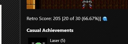
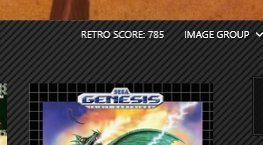
Updated to add the new Retro Achievement stuff, you will find a Gamer Score at the top which can be clicked on as well as a game specific score and button in the Game Details panel below the game screen shots.

Link to comment
Share on other sites


Join the conversation

You can post now and register later. If you have an account, sign in now to post with your account.

Guest
Unfortunately, your content contains terms that we do not allow. Please edit your content to remove the highlighted words below.
Add a comment...

×   Pasted as rich text.   Paste as plain text instead

  Only 75 emoji are allowed.

×   Your link has been automatically embedded.   Display as a link instead

×   Your previous content has been restored.   Clear editor

×   You cannot paste images directly. Upload or insert images from URL.

×
×
  • Create New...