Jump to content
LaunchBox Community Forums

Unified Pause Theme 1.1.0

   (1 review)

8 Screenshots

About This File

This is a Pause theme for use with CriticalCid's Unified theme.
The theme will pull its Platform background and clear logo images from CriticalCid's Unified theme folder so it will not work properly without the theme being installed.
The theme was designed for 16:9 screens and display resolutions only.

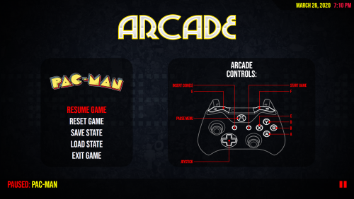
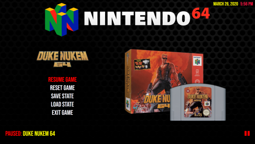
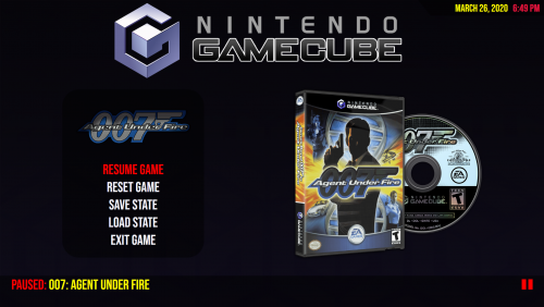
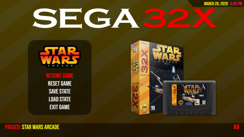
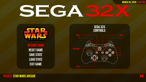
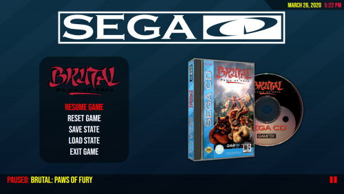
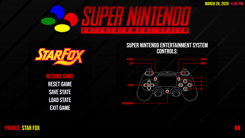
I have made 2 versions of the pause theme, one will display the box and cart art and the other will display the controller layout for the system being used.
I have also included the .PSD template for the controller layout so you can create your own.

Installation:

Box Art pause theme:

  1. Extract the archive and drag the 'Unified' folder inside to the "..\Launchbox\PauseThemes\" folder.
  2. Install the font supplied in Font folder.
  3. Launch BigBox and go into -> Options -> Game Pause -> Pause Theme and change the Theme to "Unified".

Controls pause theme:

  1. Extract the archive and drag the 'Unified' folder inside to the "..\Launchbox\PauseThemes\" folder.
  2. Drag the 'Game Controls' folder from the 'Controls' folder you want to use, to the "..\Launchbox\Images\" folder.
  3. Install the font supplied in Font folder.
  4. Launch BigBox and go into -> Options -> Game Pause -> Pause Theme and change the Theme to "Unified".

IMPORTANT: Never rename the theme folder! The theme folder has to be named exactly "Unified" or the theme won't work properly!

NOTE: All images must be placed in a specific folder structure and follow a standard LaunchBox naming convention to work with this pause theme.

All platform specific control images must be named as the platform in your set-up is named and placed in the "..\Launchbox\Images\Game Controls\" folder.
All game specific control images must be named as the LaunchBox Database ID and be placed inside a folder that is named as the platform in your set-up is named and the folder must be placed in the "..\Launchbox\Images\Game Controls\" folder.


I have also made a Startup and Shutdown Theme to go with the Unifed theme to complete the setup.


What's New in Version 1.1.0   See changelog

Released

Fixed screen scaling.
Fixed text scaling.
Added Default fallback image to pause screen background.
Added Per game controls using the LaunchBox Database ID.

  • Like 11
  • Thanks 3
  • Game On 1
  • Unusual Gem 2

User Feedback

Recommended Comments

It's great to see more devs making pause screens that show control layouts. Can I recommend adding a link to 'View manual' in the pause screen menu? That is an important link that I use when pausing... using another pause theme. It's where I place my move lists for fighting games and other games that require move lists or stuff like instruction cards (pinball).

  • Like 1
Link to comment
Share on other sites

On 3/30/2020 at 3:37 PM, ItchyRobot said:

It's great to see more devs making pause screens that show control layouts. Can I recommend adding a link to 'View manual' in the pause screen menu? That is an important link that I use when pausing... using another pause theme. It's where I place my move lists for fighting games and other games that require move lists or stuff like instruction cards (pinball).

View manuals option shows up if there is a manual available. It works with both versions of this theme:Capture.JPG.74048ccaa1192f4c2cabc169662014e4.JPG

  • Thanks 1
Link to comment
Share on other sites

RetroNi thanks for the Pause screen, but there is an issue. The pause menu is bigger than the screen. I'm running 4k on a UHD TV with the recommended 300% scale and layout.

broken.thumb.jpg.cb63ff12a53b49b2a573eddbdc477571.jpg

I changed the scale and layout and it's a little better, but it's still looks off considering the scale of the side panel. I can't leave the computer at that scale since everything is tiny. Any solution to this? Thanks

broken2.thumb.jpg.3b3329dfbeffe293459639e3ad56abd9.jpg

Edit: I have been looking at the XAML code and it seems your rowdefinitions and column definition will only work for a 1080p screen with the scale and layout set to 100%. I am not that good in XAML, but I think you need to change those numbers to ratios e.g <RowDefinition Height=".5*" /> 
                

Edited by Spiro9210
  • Like 1
Link to comment
Share on other sites

Hey RetroNi, I modded your XAML code for a little bit more flexibility. Instead of fixed Rowdefinition and Columndefinition sizes, I converted all your grids to ratios. I also cleaned up the code a bit by nesting Grids instead of a single complex main Grid. The edited code below is taken from the Arcade pause screen XAML.  I haven't done much XAML. I was a HTML guy before I gave up web design, so there might be mistakes in the code. I tested it on my system, so it works well on my end at different resolutions and scaling. Hope it works well for you so others with 4K screens can benefit. Cheers. 

<UserControl xmlns="http://schemas.microsoft.com/winfx/2006/xaml/presentation"
             xmlns:x="http://schemas.microsoft.com/winfx/2006/xaml"
             xmlns:mc="http://schemas.openxmlformats.org/markup-compatibility/2006"
             xmlns:d="http://schemas.microsoft.com/expression/blend/2008"
			 xmlns:gif="clr-namespace:WpfAnimatedGif;assembly=Unbroken.LaunchBox.Wpf"
			 xmlns:controls="clr-namespace:Unbroken.LaunchBox.Wpf.Controls;assembly=Unbroken.LaunchBox.Wpf"	
             xmlns:transitions="clr-namespace:Unbroken.LaunchBox.Windows.Transitions;assembly=Unbroken.LaunchBox.Windows"
			 xmlns:sys="clr-namespace:System;assembly=mscorlib"
             mc:Ignorable="d"
             d:DesignHeight="562"
             d:DesignWidth="1000"
             HorizontalAlignment="Stretch"
             VerticalAlignment="Stretch"
             FocusVisualStyle="{x:Null}"
             BorderThickness="0"
             Margin="0"
             Padding="0"
             Background="#000">
			 
    <UserControl.Resources>
        <Style x:Key="ListBoxItemStyle" TargetType="ListBoxItem">
            <Setter Property="FocusVisualStyle" Value="{x:Null}" />
            <Setter Property="Padding" Value="0" />
            <Setter Property="HorizontalContentAlignment" Value="{Binding HorizontalContentAlignment, RelativeSource={RelativeSource FindAncestor, AncestorLevel=1, AncestorType={x:Type ItemsControl}}}" />
            <Setter Property="VerticalContentAlignment" Value="{Binding VerticalContentAlignment, RelativeSource={RelativeSource FindAncestor, AncestorLevel=1, AncestorType={x:Type ItemsControl}}}" />
            <Setter Property="Background" Value="Transparent" />
            <Setter Property="BorderBrush" Value="Transparent" />
            <Setter Property="BorderThickness" Value="1" />
            <Setter Property="Template">
                <Setter.Value>
                    <ControlTemplate TargetType="{x:Type ListBoxItem}">
                        <Border x:Name="Bd" Background="{TemplateBinding Background}" BorderBrush="{TemplateBinding BorderBrush}" BorderThickness="1"
						Padding="0" SnapsToDevicePixels="True">
                            <ContentPresenter HorizontalAlignment="Stretch"
                            VerticalAlignment="{TemplateBinding VerticalContentAlignment}"
                            Content="{TemplateBinding Content}"
                            ContentStringFormat="{TemplateBinding ContentStringFormat}"
                            ContentTemplate="{TemplateBinding ContentTemplate}"
                            SnapsToDevicePixels="True" />
                        </Border>
                        <ControlTemplate.Triggers>
                            <MultiTrigger>
                                <MultiTrigger.Conditions>
                                    <Condition Property="IsMouseOver" Value="True" />
                                </MultiTrigger.Conditions>
                                <Setter TargetName="Bd" Property="Background" Value="#FF0000" />
                                <Setter TargetName="Bd" Property="BorderBrush" Value="#FF0000" />
                            </MultiTrigger>
                            <MultiTrigger>
                                <MultiTrigger.Conditions>
                                    <Condition Property="Selector.IsSelectionActive" Value="False" />
                                    <Condition Property="IsSelected" Value="True" />
                                </MultiTrigger.Conditions>
                                <Setter TargetName="Bd" Property="Background" Value="Transparent" />
                                <Setter TargetName="Bd" Property="BorderBrush" Value="Transparent" />
								<Setter Property="Foreground" Value="Red" />
                            </MultiTrigger>
                            <MultiTrigger>
                                <MultiTrigger.Conditions>
                                    <Condition Property="Selector.IsSelectionActive" Value="True" />
                                    <Condition Property="IsSelected" Value="True" />
                                </MultiTrigger.Conditions>
                                <Setter TargetName="Bd" Property="Background" Value="#FF0000" />
                                <Setter TargetName="Bd" Property="BorderBrush" Value="#FF0000" />
                            </MultiTrigger>
                            <Trigger Property="IsEnabled" Value="False">
                                <Setter TargetName="Bd" Property="TextElement.Foreground" Value="{DynamicResource {x:Static SystemColors.GrayTextBrushKey}}" />
                            </Trigger>
                        </ControlTemplate.Triggers>
                    </ControlTemplate>
                </Setter.Value>
            </Setter>
        </Style>
        <Style x:Key="ListBoxStyle" TargetType="ListBox">
            <Setter Property="ItemContainerStyle" Value="{DynamicResource ListBoxItemStyle}"></Setter>
            <Setter Property="BorderBrush" Value="Transparent" />
            <Setter Property="Background" Value="Transparent" />
            <Setter Property="Foreground" Value="GhostWhite"></Setter>
            <Setter Property="FontFamily" Value="Calibri" />
            <Setter Property="ScrollViewer.HorizontalScrollBarVisibility" Value="Hidden" />
            <Setter Property="ScrollViewer.VerticalScrollBarVisibility" Value="Hidden" />
            <Setter Property="BorderThickness" Value="0" />
            <Setter Property="Padding" Value="0" />
            <Setter Property="Margin" Value="0" />
            <Setter Property="FocusVisualStyle" Value="{x:Null}" />
        </Style>
    </UserControl.Resources>
	
	<!-- VIEW START -->
    <Canvas Name="Canvas">
	
        <!-- BACKGROUND -->
        <Image Source="{Binding BackgroundImagePath}" Stretch="UniformToFill" RenderOptions.BitmapScalingMode="HighQuality"
            Height="{Binding ElementName=Canvas, Path=ActualHeight}" Width="{Binding ElementName=Canvas, Path=ActualWidth}" >
            <Image.Effect>
                <BlurEffect Radius="5"/>
            </Image.Effect>
        </Image>
		
		<!-- PLATFORM LOGO -->
		<TextBlock x:Name="LogoFileName" Visibility="Collapsed">
			<TextBlock.Text>
				<MultiBinding StringFormat="{}pack://siteoforigin:,,,/PauseThemes/Unified/Images/Logo/{0}.png">
					<Binding Path="NonPlaylistNonCategoryPlatformTitle" />
				</MultiBinding>
			</TextBlock.Text>
		</TextBlock>
		<Image x:Name="LogoImage" Source="{Binding Text, ElementName=LogoFileName, FallbackValue='pack://siteoforigin:,,,/Themes/Unified/Images/Theme/Logo/_Default.png'}" Panel.ZIndex="1" Stretch="UniformToFill" RenderOptions.BitmapScalingMode="HighQuality" Height="{Binding ElementName=Canvas, Path=ActualHeight}" Width="{Binding ElementName=Canvas, Path=ActualWidth}" />
		
		<!-- MAIN GRID -->	
        <Grid Height="{Binding ElementName=Canvas, Path=ActualHeight}" Width="{Binding ElementName=Canvas, Path=ActualWidth}">
            <Grid.Background>
                <SolidColorBrush Color="Black" Opacity="{Binding BackgroundFade}" />
            </Grid.Background>
            <Grid.RowDefinitions>
                <RowDefinition Height="25*" />
                <RowDefinition Height="67*" />
                <RowDefinition Height="8*" />
            </Grid.RowDefinitions>
			<Grid.ColumnDefinitions>
			    <ColumnDefinition Width="100*" />
			</Grid.ColumnDefinitions>
			
		    <!-- HEADER GRID-->
			<Grid Grid.Row="0" Grid.Column="0">
                <Grid.RowDefinitions>
                    <RowDefinition Height="20*" />
                    <RowDefinition Height="80*" />
                </Grid.RowDefinitions>
                <Grid.ColumnDefinitions>
                    <ColumnDefinition Width="23*" />
                    <ColumnDefinition Width="47*" />
                    <ColumnDefinition Width="4*" />
					<ColumnDefinition Width="26*" />
                </Grid.ColumnDefinitions>
				
				<!-- UPPER GLASSBAR -->
				<Viewbox Grid.Row="0" Grid.Column="2" Grid.ColumnSpan="2" Stretch="UniformToFill" >
					<Polygon x:Name="UpperGlassBar" Points="0,0 45,55 2000,55 2000,0" Stroke="Black" StrokeThickness="0" Fill="Black" Opacity="0.5">
						<Polygon.RenderTransform>
							<TransformGroup>
								<ScaleTransform/>
								<SkewTransform/>
								<RotateTransform/>
								<TranslateTransform/>
							</TransformGroup>
						</Polygon.RenderTransform>
					</Polygon>
				</Viewbox>
				
			    <!-- DATE AND TIME -->
				<Viewbox Grid.Row="0" Grid.Column="3" Margin="0,0,0,0" >
					<DockPanel Height="55" Width="385" HorizontalAlignment="Stretch" VerticalAlignment="Stretch" >
						<TextBlock Text="{Binding Source={x:Static sys:DateTime.Today}, StringFormat='{}{0:MMMM dd, yyyy}'}" FontFamily="Bebas Neue" FontSize="40" Foreground="Yellow" HorizontalAlignment="Right" VerticalAlignment="Center" DockPanel.Dock="Right" >
							<TextBlock Text="  " FontFamily="Bebas Neue" FontSize="37" HorizontalAlignment="Right" VerticalAlignment="Center" DockPanel.Dock="Right" />
							<TextBlock Text="{Binding CurrentTime}" FontFamily="Bebas Neue" FontWeight="Bold" FontSize="40" Foreground="Crimson" HorizontalAlignment="Right" VerticalAlignment="Center" DockPanel.Dock="Right" />
						</TextBlock>
					</DockPanel>
				</Viewbox>	
			</Grid>

		    <!-- MIDDLE GRID-->
			<Grid Grid.Row="1" Grid.Column="0" Grid.RowSpan="1">
                <Grid.RowDefinitions>
                    <RowDefinition Height="6*" />
                    <RowDefinition Height="88*" />
                    <RowDefinition Height="6*" />
                </Grid.RowDefinitions>
                <Grid.ColumnDefinitions>
                    <ColumnDefinition Width="11*" />
                    <ColumnDefinition Width="25*" />
                    <ColumnDefinition Width="11*" />
					<ColumnDefinition Width="42*" />
					<ColumnDefinition Width="11*" />
                </Grid.ColumnDefinitions>
				
				<!-- SIDE MENU GRID-->
				<Grid Grid.Row="1" Grid.Column="1">
					<Grid.RowDefinitions>
					    <RowDefinition Height="5*" />
						<RowDefinition Height="20*" />
						<RowDefinition Height="3*" />
						<RowDefinition Height="66*" />
						<RowDefinition Height="*" />
					</Grid.RowDefinitions>
					<Grid.ColumnDefinitions>
						<ColumnDefinition Width="100*" />
					</Grid.ColumnDefinitions>
					
				    <!-- MENU BACKGROUND -->
				    <Border Grid.Row="0" Grid.Column="0" Grid.RowSpan="5" CornerRadius="58" Background="Black" Opacity="0.5" />
					
					<!-- CLEAR LOGO -->
					<Image Grid.Row="1" Grid.Column="0" Source="{Binding SelectedGame.ClearLogoImagePath}" VerticalAlignment="Center" HorizontalAlignment="Center" Margin="35,0,35,0" Stretch="Uniform"  RenderOptions.BitmapScalingMode="HighQuality">
						<Image.Effect>
							<DropShadowEffect BlurRadius="10" Direction="-90" RenderingBias="Quality" ShadowDepth="1" />
						</Image.Effect>
				    </Image>
				
					<!-- MENU LISTBOX -->
					<ListBox Name="Items" Grid.Row="3" Grid.Column="0" Style="{StaticResource ListBoxStyle}"   VerticalAlignment="stretch" HorizontalAlignment="Center" >
						<ListBox.ItemTemplate>
							<DataTemplate>
								<TextBlock Text="{Binding Path=Text}" Panel.ZIndex="6" HorizontalAlignment="Center" FontSize="28" FontFamily="Bebas Neue" />
							</DataTemplate>
						</ListBox.ItemTemplate>
					</ListBox>		
				</Grid>
				
			    <!-- CONTROLLER GRID -->
				<Grid Grid.Row="1" Grid.Column="3">
					<Grid.RowDefinitions>
					    <RowDefinition Height="2*" />
						<RowDefinition Height="95*" />
						<RowDefinition Height="3*" />
					</Grid.RowDefinitions>
					<Grid.ColumnDefinitions>
						<ColumnDefinition Width="3*" />
						<ColumnDefinition Width="95*" />
						<ColumnDefinition Width="2*" />
					</Grid.ColumnDefinitions>
					
				    <!-- CONTROLLER BACKGROUND -->
					<Border Grid.Row="0" Grid.Column="0" Grid.RowSpan="3" Grid.ColumnSpan="3" CornerRadius="58" Background="Black" Opacity="0.5" />
					
					<!-- CONTROLLER -->
					<TextBlock x:Name="ControllerFileName" Visibility="Collapsed">
						<TextBlock.Text>
							<MultiBinding StringFormat="{}pack://siteoforigin:,,,/PauseThemes/Unified/Images/Controller/{0}.png">
								<Binding Path="NonPlaylistNonCategoryPlatformTitle" />
							</MultiBinding>
						</TextBlock.Text>
					</TextBlock>
					<Image Grid.Row="1" Grid.Column="1" Source="{Binding Text, ElementName=ControllerFileName, FallbackValue='pack://siteoforigin:,,,/PauseThemes/Unified/Images/Controller/_Default.png'}"  VerticalAlignment="Center" HorizontalAlignment="Center" Stretch="Uniform" RenderOptions.BitmapScalingMode="HighQuality"/>
				</Grid>
            </Grid>
				
		    <!-- BOTTOM GRID-->
			<Grid Grid.Row="2" Grid.Column="0">
                <Grid.RowDefinitions>
                    <RowDefinition Height="3*" />
                    <RowDefinition Height="60*" />
                    <RowDefinition Height="37*" />
                </Grid.RowDefinitions>
                <Grid.ColumnDefinitions>
                    <ColumnDefinition Width="3*" />
                    <ColumnDefinition Width="90*" />
					<ColumnDefinition Width="4*" />
					<ColumnDefinition Width="3*" />
                </Grid.ColumnDefinitions>

				<!-- LOWER GLASSBAR -->
				<Border Grid.Row="0" Grid.RowSpan="3" Grid.Column="0" Grid.ColumnSpan="4" Background="Black" Opacity="0.5" />
				
				<!-- LOADING TITLE -->
				<TextBlock x:Name="Title" Grid.Row="1" Grid.Column="1" Text="Paused: " FontFamily="Bebas Neue" FontSize="32" Foreground="Red" VerticalAlignment="Center" HorizontalAlignment="Left">
					<TextBlock Text="{Binding SelectedGame.Title}" FontFamily="Bebas Neue" FontSize="30" Foreground="Yellow" VerticalAlignment="Center" HorizontalAlignment="Left"/>
				</TextBlock>

				<!-- PAUSE GIF -->
				<Image gif:ImageBehavior.AnimatedSource="{}pack://siteoforigin:,,,/PauseThemes/Unified/Images/Gifs/Pause.gif" Grid.Row="1" Grid.RowSpan="1" Grid.Column="2" Grid.ColumnSpan="1" 
				VerticalAlignment="Center" HorizontalAlignment="Right" Stretch="Uniform" RenderTransformOrigin="0,0">
				</Image>
            </Grid>			   
        </Grid>
    </Canvas>
</UserControl>


Edited by Spiro9210
Link to comment
Share on other sites

Love the pause menu. I was wondering if it was possible to add a default background image somehow, not for all games, but for games that don't have the right kind of image it grabs the game logo and just makes it stretched to fit the screen and doesn't look very nice, I was thinking if there was a default image for instances like this it would be nice, but I'm not sure if it would work or if it would just override and use the same image for everything. 

Link to comment
Share on other sites

Nice pause theme, but I'm having a problem.  I don't have any images displaying to the right of the resume game, pause, exit, etc...

Link to comment
Share on other sites

Please remove the "bigbox" logo from the pause menu in next update. It would be nicer to have less frontend "commercial" and more RETRO feel! I love BB but it should operate "in the background". 

Link to comment
Share on other sites

Join the conversation

You can post now and register later. If you have an account, sign in now to post with your account.

Guest
Unfortunately, your content contains terms that we do not allow. Please edit your content to remove the highlighted words below.
Add a comment...

×   Pasted as rich text.   Paste as plain text instead

  Only 75 emoji are allowed.

×   Your link has been automatically embedded.   Display as a link instead

×   Your previous content has been restored.   Clear editor

×   You cannot paste images directly. Upload or insert images from URL.

×
×
  • Create New...