Jump to content
LaunchBox Community Forums

RetroFresh 1.3

   (15 reviews)

15 Screenshots

About This File

This theme was designed to add as little overhead as possible, while giving a clean and simplistic view of the content. RetroFresh works with your own media and uses them as its centerpiece. Hope you guys enjoy.

This theme was ported over to the COMMUNITY Theme Creator, and is the only version still supported. Both the theme and the Theme Creator files are supplied, just in case you would like to make any changes with the theme.


Installation Instructions

  1. Extract 'RetroFresh - Theme.zip' LaunchBox/Themes folder.
  2. Open Big Box, go to Options/Views, select the RetroFresh theme.


Video Demonstration


The views I made are as follows:

RetroFresh

Spoiler

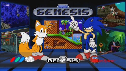
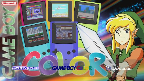
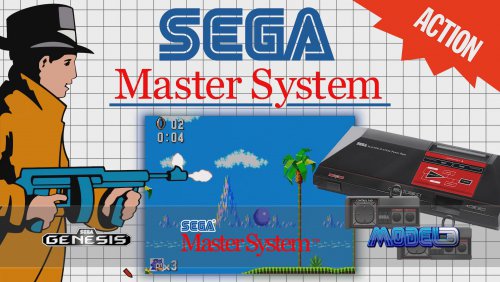
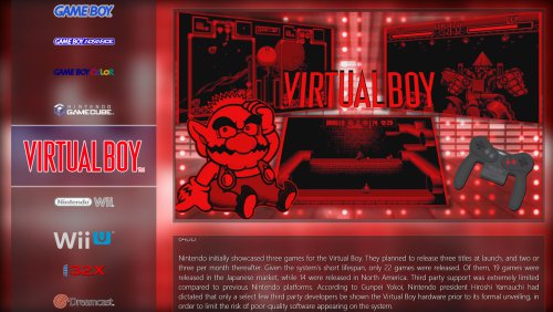
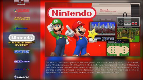
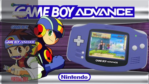
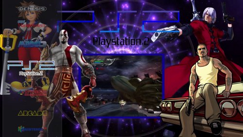
Platform Wheel View 1
This platform view was designed to get out of the way of the full screen platform videos made by all the wonderful people contributing to LaunchBox. The platform videos are the focus here, as the wheel's transparent background let's the video shine through.

RetroFresh.PlatformList.Example1.jpgRetroFresh.PlatformList.Example2.jpg

- Platform Wheel View 2
This is a vertical version of Platform Wheel View 1. It was designed to get out of the way of the full screen platform videos made by all the wonderful people contributing to LaunchBox. The platform videos are the focus here, as the wheel's transparent background let's the video shine through.

RetroFresh.PlatformList3.Example1.jpgRetroFresh.PlatformList3.Example2.jpg

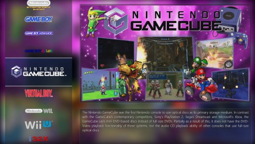
Platform Wheel View 3
This view's focus is on the platform theme videos, along with displaying their descriptions. It's all tied together with background platform images.

RetroFresh.PlatformList2.Example1.jpgRetroFresh.PlatformList2.Example3.jpg

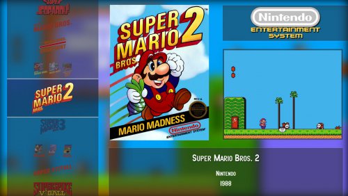
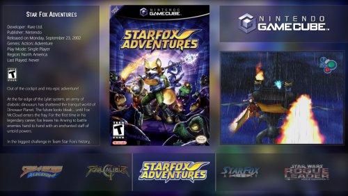
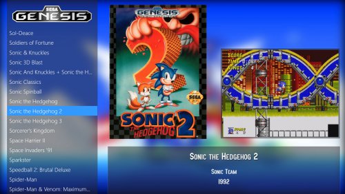
Game Wheel View 1
This game view let's the box art and game video take center stage, while the blurred background image allows for the transparent UI elements to take on its color property.

RetroFresh.GameList.WheelLeft1.2.jpg

Game Wheel View 2
This game view is the same as the first, except the wheel is on the right.

RetroFresh.GameList.WheelRight1.2.jpg

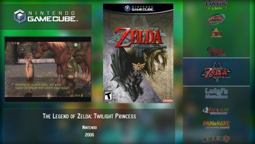
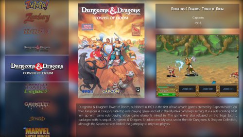
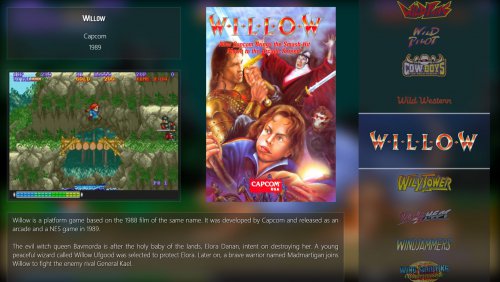
Game Wheel View 3
This view keeps the same focus as with the Vertical views, while also providing space for more game details.

RetroFresh.GameList.HorizontalWheel1.jpg

 Game Wheel View 4 - Experimental
This experimental view is designed specifically for game theme videos. It's a bare bones view with the main focus on the game video.

RetroFresh.Sleek.GameList4.GamThemes4.jpg

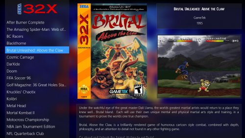
Game List View
This game view substitutes the wheel for a text list. This view will help on lower end systems, while the essence of theme remains intact.


If anyone finds any issues, please let me know.


RetroFresh.GameList.TextList-update.jpg

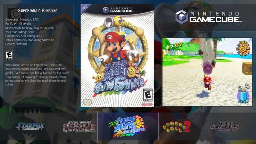
RetroFresh.Detailed.GameList.TextList1.jpg

RetroFresh.Detailed.GameList.WheelLeft.jpg

RetroFresh.Detailed.GameList.WheelRight.jpg

RetroFresh glass.png


What's New in Version 1.3   See changelog

Released

  • This theme is 3D Box Model ready: All relevant views have had their hard coded box image element replaced with the main image transition.
  • Like 33
  • Thanks 7
  • Unusual Gem 2

User Feedback

You may only provide a review once you have downloaded the file.


Riffman81

   4 of 4 members found this review helpful 4 / 4 members

Another AWESOME theme to add to my setup! No complaints here! BIG thanks to Faeran for making this!

  • Like 3
Link to review
crack__19

· Edited by crack__19

   4 of 4 members found this review helpful 4 / 4 members

This theme is awesome, near to be perfect. I Think that another alternative view would be great: 

Name, company, release date and genres on top right.

And game description on bottom.


I have tried to modify your theme but it is a bit difficult for me.


RetroFresh.GameList.TextList-update.jpg.bdaa759caa5f75581b03e554a55f223f.jpg

  • Like 3
Link to review
MarianS3

   2 of 2 members found this review helpful 2 / 2 members

De los mejores themes que he probado en BigBox, actualmente lo estoy usando y estoy muy satisfecho con el trabajo que han hecho, muchas gracias

Solo una cosa, quizás la fuente usada para el título del juego no sé si es la adecuada, en cualquier caso yo lo tengo con una fuente predeterminada, sin instalar la que viene en el theme.

  • Like 2
  • Game On 1
Link to review
LogicalEgo

   2 of 2 members found this review helpful 2 / 2 members

Really neat and clean small theme. I love the glass look.

  • Like 2
Link to review
BluSonik

   2 of 2 members found this review helpful 2 / 2 members

I'm really impressed with this theme and after all the cool additions in 1.2 i will be downloading both versions and using this as my new main theme. Thanks for all you hard work faeran :) 

  • Like 1
Link to review
kmoney

   2 of 2 members found this review helpful 2 / 2 members

Just got a chance to check out this theme and it is awesome and will be putting this in my rotation of themes. I love all the views but I was wondering if you would consider making an additional game view that would utilize the the recorded Hyperspin themes in partial fullscreen with the clear logo wheel on the right or left side of the screen that @CriticalCid made on this thread:

Great job on the theme!

  • Like 1
Link to review
bundangdon

   1 of 1 member found this review helpful 1 / 1 member

Simple, easy and very nice to look at. Great work!

Link to review
Nyny77

   1 of 1 member found this review helpful 1 / 1 member

very good job !

  • Like 1
Link to review
Emulation_Guru

   1 of 1 member found this review helpful 1 / 1 member

love it where can i get the game themes used?

Link to review
cmods


This is one of those themes that really grabs attention like a beautiful piece of art, many thanks and keep up the awesome creations ?

Link to review
×
×
  • Create New...