Jump to content
LaunchBox Community Forums

12 Screenshots

About This File

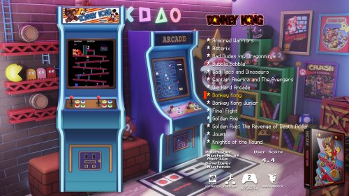
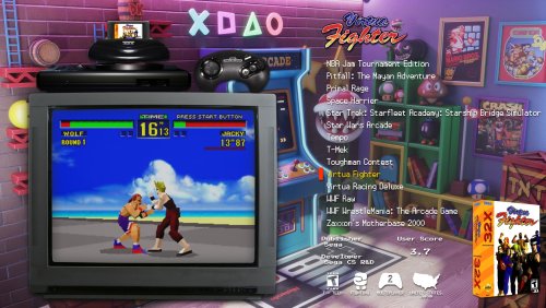
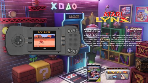
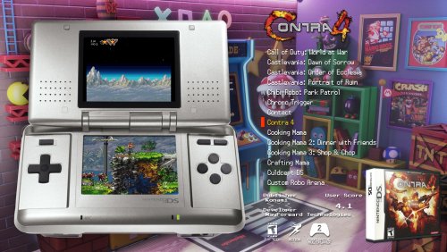
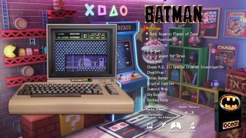
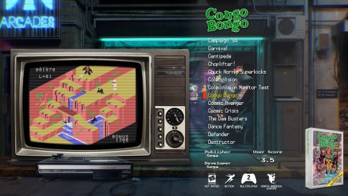
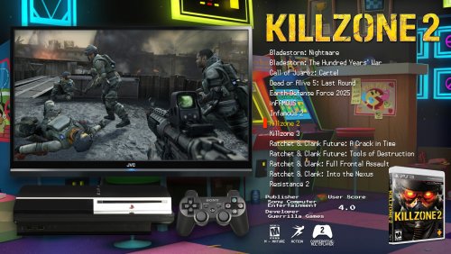
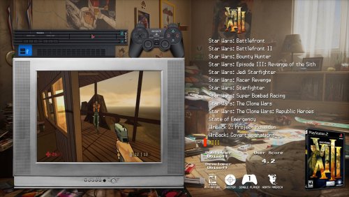
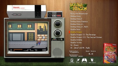
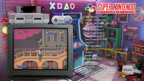
Step into your Game Room and view a virtual collection showcasing your love of video games.  Each video game console or platform appears with an authentic looking video screen to match that look and feel.  It is paired with a set of classic fonts to complete the experience.

  • Requires BigBox 13.1 or higher to properly function.
  • Designed to support 16:9, 21:9, and 4:3 aspect ratios.
  • Unique views for 54 platforms with game videos, game 3D/2D box art, device packaging, and game cart images.
  • Consoles and PCs are paired with TVs and Monitors from the same decade they were released.
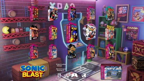
  • "Wall View" for looking at game boxes on shelves is accompanied by platform/game logos and image of the original console packaging.
  • Metadata showing Publisher, Developer, User Score, ESRB Rating, Genre, Play Mode, Region, and Platform Description.
  • Two different platform wheel views to choose from.
  • Full Playlist support, so the video size, platform image, and other relevant media will change to match each individual game.
  • Easily customizable by replacing \Themes\GameRoom\Media\Background\background.jpg with one of several included backgrounds or your own custom one!

Theme was created using the COMMUNITY Theme Creator by @y2guru - HUGE thank you, he's responsible for the dynamic video size logic.  Project files attached for those brave souls wishing to customize further.  Requires version 2.5.4 or higher.


Edited by BMovieBen
moved project files to where they are supposed to be


What's New in Version 1.1.0   See changelog

Released

- Added Platform Text Filters view to meet requirements for inclusion in BigBox
- Added default fallback cart image for NeoGeo

  • Like 11
  • Unusual Gem 1

User Feedback

Recommended Comments

Hi @BMovieBen, installing your theme for the first time. I previously had your beautiful 'Wood Panels' installed. But in that previous theme, there were a number of LaunchBox settings we had to apply to get it looking right.

In this new theme, I don't see any extra instructions. Will it run "out the box" without modifications?

====

EDIT: I also see in the preview images, the old 'Wood Panels' look is available. But I can't figure out how to enable it. Can you please instruct me on this?

Edited by FamShoppa
Link to comment
Share on other sites

1 hour ago, FamShoppa said:

Hi @BMovieBen, installing your theme for the first time. I previously had your beautiful 'Wood Panels' installed. But in that previous theme, there were a number of LaunchBox settings we had to apply to get it looking right.

In this new theme, I don't see any extra instructions. Will it run "out the box" without modifications?

====

EDIT: I also see in the preview images, the old 'Wood Panels' look is available. But I can't figure out how to enable it. Can you please instruct me on this?

I should probably add instructions around the cart images now that you mention it... I'll think on that.

For the Wood Panels look all you need to do is as follows:

Replace \Themes\GameRoom\Media\Background\background.jpg with the included background_WoodPanels.jpg

Just delete background.jpg and rename background_WoodPanels.jpg to background.jpg

Hope this helps. Please let me know if you have any further issues!

Link to comment
Share on other sites

2 hours ago, BMovieBen said:

I should probably add instructions around the cart images now that you mention it... I'll think on that.

For the Wood Panels look all you need to do is as follows:

Replace \Themes\GameRoom\Media\Background\background.jpg with the included background_WoodPanels.jpg

Just delete background.jpg and rename background_WoodPanels.jpg to background.jpg

Hope this helps. Please let me know if you have any further issues!

I just noticed your theme page contains instructions for swapping the background, sorry for bothering you about that. I just did that and the 'Wood Panels' look is great! A little more refined than the old one, in terms of how the text displays. I think this version also included a nice logo of the game on the top-right. Thanks for all these improvements!

If I could suggest one thing for the console display page (the "front page" that lets you cycle through the different consoles). Right now it shows a television-preview on the left, then a summary of the console on the right.

The console summary is great. But the television preview is a little confusing, because it fixates on a single game. That makes you feel like it's a game-selection item, rather than a general console item.

I'm thinking of some alternate things that television preview could show...
- A television commercial of that particular console (they're all on youtube and I could download them for you)
- A still image (the console's logo, a console advertisement, etc.)
- A changing cycle of game previews instead of just one game.

All that aside, it's still great as-is!
I switched the console page to the view where the console's themselves cycle like a wheel.
That looks cool as well!

Edited by FamShoppa
  • Thanks 1
Link to comment
Share on other sites

12 hours ago, FamShoppa said:

I'm thinking of some alternate things that television preview could show...
- A television commercial of that particular console (they're all on youtube and I could download them for you)

This is a great idea! I may play around with this idea. See if I can cook something up. I think the challenge for me would be making/finding videos for *all* the platforms, like the older obscure ones. But maybe I could just create a small clip that loops through the top games on the platform on that case.

  • Thanks 1
Link to comment
Share on other sites

7 hours ago, BMovieBen said:

This is a great idea! I may play around with this idea. See if I can cook something up. I think the challenge for me would be making/finding videos for *all* the platforms, like the older obscure ones. But maybe I could just create a small clip that loops through the top games on the platform on that case.

I just looked at the emulation wiki and realized I was pretty ignorant about the number of consoles there are. So you'd be absolutely right to pass on this, and I wouldn't want to put such a burden on anyone.

....

BTW, I had a little get-together with some friends today - and wanted to share some of the great feedback/observations from their "common man" perspective...

- All were in a jaw-dropped state at the presentation. You could see them nudging the guy with the first player controller so they could get a turn scrolling through the 'Wood Panels' presentation...while whoever had that controller was mesmerized by the presentation of games.

- What's amazing is, more time was spent scrolling through the game selection screen than actually playing the games lol! The television previews of the games were the main attraction. They sparked people's childhood memories, discussions began, and comments about "they don't make em' like this anymore!" etc.

- When it came to deciding on games - one absolutely priceless feature was your addition of the "single player/multi player" icons at the bottom of the game information screen. I don't recall it being in the old 'Wood Panels' theme. But anyways, it was an absolute lifesaver that helped us avoid wasting time on single player titles. 

....

I could go on and on...but this actually sparked another idea. 

I previously mentioned the alternate homepage view (where you cycle through images of the consoles themselves). The benefit of that view is that it lets you scroll quickly because it doesn't have video previews.

But it still looks a slight bit "empty". I wonder if we can take the other view's "console-information panel" (that text box which contains a paragraph explaining the console)...and add it to this view, somewhere in the background or to the side (whatever looks best).

That might be easier than overhauling the console television view.

  • Game On 1
Link to comment
Share on other sites

Hello just  installed this theme i like it   , when i switch to the game view  it displays just the game boxes even when i set it to text or horizontal view

how come i cant change the game wheel view?


Link to comment
Share on other sites

@Stylemaster it's been a while since I worked on the theme. Please remind me what the game wheel view is? Can you post some screenshots of what you're looking to see that's not in the theme already?

Link to comment
Share on other sites

Hi @BMovieBen, I'm about to use "playlists" for the first time in LaunchBox. And in BigBox, I use "Game Room" as my arcade's daily-driver theme.

In my "Game Room" console selection screen, I'd like to have each playlist represented with custom and unique icons.

But I'm not sure what the image criteria would be (dimensions, format, file size, etc.)...and what folder I would place the custom artwork.

Attached are the images of the view settings and home screen I'm currently using in "Game Room" (it's the old Wood Panels background with consoles cycling):


2024-05-06_00-44-26.png

2024-05-06_00-54-03.png

Edited by FamShoppa
Link to comment
Share on other sites

20 hours ago, FamShoppa said:

Hi @BMovieBen, I'm about to use "playlists" for the first time in LaunchBox. And in BigBox, I use "Game Room" as my arcade's daily-driver theme.

In my "Game Room" console selection screen, I'd like to have each playlist represented with custom and unique icons.

But I'm not sure what the image criteria would be (dimensions, format, file size, etc.)...and what folder I would place the custom artwork.


Hey there!  So each platform uses two images for the platform wheel view.  Device and Clear Logo.  Playlists work the same as Platforms in this respect.  You'll find folders to place overrides for these here:

GameRoom\BigBox Media Overrides\Images\Playlists\Device
GameRoom\BigBox Media Overrides\Images\Playlists\Clear Logo

So the "Device" is the image that shows up in the middle.  I recommend using a PNG file with transparency that's at least 600px tall.
The "Clear Logo" is the image that shows up below.  If you do not place an image here, it will just show text instead, so it's not required.  But if you do have something you want to place here, get a PNG with transparency again, and about 250px tall is fine.

The file names for the images should match the name of the playlist.

BigBox will resize images appropriately.  The drop shadows are part of the PNG images themselves, and not an effect done in real time.

Best of luck, let me know if you have issues and what you tried and I'll attempt to recreate the problem and diagnose on my end.

  • Game On 1
Link to comment
Share on other sites

On 2/26/2024 at 3:00 AM, Stylemaster said:

i cant seem to switch views 

gamerm wheel view.jpg

Sorry I didn't respond to this sooner; I missed the notification.  This looks like the "wall view".  This is what it's supposed to look like.  It's a wall of box art with some metadata at the bottom.  The selected game (ecco the dolphin in the screenshot) is slightly larger and its information displays at the bottom.

Link to comment
Share on other sites

Join the conversation

You can post now and register later. If you have an account, sign in now to post with your account.

Guest
Unfortunately, your content contains terms that we do not allow. Please edit your content to remove the highlighted words below.
Add a comment...

×   Pasted as rich text.   Paste as plain text instead

  Only 75 emoji are allowed.

×   Your link has been automatically embedded.   Display as a link instead

×   Your previous content has been restored.   Clear editor

×   You cannot paste images directly. Upload or insert images from URL.

×
×
  • Create New...