-
Posts
26 -
Joined
Content Type
Profiles
Forums
Articles
Downloads
Gallery
Blogs
Everything posted by hydef
-
Hey, thanks very much. I haven't tested this yet (I barely fire this up any more) but appreciate it and will use it if I play again.
-
Nah, just what you've done in the first post is great, thanks!
-
This is nice but I would like some credit for the art, please.
-

Restoring and Preserving Historical Video Game Box Art
hydef replied to Jonny Severn's topic in Game Media
Could you share a link to any packs, please? -

Restoring and Preserving Historical Video Game Box Art
hydef replied to Jonny Severn's topic in Game Media
I just wanted to say great work on these cassette game covers. Do you host them anywhere in ZX Spectrum, C64 etc. folders (otherwise I'm not always sure which is for which format) ? -
Awesome, I'm glad you haven't given up on it. I spend a lot of time looking for resources and never really find what I'm looking for. google is full of rubbish and many sites have very low quality and outdated images. Even though I think emulation is in a great state, the preservation of original art is somewhat disorganized and behind. For me, as you might agree, the box art is just as much part of the game and it's still something we haven't quite nailed in some areas. It's surely a difficult job. To be done right, any format would have to all be done by the same person with the same settings to give consistent quality. I wish there was a master, grand repository somewhere to link to or host both scans and remakes. Speaking of something like this, I read about Near's lossless SNES scans, which I haven't downloaded yet. Hopefully there's PAL scans in the 70GB DL like it says https://www.patreon.com/posts/nears-original-57250631 and I found another for PAL SNES at snesboxes.com/snes-box-art (all remakes, you be the judge of quality).
-
No worries but cheers.
-
Thanks for looking into this and great, you've got the stacking correct there. That doesn't look bad at all. I hadn't given any thought yet how new boxes would appear from either side.. Maybe they'd just appear and not come from anywhere? Not sure how that would look. I just wanted to note that this particular idea was always to just have 5 items, no more. And then for them to get smaller because it's easier to use with every platform this way and keep 5 on screen. Even with horizontal boxes. Finding one idea that worked with everything was a pain. And yep, just plain old 2D.
-
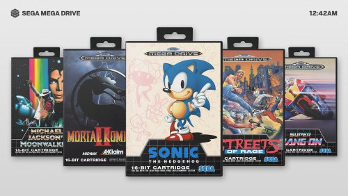
So I've been a bit frustrated with what I'm able to do and can't progress making a theme but I have this mockup: Hopefully you can see by the image that the stacking is intended. The selected title should be the point at which the wheel bends bends and the stacking becomes inverted. And the side boxes are a different scale, each becoming 10% smaller. Right now these things don't seem to be possible with the editor and I haven't seen them anywhere. As I'm not able to code and won't be able to any time soon, would anyone be willing to try and make this idea possible, please? I could even pay you something?
-
Thanks @fraganator, this oddly seems to work.
-
No one had this? I still can't figure it out.
-
I've had this problem forever but I've just put up with it. Games launch twice. No idea why it happens. I had a quick google and it seems people have had this issue before but I didn't see a resolution. I wondered if my installation was somehow broken but after installing a new version of LaunchBox on a different drive, it's not. Method: Installed LaunchBox 13.1, import ROMs from main menu - just one system, the NES. Configured an emulator to use with it, I chose the Retroarch.exe and the default platforms LaunchBox populated. Didn't change any other options. Press Enter to launch a game. The first time it opens 2 instances of Retroarch, once which plays, the other is paused. I close both. I launch another game with Enter, this time nothing happens. The 3rd time and onwards, a game will launch normally with only one instance. This is also the same for any other system and also PC games, those will also complain that another instance is running, the 2nd time not work and the 3rd time run normally. Same goes for using double click to launch instead of enter. Any ideas?
-
-
Light View File There were no themes I liked except part of one faeran made called Radiance so I took the game view from that and made a platform view to compliment it and that's all it is. It's very stripped-down. It's made for me so there's a limited amount of platforms (it's popular console/handheld only) with no text lists or sound or videos and is ideally suited for 2D box art. If you want to make it work for you in some way, you might have to do some xml editing. I don't even know how to edit those myself - Consequently, it's not set up perfectly in the games view, text could be aligned better there for some platforms and better box art spacing but I don't plan to make any revisions of this. Hopefully there's no major problems. The theme also matches my old Game & Watch stuff (although the game title isn't aligned well on that system because of all the different box sizes) and also my Game Boy overlays for Retroarch - Links here Again, thanks to faeran and the Community Theme Creator. Attached some sample images. Submitter hydef Submitted 03/20/2022 Category Big Box Custom Themes
-
Version 1.0.0
646 downloads
There were no themes I liked except part of one faeran made called Radiance so I took the game view from that and made a platform view to compliment it and that's all it is. It's very stripped-down. It's made for me so there's a limited amount of platforms (it's popular console/handheld only) with no text lists or sound or videos and is ideally suited for 2D box art. If you want to make it work for you in some way, you might have to do some xml editing. I don't even know how to edit those myself - Consequently, it's not set up perfectly in the games view, text could be aligned better there for some platforms and better box art spacing but I don't plan to make any revisions of this. Hopefully there's no major problems. The theme also matches my old Game & Watch stuff (although the game title isn't aligned well on that system because of all the different box sizes) and also my Game Boy overlays for Retroarch - Links here Again, thanks to faeran and the Community Theme Creator. Attached some sample images.


