Jump to content
LaunchBox Community Forums

NESiCAxLive Theme 2.0.0

   (2 reviews)

14 Screenshots

About This File

Click to view video of theme

Introduction

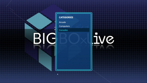
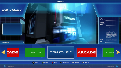
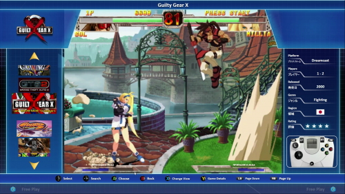
This theme was originally requested by @Evilmaster and is designed to mirror the interface of the NESiCAxLive system Taito use in their TypeX2 mutli-game cabinets. The theme has been completely rebuilt from the ground up in version 2.0 and should now scale correctly for all resolutions.

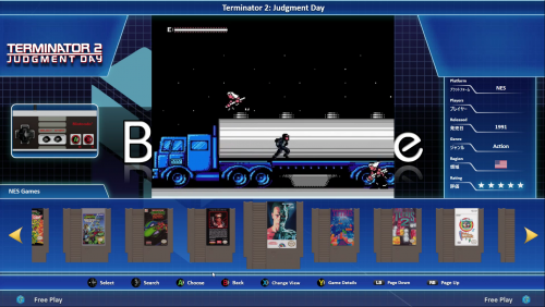
The theme does include the ability to display publisher logos as well as game specific control layouts within the interface. The theme is also built around using steam-style banners - I have detailed the simplest way to set this up currently in Launchbox below as the wheel does not support steam banners as a games view currently without some tweaking of your library. It will however, now also work with standard game boxes but I highly recommend that you set the option to remember different views per platform so that you can use the view that works best for the given platform cover art / banners you are using.

Installation

Unzip the NESiCAxLive folder to your Launchbox /Themes directory into a subfolder called NESiCAxLive.

Setting up Steam Banners

In order to setup the steam banners you will need to download steam banners for your games manually as unfortunately Launchbox does not yet automatically download these particular files for anything other than Steam games. Some good resources I have used to get these images from are:

http://consolegrid.com/

http://steambanners.booru.org/index.php

http://www.steamgriddb.com/

(Thanks to @Evilmaster for pointing me in the direction of these)

When you download the images and add them to your games make sure you set them as Steam Banners within the game options in Launchbox. Then for them to be used in the theme correctly set the priority of the boxes view to prioritise Steam Banners first - if you ever want to revert this it is then simply a case of lowering the priority of the steam banners in the boxes list rather than having to remove or reorganise images. To do this open Launchbox and go to Tools --> Options and in the window that appear select Box Front Properties in the Images section and use the Up button to move the Steam Banners to the top of the list.

Setting up Control Layouts

Open the theme directory and browse to Images/Controls - in here you will find a folder for most systems, if the system you want to add control layouts for is not listed create a new Folder in this directory ensuring the folder name matches the platform name in Launchbox exactly. In each platform directory you will find a minimum of two files; controller.png and buttons.png. Using your preferred PNG image editing program (Photoshop or GIMP are recommended) open both files as layers. You can then position the buttons over the controller image as you want. When done you can hide the controller layer and just save the new button layout into the directory to replace buttons.png. This file will then be loaded by the theme and the animation applied automatically to fade it in and out.

Setting up Developer Logos

By default Launchbox/BigBox does not grab Developer/Publisher logos. I have downloaded many of the most common ones already and included in the theme. If you find that the view you are using needs developer logos and the one you need is missing you can simply download from the internet - ensuring it is a PNG file with transparent background - and place the file in the images/company logos subfolder of the theme directory ensuring the file is named exactly the same as the developer of the game/system is listed in LaunchBox. 

The Platform Views

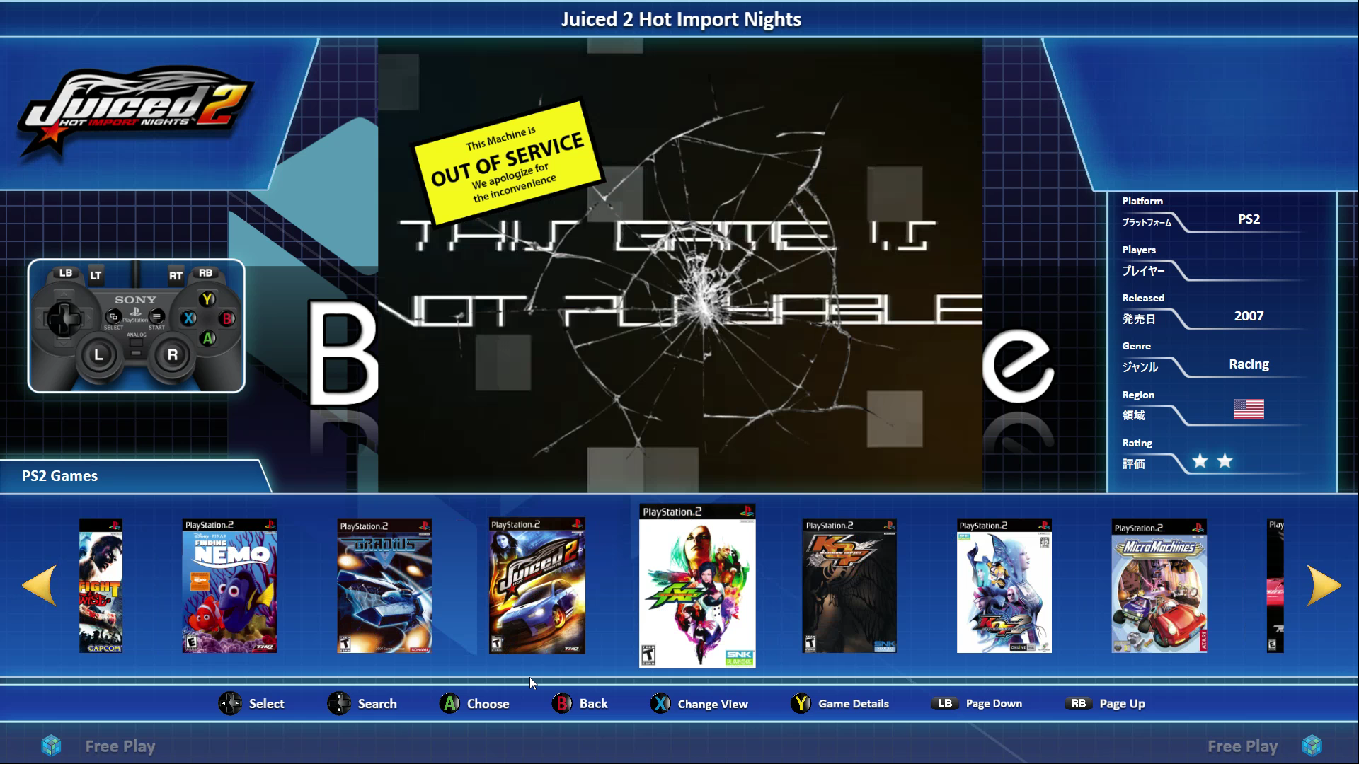
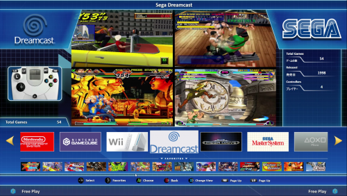
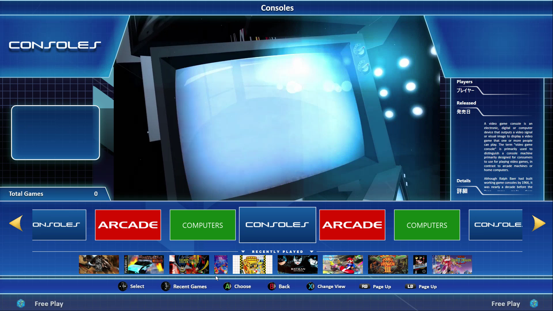
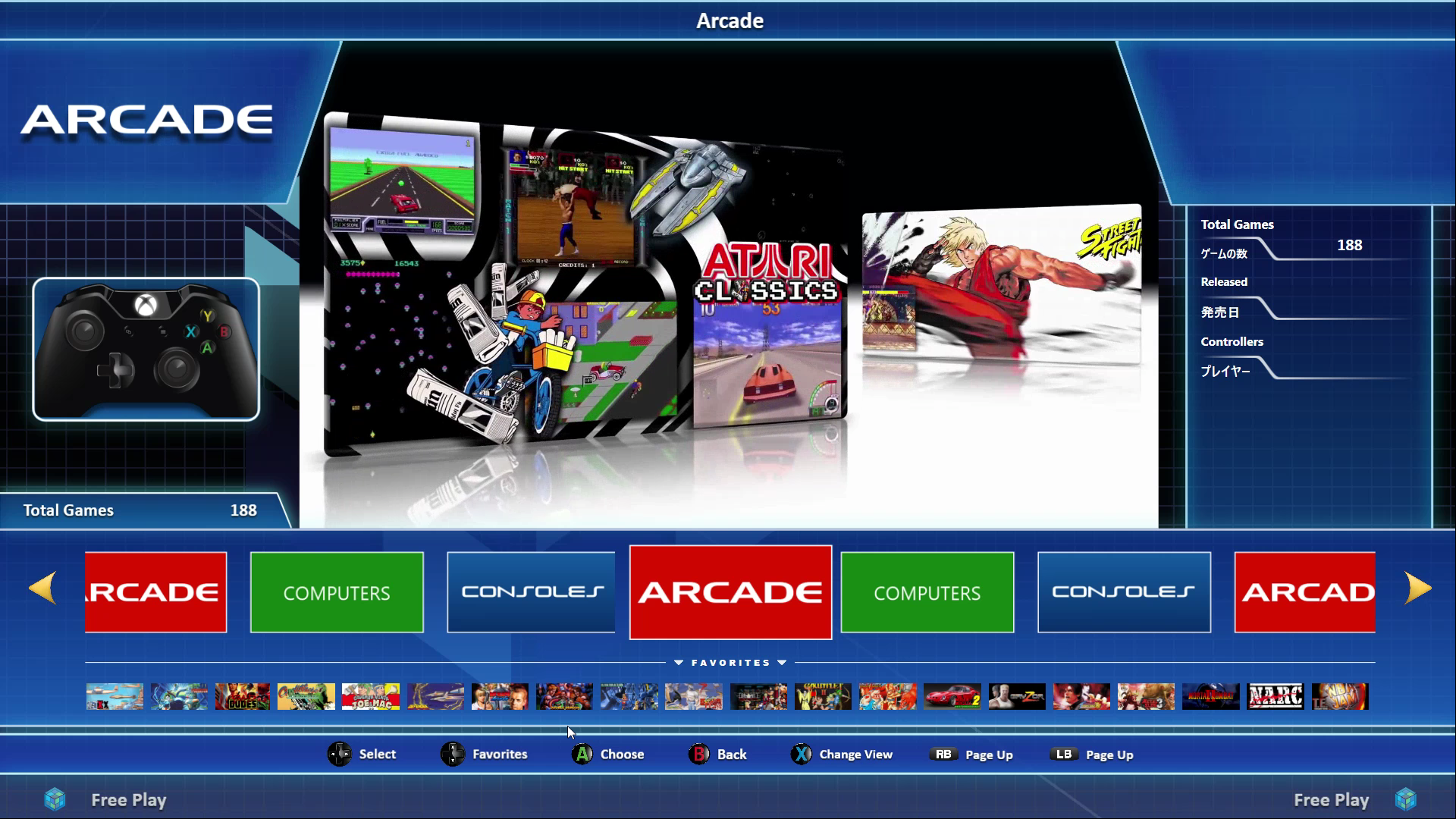
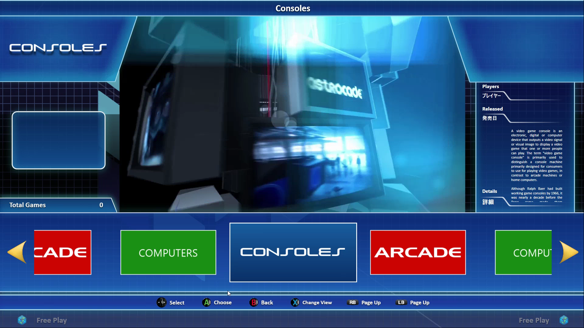
There are 4 Platform Views to select from shown below:
 5aca7d1c5d227_PlatformView1.png.762d520f Platform View 1 - Banner View with Recently Played Items Bar
5aca7d214ab98_PlatformView2.png.9fd653fe Platform View 2 - Banner View with Favorites Items Bar
5aca7d2386058_PlatformView3.png.db8f921a Platform View 3 - Banner View with no Bar

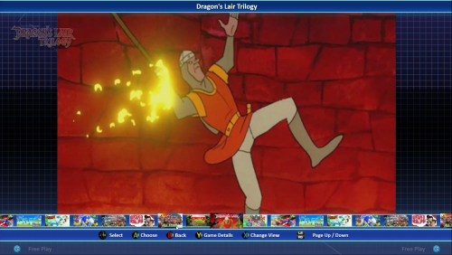
5aca7d192e14a_PlatformTextView.png.c82a1 There is also the Text Only Platform View

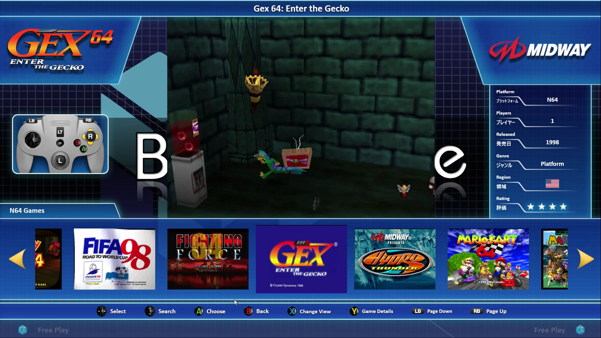
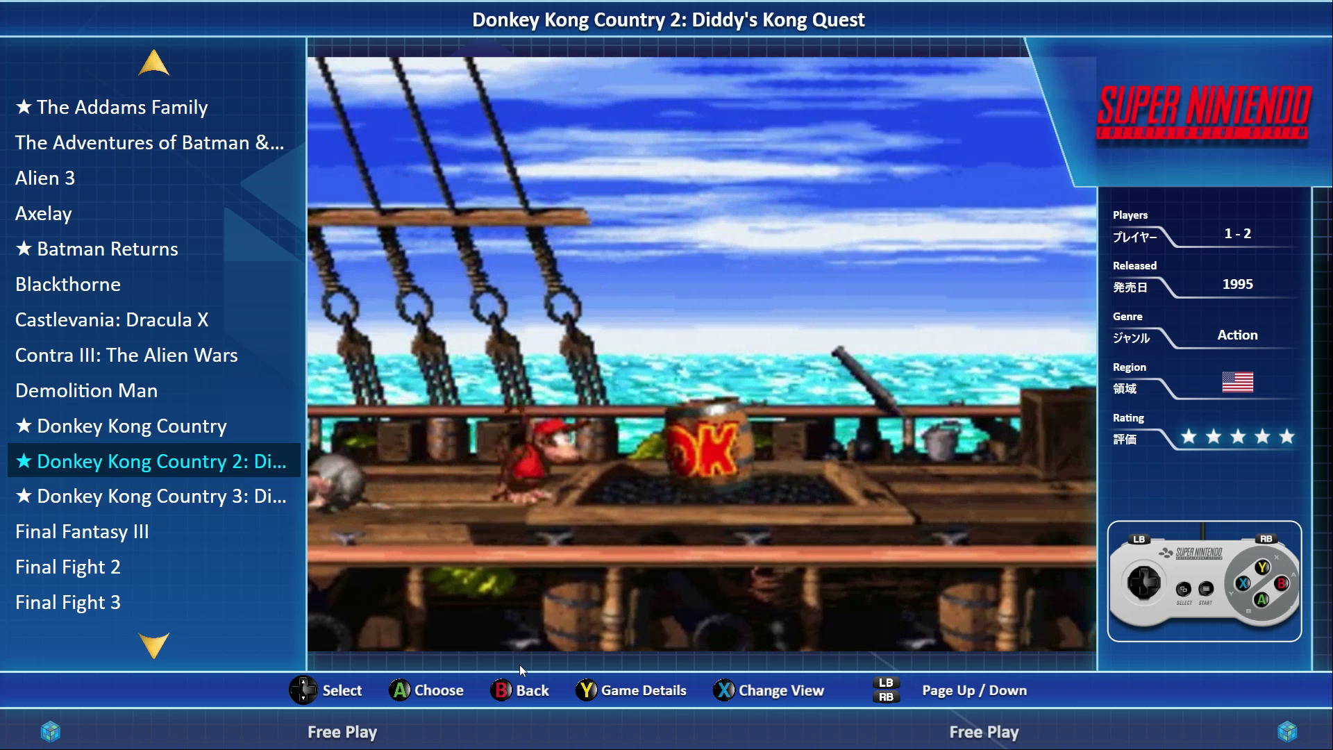
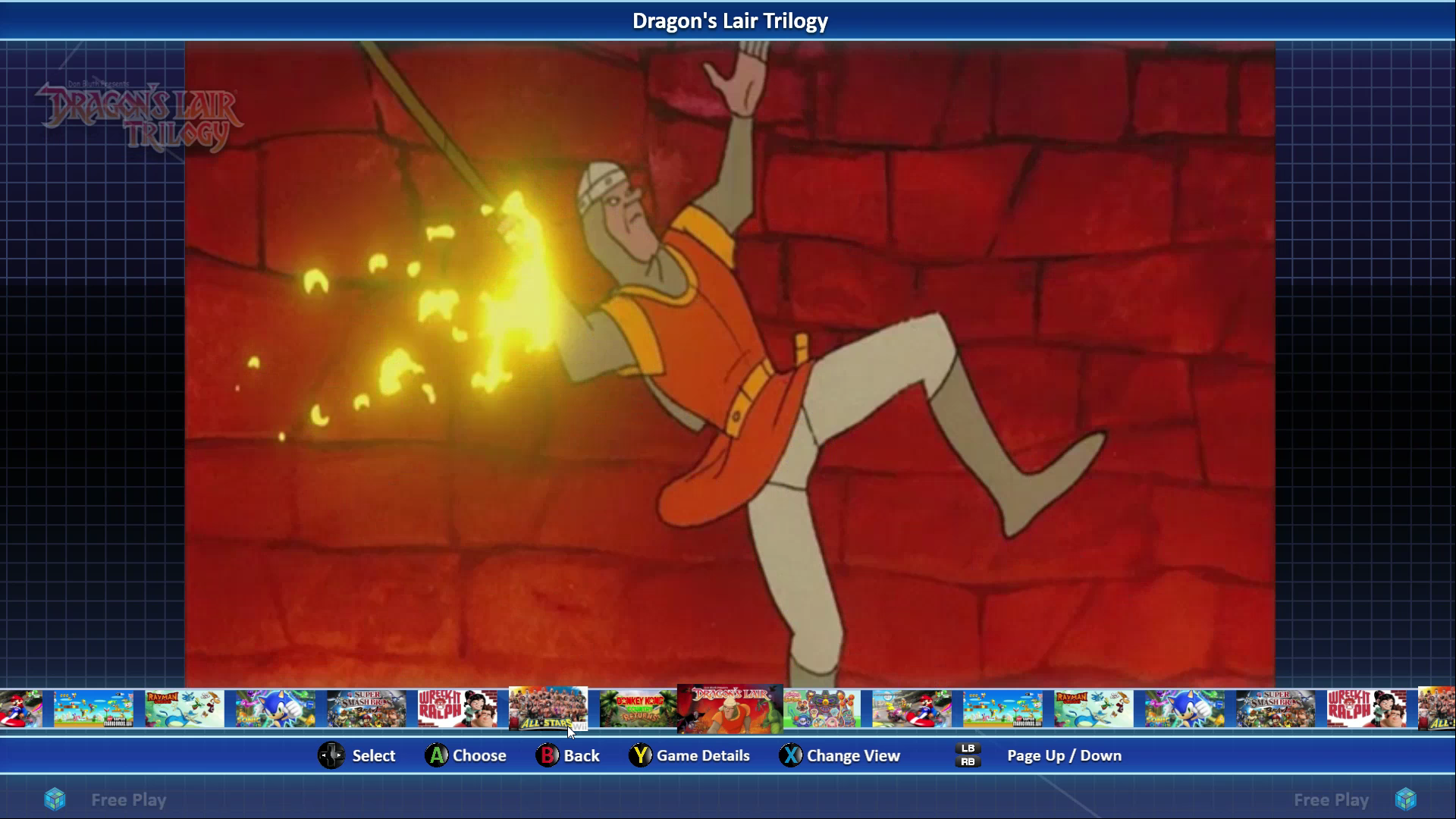
The Game Views

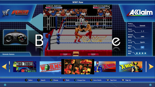
5aca7cfee8afe_GameBannerView.png.14e3938 Horizontal Banner View *

5aca7d03cd730_GameBoxesView.png.1f7611e2 Horizontal Boxes View

5aca7cf78fdc7_CartCoverflow.png.49bcf761 Horizontal Carts/CD/DVD View

5aca7d0af0aa3_GameScreenshotCoverflow.pn Horizontal Screenshots View

Snapshot_2.png.9116496f33b4ef84adcfff288 Vertical Logos View

5aca7d290b2c5_VerticalBannerView.png.f75 Vertical Banners View *

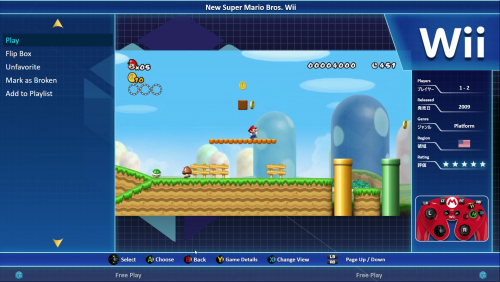
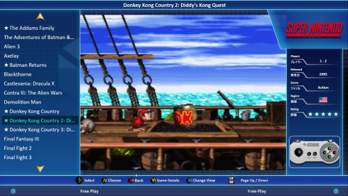
5aca7d11a8af7_GameTextView.png.c5de072c7 Text List View

5aca7cfad4787_CoverflowView.png.d18052e1 Small Banner View *


* Requires Front Images configured with Steam Banner as the top priority and for Steam Banner images to be present in your library to display correctly.


What's New in Version 2.0.0   See changelog

Released

This is a complete re-working of the NESiCAxLive Theme from the ground up with a great many hours put into it, the file size is now 4x bigger than version 1! As before it is built for steam banner style cover images however, it does have views that will allow for standard type box images to be used. It is highly recommended that you set Launchbox so that platforms can have different views applied so you can find the ones that work best on your setup for each platform.

The theme will now correctly resize to different resolutions. All of the animation is now done within .Net rather than via animated gifs. This not only speeds up the running of this theme but also allows for better effects and smoother transitions. 

Thanks to everyone who has helped with this theme along the way, this community has been invaluable in getting me this far with my theme building and I still feel there is a long way to go. @necroticart has also provided me a sound pack which I have included as a separate download. Control schemes should be relatively straight forward for you to customise to your own layouts by amending the appropriate png file in the theme. These are no longer embedded into the controller images so changing them is much easier than before.

All shadowing, blur effects and animation are now automatically applied via code to the png theme elements so these will automatically be applied to your media.

I have also created a customised background image for the theme in the NESiCAxLive style but using BigBox logo/images. Should you prefer the full authentic NESiCA look the previous background file is also included within the theme images folder and just needs to be renamed to LogoBG.png to replace the existing file.

All feedback, as always, is welcome.

Next up is a new version of my Griddle theme and I also have two other themes nearing completion so watch this space!

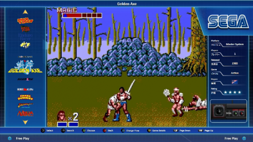
  • Like 6

User Feedback

Recommended Comments


7 hours ago, Thanos Reigns said:

Theme is oversized on my setup. Most of the screen is cut off

Hi @Thanos Reigns, the theme is built for 1920x1080 resolution specifically. What resolution are you running on your setup?

Link to comment
Share on other sites

The theme was made specifically for 1920x1080 but to make it responsive so that it scales to other resolutions should not be too much work the only issue is I don't have any screen capable of above 1080p. If you are happy to test this with me then I can look at starting on this with that as the max resolution and able to scale down to other 16:9 resolutions?


Link to comment
Share on other sites

4 minutes ago, Thanos Reigns said:

1920x1080

That's very strange as that is the same resolution I am running here. What OS are you running? Assuming windows Do you have any scaling turned on to make items larger on screen?

Link to comment
Share on other sites

55 minutes ago, Thanos Reigns said:

No display scaling..every other Big Box theme looks as it should. This theme is way too big for 1920x1080

Untitled.png

Does it do this on all platform/game views that you pick with this theme enabled? Can you screenshot the options you have set in BigBox and I will compare to mine as I can only think some option within big box is conflicting with the code in the theme to cause this if all other themes display correctly at 1080p on your setup. 

Link to comment
Share on other sites

19 minutes ago, Thanos Reigns said:

Does it on all views, platform and game

options.png

options1.png

Sorry about this, sure I'll crack it shortly. Nothing on those options that I would think could cause this. Can you screenshot the options set in images, videos and game details please?

Link to comment
Share on other sites

Just noticed can you untick show filters recent games. It may not be the cause but the theme does not have that available so wondering if that's causing an issue being set

Link to comment
Share on other sites

Can you untick "remember seperate view for each platform" as that is a new setting in the latest LB release that I have not tested so could be causing issue. If you can also make sure "show filters recent games" and "show filters favourite games" are unticked. If this does not solve it if you wouldn't mind sending through screenshots of your other options settings, I will try to replicate the issue on my setup tomorrow. 

Link to comment
Share on other sites

@Thanos Reigns - I have tried changing every setting in options and cannot recreate the issue you are seeing. Can you try turning off "remember separate view for each platform" in views and then going to image cache and clicking Refresh All Images.

if this does not work then I am lost as to what is causing it as cannot replicate the issue on my setup no matter what I try 

Link to comment
Share on other sites

On 2/17/2017 at 0:04 AM, shro2016 said:

The theme was made specifically for 1920x1080 but to make it responsive so that it scales to other resolutions should not be too much work the only issue is I don't have any screen capable of above 1080p. If you are happy to test this with me then I can look at starting on this with that as the max resolution and able to scale down to other 16:9 resolutions?


I'll gladly beta test the theme for you as I have both 3840 x 2160P TV and a 3440 x 1440P Monitor with 21:9 aspect ratio. I can also try and assist with coding whenever possible so let me know if you wanna go ahead with the project.

Link to comment
Share on other sites

I am contributing some company logos. They are all named correctly, however for "Nitro Games / Remedy Entertainment" I changed it in the game to "Nitro Games, Remedy Entertainment" because "/" is not allowed in the file name. Anyway, these were all missing for my own collection, so I thought I'd share in case anyone else has a PC game library they'd like to include.

2K Australia.png

2k games.png

505 Games logo.png

Bethesda.png

Bioware.png

cd projekt red.png

croteam.png

Crystal Dynamics.png

Deck 13.png

DICE.png

dontnod entertainment.png

Frictional Games.png

Irrational games.png

Jackbox games, inc..png

Lionhead.png

Moon Studios.png

Ninja Theory.png

Nitro Games, Remedy Entertainment.png

Nitro Games.png

Remedy Entertainment.png

three one zero.png

Valve Corporation.png

Yager Development.png

  • Like 1
Link to comment
Share on other sites

I've been adding all of the publisher logos, and customizing the controls for each game/platform and I noticed something while testing everything out. There isn't a line under RAM in platform view. Everything else has the line, and I just looked through your screenshots for the theme, and there are still no lines under RAM. Is that intentional? Or is there a quick fix for it? I don't have VS installed right now, but I could do so if it's an easy thing to update.

Link to comment
Share on other sites

Thanks @Pyrometheous for both the review and publisher logos contribution - glad you like the theme! 

Adding the line in sounds like an error  on my part and should be simple to fix - I'll try and get an amended theme uploaded this week. I am also still working on making this theme more responsive so it resizes better to other resolutions and am also working on a new theme which will incorporate many of the elements of Nesica but be a theme specific to BigBox only. Had a lot on st work recently so progress has been a bit slower than planned. 


Would you mind if i included your additional publisher logos in future releases of this theme and the theme I am currently working on which will also utilise publisher logos? I will obviously give you a thanks in the theme description. 


  • Like 1
Link to comment
Share on other sites

I don't mind at all :-), I've been doing quite a lot of graphical mods to your theme on my end to better suite my own needs. Mainly creating or modifying existing art (found via google search) to make everything work for my own needs. I've attached my current progress. I really love the freedom that your theme has for modification. Having company logos and controllers that are modifiable per game is awesome. I'm surely not finished with my theme mod project, but I'm more than happy to contribute. The only snag I've run into as far as logos and controller art is, anytime there is a ":" in the game name or company name, I have to change it to " -", because you can't have ":" in a windows file name. So it's a little bit more manual effort with that, but I think the results are worth it. I saw that you were able to incorporate animated gif files into your theme, and if you're working on a new theme, I might be able to do some neat animated game boxes for it. It would take some time, but I think it would be a neat thing to do.

I was also wondering, and I'm not sure if BigBox has this flexibility, but do you know of a way to have the video preview of a game be game play footage, and then when you go into the sub-menu of a game, it plays the game trailer instead? I think that would be really neat, or even just a "play trailer" button or something. I've just been super impressed and blown away with what you've been able to do with this theme, and I thought I'd throw some thoughts your way since you're working on a new one. I love doing graphic artwork when I can, and I'm "ok" at 3D modeling and animation in blender, and I can make some animated gifs that way.

NESiCAxLive(with modded art).zip

Link to comment
Share on other sites

Well, because I love this theme so much. I put together this little clip demoing it. It's a sorta rough theater HTPC setup. 92" screen via projector on a wall. A little big of gameplay, and it's basically just practicing on Vegas Fastcut. I think it turned out pretty good.


Link to comment
Share on other sites

i love this theme , is is possible for more banners to be made? from what i can see theres no banner for taito type x or nessica or most arcade platforms :P

Link to comment
Share on other sites


Join the conversation

You can post now and register later. If you have an account, sign in now to post with your account.

Guest
Unfortunately, your content contains terms that we do not allow. Please edit your content to remove the highlighted words below.
Add a comment...

×   Pasted as rich text.   Paste as plain text instead

  Only 75 emoji are allowed.

×   Your link has been automatically embedded.   Display as a link instead

×   Your previous content has been restored.   Clear editor

×   You cannot paste images directly. Upload or insert images from URL.

×
×
  • Create New...