Jump to content
LaunchBox Community Forums

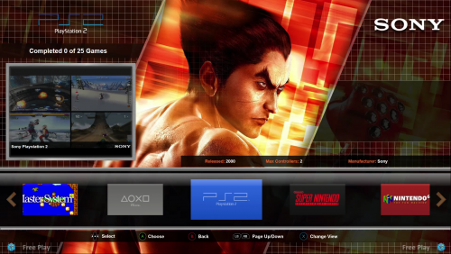
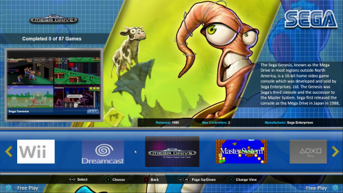
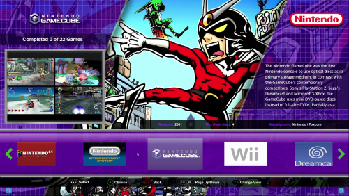
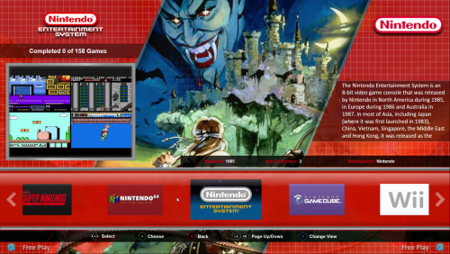
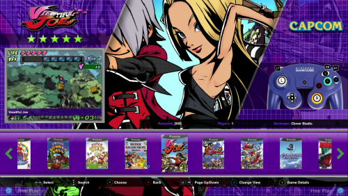
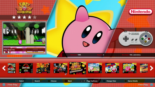
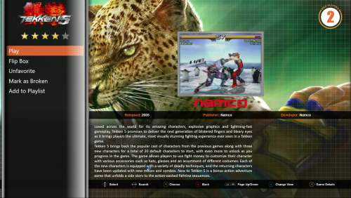
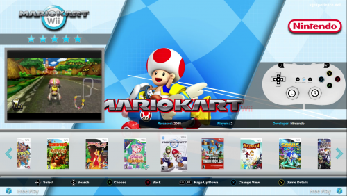
10 Screenshots

About This File

****** NOTE THIS THEME IS BUILT FOR FOR STANDARD BOXART TO BE SHOWN ON THE FLOWCONTROL WHEEL. IF YOU WOULD RATHER USE STEAM STYLE BANNERS THEN DONWLOAD THE THEME GRIDDLE BANNERS INSTEAD *********


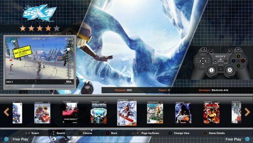
Following on from the NesicaxLive theme I created previously this is my second theme - GRIDDLE

Unlike the Nesica theme this theme should scale correctly to most 16:9/16:10 resolutions. I have tested at 1080p but the theme has been built with images sized suitably for 4k displays. If anyone has a 4k display and would like to test this and feedback in the comments section that would be appreciated.

Also as with the Nesica theme I created this theme has additional elements included within it for Publisher/Developer logos to be displayed and also controller layouts to be shown for each platform. I have also included in seperate zip files below the platform fanart I have used in the screenshots above should you want to do the same in your setup (note unlike theme itself which is drawn to 4k the fanart are only 1080p but should scale ok up to 1080p). With regards the game/platform videos I recommend using default videos for this theme without other elements to keep the look clean and in 4:3 ratio where possible - videos shown in screenshots are all available from emumovies.

If you want to change or add additional controller layout images you just need to drop the images into the following directory within your Launchbox directory /Themes/Griddle/Images/Controls/Platform Name (you may need to create the relevant Platform Name if it does not already exist)

All views are the same layout but with different colour themes applied. This allows you to set each platform to a different colour scheme but whilst keeping a consistent look and feel throughout.

Any issues, recommendations etc. are always welcome.

For anyone who has posted on the Nesica theme I am going back and working on that one currently to make that one responsive so it scales to other resolutions and also adding in some of the features from this theme so expect a 2.0 Nesica release soon.


Thanks

Platform_FanArt.zip


What's New in Version 2.0.0   See changelog

Released

Major update of the Griddle Boxes theme.

Changes in this version include:

  • Fixed issue with music notification popup
  • Added search index when browsing for games (A-Z and Search bar)
  • Now added information showing number of games available and completed for all platforms and filters (big thanks to @eatkinola for the plugin for this!)
  • Improved controller images/layouts
  • Added artwork and assets for most popular platforms/playlists
  • Removed all animated gif elements and all animation now done via code
  • Improved performance of theme
  • Slight changes to layout including removal of Max Players wheel which has been replaced with Publisher Logos and added shadowing and other effects

Griddle_Boxes.zip

  • Like 7

User Feedback

Recommended Comments

Really nice job! this is my favorite them at the moment.

Just a heads up. the MusicNotificationView.xaml seems to be broken. At least for me. It just errors out when attempting to play a track.

Keep up the great work! :D

EDIT: Fixed it. Line 6 is wrong. It looks like this:
 

             d:DesignHeight="300" d:DesignWidth="300" HorizontalAlignment="Stretch" VerticalAlignment="Stretch" BorderThickness="1" BorderBrush="DE303030">

It should look like this:

             d:DesignHeight="300" d:DesignWidth="300" HorizontalAlignment="Stretch" VerticalAlignment="Stretch" BorderThickness="1" BorderBrush="#DE303030">


Edited by Invader
Link to comment
Share on other sites

On 7/17/2017 at 11:57 PM, Invader said:

Really nice job! this is my favorite them at the moment.

Just a heads up. the MusicNotificationView.xaml seems to be broken. At least for me. It just errors out when attempting to play a track.

Keep up the great work! :D

EDIT: Fixed it. Line 6 is wrong. It looks like this:


             d:DesignHeight="300" d:DesignWidth="300" HorizontalAlignment="Stretch" VerticalAlignment="Stretch" BorderThickness="1" BorderBrush="DE303030">

It should look like this:


             d:DesignHeight="300" d:DesignWidth="300" HorizontalAlignment="Stretch" VerticalAlignment="Stretch" BorderThickness="1" BorderBrush="#DE303030">


Thanks, good catch I will amend in the code and upload a revised version this week.

Link to comment
Share on other sites

Fantastic theme, nicely done. Quick question, on my game select menu I can't get anything other than the clear logo to show in the background, is there a way to change that?

Link to comment
Share on other sites

Thx! really a great Theme!

I have 2 request; there is the possibility to increase Video dimension? is too small and do not emphasize Video Theme, and the second if there is a way to have the search for letters string; having a 9000+ games collection it's really usefull

Link to comment
Share on other sites

Some notes:

After changing any options in the Big Box settings screen, the theme freezes up.

Pressing down on the game selection screen doesn't bring up the search by letter overlay. It would be nice if that happened.

The music playback still crashes.

Thank you

Edited by mcfilmmakers
Link to comment
Share on other sites

Love the theme, but there seems to be a bug in my testing.

Platform and Platform Category views are not aligned properly for the video box (on the left).  Both these views have the video pushed up higher than what is intended.  It seems to be limited to this view, as I went through multiple consoles and the individual game video was aligned fine.  It is only related to the platform/categories video appearance.  This was tested both at 4k and 1080p, and using multiple video sizes.

Edited by bmonomad
Link to comment
Share on other sites

Fantastic Theme. Took me a while to get around to it, but this theme's box-art and fanart focused layout sole me with one big, big plus: controllers overlaid with Xbox One buttons. I have a lot of folks who rarely play games over and the layouts under each platform are a lifesaver.

That said, are there any schemes for handhelds?  Or a simple six-button joystick picture for arcade (with no Xbox button overlays)? Those are pretty much my only gripes so far--my biggest issue is with launchbox's lack of fanart for more obscure games. Not an issue with the theme.

Edited by shadowblind
Link to comment
Share on other sites

Love the theme, but I ran into an issue, first it shows lanunchbox could not  use "0" Plugin. I have no idea how to unblock it, and maybe because of that, my video did not work correctly. The video suppose to go to the left side in the blue box, however, it showed in the background (which i believe the fanart should take place at that location) and the left blue box does not show anything. Please if you could kindly help me to resolve this problem! Thanks

Link to comment
Share on other sites

Join the conversation

You can post now and register later. If you have an account, sign in now to post with your account.

Guest
Unfortunately, your content contains terms that we do not allow. Please edit your content to remove the highlighted words below.
Add a comment...

×   Pasted as rich text.   Paste as plain text instead

  Only 75 emoji are allowed.

×   Your link has been automatically embedded.   Display as a link instead

×   Your previous content has been restored.   Clear editor

×   You cannot paste images directly. Upload or insert images from URL.

×
×
  • Create New...