Jump to content
LaunchBox Community Forums

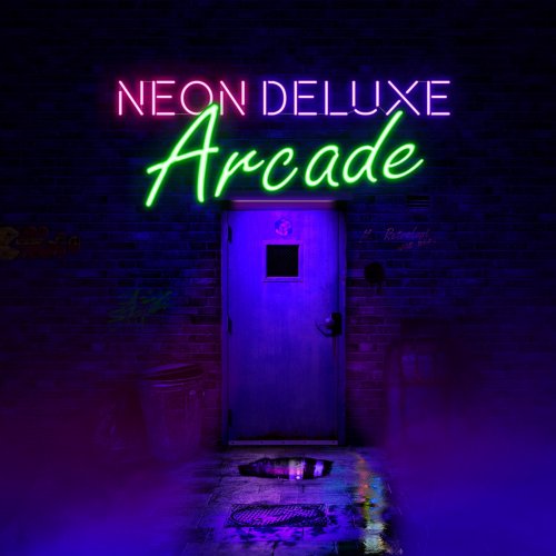
Neon Deluxe Arcade - 16:9 (Big Box Theme) 2.6.1

   (8 reviews)

20 Screenshots

About This File

Note: This thread will not be pushed to the front in the "whats new" section once updated in the future, if you want notifications for future updates be sure to follow this page by using the follow button in the upper right corner.

NEON DELUXE ARCADE - 16:9

-----------------------------------------------------
CREDITS

Huge thanks goes out to @y2guru for his Community Theme Creator Software and his endless personal help, also he created the animated wheels for this theme! @Hexxxer for the original inspiration of his FutureState theme. @Rincewind for the inspiration on his use of the icons. @faeranfor explaining the new marquee options in v12. Thanks guys!

-----------------------------------------------------

INSTALLATION

1. Download the theme here and place the folder in Launchbox/Themes/

2. You might need to unblock the zip file or all the .DLL's in the plugin folder. Right click the zip or DLL files, choose properties and at the bottom you click "Unblock".

3. I recommend doing the following to speed up Big Box greatly: 

 - Uncheck all Background Images in Launchbox > Tools > Options > Media > Background Priorities
 - Set all transitions to "None" in BigBox settings
 - Use the Clean Up media tool in launchbox/tools/Clean Up Media... (this can really speed up lists with thousands of games and duplicate media)
 - Defrag the drive that holds your media files


Hope you like and enjoy! ?

-----------------------------------------------------
LINKS

Neon Deluxe Arcade is a series of themes and elements, if you like you can download these to accompany the complete theme, visit this page to see all my other work:
https://forums.launchbox-app.com/profile/88501-mr-retrolust/content/?type=downloads_file

Arcade stick and buttons sound pack, sounds really good with this theme:

Edited by Mr. RetroLust


What's New in Version 2.6.1   See changelog

Released

No changelog available for this version.

  • Like 37
  • Thanks 12
  • Game On 1
  • Unusual Gem 5

User Feedback

Recommended Comments


1 hour ago, Azgorath said:

@Mr. RetroLust Just wanna let you know that @dreamy's above problem still affects all the platform views, even on 2.5.1.

Oh damn, thanks man! I thought I had that covered, it's hard to test as I removed a platform logo but LB automatically created a new image, i'll try with playlists then lol

Link to comment
Share on other sites

2.5.2

- Fixed Platform wheel titles without clear logo will display text now (Thanks @Azgorath and @dreamy)
- Coverflow fullscreen has a spinning box version now, but on my system it's all in slow motion, dunno how it's behaving for you guys?

2.5.1

- Fixed wheel titles without clear logo will display text now (Thanks @dreamy)

2.5

- Fixed long standing issue of options background image not scaling properly in resolutions other than 3840x2160 thanks to @C-Beats !
- Logos now use the new WheelItemTemplate so they size correctly within the arrow selector
- Tweaked wheel looks (Thanks for explaining and your patience @y2guru !) also wheel logos are higher res compared to previous version
- Wheels response times are faster
- Text title on Wheel2GamesView, 3 and 4 is smaller for more room when longer titles, changed color to fit design and added game version field below title
- Brightened wheel arrow selector images; more apparent animation
- Changed wheel/search index colors to better fit design
- Minor pixel sized tweakings to UI elements size and position for consistant look and feel
- Wheels in text lists now have "wrap"; long titles will start on next line instead of dissapearing text
- Added another WallGamesView, one with 3D boxes and one with front boxes
- Changed look pop-ups thanks to and based on @y2guru 's new pop-up view in CTC 2.5
- Huge thanks to @y2guru for CTC 2.5 which made all of this possible: https://forums.launchbox-app.com/files/file/2115-community-theme-creator-for-bigbox/

Link to comment
Share on other sites

Just tried version 2.5.2 and everything works as expected. The box in coverflow is also spinning normaly. Maybe a bit laggy at first but i guess that is because the images are being cached.

  • Game On 1
Link to comment
Share on other sites

9 hours ago, Mr. RetroLust said:

2.5.2

- Fixed Platform wheel titles without clear logo will display text now (Thanks @Azgorath and @dreamy)
- Coverflow fullscreen has a spinning box version now, but on my system it's all in slow motion, dunno how it's behaving for you guys?

2.5.1

- Fixed wheel titles without clear logo will display text now (Thanks @dreamy)

2.5

- Fixed long standing issue of options background image not scaling properly in resolutions other than 3840x2160 thanks to @C-Beats !
- Logos now use the new WheelItemTemplate so they size correctly within the arrow selector
- Tweaked wheel looks (Thanks for explaining and your patience @y2guru !) also wheel logos are higher res compared to previous version
- Wheels response times are faster
- Text title on Wheel2GamesView, 3 and 4 is smaller for more room when longer titles, changed color to fit design and added game version field below title
- Brightened wheel arrow selector images; more apparent animation
- Changed wheel/search index colors to better fit design
- Minor pixel sized tweakings to UI elements size and position for consistant look and feel
- Wheels in text lists now have "wrap"; long titles will start on next line instead of dissapearing text
- Added another WallGamesView, one with 3D boxes and one with front boxes
- Changed look pop-ups thanks to and based on @y2guru 's new pop-up view in CTC 2.5
- Huge thanks to @y2guru for CTC 2.5 which made all of this possible: https://forums.launchbox-app.com/files/file/2115-community-theme-creator-for-bigbox/


goku-thumbs-up.gif

  • Game On 1
Link to comment
Share on other sites

2 minutes ago, retrospace said:

I miss this view on the latest update.

image.thumb.png.e87403dea728ef7d15d81b00b49610f6.png

That view hasn't been in this theme at all, you'll need neon deluxe arcade final (fading wheels) for that, which is discontinued but can still be downloaded under the download button

Link to comment
Share on other sites

7 minutes ago, Mr. RetroLust said:

That view hasn't been in this theme at all, you'll need neon deluxe arcade final (fading wheels) for that, which is discontinued but can still be downloaded under the download button

It´s possible to add this view on the main THeme? I mean, I like so much your Neon Theme, there´s no other theme on my cab, by this view is awesome.

No problem if you can´t buddy.

Link to comment
Share on other sites

54 minutes ago, retrospace said:

It´s possible to add this view on the main THeme? I mean, I like so much your Neon Theme, there´s no other theme on my cab, by this view is awesome.

No problem if you can´t buddy.

Well theoratically I could but then I'd have to remove another view which in turn could be someone else's favorite view lol but if in the future they'll add more views I will definetly add it.

  • Thanks 1
Link to comment
Share on other sites

What's New in Version 2.6.1

- Increased delay of all scrolling game/platform notes, giving you more time to start reading before it starts scrolling.

  • Like 1
Link to comment
Share on other sites

Question.  You can see in the video that I made silver ring logos for my games under steam platform.  You can also see that my platform logo silver rings are bigger than the game silver ring platforms under the steam platform.  I assume that this relationship between platform and games is applicable for all platforms and games under that platform.  It's just that it's more visible now for the Steam platform because I made silver ring logos for Steam games as well.  Can I change some parameters so that the game clear logos have same size as platform logos?  Probably under theme/views but that's about as far as I dare to go.  thanks.

Link to comment
Share on other sites

5 minutes ago, Morris Schaffer said:

Question.  You can see in the video that I made silver ring logos for my games under steam platform.  You can also see that my platform logo silver rings are bigger than the game silver ring platforms under the steam platform.  I assume that this relationship between platform and games is applicable for all platforms and games under that platform.  It's just that it's more visible now for the Steam platform because I made silver ring logos for Steam games as well.  Can I change some parameters so that the game clear logos have same size as platform logos?  Probably under theme/views but that's about as far as I dare to go.  thanks.

I guess you could change parameters but I wouldn't know where to look or what to change as I use CTC to make this theme.

Link to comment
Share on other sites

1 hour ago, Megadriver64 said:

How can i disable the Scanlines overlay for modern Windows Games?

Choose another view theres a view without scanlines. But if you want to use the view with the 3d box and stuff you can delete the scanline.png file somewhere in the themes folder.

Link to comment
Share on other sites

I love the theme! One question though, I saw a youtube video of someone showcasing your theme and they had it set to where you highlight a game and the game list would fade away and the game details would show up in it's place. How do I get that view for my setup? Or was it a custom view they were using for their games? The youtube video is linked below for reference. Thank you very much in advance for all of your help!


Link to comment
Share on other sites

3 hours ago, Flyingboots1 said:

I love the theme! One question though, I saw a youtube video of someone showcasing your theme and they had it set to where you highlight a game and the game list would fade away and the game details would show up in it's place. How do I get that view for my setup? Or was it a custom view they were using for their games? The youtube video is linked below for reference. Thank you very much in advance for all of your help!


Thanks glad you like :) The theme he displays is the discontinued version, you can click the download button in top of the page and choose: "Discontinued - Neon Deluxe Arcade Final (Fading wheels).zip".

Link to comment
Share on other sites

13 hours ago, Mr. RetroLust said:

Thanks glad you like :) The theme he displays is the discontinued version, you can click the download button in top of the page and choose: "Discontinued - Neon Deluxe Arcade Final (Fading wheels).zip".

I love this view also, my desire is in one day if is possible you can add this view on latest Version again. THen will be the perfect THeme for BB ever.

Let´s god touch in your hearth man, heeheh  Thanks in advance.

Link to comment
Share on other sites

4 minutes ago, retrospace said:

I love this view also, my desire is in one day if is possible you can add this view on latest Version again. THen will be the perfect THeme for BB ever.

Let´s god touch in your hearth man, heeheh  Thanks in advance.

I will add this view once we have the ability to add more views but it will also need the extra view in CTC which will be a paid version of CTC  the future and at this moment I don't have the ability to pay for that. Concluding it might happen in a few years or not.

Link to comment
Share on other sites

I'm happy to support developers, especially if they've already done so much for the community! I've expanded my setup so nicely because of your work, that's the least!

  • Thanks 1
Link to comment
Share on other sites

Honestly it's perfectly fine if you don't add it to the latest version of the theme. I'm just using the discontinued version with the fading wheels. I don't see a reason why it would even need to be updated.

Link to comment
Share on other sites

Hi, so i'm using horz wheel view and was wondering what the dif in the 4 horz views was? I can see that view4 has no box/media artwork but the other 3 i didn't see a dif. what i'm trying to achieve is that the box art shows but not the media (cart, disc, etc).

thx

Link to comment
Share on other sites

44 minutes ago, PiperCalls said:

Hi, so i'm using horz wheel view and was wondering what the dif in the 4 horz views was? I can see that view4 has no box/media artwork but the other 3 i didn't see a dif. what i'm trying to achieve is that the box art shows but not the media (cart, disc, etc).

thx

One view shows 3d box art plus cart, plus box back. One wwith 3d box and cart but without box back. One without scanlines.

To achieve what you want you could adjust the xamls and remove the cart codes.

Link to comment
Share on other sites

2 minutes ago, Mr. RetroLust said:

One view shows 3d box art plus cart, plus box back. One wwith 3d box and cart but without box back. One without scanlines.

To achieve what you want you could adjust the xamls and remove the cart codes.

ok thx. yes i just did that and found the control for "cart" and removed it and it works. thx much

  • Game On 1
Link to comment
Share on other sites


Join the conversation

You can post now and register later. If you have an account, sign in now to post with your account.

Guest
Unfortunately, your content contains terms that we do not allow. Please edit your content to remove the highlighted words below.
Add a comment...

×   Pasted as rich text.   Paste as plain text instead

  Only 75 emoji are allowed.

×   Your link has been automatically embedded.   Display as a link instead

×   Your previous content has been restored.   Clear editor

×   You cannot paste images directly. Upload or insert images from URL.

×
×
  • Create New...