Jump to content
LaunchBox Community Forums

Big Details 2.3

   (7 reviews)

3 Screenshots

About This File

The newest version of this theme requires version 13.4, or higher.

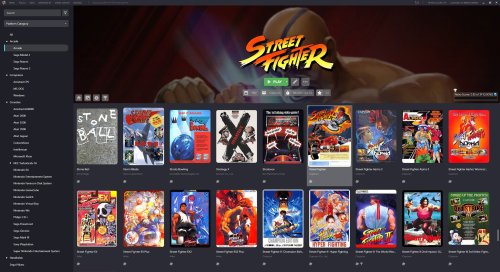
Big Details is a new theme that reimagines what the LaunchBox interface can be. Every piece of the interface has been tweaked and adjusted to provide a smooth and modern experience with subtle animations across the theme. The main highlight is the transition to a banner-type horizontal Game Details view.

There's a lot to unbundle in this one, and any potential theme developers are welcome to take a peak into the code to get inspiration.

Some features of this theme include:

  • Banner style game details view with 
  • Uniform Image Grid View with rounded corners and vertically aligned images
  • New controls pop-up that houses the music controls, and image and volume sliders
  • Redesigned top menu bar
  • Dynamic Play button with multiple version support, and states for: Play, Install, Unavailable


LaunchBox_lNum5uuCgI.thumb.jpg.8d1c05e691938887e3a325238973799d.jpg


What's New in Version 2.3   See changelog

Released

  • Enhanced play button functionality now includes comprehensive storefront management features, such as install, uninstall, and upgrade support
  • The game image within the image grid now offers animated visual feedback during the installation, uninstallation, or upgrade of storefront games
  • The Advanced Search Options box will now close when your mouse is no longer over the search bar or the pop-up
  • Like 35
  • Thanks 8
  • Game On 1
  • Unusual Gem 12

User Feedback

Recommended Comments


1 hour ago, aett said:

I love this theme! Do you know if there's any way to make the background images centered vertically? Only being able to see the top of each one means that a lot of background images show you blank space or the tops of heads. (I'd rather not manually edit every game's BG art, especially since I still use the full images for loading.)

You can do this. However, I tested this out before releasing this theme, and instead of looking at the top of images, you end up looking at the middle of people's bodies, or a messy middle portion of some scenes, so I chose the top as it was personally the better of the two.

If you want to give it a try, you can change this by opening the GameDetailsView.xaml file, diving into the code, finding the Binding GameBackgroundImage and changing the VerticalAlignment from Top to Center.


20 hours ago, DeadVoivod said:

Me again. Now I noticed another thing that doesn't please me, I know it looks great with rounded corners. But I'm only using the clear logos view on ALL of my platforms, and I noticed now that the clear logos also get rounded, which doesn't look good at all. 

Any possibility how I could change this? 

This is coded into the BoxesContentView.xaml. You will have to dive into the code and remove the opacity mask. If you do this, the opacity mask will be removed from all image groups. Get rid of this portion of the code:

                                        <Border.OpacityMask>
                                            <VisualBrush>
                                                <VisualBrush.Visual>
                                                    <Border Height="{Binding ActualHeight, ElementName=ContentImage}" Width="{Binding ActualWidth, ElementName=ContentImage}" Background="#2A2B34" BorderThickness="0" CornerRadius="10"/>
                                                </VisualBrush.Visual>
                                            </VisualBrush>
                                        </Border.OpacityMask>


Link to comment
Share on other sites

4 hours ago, faeran said:

You can do this. However, I tested this out before releasing this theme, and instead of looking at the top of images, you end up looking at the middle of people's bodies, or a messy middle portion of some scenes, so I chose the top as it was personally the better of the two.

If you want to give it a try, you can change this by opening the GameDetailsView.xaml file, diving into the code, finding the Binding GameBackgroundImage and changing the VerticalAlignment from Top to Center.


Thanks for the quick response. You're right that it doesn't work for every image, but it gives me the option to choose between hair or torsos. If only there was an option to select "upper middle" or something.


Edit: Would it be possible for me to edit something in GameDetailsView.xaml to change the source of the image? I'm thinking of using a category I don't normally use - Arcade Marquee - and using that folder to have my manually-edited images for the game details view. Then my Background folder can remain unedited, and still look nice in Big Box when I load games.

Edited by aett
Link to comment
Share on other sites

18 hours ago, aett said:

Thanks for the quick response. You're right that it doesn't work for every image, but it gives me the option to choose between hair or torsos. If only there was an option to select "upper middle" or something.


Edit: Would it be possible for me to edit something in GameDetailsView.xaml to change the source of the image? I'm thinking of using a category I don't normally use - Arcade Marquee - and using that folder to have my manually-edited images for the game details view. Then my Background folder can remain unedited, and still look nice in Big Box when I load games.

Just add your Arcade - Marquee image type into your Background priority group in your Options. Set it as the highest priority and it will try and load an arcade marquee image first, and then try and fallback to whatever you have under it.

  • Thanks 1
Link to comment
Share on other sites

3 hours ago, faeran said:

Just add your Arcade - Marquee image type into your Background priority group in your Options. Set it as the highest priority and it will try and load an arcade marquee image first, and then try and fallback to whatever you have under it.

Unfortunately, when I open a game in Big Box, it will also show my edited "marquee" images first instead of the full-screen backgrounds. I appreciate the suggestion!

Link to comment
Share on other sites

Had to come back and say I'm using 1.1 and its working perfectly. Absolute masterpiece of the theme and thank you for adding that functionality. 😁

Link to comment
Share on other sites

Hello! Any idea why the resizing bar behaves like this?

When I'm adjusting it the covers resize and  look very nice:
image.thumb.png.27a4eccd78a610b0b5bbb87c82670ca6.png


But as soon as I let go the resizing bar they look like this:
image.thumb.png.edc0ab929e249f9a8492707c8a1c4334.png

Also in the upper part, this text looks like this (maybe a problem with spanish?):
image.thumb.png.df47f69af17e08c7ee2d96e4b7dcf2a0.png

Link to comment
Share on other sites

Having the text (downloading media, saving games...) at the top is a bad decision because it actually overlaps the other existing text. I'm usually using LB in 4/5 and not fullscreen when adding games, as I have an explorer window open on the right side to pull the games over, and then it does this, not nice at all. It's fine though when used in fullscreen. 

Would be better if that downloading "line" is at the bottom, as there is nothing there and it would not bother at all. 

Link to comment
Share on other sites

On 3/13/2022 at 6:17 AM, exodus_cl said:

Hello! Any idea why the resizing bar behaves like this?

When I'm adjusting it the covers resize and  look very nice:
image.thumb.png.27a4eccd78a610b0b5bbb87c82670ca6.png


But as soon as I let go the resizing bar they look like this:
image.thumb.png.edc0ab929e249f9a8492707c8a1c4334.png

Also in the upper part, this text looks like this (maybe a problem with spanish?):
image.thumb.png.df47f69af17e08c7ee2d96e4b7dcf2a0.png

I'm not sure why you'd be seeing the image changes. I'm not seeing what you are. It could be related to your margin or aspect ratio settings within LaunchBox. Check them out and see what happens when you adjust them.

The top bar issue is definitely because of different languages. I'll have this fixed in the next update to this theme.

44 minutes ago, DeadVoivod said:

Having the text (downloading media, saving games...) at the top is a bad decision because it actually overlaps the other existing text. I'm usually using LB in 4/5 and not fullscreen when adding games, as I have an explorer window open on the right side to pull the games over, and then it does this, not nice at all. It's fine though when used in fullscreen. 

Would be better if that downloading "line" is at the bottom, as there is nothing there and it would not bother at all. 

This was a choice I made during its development. Design decisions will be made based on a full screen 1080p monitor.

However, with the above issue, I'll probably float the working view just below the top bar to compensate for the menu changing its size based on language.

Link to comment
Share on other sites

Very impressed with how this looks out of the box. The only thing that would be nice, although I doubt that it is even possible, would be to realign the background on a per game basis (center, top, bottom). Most of the time it looks great, certain parts of the art gets cut off which I would rather be the focus.

image.thumb.png.d44d073af10572599ec5b36550937225.png

Edit: I know that you say this is designed for 1080p monitors, but it looks great at 1440p!

Edited by Kylus12
  • Like 1
Link to comment
Share on other sites

I love this! Just a couple of issues which I'm sure are easily fixable (for my setup):

I don't get the game image on the main panel behind the game title logo and info. have I disabled something in my settings?
noImage.thumb.PNG.fa1130954de93e4d9d8eda963c5b3a8b.PNG
Is it possible to default the view for the game to the one you get when clicking the "image" logo; to show the video and images instead of the game details?

DefaultView.thumb.PNG.b796811eb3149bcddf3b61436cc4fcd5.PNG

Link to comment
Share on other sites

1 hour ago, SimonLev said:

I love this! Just a couple of issues which I'm sure are easily fixable (for my setup):

I don't get the game image on the main panel behind the game title logo and info. have I disabled something in my settings?
noImage.thumb.PNG.fa1130954de93e4d9d8eda963c5b3a8b.PNG
Is it possible to default the view for the game to the one you get when clicking the "image" logo; to show the video and images instead of the game details?

DefaultView.thumb.PNG.b796811eb3149bcddf3b61436cc4fcd5.PNG

The background image is controlled by your Background Image Priorities that you set under Options > Background Priorities


If you would like to change which button is checked when you load a game, you'll need to dive into the code. Open GameDetailsView.xaml which is located inside of:

  • LAUNCHBOX\LBThemes\Big Details\Views

You need to remove IsChecked="True" From the Home Button and add it to the Media Button. Here's the default codes for reference:

Home Button

<!-- Home Button -->
<RadioButton GroupName="Menu" Name="HomeButton" cal:Message.Attach="[Event Click] = [Action PauseVideo()]" IsChecked="True" ToolTip="Home">

Media Button

<!-- Media Button -->
<RadioButton GroupName="Menu" Name="MediaButton" ToolTip="Media">


  • Like 1
Link to comment
Share on other sites

22 minutes ago, faeran said:

The background image is controlled by your Background Image Priorities that you set under Options > Background Priorities


If you would like to change which button is checked when you load a game, you'll need to dive into the code. Open GameDetailsView.xaml which is located inside of:

  • LAUNCHBOX\LBThemes\Big Details\Views

You need to remove IsChecked="True" From the Home Button and add it to the Media Button. Here's the default codes for reference:

Home Button

<!-- Home Button -->
<RadioButton GroupName="Menu" Name="HomeButton" cal:Message.Attach="[Event Click] = [Action PauseVideo()]" IsChecked="True" ToolTip="Home">

Media Button

<!-- Media Button -->
<RadioButton GroupName="Menu" Name="MediaButton" ToolTip="Media">


Amazing! All sorted now. Thanks so much.

This stuff is so powerful. I really need to get into the code a bit more when time permits.

Link to comment
Share on other sites

Very nice work as always, @faeran! I knew I wanted this for my setup immediately once I saw it. I can't really say why this is, but the rounded corners on the boxart is such a subtle touch that makes it look so clean! Very much appreciated! 

  • Thanks 1
  • Game On 1
Link to comment
Share on other sites

Hello @faeran, first of all my congratulations for this great work.

I only have two questions that I would like to be able to solve:

1 - Would it be possible not to shorten long titles by adding a second line of text if necessary? Long titles are now cut off with (...)

2 - I know that your theme is designed to always have the game information visible at the top, but sometimes it is better to hide the game information to be able to see more games on the screen. Would it be possible that when hovering over the game cover the information icon would appear so that pressing it would activate the game information at the top?

I have activated the option to show icons when hovering over games, but it seems that in this theme this function does not work or is deactivated. The only way to hide game information is through the Launchbox settings menu which makes it very inconvenient.

Thank you very much and congratulations for this great work.


Edit:

Would it be possible to activate the details of the game by pressing the middle mouse button?

I think it would be a good option to be able to activate or deactivate the details of the game and to be able to have a broader view of the games when necessary.

Launchbox has the option to show / hide game details with the key combination ctrl + T. Could this key combination be assigned to the middle mouse button?

Another solution would be to add a game details toggle button to the bottom bar.

Thank you @faeran.

Edited by Daliant
Link to comment
Share on other sites

16 hours ago, Daliant said:

Hello @faeran, first of all my congratulations for this great work.

I only have two questions that I would like to be able to solve:

1 - Would it be possible not to shorten long titles by adding a second line of text if necessary? Long titles are now cut off with (...)

2 - I know that your theme is designed to always have the game information visible at the top, but sometimes it is better to hide the game information to be able to see more games on the screen. Would it be possible that when hovering over the game cover the information icon would appear so that pressing it would activate the game information at the top?

I have activated the option to show icons when hovering over games, but it seems that in this theme this function does not work or is deactivated. The only way to hide game information is through the Launchbox settings menu which makes it very inconvenient.

Thank you very much and congratulations for this great work.


Edit:

Would it be possible to activate the details of the game by pressing the middle mouse button?

I think it would be a good option to be able to activate or deactivate the details of the game and to be able to have a broader view of the games when necessary.

Launchbox has the option to show / hide game details with the key combination ctrl + T. Could this key combination be assigned to the middle mouse button?

Another solution would be to add a game details toggle button to the bottom bar.

Thank you @faeran.

Thanks @Daliant.

As far as your questions go. Yes, I removed the icons, although in the future, I could always look into adding some back that can be clicked on, but no promises on when I can get to that.

There' wouldn't really be an easy way for me to make a particular button to open and close the Game Details section. That's all handled outside of a theme's scope. You could use a third party program to make it so a middle mouse button would trigger CTRL+T.


Link to comment
Share on other sites

12 minutes ago, faeran said:

Thanks @Daliant.

As far as your questions go. Yes, I removed the icons, although in the future, I could always look into adding some back that can be clicked on, but no promises on when I can get to that.

There' wouldn't really be an easy way for me to make a particular button to open and close the Game Details section. That's all handled outside of a theme's scope. You could use a third party program to make it so a middle mouse button would trigger CTRL+T.


Thank you very much for your answer @faeran.

For me it is very important to be able to see the largest number of covers when I am making changes or modifying the ones that are not downloaded correctly. With my previous theme it was easy to open the side panel when I needed it and be able to see if it contained the images, videos and other extra elements that can only be seen by accessing these options.

Anyway Faeran, I see that this theme is not very comfortable for all those like me who use Launchbox to organize their game library.

The fact that the images or video do not appear directly in the top menu makes it very difficult to update or modify the games in the library.

This theme is really wonderful if your library is 100% configured and you don't need to touch many things, but if I'm honest I spend much more time in Launchbox than in BigBox because I try to make each of my games have all their art up to date and for that I need a comfortable interface to work with.

Finally, I would like to tell you that on many occasions when I try to play a video of one of my games, when I press the play button, it does not play. The only solution I find is to click on one of the images in that game and then press play again on the video. This way it does reproduce. This doesn't happen 100% of the time but it does fail 30-40% of the time you try to play the video the first time.

Thank you again for your great contribution to this community.

A hug from Spain.

Link to comment
Share on other sites

Is there any way to make the theme play videos automatically, instead of Clear Logo? Or at least in the background of the details page, because I've a really big collection and people that don't know the games just select it based on videos, so going to picture and then playing a video is a bit of struggle.

Theme is TOP NOTCH! Just want to know if I can edit something, or have a checkmark to replace details background with the games video 

Link to comment
Share on other sites

2 hours ago, izzishor said:

Is there any way to make the theme play videos automatically, instead of Clear Logo? Or at least in the background of the details page, because I've a really big collection and people that don't know the games just select it based on videos, so going to picture and then playing a video is a bit of struggle.

Theme is TOP NOTCH! Just want to know if I can edit something, or have a checkmark to replace details background with the games video 

Yes, although you would have to edit the GameDetails xaml code. Might be a bit of a change, as you essentially would need to move the Carousel code in the place of the clear logo.

Link to comment
Share on other sites

2 hours ago, faeran said:

Yes, although you would have to edit the GameDetails xaml code. Might be a bit of a change, as you essentially would need to move the Carousel code in the place of the clear logo.

Thanks for the answer, I'll try, can't guarantee it's gonna work, but I'll do my best :))))))
Cheers mate, awesome theme.

Link to comment
Share on other sites

9 hours ago, Spevash11 said:

hello, my clear logos no longer appear at the top anymore, is there something that i can do to fix this?

@faeran

image.thumb.png.452804eb7bc78c59da3de75f3adc6710.png

Can't really think of any reasons why the clear logos wouldn't appear there.

I would first check one of the game's images within the Edit Game window and make sure you are still seeing a clear logo available in there.

I would then refresh the LB Image Cache to see if that helps.

Link to comment
Share on other sites

On 11/23/2022 at 8:12 AM, faeran said:

Can't really think of any reasons why the clear logos wouldn't appear there.

I would first check one of the game's images within the Edit Game window and make sure you are still seeing a clear logo available in there.

I would then refresh the LB Image Cache to see if that helps.

@faeran


hello, thank you for your assistance with this faeran, the clear logo's still won't show up :(

Link to comment
Share on other sites

Any way to have a platform clear logo or something in the top-right where there's a Steam/GOG icon? It's also annoying that it doesn't remember the column-sizes in ListView and I have to resize one of them every time I change platform.

Link to comment
Share on other sites

3 hours ago, Karoline said:

Any way to have a platform clear logo or something in the top-right where there's a Steam/GOG icon? It's also annoying that it doesn't remember the column-sizes in ListView and I have to resize one of them every time I change platform.

You could add the platform clear logo image binding to the stackpanel in the top right, or replace the badges with it.

The list grid is one of those things that themes don't have control over really. LaunchBox doesn't currently save the width information for the columns, which would need to happen for any themes to be able to utilize them. With Big Details I tried to counteract this by setting the size of the entire list to the available width, then users could remove the unnecessary column headers they don't want to see until the grid is in a more manageable state. This does stop columns from auto-changing columns as you navigate through it, but it does reduce the amount of columns you can see in this view. Saving grid column size is a program level thing that would need to happen, and while it's on the list to take a look at, it's never been able to take the priority over other areas of LaunchBox.

Link to comment
Share on other sites


Join the conversation

You can post now and register later. If you have an account, sign in now to post with your account.

Guest
Unfortunately, your content contains terms that we do not allow. Please edit your content to remove the highlighted words below.
Add a comment...

×   Pasted as rich text.   Paste as plain text instead

  Only 75 emoji are allowed.

×   Your link has been automatically embedded.   Display as a link instead

×   Your previous content has been restored.   Clear editor

×   You cannot paste images directly. Upload or insert images from URL.

×
×
  • Create New...