

gamesmame
-
Posts
123 -
Joined
-
Last visited
-
Days Won
2
Content Type
Profiles
Forums
Articles
Downloads
Gallery
Blogs
Everything posted by gamesmame
-

BezelLauncher
gamesmame replied to JoeViking245's topic in Third-Party Applications and Plugins (Released)
https://attractmode.org/ This is a front-end, yes he supports plugins, but i dont have any hability for devloping this, im not programer, i think you can make this If you want and can do it, of course. It would be wonderful if your beautiful app could support and work on this front-end as well. It should be easy to adapt. The programmer Chadmando's created a wonderful app for Launchbox and i talked with him if possible adapt to work in attractmode i introduce he to attractmode and he created a plugin to support attract-mode as well. He did it in a short time. From what I saw, it was really fast. If you take a look, I would be eternally grateful. I and the entire front-end community, which I even invite you to participate in https://discord.gg/TvHwaueb can even help you if you have any questions ^^ PLEASE give a chance to you adapt your amazing app(plugin) in this other front-end. -
BezelLauncher
gamesmame replied to JoeViking245's topic in Third-Party Applications and Plugins (Released)
😰 Attractmode front-end? This start all emulators existent 🤷♀️ -
WOW its AMAZING, Chadmando its will be very usefully, some times we need change Diskets/Cds/bin/cassete/etc... and front ends dont have support this =( and your SPM will be the salvator ^^
- 92 replies
-
- 2
-

-
- pause menu
- addon
- (and 2 more)
-
BezelLauncher
gamesmame replied to JoeViking245's topic in Third-Party Applications and Plugins (Released)
Please have a way to use in attractmode too? -
Easy man, I just commented if someone can get a better quality scan or a higher quality or redesign/redraw higher quality and if not, we can use the same one, understand? You can continue posting, your work is good, i like your very mutch, hugs friend!
-
I maked this.. is more sharp!!! 😃

-
Is it just me or were all this wheels existing and just only was upscaled, it seems that even though they are big they are not clear, if there not is a scan with better quality we can use these, but if someone has a better and clearer one please update, thank you artists and friends.
-
Fujitsu FM Towns/FM Towns Marty 3D Boxes
gamesmame commented on edgemundo's file in Fujitsu FM Towns Marty
 i like to try the 2D jpg arquives you have?
 -
i send a PM for you to my friend!!!
-
I look the PM man, i hope you can make the options in menu with custom artwork (Manuals in pdf/cbr/etc.. videos jpgs etc...) working, its very amazing!!! i hope anyone master of programing help you to create a plugin there!!! and thanks again!!!
-
works with attractmode? if yes where i find this "plugin"?
-
Have news Cavey? please send more scans, lets GO to finish clean logos from Old japan computer set!!
-
Restoring and Preserving Historical Video Game Box Art
gamesmame replied to Jonny Severn's topic in Game Media
Congratulation @Jonny Severn, ever with BIG and AMAZING quality! Thanks. -
@JereBear and @seaview59 are big monsters artists, have impeccable talent and quality of work, bouth are wheel creator machines extremely talented 👏👏👏👏👏👏👏👊
-
Harlem Blade PC98 (Eroge game 🤭)
-
Ryuuki Denshou Dragoon (竜機伝承 ドラグーン)
-
YES basing images on the Internet, i dont know if this right, just "for me" the colors have a better apareance, but if this wrong we got the original saturated with the characters very suntanned/orangey ^^ We prefer ORIGINAL ever 😉 I don't know why these and other details were lost in your Scan: Perhaps it was some post-processing or some filter or editing in Photoshop that darkened the image, for me it's a mystery, but yours has a higher resolution and is certainly sharper. It was these "lost" details that made me think that the colors might not be correct but I don't have the original cover to be sure. Could someone who understands more about color and saturation solve the mystery?
-
If helps, i have this one with maybe i think have "better colors" if anyone can make the corrections and fix, please use and send here with corrections ^^ because the scan from Cavey have a better quality and its more sharp!
-
WOW its great, please when your found make upload this ^^ will be amazing!!!
-
Restoring and Preserving Historical Video Game Box Art
gamesmame replied to Jonny Severn's topic in Game Media
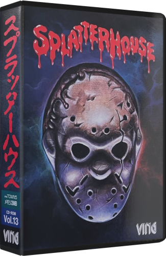
If possible, please help with this one ^^ i dont find in anyware one way for get this cover with quality 😔


0dpicopy.png.dbc8f857631cf765135fa33ca3e960c7.png)


