
Jason Carr
-
Posts
13,723 -
Joined
-
Last visited
-
Days Won
388
Content Type
Profiles
Forums
Articles
Downloads
Gallery
Blogs
Everything posted by Jason Carr
-
Thanks @dukeemu, you can email me the translation when you're all done to jason@unbrokensoftware.com. Then I can get it integrated for testing. :) @Opaklopper, I finally re-integrated the latest German translation and fixed the placement issues for all the forms. It's hard for me to tell everything because I don't know German, but everything looks fine except for the fact that the titles for all the windows are set to Willkommen for some reason. I want to try and get the German translation here in the 6.4 release if we can, to be out in a couple of days. Any testing anyone can do with the German translation in the latest beta would be appreciated. :)
-
Gotcha, thanks guys. Sounds like a good road plan. :)
-
Thanks guys, I did finally wrap up support for deleting games over the weekend. I started to get into more changes but haven't wrapped any of it up yet (though deletions are deployed). Would like to hear feedback from you guys on the deletions if there's anything we need to change. The reasons, for example, could certainly be improved on as I'm sure there are some reasons for deleting games that I haven't thought of. Also, for moderators, what would you say is the next most important thing to tackle? Thanks all.
-
Hi @domoaligato, the CPU usage is due to LaunchBox generating the disk image cache in the background. All the images in your collection are being resized and cached in order to display quickly. Once that process is done, the CPU usage should go down to zero while it's not in use. We're always working on performance, but collections of that size and larger are unfortunately a challenge to keep performant. I assume you're importing multiple versions of the games? In the future we plan to provide a way for games to support multiple versions in order to keep the game count down and better organize things.
-
Hi @jtrain, unfortunately we haven't consolidated everything yet per the emails and accounts. To switch up the weekly emails you can unsubscribe from the email list via the link at the bottom of the emails. Then to re-subscribe for the weekly emails, just go to the download page here and put in your email: https://www.launchbox-app.com/download Thanks!
-
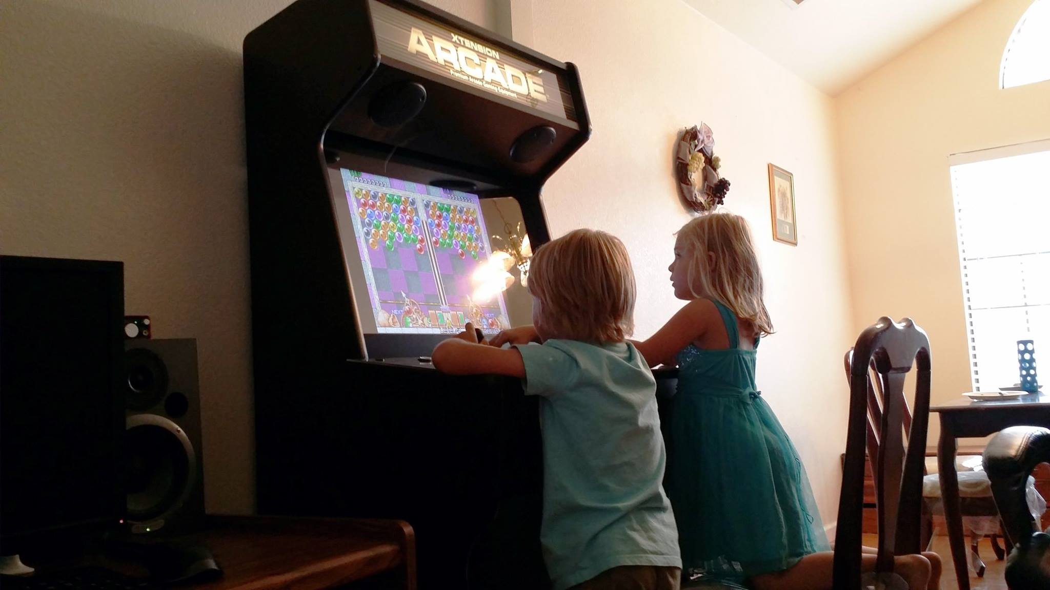
Who wants to help us design a bartop arcade cabinet? :)
Jason Carr replied to Jason Carr's topic in News and Updates
donarumo said Does the t-moulding on a build like this end up showing a lot of wear? If so, I would go with black. Is there a reason not to include a spinner or trackball in a build like this? How about pinball flipper buttons on the sides? Anyone know about the wear? I'm thinking of doing the blue and green thing currently. I've never seen t-moulding get worn out but I'm pretty much clueless on that topic. We actually are including a spinner on it; it's just not in the mockup. If you check the video at the beginning of this topic there's a spinner on that one so that's the location where it will go on ours. It'll be above the buttons so it won't obstruct Luigi or Mega Man. There will be pinball flippers on the sides as well, also per the video. -
Who wants to help us design a bartop arcade cabinet? :)
Jason Carr replied to Jason Carr's topic in News and Updates
Renard said Never use a grid layout for the panel! http://www.slagcoin.com/joystick/layout.html (I'd advise using the Vewlix Arcade one, minus the last button) That makes a lot of sense; sadly though I think I'd have to switch to a different build in order to make that happen. Unfortunately Monster Arcades uses the grid layout so I think that's what we're stuck with. That is what I'm used to though with my current upright, so I guess it is what it is. -
Who wants to help us design a bartop arcade cabinet? :)
Jason Carr replied to Jason Carr's topic in News and Updates
I talked with Neal (Rincewind) via email a bit; I'm thinking it would be good to have the branding on both sides as well since part of the point of it is visibility at game conventions. I don't want to screw up the look of the unit though so I'd rather drop that idea if it doesn't look good or doesn't fit in. Here's my horrible Photoshop version of what I'm thinking: Thoughts guys? The other thing I asked Rincewind to try is to blue-tint the backgrounds to see if that brightens it up a bit or makes it a bit more cheery. That's about the end of my feedback; I can't believe how awesome it looks already. I'd be very happy with it as-is, so I think we'll be sending it off to Monster Arcades very soon. :) -
Who wants to help us design a bartop arcade cabinet? :)
Jason Carr replied to Jason Carr's topic in News and Updates
Alright, here's the semi-completed set! -
Hi @Deimos, technically all box art is official imagery from the game; official images should be fine. :)
-
You're missing something Brad. All the paths are kept in a relative format. For example: ..\Emulators\Project64\Project64.exe This means the parent folder of the LaunchBox folder, then Emulators, Project64, etc. Obviously if you move the LaunchBox folder and leave the Emulators folder there, it'll break it.
-
Just be careful about moving things around if you do chose to keep things separate. The biggest benefit of keeping everything all in one folder is the fact that you can put that folder anywhere and it'll just work. But if you keep things outside the LaunchBox folder, and then end up moving either your ROMs, emulators, or LaunchBox itself, you'll have some work to do to fix the paths.
-
Who wants to help us design a bartop arcade cabinet? :)
Jason Carr replied to Jason Carr's topic in News and Updates
Well happy birthday Rincewind! Yeah, what Brad said. Enjoy your day; don't spend it on us. :) -
I was just made aware of this from Brad, actually. Apparently we do still have a sorting issue that is due to my previous attempts to properly handle roman numerals. I thought I had removed it all but apparently not. I'll take a look at this soon. You can get around it with the sort title as discussed, but of course that's not ideal.
-
Who wants to help us design a bartop arcade cabinet? :)
Jason Carr replied to Jason Carr's topic in News and Updates
Sounds great @Rincewind. I like the blue and green idea. Also, I think you're right about Luigi, might even be best to flip him and put him on the right edge. :) -
Who wants to help us design a bartop arcade cabinet? :)
Jason Carr replied to Jason Carr's topic in News and Updates
And the question of the hour...what color to make the t-moulding? -
Who wants to help us design a bartop arcade cabinet? :)
Jason Carr replied to Jason Carr's topic in News and Updates
-
Who wants to help us design a bartop arcade cabinet? :)
Jason Carr replied to Jason Carr's topic in News and Updates
Indeed! @Rincewind just keeps popping them out... :) -
Who wants to help us design a bartop arcade cabinet? :)
Jason Carr replied to Jason Carr's topic in News and Updates
Also, I made this in an attempt to visualize the whole cabinet: Really the only piece left to build is the bottom part underneath the controls. Thoughts, everyone? :) I can't thank @Rincewind enough for this; I couldn't have found a better person for the job if I was throwing money at people. -
Who wants to help us design a bartop arcade cabinet? :)
Jason Carr replied to Jason Carr's topic in News and Updates
And we have the controls! I already suggested possibly jamming in some more characters to the control panel as well as having a different color for the buttons on each side (for each player). I'm thinking either green and blue or maybe orange and blue for LaunchBox vs. Big Box. :) -
Hi @Beatlemaniac, I've actually done that in the past, but it ended up messing with the sort order too much so I had to get rid of it. I can't remember the specifics but I learned that it's extremely complicated to sort things properly for roman numerals without affecting anything else. Still, I might come back to that at some point. @shadowfire36, that sorting behavior is really weird. Just in case you happen to have something in the Sort Title field, for any of those games, that could explain it. You can override the default sort any way you wish by putting a value in the Sort Title field on your games. For example, if you have a sorting issue with roman numerals, you can just put Ultima 1, Ultima 2, Ultima 3, Ultima 4, etc. in the Sort Title field for those games and then they will show up in order. I'm interested to know if that's what's causing the problem, @shadowfire36. Other than that, it doesn't make a whole lot of sense. Keep in mind that web technologies are very different from desktop application techs, so it's not really surprising that we have different results between the two, but honestly I haven't seen the LaunchBox sorting engine behave that wonky before.
-
Who wants to help us design a bartop arcade cabinet? :)
Jason Carr replied to Jason Carr's topic in News and Updates
It might be good to make the text stand out or pop out a bit more, maybe, but I generally don't like using a different color for every letter of the logo like we've done in the past @SentaiBrad. I think we'll be alright without all those colors. -
Who wants to help us design a bartop arcade cabinet? :)
Jason Carr replied to Jason Carr's topic in News and Updates
And @Rincewind pulls through again! ;) I prefer the second one with Crash on the left and the bigger text. :) -
Who wants to help us design a bartop arcade cabinet? :)
Jason Carr replied to Jason Carr's topic in News and Updates
Awesome, thank you @Rincewind. :) -
Who wants to help us design a bartop arcade cabinet? :)
Jason Carr replied to Jason Carr's topic in News and Updates
Ah, that's right. I'd actually rather not match the background up I think for the marquee; it might be a little bit overboard. We do have to keep in mind the LED light that is going to shine through the marquee, but it's actually printed without transparency and the light just shines through the plexiglass and the vinyl and it works just fine.
