Jump to content
LaunchBox Community Forums

Lambda beta 1.1.2

   (7 reviews)

8 Screenshots

About This File

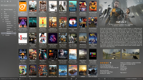
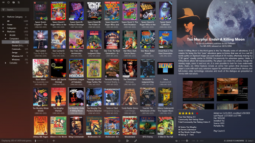
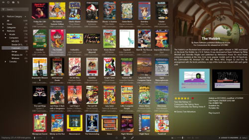
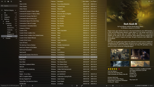
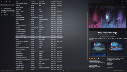
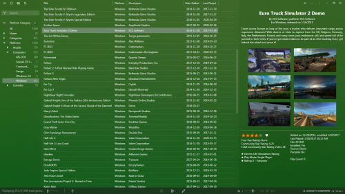
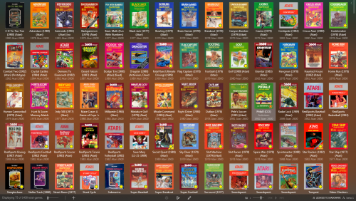
This theme attempt to be minimal and modern and maximise screen estate.

Note: this is a beta release and features may change in future releases.

Installation

  • Unzip into LaunchBox\LBThemes directory
  • In LaunchBox go to: Options -> Visuals -> Theme: Lambda beta

Windows 7/8 user: Microsoft's “Segoe MDL2 Assets” font ( SegMDL2.ttf ) is required for the buttons and icons to rendered properly. (If you have it it will work but it’s not included here because of licensing reasons.)

Settings guide

tl;dr:

  • You may have to tweak your Boxes aspect ratio and spacing. 
  • The top Details image is only visible when Fanart is available.
  • Button bar can't be hidden because of the licensing info.
  • Font and colour settings have no effect (font is based on system font).

Settings used in screenshots are:

Options -> Visuals -> Boxes -> Spacing:

Aspect Ratio: 0.6 * 
Horizontal Spacing: 2
Vertical Spacing: 2
Horizontal Padding: 8
Vertical Padding: 2
Text Spacing: 4
Text Lines to Show: 2

*) For horizontal box art you may need to use a higher value.

Options -> Visuals -> Boxes:

Align Text Vertically : enabled
Align Text Horizontally : enabled
Show Subline : enabled (for platform info)

Other recommended settings:

Options -> Legacy -> General -> Game Details:

Show Fanart: enabled
other options at your own preference

Options -> Legacy -> Images -> Background Priorities :

Fanart : enabled
other options disabled

Options -> Visuals -> Backgrounds:

Background Blur Amount : 100
Background Fade Amount : 0

(Imo. the theme looks best when blurred background Fanart and Details Fanart are the same image.)

Settings that don't have any effect:

  • Button bar can't be hidden because the license has to stay visible.
  • Colours are hard coded.
  • Font (including size and scaling) is based on your Windows system settings.


Thanks to Grila for allowing me to use his LBPlex theme code, Retro808, neil9000, C-Beats and Jason Carr for testing and everyone who supported this release on the forum.

Lambda beta theme CC BY-NC-SA 4.0 Shadowfire 2020


What's New in Version 1.1.2   See changelog

Released

No changelog available for this version.

  • Like 22
  • Thanks 4
  • Game On 1
  • Unusual Gem 3

User Feedback

Recommended Comments


On 5/9/2020 at 4:25 PM, shadowfire said:

I have found a workaround for the VLC video aspect issue which enforces a 16:9 video container. So 16:9 letterboxing is removed but  instead 4:3 are now pillarboxed. Maybe that's more acceptable?

Launchbox_Lambda_video_aspect_fix.jpg

I'm kind of interested in feedback on this, particularity if anyone cares about the left/right margin of 4:3 videos (pillarboxing) as a consequence. Also since I've moved code around and I don't have many (4:3) videos (and WMP) maybe someone wants to volunteer as a tester before I do before an update to the release?

Link to comment
Share on other sites

I will keep the WMP selected with no black bars (horizontal or vertical) with the xaml tweak from previous posts.

If I had to decide between bars, I would rather have the horizontal ones over the pillars.

I can test your revised theme if you want.

  • Thanks 1
Link to comment
Share on other sites

5 hours ago, shadowfire said:

I'm kind of interested in feedback on this, particularity if anyone cares about the left/right margin of 4:3 videos (pillarboxing) as a consequence. Also since I've moved code around and I don't have many (4:3) videos (and WMP) maybe someone wants to volunteer as a tester before I do before an update to the release?

Since I'm using WMP, I don't have any issues with 4:3 and 16:9 videos. I did, however, run into something interesting with vertically-oriented videos. The video ends up taking almost all the real estate in the game details screen, probably because I deleted the height properties in the appropriate xaml file. I don't hate it, but there's so much I can't see when a vertical video snap is playing. This is a tricky one.

mame big video.png

  • The Cake is a Lie 1
Link to comment
Share on other sites

27 minutes ago, tycho1974 said:

Since I'm using WMP, I don't have any issues with 4:3 and 16:9 videos. I did, however, run into something interesting with vertically-oriented videos. The video ends up taking almost all the real estate in the game details screen, probably because I deleted the height properties in the appropriate xaml file. I don't hate it, but there's so much I can't see when a vertical video snap is playing. This is a tricky one.

The xaml could have an additional height property that maxes it at a certain value, so for vertical videos it would not take all the sidebar. 

Link to comment
Share on other sites

14 hours ago, Kondorito said:

The xaml could have an additional height property that maxes it at a certain value, so for vertical videos it would not take all the sidebar. 

( @tycho1974 ) I would recommend using the MaxHeight property since that would not mess with scaling when you want to to reduce the width of the Details panel. Set it either on the video control or one of it's containers should do the trick.

Note that my workaround will apply to both VLC and WMP since the theme is not aware which back-end is used.

Btw. can someone provide me with a vertically-oriented video so I can test this? I don't have an EmuMovies account...


Edited by shadowfire
Link to comment
Share on other sites

5 hours ago, shadowfire said:

( @tycho1974 ) I would recommend using the MaxHeight property since that would not mess with scaling when you want to to reduce the width of the Details panel. Set it either on the video control or one of it's containers should do the trick.

I would love to try that, but the entirety of my coding knowledge tops out at a "deleting stuff line by line and testing until it works and hope it doesn't break anything" sort of reverse engineering. If anyone here could post a code snippet, I'd be more than happy to test it out.

Here are a couple vertical videos for you:

Link to comment
Share on other sites

6 hours ago, tycho1974 said:

I would love to try that, but the entirety of my coding knowledge tops out at a "deleting stuff line by line and testing until it works and hope it doesn't break anything" sort of reverse engineering. If anyone here could post a code snippet, I'd be more than happy to test it out.

Not 100% sure if this will also work with WMP (as I mentioned mine is broken so I can only test VLC for now) but you can try adding MaxHeight to your already modified VideoControls line in GameDetails.xaml like this: 

<controls:VideoControl x:Name="VideoControl" Background="{StaticResource LD_VideoBackgroundBrush}" Visibility="{Binding VideoVisibility}" MaxHeight="500" Margin="0,-10,0,5"/>

The value of 500 is just a suggestion, you may want to tweak it depending on your preferred window size. Also this will most likely pillarbox your vertical videos anyway because reducing height also means reducing width.

Quote

Here are a couple vertical videos for you

Thanks, appreciated :) Note that the workaround I'm working on will have a fixed aspect ratio but I'll make it relatively easy to change the default to another one (e.g. 16:9, 4:3 or 3:4 vertical) 


Edited by shadowfire
  • Like 1
  • Thanks 1
Link to comment
Share on other sites

4 hours ago, shadowfire said:

Not 100% sure if this will also work with WMP (as I mentioned mine is broken so I can only test VLC for now) but you can try adding MaxHeight to your already modified VideoControls line in GameDetails.xaml like this: 


<controls:VideoControl x:Name="VideoControl" Background="{StaticResource LD_VideoBackgroundBrush}" Visibility="{Binding VideoVisibility}" MaxHeight="500" Margin="0,-10,0,5"/>

The value of 500 is just a suggestion, you may want to tweak it depending on your preferred window size. Also this will most likely pillarbox your vertical videos anyway because reducing height also means reducing width.

Thanks, appreciated :) Note that the workaround I'm working on will have a fixed aspect ratio but I'll make it relatively easy to change the default to another one (e.g. 16:9, 4:3 or 3:4 vertical) 


Thanks, this worked like a charm. I set my max height to 400, and now the vertical snaps don't take up the whole are, and I can now access the middle frame of the game details window. 16:9 and 4:3 snaps also play "full frame", so to speak. Thanks!

400.png

  • Like 1
Link to comment
Share on other sites

@shadowfireBeautiful theme, simple and clean and lost of room for Background and Screenshot art to shine :) Is there a way to change the thickness and fill of the selection brush and hover background brush?  To have just a thin rectangle line around selected box art? thanks

  • Thanks 1
Link to comment
Share on other sites

On 5/21/2020 at 3:16 AM, Tony Birt said:

@shadowfireBeautiful theme, simple and clean and lost of room for Background and Screenshot art to shine :) Is there a way to change the thickness and fill of the selection brush and hover background brush?  To have just a thin rectangle line around selected box art? thanks

I'm sorry, but there are various reasons why this particular style was chosen. In an earlier version I experiment with various box selection style and the reason why the bordered style didn't make it was because it made it difficult to see which box is selected when you have a lot of box art on screen. E.g. when you use a keyboard shortcut to jump ahead in the list or use the "choose random game option".

Eventually the current style was the style that was chosen because of it's visibility, simplicity and consistency with other UI elements.

(And keeping the other options around made the code complex to maintain.)

The only thing you can do without hacking the code (which I wouldn't recommend) is - if you're boxes have the same aspect ratio - minimise the padding and tweak the aspect ratio in Launchbox' Boxes settings.

Link to comment
Share on other sites

Great theme.

I'm curious if you have any idea how to accomplish something- so I'm really enjoying the fanart background implementation at the top of the details sidebar like so.

Spoiler


image.png.a40def94c7313970e88409e883d76d96.png


However, if I have video for the game, this goes away:

Spoiler


image.png.1ecef0913fb86a4f97e4673ae4fae03b.png

Is there a way to prevent this / relocate the video's position? Think if I can do that and me darkening the background of the sidebar, this'll wind up my permanent layout. I appreciate it if you have any ideas.


Edit / Actually wasn't as hard as I thought it'd be on the video part. Seems elegant enough for my tastes.


Spoiler

image.thumb.png.624bb8db411ba871cc6e1fc6a0028200.png

Did some rough tweaking here and there, looking solid. Thanks again!


Spoiler

image.thumb.png.562cf3d8973358d12a1045f90b5c623f.png


Edited by Haelstrom
  • Like 1
Link to comment
Share on other sites

1.1 is a great update. Thanks for the time you put into the changes - I love the fanart as bezel for the video snaps. That is some *chef's kiss* work.

Update #1:  I noticed some odd behavior with some video snaps, consistent with the particular files. For example, my Descent video, which is 640x480, displays in the 4:3 ratio, and I can see the fan art underneath. My snap for Descent II, which is 640x480, also displays in 4:3, but shows black bars on the sides. Upon further inspection, this seems to happen with games that do not have any images classified as "fanart - background". Every game that has such an image displays videos properly, and without any black bars.

descent.png

d2.png

Update #2: I can confirm that manually adding or defining an image as "fanart - background" fixes the issue, and allows proper video display. Not a big deal, as the completionist portion of my brain is now demanding I make sure every game in my collection has a proper wallpaper now...

Edited by tycho1974
  • Thanks 1
Link to comment
Share on other sites

18 hours ago, tycho1974 said:

Update #1:  I noticed some odd behavior with some video snaps, consistent with the particular files. For example, my Descent video, which is 640x480, displays in the 4:3 ratio, and I can see the fan art underneath. My snap for Descent II, which is 640x480, also displays in 4:3, but shows black bars on the sides. Upon further inspection, this seems to happen with games that do not have any images classified as "fanart - background". Every game that has such an image displays videos properly, and without any black bars.

Yes, that's intended behavior. The background of videos is darkened when there's no FanArt in case someone has "Auto-Play Video" turned off  to hint the area where the video player is. (Otherwise it would just show a large play icon which can be confused with meaning "play game" or something.)

But if you prefer to have it transparent you can override it by removing the comment tags in line 55 of Lambda beta 1.1/Views/Settings.xaml so it reads like this:

<SolidColorBrush x:Key="LD_VideoBackgroundBrush" Color="Transparent"/>

(You may have to restart Launchbox for it to take effect.)

  • Thanks 1
Link to comment
Share on other sites

On 6/3/2020 at 11:37 AM, shadowfire said:

Yes, that's intended behavior. The background of videos is darkened when there's no FanArt in case someone has "Auto-Play Video" turned off  to hint the area where the video player is. (Otherwise it would just show a large play icon which can be confused with meaning "play game" or something.)

But if you prefer to have it transparent you can override it by removing the comment tags in line 55 of Lambda beta 1.1/Views/Settings.xaml so it reads like this:


<SolidColorBrush x:Key="LD_VideoBackgroundBrush" Color="Transparent"/>

(You may have to restart Launchbox for it to take effect.)

I see, thanks for clarifying that. I think that, given my own personal proclivities, I am more likely to flesh out my backgrounds collection; that being said, I'll try this out later tonight and see it for myself.

Thanks again for this theme, it is everything I never knew I wanted for LB presentation and visuals.

UPDATE: I added about fifty more backgrounds, then looked at the prospect of finding backgrounds for around 6,000 more games, and decided to go with this method of making the placeholder transparent. Works great!

Edited by tycho1974
  • Like 1
Link to comment
Share on other sites

Loved the original release and these refinements look even better! I can't help myself but tinker with it though for a few personal preferences.

One thing I'm curious about and haven't stumbled upon yet is pointing the GameDetailsView header image from 'FanartImages' to the box art. I don't know if it's actually possible since the box art could be in several different places (front cover, back cover, 3D, reconstructed, etc). Any suggestions appreciated... even if I ditch it in favor of fanart in the end ;) Thanks!

  • Thanks 1
Link to comment
Share on other sites

On 6/5/2020 at 9:50 PM, ShawnS said:

One thing I'm curious about and haven't stumbled upon yet is pointing the GameDetailsView header image from 'FanartImages' to the box art. I don't know if it's actually possible since the box art could be in several different places (front cover, back cover, 3D, reconstructed, etc). Any suggestions appreciated... even if I ditch it in favor of fanart in the end ;) Thanks!

That's what I originally wanted as well but unfortunately I couldn't find a way to make that work. It's seems that Launchbox restricts image types allowed in the Details panel to FanArt and Screenshots. That's why I decided to use FanArt with the title overlayed as sort of a banner representation of the game.

Edited by shadowfire
Link to comment
Share on other sites

4 hours ago, shadowfire said:

That's what I originally wanted as well but unfortunately I couldn't find a way to make that work. It's seems that Launchbox restricts image types allowed in the Details panel to FanArt and Screenshots. That's why I decided to use FanArt with the title overlayed as sort of a banner representation of the game.

Hey hey, I think I figured out *a* solution! I had this idea the other day but haven't had time to check until now. It would be on a per-platform basis but right click a platform > Edit > Folders > and then change the path for 'Fanart - Background' to anything else. I changed mine to 'Cover - Front' but I know there are some covers that only exist in 'Fanart - Reconstructed' so I'd have to move some things around but this accomplishes what I was looking for: not having to fill up my limited HDD with extra images. ?

The only complaint now is that the text loads first at the top of the sidebar, then the cover image loads and the text jumps down the screen. I know this is sorta beyond your theme but any ideas if you can slow down the sidebar text loading speed so it all appears at the same time?

Link to comment
Share on other sites

18 hours ago, ShawnS said:

Hey hey, I think I figured out *a* solution! I had this idea the other day but haven't had time to check until now. It would be on a per-platform basis but right click a platform > Edit > Folders > and then change the path for 'Fanart - Background' to anything else. I changed mine to 'Cover - Front' but I know there are some covers that only exist in 'Fanart - Reconstructed' so I'd have to move some things around but this accomplishes what I was looking for: not having to fill up my limited HDD with extra images. ?

The only complaint now is that the text loads first at the top of the sidebar, then the cover image loads and the text jumps down the screen. I know this is sorta beyond your theme but any ideas if you can slow down the sidebar text loading speed so it all appears at the same time?

Interesting 'solution' :) ?

No sorry, I don't know which part of the application handles loading and rendering. But I've noticed a few per game factors that can lag rendering on my system: 4K images, lots of screenshots (and maybe FanArt; the theme uses a workaround to display only one of them) and blur ratio of the main background image. You can rule out drop shadows since this theme doesn't use any.

Edited by shadowfire
Link to comment
Share on other sites

It's worked out so far for all my platforms. I just edited the alignment so the box art is aligned at the top instead of centered (attachment 2) 

Thought I'd also share a couple screenshots of what else I've done. Please forgive ? Mostly I wanted to increase text size for couch-distance. I moved the screenshots up to the top just yesterday, kinda digging it. The only other big change was rearranging the rating/favorites/info for myself. I wanted the stars but never needed the community rating info or genres so I pared it down to just a few details.

Thanks for suggestions on the loading. I'm going to blame my slow USB HDD for most of it. That's why I already had the full screen backgrounds turned off and wanted to go this route to bypass loading fanart as well.

lambda-edit.jpg

lambda-edit-nosnap.jpg

  • Like 1
Link to comment
Share on other sites

40 minutes ago, ShawnS said:

Mostly I wanted to increase text size for couch-distance. I moved the screenshots up to the top just yesterday, kinda digging it. The only other big change was rearranging the rating/favorites/info for myself. I wanted the stars but never needed the community rating info or genres so I pared it down to just a few details.

Thanks for suggestions on the loading. I'm going to blame my slow USB HDD for most of it. That's why I already had the full screen backgrounds turned off and wanted to go this route to bypass loading fanart as well.

Just in case you didn't know: you can turn off most of the info details and FanArt in Lauchbox's Game Details options (no need to hack the code) and the font settings are based on Windows' font settings. So if you increase Windows' font size to couch-distance it should apply to the theme as well.

Link to comment
Share on other sites

I did that in the settings at first but iirc it turned off the stars along with the 'your star rating', 'community star rating', and 'total ratings'. I just wanted to keep the stars and heart.

I had read that about the fonts in your theme description but I'm oddly fine with Windows font settings in general but in LB it just felt like it needed to be bigger for my eyes.

Link to comment
Share on other sites

This is the theme that I am looking for? and I will not use any other. I am very excited about update 1.2 release of this theme because ver.1.1 makes Windows games close suddenly after a few hours of play ..

Edited by Eyssa
Link to comment
Share on other sites

I'm a huge fan of this theme but since the last update, I experienced freeze and crash when browsing too fast games compatible with retroachievements. Launchbox is having difficulties loading achievements and after browsing few games, it  freezes approximately 30 seconds. And if I continues browsing after that, it crash.

I hope you'll find a quick fix for that bug.

Thanks for your work  ;)

Link to comment
Share on other sites

On 10/23/2020 at 5:51 PM, Mumut said:

I'm a huge fan of this theme but since the last update, I experienced freeze and crash when browsing too fast games compatible with retroachievements. Launchbox is having difficulties loading achievements and after browsing few games, it  freezes approximately 30 seconds. And if I continues browsing after that, it crash.

I hope you'll find a quick fix for that bug.

Thanks for your work  ;)

I don't have retroachievements myself so it's sort of an unsupported feature (the code is copy/paste from a different theme) but according to the Changelog the latest version of LaunchBox seems to have a fix for that.

Link to comment
Share on other sites

On 8/7/2020 at 6:09 AM, Eyssa said:

This is the theme that I am looking for? and I will not use any other. I am very excited about update 1.2 release of this theme because ver.1.1 makes Windows games close suddenly after a few hours of play ..

Sorry, I could not reproduce that issue so I'm unable to help you with that...

Edited by shadowfire
Link to comment
Share on other sites


Join the conversation

You can post now and register later. If you have an account, sign in now to post with your account.

Guest
Unfortunately, your content contains terms that we do not allow. Please edit your content to remove the highlighted words below.
Add a comment...

×   Pasted as rich text.   Paste as plain text instead

  Only 75 emoji are allowed.

×   Your link has been automatically embedded.   Display as a link instead

×   Your previous content has been restored.   Clear editor

×   You cannot paste images directly. Upload or insert images from URL.

×
×
  • Create New...